Add some zing to your typography in Photoshop
Radim Malinic reveals how to produce exciting lettering with the Pen tool
There are many ways to achieve a particular look, it just depends on what processes you are more comfortable with and find easier to execute. And although I’m using CS5 here, this tutorial isn’t looking at the latest additions to Photoshop and Illustrator – it simply takes the solid, basic functionality of some key tools to demonstrate how it is possible to create a relatively complex image using a series of fairly simple techniques
The image we’re going to create can almost serve as a Pen tool practice session, as half of the tutorial is done in Illustrator. We’ll be working with a single text character as a focal point, setting the scene in somewhat colourful, windy conditions. I hope you’ll take extra time and enjoy each step along the way, and modify the final outcome as you see fit.
Find 30 free Photoshop brushes at our sister site, Creative Bloq.
01 The subject of this tutorial is a capital letter ‘A’ set in ITC Serif, but it could just as well be any letter in the alphabet in any typeface you like. Choose the letter you prefer, and place it in the middle of a new Illustrator A4-sized canvas.

02 Next, select the Pen tool and draw a simple, upward-facing curve or swoosh in a plain stroke. Create a copy by holding Opt/Alt and dragging the object to the side. From the Stroke panel increase the width to 21pt and give it a pointy end.

03 The main idea is to create a build up of swooshes that look like they’re in motion, swirling around the main character. There’s no need to redraw each swoosh, simply create working copies of the original curve and use the Direct Selection tool to adjust the end points to fit.
04 Each swoosh can be given a different look by adjusting its anchor points as well as by using different stroke weights. Objects at the bottom of the stack should have a weight of 20-40pt to look and feel sturdier. The overlaps, or vines, will then add contrast in smaller looking parts.
05 With a good set of strokes in place, we can prepare our elements for transfer to Photoshop. Create a copy of the main group and place it on a new layer by pressing F7. Select all with Cmd/Ctrl+A and go to Object>Path>Outline Stroke. Once you’re done, hit D for default fill and stroke colours
Sign up to Creative Bloq's daily newsletter, which brings you the latest news and inspiration from the worlds of art, design and technology.
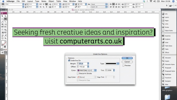
06 Should you wish to add extra detail to the final layout, make another copy of the main group of paths on a new layer, highlight the group and tick Dashed Line. Increase the line thickness to 5pt and add 2.85pt for the size of the dashes.
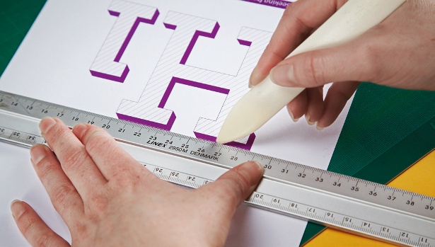
07 Switching to Photoshop, we need to create the scene for the main image. Fill the canvas with a base yellow colour – I’ve chosen a CMYK profile of 0/4/54/0 – and you can add some extra shading to the corners for a nice variation in the background.

The Creative Bloq team is made up of a group of art and design enthusiasts, and has changed and evolved since Creative Bloq began back in 2012. The current website team consists of eight full-time members of staff: Editor Georgia Coggan, Deputy Editor Rosie Hilder, Ecommerce Editor Beren Neale, Senior News Editor Daniel Piper, Editor, Digital Art and 3D Ian Dean, Tech Reviews Editor Erlingur Einarsson, Ecommerce Writer Beth Nicholls and Staff Writer Natalie Fear, as well as a roster of freelancers from around the world. The ImagineFX magazine team also pitch in, ensuring that content from leading digital art publication ImagineFX is represented on Creative Bloq.
