Can you tell what wine is like from a geometric pattern?
These designer wines use colourful geometric patterns instead of text to describe their taste and character.
Sign up to Creative Bloq's daily newsletter, which brings you the latest news and inspiration from the worlds of art, design and technology.
You are now subscribed
Your newsletter sign-up was successful
Want to add more newsletters?
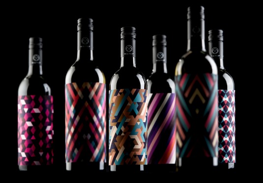
What do you look for when you buy a bottle of wine? If you don't really know wine then there can be a fair bit of guesswork involved. If you can't tell your Sauvignon Blanc from your Semillon then here's a new range of wine that wants to make things a little easier for you; rather than blinding you with names and descriptions that might not mean anything to you, Motif Wine is a lovely piece of experimental design that indicates what's in the bottle with simple geometric patterns.
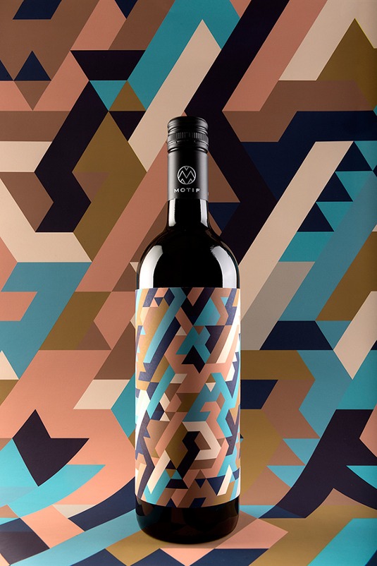
Designed by Austrian studio En Garde, Motif is a range of six wines that consciously refrain from using information about the variety of grape or other specifications on the bottle. Instead the patterns on each label provide a subtle indication of whether the wine is semi-sweet, full-bodied or effervescent.
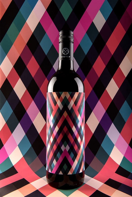
To further differentiate, Motif uses earth tones and fresh warm colours to visualise each wine: yellows and green for the whites, reds and blues for the rosé and more vivid pinks and blues for the red.
Article continues below 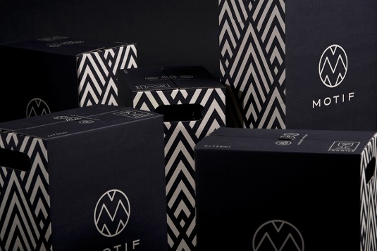
The Motif range is tied together by the letter M as a key visual that also informs the patterns themselves; the lines of the M are placed at the same 60 degree angle that's used as the basis of each label's vivid geometric design. The motif is also used for the monochrome pattern in the packaging design for each case of six bottles.
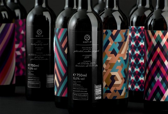
The bottles aren't entirely text-free; the labels on the back feature delightfully enigmatic descriptions to help you out a little. So, for example, Dign red is determined, dense and concentrated, and the Gschniglt white is best drunk in an office from 3pm. See you then!
Sign up to Creative Bloq's daily newsletter, which brings you the latest news and inspiration from the worlds of art, design and technology.
Jim McCauley is a writer, performer and cat-wrangler who started writing professionally way back in 1995 on PC Format magazine, and has been covering technology-related subjects ever since, whether it's hardware, software or videogames. A chance call in 2005 led to Jim taking charge of Computer Arts' website and developing an interest in the world of graphic design, and eventually led to a move over to the freshly-launched Creative Bloq in 2012. Jim now works as a freelance writer for sites including Creative Bloq, T3 and PetsRadar, specialising in design, technology, wellness and cats, while doing the occasional pantomime and street performance in Bath and designing posters for a local drama group on the side.
