Craft vectors with style
Tom Lane explains how to create detailed type treatments by hand
In this tutorial I’ll explain a technique that I developed to treat a logotype supplied in vectors by the creative team at The KDU. The project started with an all-member call-out to help promote a fashion trade show called TMRW.
The technique we’ll walk through here effectively involves creating an analogue version of Photoshop’s Layers panel. I hate having a blank piece of paper and starting each piece of work from scratch, so to overcome this peeve I have started using a lightbox to develop work-through layers, deciding what I needed to add along the way until I have a fairly polished artwork. I was supplied with a template to use as a basis for this particular piece, so I’ve adapted my process to take this into account.
To produce this hand-crafted style you’re going to need a bit of kit: a 0.3mm fineliner, some good sketchpad paper, pencils, a scalpel, a ruler (preferably metal), possibly a glue stick, a roll of masking tape and a lightbox. Or, if you have no lightbox, use tracing paper instead of sketchpad paper.

01 Launch Illustrator and either open your own logo file, set some type or draw out some letterforms so that you have a template to work with. Ensure that your artwork is predominantly solid, clear and set up as black on white.
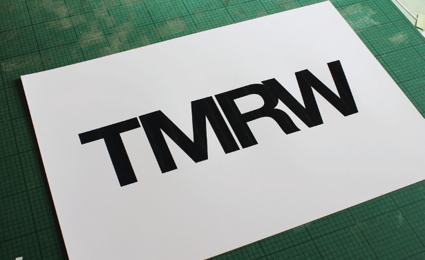
02 Print out your template. If you have an A3 printer, aim to have the art sitting nicely in the middle with about 35mm clearance to the left and right. If A4 is your maximum, print the art as large as you can on the page, and then stick it on top of an A3 sheet of paper.
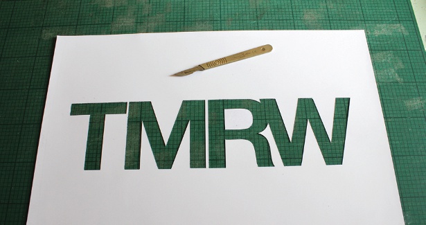
03 Now make a stencil out of your printed artwork. With your scalpel and metal ruler, carefully cut out the forms of the lettering. Make sure you keep the negative space elements to hand (the centre of the ‘R’, for example).
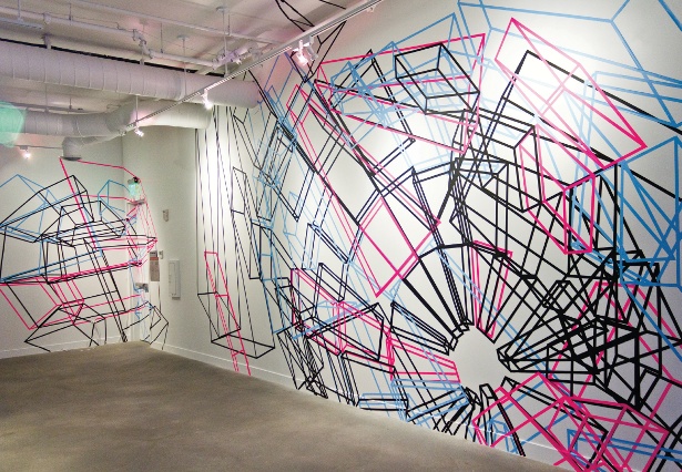
04 On a separate piece of paper, mark out roughly the size and shape of your whole artwork. You don’t need to be overly precise here. Just give yourself a little guidance for laying down your second piece of artwork.
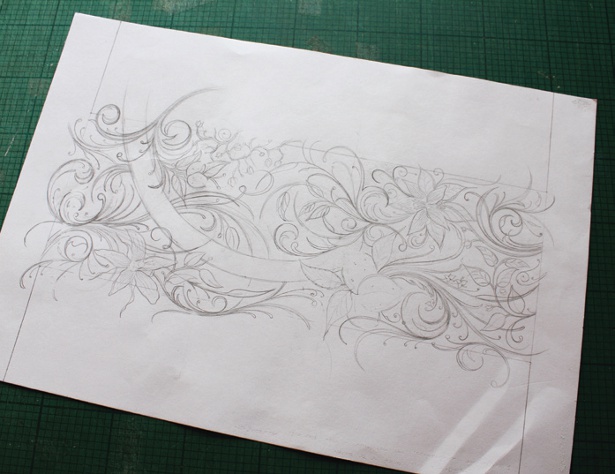
05 For this particular project I chose to draw an intertwining mass of organic forms, but there’s nothing stopping you from choosing anything you like to work into this space. Is there a particular subject you want to tackle? Just make sure there’s a fair amount of detail to work with in the later steps.
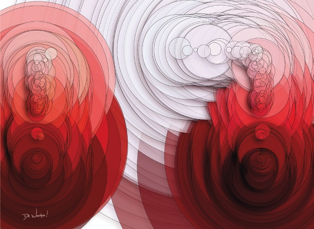
06 Now you need to make a paper sandwich. Grab a fresh piece of sketch paper (if you’re not using a lightbox, use tracing paper) and tape it along the top of the sketch you completed in the last step. Now attach the lettering stencil to the top of that and place it on the lightbox.
Sign up to Creative Bloq's daily newsletter, which brings you the latest news and inspiration from the worlds of art, design and technology.
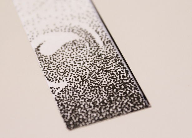
07 With a 0.3mm fineliner, begin at the base of the first character in the stencil. Start dotting tightly over your sketch, and create a fairly dense mass. As you move steadily up through the character, begin spacing out the dots, creating more and more white space visible between the dots. This method forms the gradients.

The Creative Bloq team is made up of a group of art and design enthusiasts, and has changed and evolved since Creative Bloq began back in 2012. The current website team consists of eight full-time members of staff: Editor Georgia Coggan, Deputy Editor Rosie Hilder, Ecommerce Editor Beren Neale, Senior News Editor Daniel Piper, Editor, Digital Art and 3D Ian Dean, Tech Reviews Editor Erlingur Einarsson, Ecommerce Writer Beth Nicholls and Staff Writer Natalie Fear, as well as a roster of freelancers from around the world. The ImagineFX magazine team also pitch in, ensuring that content from leading digital art publication ImagineFX is represented on Creative Bloq.
