Using Adobe Edge Code along with D3.js, this tutorial will demonstrate how to get started with automated data visualising in HTML. We’ll be generating a donut chart with data sourced from the Design Council’s design industry research programme.
I’ll give you some pointers on how to start generating data visualisations using D3.js. You will create SVG graphics generated with D3 from the data. We’ll look at how to place charts into an HTML layout along with making your charts interactive.

01 We’ll start with a pie chart example found on mbostock's blocks, a great resource offering code by D3.js developer Mike Bostock. I found a similar-looking graph to what I was looking for in the code examples at d3js.org. It’s worth reading the introduction to the library as it gives some handy pointers.

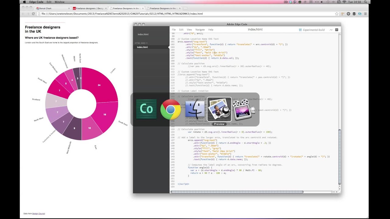
02 Now we’ll add some data. Here I’m using some from the research section of The Design Council’s website. The figures deal with freelance designers in the UK from 2009. The first set of data is ‘Where are UK freelance designers based?’

03 I’ll add some custom colours removing the variable:
color = d3.scale.category20(),
and adding:
// Add Custom Colours
var color = d3.scale.ordinal()
.range([“#EC0677”, “#EA2F91”, “#E25AA1”, “#6b486b”,
“#926593”, “#C793C9”, “#DBC6D2”]);
As you will see the donut chart example is only providing labels for the “val” data set. I want to show both the “val” and “name” data. So I added a new function to show the name data using this code:
// Calculate position
var rotate = d3.svg.arc().innerRadius(r + 0).outerRadius(r + 110);
// Add a label to the larger arcs, translated to the arc centroid and rotated.
arcs.append(“svg:text”)
.attr(function(d) { return d.endAngle - d.startAngle > .2; })
.attr(“dy”, “.35em”)
.style(“fi ll”, “grey”)
.style(“font”, “normal 10px Arial”)
.attr(“text-anchor”, “middle”)
.attr(“transform”, function(d) { return “translate(“ + rotate.centroid(d) + “)rotate(“ + angle(d) +
“)”; })
.text(function(d) { return d.data.name; });
// Computes the label angle of an arc, converting from radians to degrees.
function angle(d) {
var a = (d.startAngle + d.endAngle) * 90 / Math.PI - 90;
return a > 90 ? a - 180 : a;
}

04 Here I have expanded my HTML layout and created a duplicate chart also replicating my chart’s code. Each chart is then attached to a “div” element using the following code:
var vis = d3.select(“#pie”).
append(“svg:svg”)
Then I updated the dataset on the second chart to show how long UK freelancers have been operating for:
var data = [
{name: “Less than 12 months”, val: 11},
{name: “1–3 years”, val: 31},
{name: “4–6 years”, val: 25},
{name: “7–10 years”, val: 14},
{name: “11-15 years”, val: 6},
{name: “15 years plus”, val: 14}
];

05 Finally I added a rollover effect to each segment of my donut chart. To do this first we need to add a new variable to the chart:
arcOver = d3.svg.arc(). innerRadius(60).outerRadius(r + 15); //set Radius
This sets a new inner and outer radius for the hover effect. Next we must add a “mouseover” and “mouseout” function to the donut segments. To do this add:
.on(“mouseover”, function(d) { // Call Mouse Over effect.
d3.select(this).select(“path”).transition()
.duration(400)
.attr(“d”, arcOver);
})
.on(“mouseout”, function(d) {
d3.select(this).select(“path”).transition()
.duration(600)
.attr(“d”, arc);
});
Feel free to experiment with the radius values along with the duration values to achieve different effects.
Discover 35 top examples of JavaScript at our sister site, Creative Bloq.

