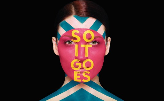
How Sagmeister & Walsh created anamorphic body art
Sagmeister & Walsh's advertising campaigns for luxury brand Aïzone have explored body art before, but painting letters that look totally flat on a face was a new challenge, as Jessica Walsh explains.
Sign up to Creative Bloq's daily newsletter, which brings you the latest news and inspiration from the worlds of art, design and technology.
You are now subscribed
Your newsletter sign-up was successful
Want to add more newsletters?
Aïzone is a luxury department store in Lebanon. Since its inception, it has grown from a single high-end clothing store into a successful, globally recognised chain. After Aïzone approached us in 2010 to rebrand the store and redesign all its store materials, it asked us to try doing its advertising campaigns.
Aïzone wanted us to take the dynamic and youthful nature of the brand and present it in campaigns in newspapers, magazines and billboards throughout Lebanon. The brief was very open - the only required element was an Aïzone logo in the bottom-right corner.
Our rebranding of Aïzone in 2010 focused on strong, black-and-white patterns and bold typographic maxims. For the Spring-Summer 2011 campaign, we decided to paint fashion models with the signature Aïzone patterns.
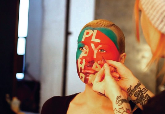
Article continues belowOver time, the creative constraint evolved to working with all typographic maxims. For this latest campaign we revisited the body painting technique, adding colour, pattern and focusing in on short typographic messages covering the models' faces.
Work in progress
Over one month in March, I started by sketching out concepts for the campaign in my notebook. I shared this with Stefan [Sagmeister] and we agreed on the best direction. There was a little back and forth about choosing which sentences and patterns to use.
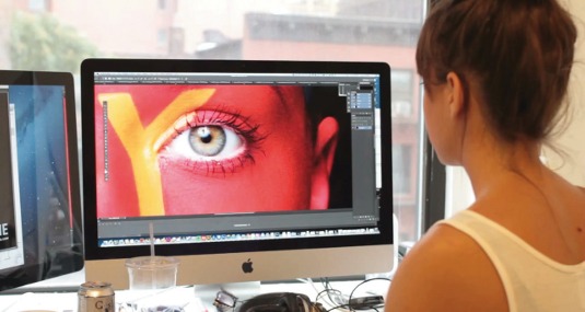
We developed the typography and patterns in Illustrator and mocked them up in Photoshop. There were certain sentences we really liked, but didn't sit well on the face. We were very concerned with legibility. Ultimately we went with 'Be free', 'Go go go' and 'Play hard'.
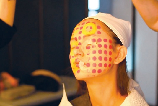
After that, I mocked the designs up nicely in Photoshop, so the client could get a pretty good idea of what the final result would look like. Aïzone immediately loved the concept and gave us a production budget. I shared the concepts with the extremely talented make-up artist and body painter Anastasia Durasova, who created stencil templates based on the typography we created, keeping in mind the distortion of the 3D shape of the models' faces.
Sign up to Creative Bloq's daily newsletter, which brings you the latest news and inspiration from the worlds of art, design and technology.
I engaged production company Group Theory to help produce the campaigns and in April we scouted locations for the photoshoot. At this point we also brought on board photographer Henry Hargreaves to discuss lighting, backdrops and strategies on schedules.
When casting for the models, it was important to find those who fitted the Aïzone image, but also, from the body painter's point of view, those with round and symmetrical face structures, so that the painting could be easily applied with an optimal end result.
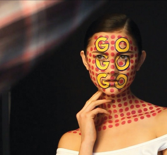
We had never done this before, so there were some worries about whether it would actually work. We did some tests with Anastasia before we arrived on shoot. Gregory Alan, who did the hair styling, tried out numerous styles, but in the end we decided it was best to keep the hair out of the way so the focus would be on the typography and the faces. On set, Henry used a Canon EOS 5d Mark III, shooting the campaign over a one-week period in early May.
We brought the images into Lightroom in order to sort through and flag them, and do initial light and shadow correction. Once the final images were chosen, the retouching was done in Photoshop. While we try to capture everything on camera, we still find it important to work with talented post production teams to clean up the images - on this campaign, Lutz + Schmidt. Retouching took about a month, going back and forth. Then the campaign went live in August 2013.
Conclusion
After you art direct these kind of productions long enough, you learn how to be flexible when dealing with a large team of models, photographers, lighting assistants, hair and make-up teams, retouchers and production coordinators. It was like piecing together a puzzle of talent, given our timing, budget and resources.
However, the concepts for this campaign were very concrete, and we had solid mock-ups of the ideas. The goal was to execute the campaign in a way that was true to the original vision. The final images looked very close to our Photoshop tests of the concept, so everyone was very happy about that.
Words: Jessica Walsh
This article originally appeared in Computer Arts issue 221.
Liked this? Read these!
- Create a perfect mood board with these pro tips
- The ultimate guide to logo design
- Discover what's next for Augmented Reality
Let us know what you think in the comments!

The Creative Bloq team is made up of a group of art and design enthusiasts, and has changed and evolved since Creative Bloq began back in 2012. The current website team consists of eight full-time members of staff: Editor Georgia Coggan, Deputy Editor Rosie Hilder, Ecommerce Editor Beren Neale, Senior News Editor Daniel Piper, Editor, Digital Art and 3D Ian Dean, Tech Reviews Editor Erlingur Einarsson, Ecommerce Writer Beth Nicholls and Staff Writer Natalie Fear, as well as a roster of freelancers from around the world. The ImagineFX magazine team also pitch in, ensuring that content from leading digital art publication ImagineFX is represented on Creative Bloq.
