New talent: Glasgow School of Art degree show
Matt Burns picks 10 highlights from the 2014 Glasgow School of Art graduate exhibition.
Sign up to Creative Bloq's daily newsletter, which brings you the latest news and inspiration from the worlds of art, design and technology.
You are now subscribed
Your newsletter sign-up was successful
Want to add more newsletters?
If you're looking for exciting new graduates for your studio or agency, don't miss Computer Arts' New Talent special, issue 230, featuring our handpicked selection of the UK's best graduates - on sale 24 July.
This year's Glasgow School of Art degree show showcased work by final year students from the School of Design and the Mackintosh School of Architecture. Sadly, students from the School of Fine Art were significantly impacted by a recent fire in the Mackintosh Building and had their work digitally presented in a specially curated exhibition.
I headed down to the degree show to check out this year's design talent. I had the tough task of reporting on my top 10 from this year's show... so here goes!
Article continues belowNicholas Davis
- Course: BA (Hons) Communication Design
- Website: www.nicholasdavis.eu
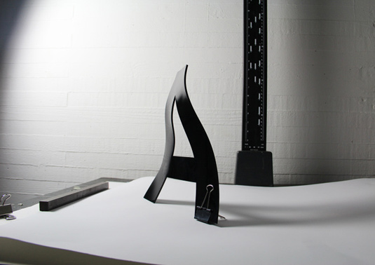
- Project: Life of a Letterform
In Life of a Letterform, Nicholas Davis challenges the perception of form – or 'good form' – by pushing letterforms into unfamiliar territory.
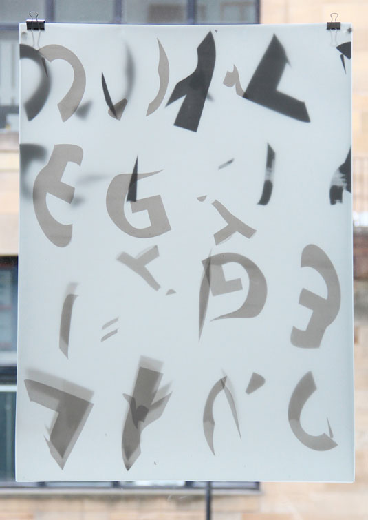
As he explains on his website: "I saw letterform as a versatile concept, one which can take many different treatments and withstand such strains and pressure with relative comfort, retaining its original and recognisable aesthetic."
Jesus Salazar
- Course: BA (Hons) Communication Design
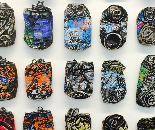
- Project: Road Kills
Sparked by an observation of Glasgow's urban landscape, Road Kills is a study of how the environment can transform the characteristics of mass-produced objects, changing them into something totally unique.
"I feel there is potential to gather further information that could be used to generate a map, a source of orginal information that could tell its own story of Glasgow and its inhabitants' behaviours," he says.
Sign up to Creative Bloq's daily newsletter, which brings you the latest news and inspiration from the worlds of art, design and technology.
Catherine Lafferty
- Course: BA (Hons) Communication Design
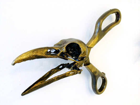
- Project: Darwin's Homology Theory
Comparing manmade tools with those from nature, Darwin's Homology Theory took over one of the exhibition walls and made for interesting viewing.
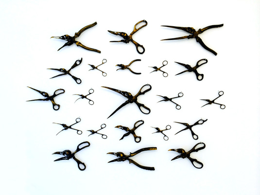
"I decided to play with the idea that birds in particular have magnificently distinctive beaks designed for different purposes, such as tearing meat, drilling holes or cracking seeds," says Catherine Lafferty.
"I wanted to compare these characteristics designs with the unique tools which humans themselves have created for similar purposes."
Alice Rooney
- Course: BA (Hons) Communication Design
- Website: www.alicerooney.com
- Project: Perfect Circle
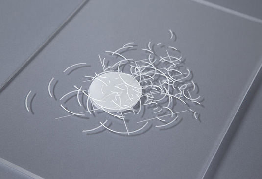
This is a piece that represents a system derived from the proof for pythagorean triplets.
Alice Rooney combined theory-based research with geometric and mathematical visuals to explore the idea of the 'perfect' circle. "I secretly knew there was no such thing as a perfect circle and this meant the process would be the outcome," she explains.
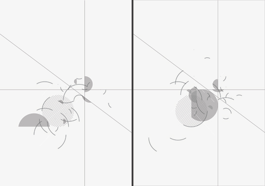
"The only place where 'perfect' describes something that actually exists is in maths. A perfect number is one that is the sum of its divisors – six divides by one, two and three, which add to give you six," she continues.
"I created a grid based on a proof for pythagorean triplets where the radii of four circles are one, two, three and six. Six systems were selected based on the grid and those systems were dispersed across six sheets of acetate."
Franc Gonzalez
- Course: BA (Hons) Communication Design
- Website: www.francgonzalez.com
- Project: Untreated Bodies
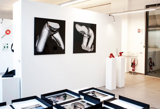
Untreated Bodies explores the digital process of 3D creation and the objectification of female bodies in the digital realm. "By 3D scanning a women’s body, its organic honesty teleports into the digital world," explains Franc Gonzalez explains.
"This visual transmutation makes the body to be digitally malleable, becoming an unprocessed geometrical entity. The digital body goes back again to the physical world when 3D printing it, eventually transforming it into an unrefined object that has changed its values, revealing its untreated qualities."
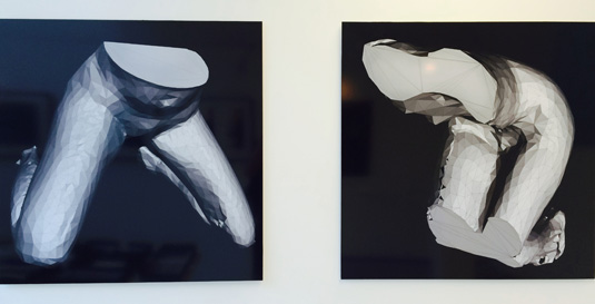
The project was Gonzalez's first attempt at 3D scanning. "The process of production was totally unknown for me," he says. "I especially liked the last part of the process – that moment of arising life, and sense, when 3D printing."
Olivia Diaz and Eve Somerville

- Course: BA (Hons) Communication Design
- Websites: www.oliviadiaz.co.uk and www.evesomerville.com
- Project: Raketto
Raketto is a racquet sport: the aim is to keep the ball off the ground, while negotiating frequent and complicated rule changes.
"We created the sport to subvert commercialised and competitive sporting culture," explains Olivia Diaz. "Designing and making the racquets was challenging. The final shape is based on the Univers ‘O’, but the material is quite heavy!"
Jake William Richardson
- Course: BA (Hons) Communication Design
- Website: jakewilliamrichardson.com
- Project: Salvage
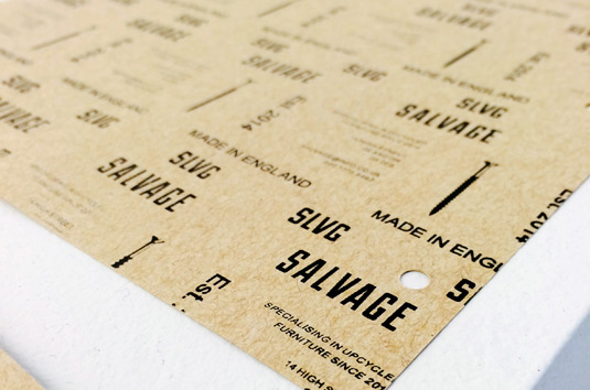
Briefed to create an identity for a fictional company specialising in up-cycled furniture, Jake William Richardson experimented with a range of non-paper-based media before taking inspiration from the inconsistent offset registration found on the back of sandpaper sheets.
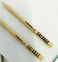
"The design orginated from patterns found on the back of sandpaper - often this information states the strength of the sand paper, among other details," Richardson recalls.
"I created a collection of patterns specific to their uses: a business card pattern, a letterhead pattern and a basic all rounder," he continues. "These were printed onto the paper stock or wood, and then cut up to create an inconsistent registration."
Zheng Li
- Course: BA (Hons) Communication Design
- Project: 3D Letters
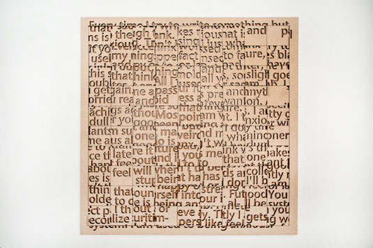
3D Letters is a series of typographic pieces showcasing various treatment methods – such as laser etching and embossing – that bring the letterforms to life.
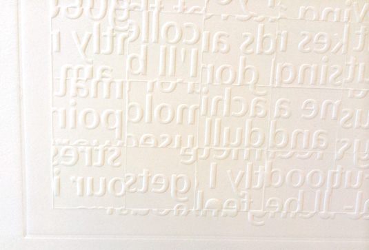
"I tried to separate the letters into shapes, and then put them into different layers. It shows a very good effect," explains Zheng Li.
"The biggest challenge for me in the project was how I could present myself in my work. I'm always looking for my own style to present my work and ideas."
Duane Harrison
- Course: BA (Hons) Product Design
- Website: www.duaneharrison.co.uk
- Project: iSwapsy
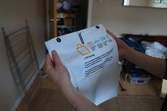
iSwapsy is an online marketplace enabling parents to swap their children's second-hand clothing. "The sharing economy is a way to solve economic and social environmental issues simultaneously," explains Duane Harrison. "We have the technology to change our patterns of consumption, but to what extent will we actually do so?"
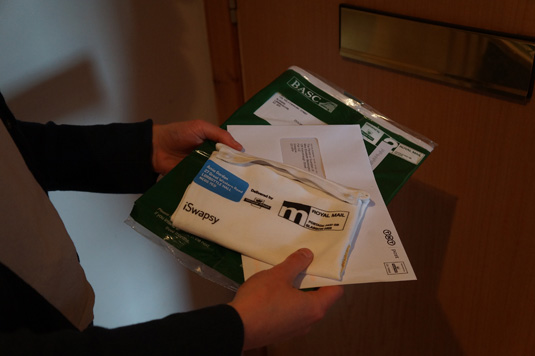
"My concept was a service that looked at parents sending the clothes their children have outgrown in reusable bags via the post. In return, they could use their 'swaps' online to receive like-new clothes."
He continues: "I like how the iSwapsy bags remain simple, yet describe the concept - linking the on and offline worlds. And as a designer I enjoyed researching how this would work with parents, and also discovered potential limits to the design - weight allowances, pre-paid postage options and designing around them."
Rosie Scott
- Course: BA (Hons) Communication Design
- Website: www.cargocollective.com/rmws
- Project: South Korean Love Postcards
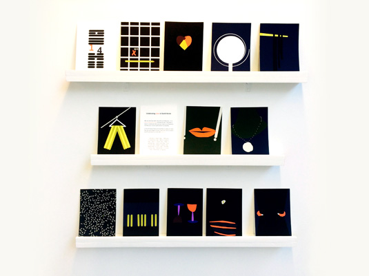
In South Korea, each month has one day set aside to exchange feelings and tokens of love - except April, where singletons wallow in their loneliness together. South Korean Love Postcards is a set of 12 postcards that celebrate love in South Korea.
Half-price CA subscription offer!
We know it isn't always easy being a recent graduate. So to help, we're offering an incredible 50% off an annual subscription to Computer Arts magazine - whether you're a new graduate or not.
For just £39 you'll receive an entire year of industry insight, opinion and inspiration, delivered directly to your door.
Plus: sign up by 10 July and you'll receive our New Talent issue, featuring our guide to 2014's most outstanding design graduates - and a very special cover designed in response to a joint brief with D&AD New Blood.
Words: Matt Burns
Matt Burns is an Aussie graphic designer who lives and works in Glasgow.

The Creative Bloq team is made up of a group of art and design enthusiasts, and has changed and evolved since Creative Bloq began back in 2012. The current website team consists of eight full-time members of staff: Editor Georgia Coggan, Deputy Editor Rosie Hilder, Ecommerce Editor Beren Neale, Senior News Editor Daniel Piper, Editor, Digital Art and 3D Ian Dean, Tech Reviews Editor Erlingur Einarsson, Ecommerce Writer Beth Nicholls and Staff Writer Natalie Fear, as well as a roster of freelancers from around the world. The ImagineFX magazine team also pitch in, ensuring that content from leading digital art publication ImagineFX is represented on Creative Bloq.
