HTC’s neon yellow Windows Phone 8 handset won’t appeal to everyone, that’s for sure (although it gets two thumbs up from us). But it will, HTC’s vice president of design Scott Croyle assures us, capture the imagination of a consumer public that’s absolutely “ready for this”.
There are, of course, other colours available for HTC’s iconic Windows Phone devices too – blue, black and, in the US only (for now), red – all equally bold, if not quite as dynamic. Factor in a sleek curved Gorilla Glass display and some impressive tech specs, and, all in all, the 4.3-inch 8X and 4-inch 8S are pretty slick pieces of kit that will provide an additional shot of colour in the marketplace when they become available in November.
So what’s with HTC’s huge explosion into the design space? According to Croyle, it’s nothing new. We sat down with him in New York after the launch to talk passion, pretty pictures and phenomenal design…

Question: What’s your role at HTC?
Scott Croyle: I was at this design consultancy called One & Co. We started working with HTC around five years ago on a product called Diamond. It was one of the first phones that took HTC as a lifestyle brand and said, ‘Hey, Windows could be more than just a techy tool – it could be something that’s geared towards mass consumers.’ It’s a very stylish phone. But also it drove us into a much smaller form factor and it changed the conversation and the culture inside HTC around design.
After the design of Diamond, HTC bought One & Co and we became the in-house design team. We brought this unique flavour of design – we’d designed snowboard boots, consumer electronics like the Amazon Kindle and Microsoft Mouse – all these iconic products. And we brought a very different approach to design than HTC had otherwise been doing. Now I lead both the design and user experience team at HTC.
Q: Where did you start with the design of the Windows Phone 8X and 8S?
SC: If I could show you the original sketches, it started with: ‘Oh you know what? How can we represent Windows Phone 8 in a very, very different way?’ So we started thinking about the tile. And of course the tile is a really crisp shape; very simple. But you can imagine that if you held that in your hand it’s not so great, so how do you come up with the perfect balance between that perfectly sharp tile and something you really want to hold?
We started with that idea, and it drove the conversation with the engineering team, because if you want to have a tile, what do you want it to be? You want it to feel really thin at the edges. When you see it animated on the Windows Phone experience you get a glimpse that it’s got zero thickness. We wanted to impart that element, so we started talking with the engineers about rearchitecturing the phone in a way that would let us achieve this super-thin edge.

Q: Did you hit any major challenges in translating your designs from paper to product?
SC: It had its own unique set of challenges – there’s never been a phone that’s been architected like this before. It’s having the designers go in and have a knowledgeable conversation with the design – that’s how you really achieve something great.
We expect our designers to not just draw pretty pictures, but really understand the fundamental architecture to drive it. It has lots of custom componentry in it, and a totally innovative layout that you’ve never seen in a mobile phone. It creates something that looks and feels very, very different in the marketplace.
Q: So the design was developed first, and then the components were built to fit that design?
SC: The best way to think of it is: it’s like a concept car. If I closed my eyes and imagined what I wanted the perfect embodiment of the tile to be, that’s what you start with. And then that manifests into a mock-up, and that becomes the starting point with the engineering team. We asked: what componentry do we have? And [then] what componentry can we create?
At the end of the day though, people don’t care about what’s going on under the table – what they care about is does that phone fit my personality? Is it something that feels great; that feels premium? Is it something that when I go out with my friends I’m excited to bring out? We always keep that in mind. We try and get out of the industry speak and think about what the consumers really want.
Q: What were you inspirations for the colour palette?
SC: Colour trends are set up by a couple of key industries, but one of the areas that you see them develop in very early on is fashion design. The other is furniture and then, thirdly, you look at graphic design. These three pillars – you’re watching them, looking at them and tracking them.
What’s tricky about product design is, you can imagine that with fashion that was just happening a week ago, say, those colours won’t be relevant to mass-market consumers for a while. They start at the high-end and trickle down for a while before they hit the mainstream.
Q: So what key considerations did you have to make?
SC: Last year we started looking at colours that would be relevant for this year. We wanted them to not only work together as a family, but singularly, as each individual phone. We also thought about what kind of choices people make when they buy a phone. Not everybody wants the neon yellow phone. But some of the more dynamic colours might draw people in, even if, at the end of the day, they walk away with the black one.

For the neon we started thinking about people. You can imagine in a typical corporate thing, people start segmenting. We think about that because it’s important for the business, but [also] we want colours that resonate with each of us personally. We’re all consumers, so we really try to keep ourselves in that mindset.
Q: Many consumers will be locked into anything up to a two-year contract – that’s a long time for such bold colours. Did you ever consider interchangeable cases?
SC: We’ve talked about in the past, but the net result is that the product grows and it feels cheaper. Once you have a number of moving parts you just can’t make it feel as solid. Our first and foremost goal was to create something that really embodied the premium experience, but also had a lot of character.
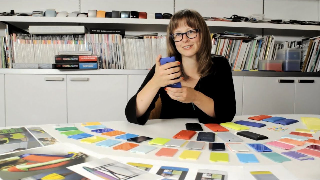
One thing I should mention is that the colour isn’t paint – it’s actually the native plastic, which means that over time it isn’t going to scratch off or degrade. That made challenges for the design team. The way plastics work is you have to go to the factory and pick a colour, so you’re flying around the world and trying to get it done in the timeframe – first you have to match the colour, then you get some made, you have to go shoot the colour and the parts… It’s actually quite difficult. But it’s fun.
Q: The launch video shows the design team sifting through boxes and boxes of colour – was that as fun as it looked?
SC: It is fun! It’s actually really painful too. It can be really overwhelming and there are a lot of different players involved between the plastic manufacturer, the engineering team, the design team – that’s painful. But we go into colour reviews and I’m always looking forward to it because it really gets me excited. Everyone’s got an opinion.