Industry insight: British design classics
2012 marks Queen Elizabeth II's 60-year reign. To celebrate the Jubilee, we asked a load of lovely designers to name their British design classic...
The year long celebration is marked, in particular, on Tuesday 5th June, to coincide with the Queen's birthday, meaning all us lucky Brits get an extra day off work to join in with the festivities!
But it's not all about throwing a big party. The Diamond Jubilee has also provided huge opportunities for the design world, giving artists the opportunity to create everything from logos, crowns, medals and fashion designs for the special occasion.
London Underground Map
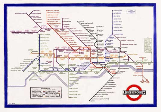
Paul Boag says

"There are so many British design classics to choose from that the choice is almost impossible. From the classic red telephone box to the original mini or our amazing road signage that has been copied world over, we have an incredible pedigree when it comes to design.
Article continues below"However, if I had to just pick one I would go for the iconic London underground map. This superb early example of infographics has stood the test of time and still allows anybody to easily navigate a complex and abstract system."
Paul is the founder of UK web design agency Headscape
Andy Thomas says

"Edward Johnston's typeface and graphic system for the London Underground and the iconic map designed by Harry Beck. No transport system in the world has anything so immediately recongnisable and iconic, despite its flaws."
Andy Thomas is creative director at the London office of global digital agency HUGE
Sign up to Creative Bloq's daily newsletter, which brings you the latest news and inspiration from the worlds of art, design and technology.
Claudio Guglieri says

"England is the origin of many famous and emblematic designs. My favorite among all of them is the Underground Map created by Harry Beck in 1931. It's the first simplified design of a railway system map and it has been lately copied in underground maps all around the world.
"The map was based on the belief that subway passengers are more interested in how to get from one station to another rather than the geographical location of those stations.
"All the versions before this map tried to match together the Underground system with the real locations of the stations getting to a point where it was hard to show the map on a real scale as some stations were too close to each other and some others were too far.
"Why do I like it? The rationale behind this map is so strong that it just feels right. It's one of those concepts that is so clear that you don't need to explain it. It serves the right purpose and it does it just right."
Claudio is a senior designer at global digital agency Fantasy Interactive
The Mini
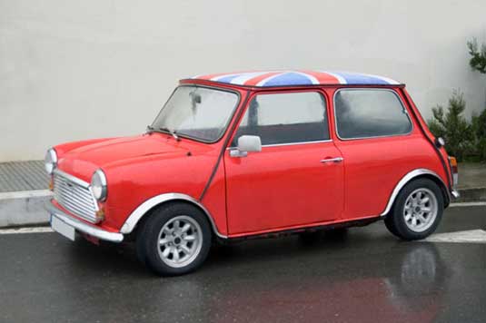
Simon Jobling says

"For me, the original Mini is a classic British design.
"The under-stated appearance with oozes of character perfectly encapsulate everything that is British. It doesn't carry any particular status around it - the product is accessible to all demographics - but, equally, it still holds that authority as a pillar of society - especially in it's traditional red body with the Union Jack roof on this Diamond Jubilee weekend."
Simon Jobling is a web designer and developer based in the UK.
The Rolling Bridge
Brendan Dawes says

"I love this because it's beautiful on so many levels. As a bridge it works very well, but, it also exists as a thing of beauty when it's rolled up and not in use and also as it transitions from rolled up form to utilitarian bridge. It shows the beauty and importance of the things in-between and it makes me and anyone else who sees it smile."
Brendan Dawes is a UK based, MoMA exhibited artist, designer, author and maker.
The Clifton Suspension Bridge
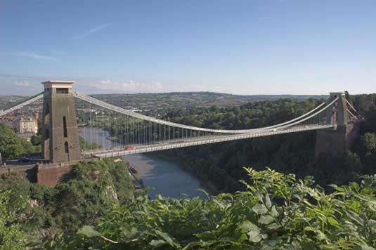
James Hilton says

"The Japanese have a saying, 'make it big enough and anything is cool.' Isambard Kingdom Brunel couldn't have agreed more.
Mastermind of the Great Western Railway and the Great Britain, he was also the man behind one of my favourite pieces of British design; the Clifton Suspension Bridge. Spanning the Avon Gorge to marry Bristol and Somerset, the bridge features roller mounted saddles on each tower allowing the three independent wrought iron chains enough minuscule movement to absorb the force of passing loads. (Physics gives me the horn #justsayin).
Sadly, Brunel died before his bridge was completed. Even more disappointing, the bridge was never adorned with the two ornamental sphinxes he originally wanted. Pity, as it's a universal truth that Sphinxes are cool. And they'd be massive. Massive Sphinxes. Dirty.
James Hilton is co-founder and chief creative officer of creative agency AKQA
The 2001 iPod

Mark Verhaagen says

"Jonathan Ive's iPod design for Apple, because of its simplicity and emotional appeal.
"It's also one of the products that helped Apple in becoming the mainstream brand it is today."
Mark Verhaagen is a freelance illustrator and animator.
Wipeout Graphic Design
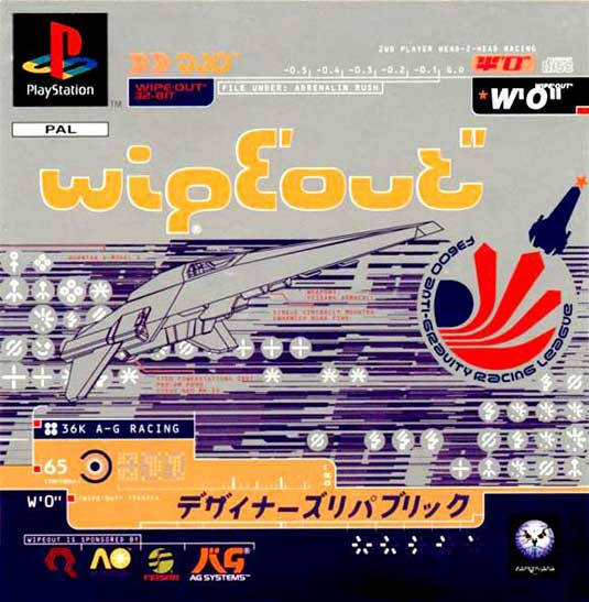
Gavin Strange says

"I think my favourite piece of British design would actually have to be the graphic design featured in the Playstation game Wipeout, which was all created by The Designers Republic.
"It was the first time I'd seen truly amazing graphic design within a video game and it just added to the whole feel of the game. Amazing to see a british studio create a futuristic japanese-inspired look for a racing simulator, it came at a time where vector graphics were very much in-vogue and makes me think back fondly to the 90's and being obsessed with doing nothing but playing Playstation!"
Gavin is a senior designer for the digital department of Aardman Animations by day and by night goes under the alias of JamFactory
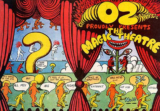
Oz Magazine
Jonathan Kenyon says

"My British design classic comes from Australia, by way of psychedelic '60s San Francisco, and eventually landing in London. Even the Queen has to admit that the definition of 'British' has evolved massively over the last three hundred years she's been on the throne. It's now a porous designation taking influence from many different countries and cultures, especially within the Commonwealth. Thus, Martin Sharp's work absolutely fits the bill.
"He was behind some of the most iconic cover designs for the London edition of Oz magazine (as well as being one of the first editors of the original Australian version). His work is characterized by a use of lavish printing techniques, the collage-fusion of content with flagrant disregard for copyright, and an infectious sense of wicked joy. There's so much stunning, seminal work to choose from, but if I was to pick a cover then it has be the Magic Theatre edition of November 1968.
"Of course, it's also a very British thing that at first the magazine caused great scandal in the country before later being revered as a seminal publication. The Brits love a bit of outrage!"
Jonathan Kenyon is creative director and co-founder of award-winning design studio Vault 49
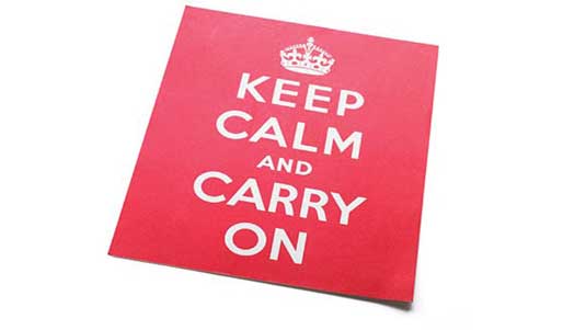
Keep Calm and Carry On
Shane Mielke says

"If I had to pick one iconic British Design I would pick the 'Keep Calm and Carry On' poster from World War II.
"The iconic royal crown, strong typography and red colour are powerful visual elements that immediately inspire visions of British culture.
"In addition the message of the poster itself inspires a mental picture of the fabled dry British personality where people would bravely yet calmly be brewing tea as bombs fell outside.
"A few other iconic British designs that came to mind were the Mini, London buses, James Bond gadgets and the decorative hats and derby hats worn by men and women."
Shane Mielke is creative director at digital agency 2Advanced.
So that's what our deisgners think. Do you agree? What's your British design classic? Let us know in the comments box below...

The Creative Bloq team is made up of a group of art and design enthusiasts, and has changed and evolved since Creative Bloq began back in 2012. The current website team consists of eight full-time members of staff: Editor Georgia Coggan, Deputy Editor Rosie Hilder, Ecommerce Editor Beren Neale, Senior News Editor Daniel Piper, Editor, Digital Art and 3D Ian Dean, Tech Reviews Editor Erlingur Einarsson, Ecommerce Writer Beth Nicholls and Staff Writer Natalie Fear, as well as a roster of freelancers from around the world. The ImagineFX magazine team also pitch in, ensuring that content from leading digital art publication ImagineFX is represented on Creative Bloq.
