Styling the user interface of a Sencha Touch application
In this exclusive excerpt from their book on the Sencha Touch mobile JavaScript framework, John Clark and Bryan Johnson explain how to customise your app and use the Sencha theme engine with SASS and Compass.
- Knowledge needed: Basic JavaScript, HTML and CSS
- Requires: Sencha Touch 1.1 and Safari Web Browser
- Project Time: 2-3 hours
This is an edited excerpt from Chapter 3 of Sencha Touch Mobile JavaScript Framework by John Clark and Bryan Johnson.
We are going to take a look at some of the different visual elements you can use to customise your application. In this article, we will:
- Take a closer look at toolbars and buttons, using layout, additional style, and icons, to boost the visual appeal of the user interface.
- Expand on our previous work with icons, including making your own custom icons and using base64 to include icons in a stylesheet, without an actual image file.
- Talk about the considerations and shortcuts for working with different devices and screen sizes.
- Explore the incredibly powerful Sencha theme engine using SASS and Compass to create complex visual skins using simple CSS style commands.
Styling components versus themes
Before we get into the details, it's important to have a good understanding of the difference between styling an individual component and creating a theme.
Article continues belowAlmost every display component in Sencha Touch has an option to set its own style. For example, a panel component can use a style in this way:
{
xtype: 'panel',
style: 'border: none; font: 12px Arial black',
html: 'Hello World'
}
We can also set a style class for a component and use an external CSS file to define the class, as follows:
{
xtype: 'panel',
cls: 'myStyle',
html: 'Hello World'
}
Sign up to Creative Bloq's daily newsletter, which brings you the latest news and inspiration from the worlds of art, design and technology.
These are very useful options for controlling the display of individual components. There are also certain style elements, such as border, padding, and margin, that can be set directly in the components' configuration:
{
xtype: 'panel',
bodyMargin: '10 5 5 5',
bodyBorder: '1px solid black',
bodyPadding: 5,
html: 'Hello World'
}
These configurations can accept either a number to be applied to all sides or a CSS string value, such as, 1pxsolidblack or 10555. The number should be entered without quotes, but the CSS string values need to be within quotes.
These kinds of small changes can be helpful in styling your application, but what if you need to do something a bit bigger? What if you want to change the colour or appearance of the entire application? What if you want to create your own default style for your buttons?
This is where themes and UI styles come into play. We will start by taking a look at the UI styles and then see how we can expand this concept to create an overall theme for our applications.
UI styling for toolbars and buttons
Let's take another look at the simple application we created in the previous chapter and use it to start our exploration of styles with toolbars and buttons.
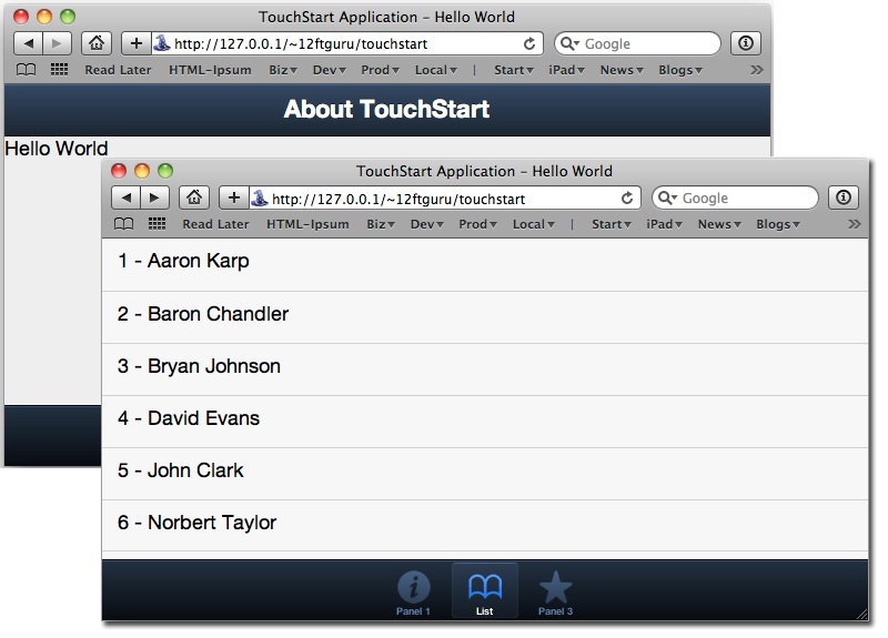
To begin our exploration of styling, we are going to add a second upper toolbar to our application. Locate the dockedItems section of our code from the previous example:
dockedItems: [
{
dock: 'top',
xtype: 'toolbar',
title: 'About TouchStart'
}
]
After the trailing curly brace for our first toolbar, let's add a second toolbar as follows:
{
dock: 'top',
xtype: 'toolbar',
title: 'About TouchStart'
}, {
dock: 'top',
xtype: 'toolbar',
items: [
{text: 'My Button'}
]
}
Don't forget to add a comma between the two toolbars.
01. Extra or missing commas
When working in Sencha Touch, one of the most common causes of parse errors is an extra or missing comma. When you are moving code around, always make sure you have accounted for any stray or missing commas. Fortunately for us, the Safari Error Console will usually give us a pretty good idea which line number to look at for these types of parse errors.
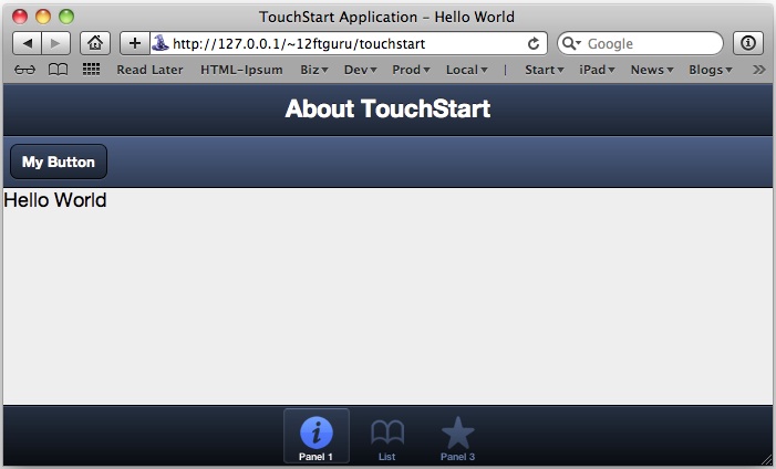
When you take a look at the new toolbar, you will see that, as it has no title, it is a bit shorter than the one above it. The title makes the top bar appear a bit bigger than the other toolbar. You can control the height of the toolbar by adding a height configuration to the toolbar, as follows:
{
dock: 'top',
xtype: 'toolbar',
height: 25,
items: [
{text: 'My Button'}
]
}
The height configuration takes a number (without quotes) to determine the height of the toolbar. You can adjust this number to fit your preference.
The two toolbars, together, also appear a bit dark, so we are going to change the appearance of the bottom bar using the ui configuration option:
{
dock: 'top',
xtype: 'toolbar',
ui: 'light',
items: [
{text: 'My Button'}
]
}
There are two initial values for a toolbar UI: dark and light. dark is the default value (used by the upper toolbar). When you save and reload the page in Safari, you should see some contrast between the upper and lower toolbars.
02. Styling buttons
Buttons also have a ui configuration setting, but they have different options:
- normal: The default button.
- back: A button with the left side narrowed to a point.
- round: A more drastically rounded button.
- small: A smaller button.
- action: A brighter version of the default button.
- forward: A button with the right side narrowed to a point.
Buttons also have some color options built into the ui option. These colour options are confirm and decline. These options are combined with the previous shape options using a hyphen. For example, confirm-small or decline-round.
Let's add some new buttons and see how this looks. Locate the items list with our button, in the second toolbar:
items: [
{text: 'My Button'}
]
Replace that old items list with the following new items list:
items: [
{
text: 'Back',
ui: 'back'
}, {
text: 'Round',
ui: 'round'
}, {
text: 'Small',
ui: 'small'
}, {
text: 'Normal',
ui: 'normal'
}, {
text: 'Action',
ui: 'action'
}, {
text: 'Forward',
ui: 'forward'
}
]
As buttons can actually be used anywhere, let's also add some to the panel container, so we can see what the ui options, confirm and decline, look like. Locate the following line in our first panel:
html: '<div id="hello">Hello World</div>',
Below that line, add the following:
items: [
{
xtype: 'button',
text: 'Confirm',
ui: 'confirm',
width: 100
}, {
xtype: 'button',
text: 'Decline',
ui: 'decline',
width: 100
}
],
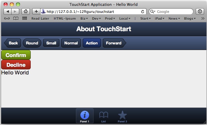
There are two things you might notice in our panel buttons that differ from our toolbar buttons. The first is that we declare xtype:'button' in our panel, but we don't in our toolbar. This is because the toolbar assumes it will contain buttons, and xtype only has to be declared if you use something other than a button. The panel does not set default xtype attribute, so every item in the panel must declare one.
The second difference is that we declare width for the buttons. If we don't declare width when we use a button in a panel, it will expand to the full width of the panel. On the toolbar, the button auto-sizes itself to fit the text.
These simple styling options can help make your application easier to navigate and provide the user with visual clues for important or potentially destructive actions.
03. The tab bar
Like the toolbar, the tab bar at the bottom also understands the ui configuration option for both light and dark. However, the tab bar also changes the icon appearance, based on the ui option; a light toolbar will have dark icons and a dark toolbar will have light icons.
These icons are actually black-and-white images that are used to create a mask over the colour of the tab bar. Later in the article, we will show you how to create your own icon masks and integrate them into your application.
While we are on the subject of icons, we should also take a look at the basic icons you will want to include with your application.
Sencha Touch themes
Themes in Sencha Touch are a powerful way to quickly change the overall look and feel of your application. We will cover the installation process a bit later in this chapter, but we do need to lay a bit of groundwork before we can get started. There is a lot of conceptual information to cover, but the flexibility you gain will be well worth the effort.
The first thing we need to cover is a basic overview of the tools used by Sencha Touch that make theming your application possible: SASS and Compass.
04. SASS + Compass = themes
Sencha Touch themes take SASS and Compass one step further, by providing variables and mixins whose functionality is specific to Sencha Touch. The JavaScript portion of Sencha Touch generates lots of very complex HTML, in order to display the various components, such as toolbars and panels. Rather than having to learn all of the intricate classes and HTML tricks used by Sencha Touch, you can simply use the appropriate mixins to change the appearance of your application.
Setting up SASS and Compass
If you decide that you would like to create your own Sencha Touch theme, you will have to install both SASS and Compass, which are separate libraries from Sencha Touch.
Installing SASS and Compass requires us to do a bit of work on the command line. Since both SASS and Compass are available as RubyGems, Windows users will first need to install Ruby.
05. Installing Ruby
Mac users get a break, since Ruby is already installed on OSX by default. Windows users should download the Ruby installer from rubyinstaller.org. (We recommend version 1.9.2.)
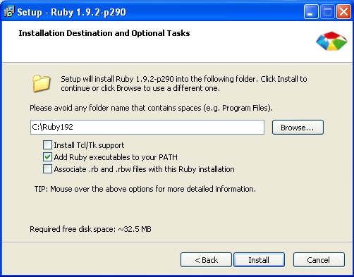
Run the installer and follow the onscreen instructions to install Ruby. Be sure to check the box that says Add Ruby executables to your PATH. This will save you a lot of typing on the command line, later on.
Once the installation is complete, open up the command line in Windows by going to Start | Run, typing cmd, and pressing Enter. This should bring up the command line.
Now, try typing ruby -v. You should see something such as the following:
C:\Ruby192>ruby -v
ruby 1.9.2p180 (2011-02-18) [i386-mingw32]
This means that Ruby is correctly installed.
06. Installing SASS and Compass
The instructions for installing SASS and Compass vary slightly for Mac and Windows users.
Mac users will need to open the Terminal application and type the following:
sudo gem install haml
sudo gem install compass
You will need to authenticate with your username and password to complete the install.
Windows users need to open the command line and type the following:
gem install haml
gem install compass
Once the installation is complete, we are ready to set up our folders and begin using SASS and Compass.
If you're not comfortable with this command line stuff, there are two applications that bundle up Ruby, SASS, and Compass for you, and run on both Windows and OSX:
Creating a custom theme
The next thing we need to do is create our own theme SCSS file. Locate the sencha-touch.scss file in TouchStart/lib/resources/sass, and make a copy of the file. Rename the new copy of the file to myTheme.scss.
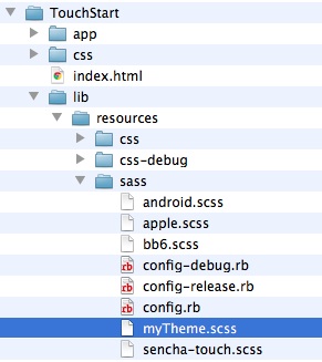
Now, we need to tell the index to look for our new theme. Using our previous example files, open your index.html file, and locate the line that says the following:
="stylesheet" href="lib/resources/css/sencha-touch.css" type="text/css">
Change the sencha-touch.css stylesheet reference in our index.html file to point to myTheme.css:
<link rel<link rel="stylesheet" href="lib/resources/css/myTheme.css" type="text/css">
07. SCSS and CSS
Notice that we are currently including a stylesheet from the css folder, called sencha-touch.css, and we have a matching file in the scss folder, called sencha-touch.scss. When the SCSS files are compiled, it creates a new file in your css folder. This new file will have a suffix of .css instead of .scss.
.scss is the file extension for SASS files. SCSS is short for Sassy CSS.
Now that we have our paths set up, let's take a look at the theme file copy we made. Open your myTheme.scss file. You should see the following:
@import 'sencha-touch/default/all';
@includesencha-panel;
@includesencha-buttons;
@includesencha-sheet;
@includesencha-picker;
@includesencha-tabs;
@includesencha-toolbar;
@includesencha-toolbar-forms;
@includesencha-carousel;
@includesencha-indexbar;
@includesencha-list;
@includesencha-list-paging;
@includesencha-list-pullrefresh;
@includesencha-layout;
@includesencha-form;
@includesencha-msgbox;
@includesencha-loading-spinner;
This code grabs all of the default Sencha Touch theme files and compiles them into a new CSS file located in the css folder. If you open up the sencha-touch.css file in the lib/resources/css folder, you will see the compressed CSS file we were previously using. This file is pretty huge, but it's all created from the basic commands.
The best part is that we can now change the entire color scheme of the application with a single line of code.
08. Base color
One of the key variables in the Sencha Touch theme is $base_color. This colour and its variations are used throughout the entire theme. To see what we mean, let's change the colour of our theme to a nice forest green by adding the following to the top of your myTheme.scss file (above all the other text):
$base_color: #546346;
Next, we need to re-compile the SASS file to create our stylesheet. From the command line, you need to change into the sass folder where your myTheme.scss file lives. Once you are in the folder, type the following into the command line and hit Enter:
compass compile
This will update our myTheme.css file with the new $base_color value. Reload the
page in Safari, and you should see a new forest green look to your application.
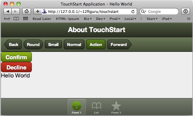
Notice that this one line of code has created variations for both our dark and light toolbars. Changing the base color has also changed the icons for our tab bar at the bottom.
This is all pretty cool, but what if we want to tweak individual parts of the theme? Sencha Touch themes provides exactly what we need, using mixins and the ui configuration option.
09. Compass compile versus compass watch
Compass uses the compile command to create the new stylesheet, based on your SCSS file. However, you can also set Compass up to watch a particular file for changes and automatically compile when anything new is added. This command is entered on the command line as the following:
compass watch filename
This command will remain active as long as your terminal is open. Once you close the terminal window, you will need to run the command again, in order to make Compass watch for changes.
10. Mixins and the UI configuration
As we have noted previously, the Sencha theme system is a set of predefined mixins and variables that get compiled to create a CSS stylesheet. Each component has its own mixins and variables for controlling styles. This means you can override these variables or use the mixins to customise your own theme.
You can also use mixins to create additional options for the ui configuration option (beyond the simple light and dark values that we have seen previously). For example, we can modify the colour of our toolbar by adding a new mixin to our myTheme.sass file.
In your myTheme.sass file, locate the line that says the following:
@import 'sencha-touch/default/all';
After that line, add the following:
@includesencha-toolbar-ui('subnav', #625546, 'matte');
This code tells SASS to create a new ui option for the toolbar. Our new option will be called subnav, and it will have a base color of #625546. The last option sets the style for the gradient. The available styles are:
- flat: No gradient.
- matte: A subtle gradient.
- bevel: A medium gradient.
- glossy: A glassy style gradient.
- recessed: A reversed gradient.
Once you have saved the file, you will need to recompile the stylesheet, using the compass compile command on the command line.
We also need to change the ui configuration option in our JavaScript file. Locate your touchStart.js file in the app folder and open it up. Find the second toolbar in our application, just above where we add the buttons. It should look like the following:
dock: 'top',
xtype: 'toolbar',
ui: 'light'
You will need to change ui:'light' to ui:'subnav' and save the file. You can then reload the page to see your changes.

11. Adding new icon masks
You can also use the mixins to add custom icon masks to your tab bar at the bottom, using the pictos-iconmaskmixin component. There are two caveats to keep in mind when using this function.
The first is that these icons are used as a mask for the button. This means that the icon is a transparent PNG file that only uses the colour black. This icon is then used to screen a particular color by allowing it to show through any of the black areas. For example, the actual PNG file for our info mask is on the far left in the following screenshot. Depending on the ui configuration for the tab, it can appear in a number of different colours, also shown as follows:

The original PNG file is also larger than our theme items, which allows the file to be scaled to fit a number of different sizes.
The second consideration for using the pictos-iconmaskmixin component is that it expects the icon file to be in a specific folder: /lib/resources/themes/images/default/pictos. If you open this folder, you will see that there are already a number of extra icons in the folder.
For example, we have an icon called "bolt", but if we try to use it as part of our touchStart.js file, we end up with a blank square instead of the icon. We need to use our mixin to actually add it to our SCSS and CSS files.
In your myTheme.sass file, locate the line that says:
@import 'sencha-touch/default/all';
After that line, add the following:
@includepictos-iconmask('bolt');
In this case, we are telling the mixin to include an icon mask for the bolt.png icon file. The argument for the mixin is always the name of the file without the .png extension. This is also the name we will use to add the icon to our JavaScript file.
In the touchStart.js file, locate the line that says:
iconCls: 'info',
Replace the line with the following:
iconCls: 'bolt',
Save your changes and reload the page to see your new icon. Don't forget to recompile the SASS file using compass compile on the command line.
You can also add your own custom mask files to this folder and call them, using the same pictos-iconmaskmixin function in your SASS file, and adding the corresponding iconCls configuration option to your js file. Just make sure they are transparent PNG files with black icons, and that you put them in the correct folder, that is, /lib/resources/themes/images/default/pictos.
12. Variables
Variables are also available for every component, and they are used to control specific colour, size, and appearance options. Unlike mixins, the variables target a single setting for a component. For example, the button component includes variables for the following:
- $button-gradient: The default gradient for all buttons.
- $button-height: The default height for all buttons.
- $button-radius: The default border radius for all buttons .
- $button-stroke-weight: The default border thickness for all buttons.
There are also variables for disabling all of the special CSS effects on all buttons (gradients, text shadows, and drop shadows) as well as setting the default size for toolbar icons.
For example, if we add $button-height: 2em; to our myTheme.scss file, then we can recompile and see that buttons in our toolbar are now larger than they were before.
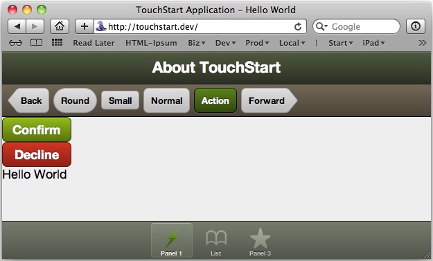
You will also notice that our Confirm and Decline buttons did not change size. This is because their UI configurations (confirm and decline) have already been defined separately and include a specific height. If you wanted to change the size of these two buttons, you would need to remove the UI configuration for both buttons.
More SASS resources
Using the mixins and variables included in the Sencha Touch theme, you can change almost any aspect of your interface to look exactly how you want. There are a number of online resources that will help you dig deeper into all of the possibilities with SASS and Compass.
13. Additional resources
- A full list of the Sencha Touch theme mixins and variables is available at dev.sencha.com/deploy/touch/docs/theme/
- Learn more about SASS at sass-lang.com
- The Compass home page has examples of sites using Compass, tutorials, help, and more, at compass-style.org
Designing for multiple devices
When creating stylesheets for your application, it's also important to consider the appearance of your application on multiple devices. Each device will have its own screen size, which limits the available area of your application.
What we really need is a way to determine the type of device we are on. We can accomplish this by using the Sencha Touch is function. The is function simply returns true or false for the following arguments:
- Android
- Blackberry
- Desktop
- Linux
- Mac
- Phone
- Tablet
- Windows
- iOS
- iPad
- iPhone
- iPod
You can also use standalone to detect if the application has been saved to the home screen. For example, if you want check screen sizes, you can use something such as the following:
if(Ext.is.Tablet || Ext.is.Desktop) {
// use full size elements here
} else {
// use phone size elements here
}
Basically, this code checks if the application is running on either a tablet or desktop. If it is, we can then add code to create our full-sized interface. If is not running on either of these two device types, we can create a smaller interface for phones, iPods, and other smaller devices.
You can use these tests to resize your various components and change styles, based on the device the application is running on. Here's an example:
if(Ext.is.Tablet || Ext.is.Desktop) {
varfontSize = '12px';
vardefaultUI = 'normal';
varbuttonWidth = 100;
} else {
varfontSize = '16px';
vardefaultUI = 'large';
varbuttonWidth = 200;
}
newExt.Application({
name: 'TouchStart',
launch: function() {
var about = new Ext.Panel({
fullscreen: true,
title: 'Touch Start',
html: 'Changing type sizes based on the device',
style: 'font-size: '+fontSize+';',
items: [{
xtype: 'button', t
ext: 'My button',
ui: defaultUI,
width: buttonWidth
}]
});
this.viewport = about;
}
});
This example code first checks to see if we are running on a tablet or a desktop machine. If we are running on one of those two environments, we make our font-size, defaultUI, and buttonWidth configuration options a default size.
If we are running on any other type of device (something with a small screen), we make the font size and component sizes a bit larger to aid with visibility and interaction.
Our application code then sets up a single panel with a button, both of which use the size values we defined in the previous example.
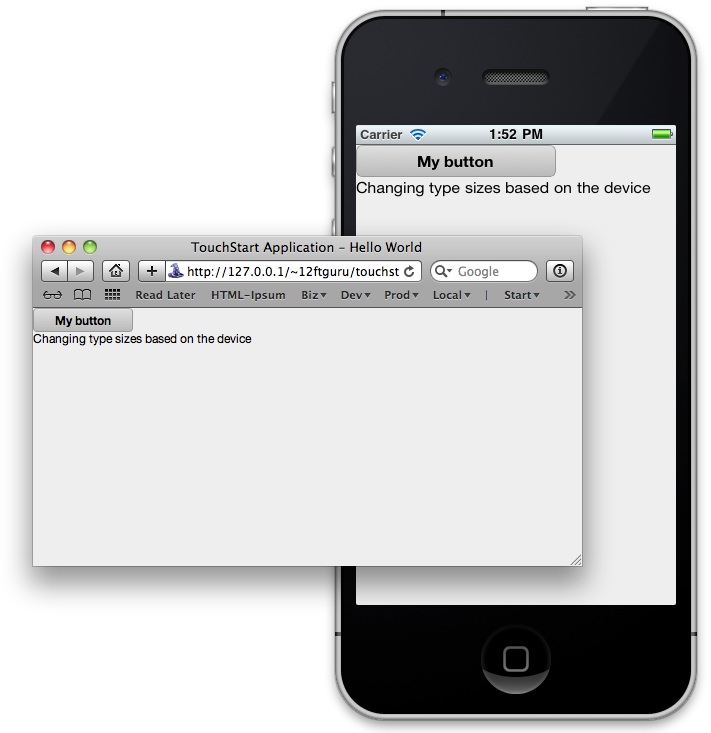
These types of conditional style tweaks will help keep your application readable and usable across multiple devices.
Images on multiple devices with Sencha.io Src
If your application uses images, you probably need something a bit more robust than conditional styles, such as those used in the previous section. Creating individual image sets for each device would be a nightmare. Fortunately, the folks at Sencha have an answer to this problem: a web-based service called Sencha.io Src.
Sencha.io Src is a separate service from Sencha Touch and can be used in any web-based application. The service works by taking an original image and resizing it on the fly, to fit the current device and screen size. These images are also cached by the service and optimised for quick, repeatable delivery. To use the Sencha.io Src service, the only thing you need to change is the URL for your image.
For example, a basic HTML image tag looks like this:
<img src="http://www.mydomain.com/images/my-big-image.jpg">
The same image tag, using the Sencha.io Src service, would look like this:
<img src="http://src.sencha.io/http://www.mydomain.com/images/my-big- image.jpg">
This passes the actual URL of your image to the system for processing.
14. Image URLs in Sencha.io Src
As you can see in the example, we are using a full image URL (with http://www.mydomain.com/), instead of a shorter relative URL (such as /images/my-big-image.jpg). Since the Sencha.io Src service needs to be able to get directly to the file from the main Sencha.io server, a relative URL will not work. The image file needs to be on a publicly available web server in order to work correctly.
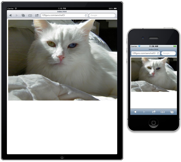
By using the service, our large image will be scaled to fit the full width of our device's screen, no matter what size device we use. Sencha.io Src also keeps the image proportions correct, without any squishing or stretching.
15. Specifying sizes with Sencha.io Src
We don't always use fullscreen images in our applications. We often use them for things such as icons and accents, within the application. Sencha.io Src also lets us specify a particular height and/or width for an image:
<img src="http://src.sencha.io/320/200/http://www.mydomain.com/images/ my-big-image.jpg">
In this case, we have set the width of our image to be resized to 320 pixels, and the height to 200 pixels. We can also constrain just the width, and the height will automatically be set to the correct proportion:
<img src="http://src.sencha.io/320/http://www.mydomain.com/images/my- big-image.jpg">
It is important to note that Sencha.io Src will only shrink images. It will not enlarge them. If you enter a value larger than the dimensions of the actual image, it will simply display at the full image size.
You full-size image should always be the largest size you will need for display.
16. Sizing by formula
We can also use formulas to make changes based on the screen size of the device. For example, we can use the following code to make our photo 20 pixels narrower than the full width of the screen:
<img src="http://src.sencha.io/-20/http://www.mydomain.com/images/my- big-image.jpg">
This is useful if you want to leave a small border around the image.
17. Sizing by percentage
We can also use percentage widths to set our image sizes:
<img src="http://src.sencha.io/x50/http://www.mydomain.com/images/my- big-image.jpg">
The x50 part of our URL sets the image size to 50 percent of the screen width.
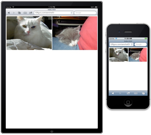
We can even combine these two elements to create a scalable image gallery:
<img src="http://src.sencha.io/-20x50-5/http://www.mydomain.com/ images/my-big-image.jpg"> <img src="http://src.sencha.io/-20x50-5/http://www.mydomain.com/ images/my-big-image.jpg"
By using the formula -20x50-5, we take our original image, remove 20 pixels for our margin, shrink it to 50 percent, and then remove an additional five pixels, to allow for space between our two images.
18. Changing file types
Sencha.io Src offers some additional options you might find useful. The first lets you change the file type for your image on the fly. For example, the following code will return your JPG file as a PNG:
<img src="http://src.sencha.io/png/http://www.mydomain.com/images/my- big-image.jpg">
This can be useful when offering your applications' users multiple download options for images.
This option can also be combined with the resizing options:
<img src="http://src.sencha.io/png/x50/http://www.mydomain.com/images/ my-big-image.jpg">
This would convert the file to PNG format and scale it to 50 per cent.
By using the functions available in Sencha.io Src, you can automatically size images for your application and provide a consistent look and feel across multiple devices.
For a full list of all the functions you can use with Sencha.io Src, go to www.sencha.com/learn/how-to-use-src-sencha-io/.
Summary
In this article, we covered how to style toolbars using the ui configuration option. We also talked about how Sencha Touch uses SASS and Compass to create a robust theme system. We included installation instructions for SASS and Compass and provided an explanation of mixins, variables, nesting, and selector inheritance. Finally, we touched upon designing interfaces for multiple devices and handling automatic image resizing, using Sencha.io Src.
In the next chapter, we will dive right back into the Sencha Touch framework. We'll review a bit of what we have previously learned about component hierarchy. Then, we will cover some of the more specialised components that are available. Finally, we'll give you some tips on finding the information you need in the Sencha Touch API documentation.
John Clark and Bryan Johnson are the founders of Twelve Foot Guru, a web consulting company based in Atlanta, Georgia. They have both been using ExtJS and Sencha Touch for several years and have been developing web applications for even longer. 12ftguru.com/
Liked this? Read these!
- How to make an app
- Free graphic design software available to you right now!
- Discover what's next for Augmented Reality
- Download free textures: high resolution and ready to use now

The Creative Bloq team is made up of a group of art and design enthusiasts, and has changed and evolved since Creative Bloq began back in 2012. The current website team consists of eight full-time members of staff: Editor Georgia Coggan, Deputy Editor Rosie Hilder, Ecommerce Editor Beren Neale, Senior News Editor Daniel Piper, Editor, Digital Art and 3D Ian Dean, Tech Reviews Editor Erlingur Einarsson, Ecommerce Writer Beth Nicholls and Staff Writer Natalie Fear, as well as a roster of freelancers from around the world. The ImagineFX magazine team also pitch in, ensuring that content from leading digital art publication ImagineFX is represented on Creative Bloq.
