The best rebrands of the '70s, from Sega to Apple and Kodak

Sign up to Creative Bloq's daily newsletter, which brings you the latest news and inspiration from the worlds of art, design and technology.
You are now subscribed
Your newsletter sign-up was successful
Want to add more newsletters?
The 1970s was a transformative decade that witnessed a vibrant evolution in graphic design. As economic turmoil erupted in the wake of the oil crisis, a spirit of rebellion and non-comformity was in the air. This encouraged designers to become bolder and more experimental.
Consequently, the branding world started to see everything from clashing colours to funky typefaces, while playful iconography began appearing in some of the best 1970s logos. In our article, we've consulted industry experts to curate a definitive list that highlights the most impactful rebrands of the decade.
So read on, as we delve into the stories behind these transformations, which often reimagined brands at every level, from introducing some of the best logos of the decade to developing innovative advertising campaigns, and sometimes changing the name itself. For our ultimate list, see our best rebrands of all time roundup.
Article continues below01. Kodak (1971)
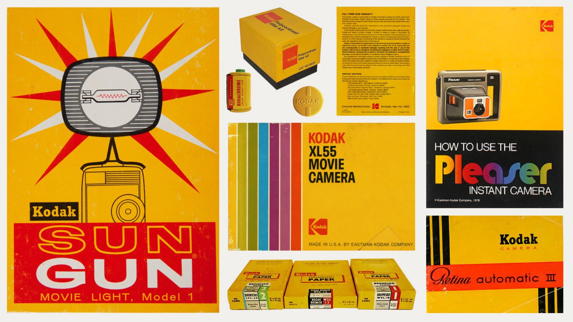
The American camera company Kodak was originally founded in 1892. But it took nearly eight decades before the branding we know and love today came into being.
"In 1971, Kodak marked its corporate zenith by unveiling a new logo in 1971, featuring the iconic Kodak 'K' symbol in its signature yellow and red," explains Matt Hauke, senior designer at Design by Structure. "Not only was this reflective of where identities were heading in the 70s, but also captured Kodak’s dominance in the market. It was a smart move to reflect the huge brand recognition the brand had built over the century."
Stephen Haggarty, managing partner, innovation at Yonder Consulting, agrees. "At a time when the brand was built around real film and processing techniques, these design spoke to their product and the industry as a whole," he enthuses.
And as creative design director at AMV Mario Kerkstra points out, they have aged well. "The company's marketing materials from the 1970s look as modern today as they did then," he enthuses. "The yellow and red colour palette, in combination with the use of clean lines and bold shapes, made it an instantly recognisable visual identity."
Sign up to Creative Bloq's daily newsletter, which brings you the latest news and inspiration from the worlds of art, design and technology.
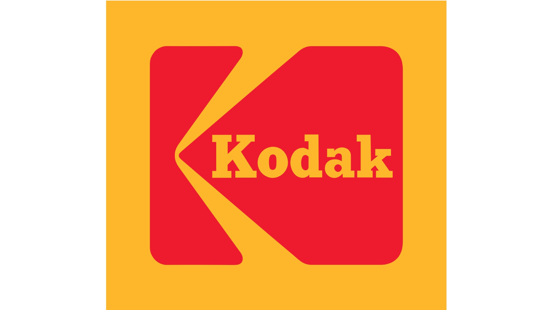
The K logo remained in use until 2006, but the moment it was gone, it was missed. As Stephen puts it: "They tried to match the shift into the digital age but lost a lot of what made the iconic marque special."
A revised version was then reintroduced in 2016 and placed back at the forefront of the company’s image and brand identity. "Even though the 1970s logo and visual identity were updated for use in today’s digital world," says Mario, "at their core they remained unchanged.
"The fact that the K logo and Kodak’s visual identity are still in use over 50 years after they were first introduced gives you an indication of their timelessness and effectiveness," he adds. "It also explains why they deserve their place amongst some of the most memorable pieces of corporate graphic design of the 1970s."
02. Rolling Stones (1971)
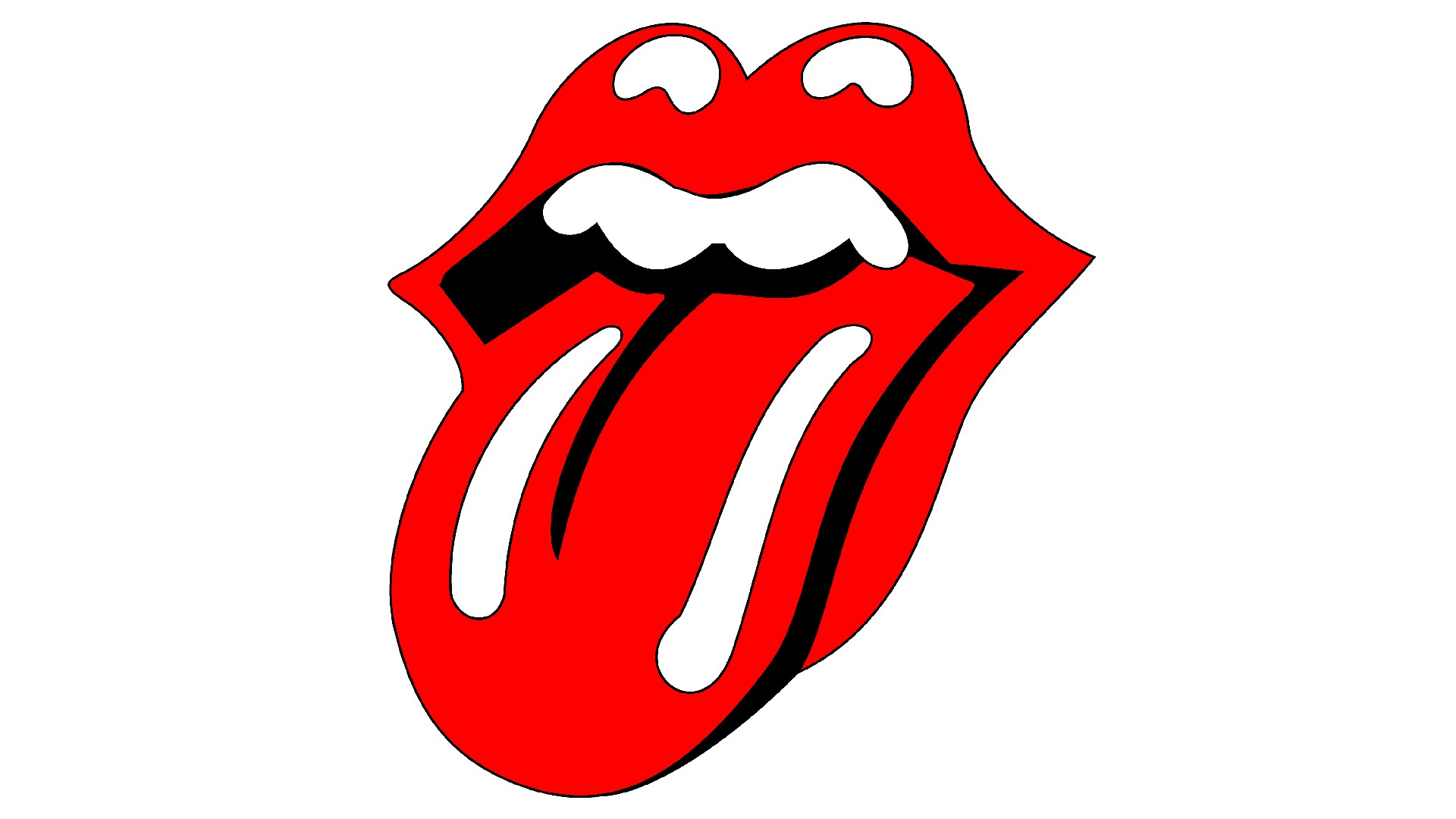
Anyone with a passing knowledge of rock music will recognise the iconic tongue and lips emblem of The Rolling Stones. Celebrated as one of the most recognizable symbols in rock music, it was designed by Jon Pasche in 1970. Initially commissioned for a tour poster, Pasche, a student at the Royal College of Art, caught lead singer Mick Jagger's attention with his designs during a degree show.
Following this, Jagger tasked Pasche with creating a logo for the newly established Rolling Stones Records, which was set to release the band's music after leaving Decca Records.
The singer's inspiration for the logo stemmed from a newspaper clipping featuring the Indian goddess Kali, known for her fierce and powerful image, which included a protruding tongue. The emblem first appeared on the 1971 album "Sticky Fingers" and has since become a staple of the band's branding, symbolizing a rebellious spirit that resonates with multiple generations.
The logo took Pasche about two weeks to finalise, and he was paid £50 for his troubles. At that time, that was enough to buy you several months' rent, a substantial down payment on a house, or a decent used car.
Nonetheless, the band got their money's worth. As Mallory McGowan, associate digital strategist at Brandwidth, explains: "This iconic pop art branding remains relevant and oh-so-profitable 62 years later. It established a long lineage of signature branding, a distinct elevation from their posed style of the 1960s.
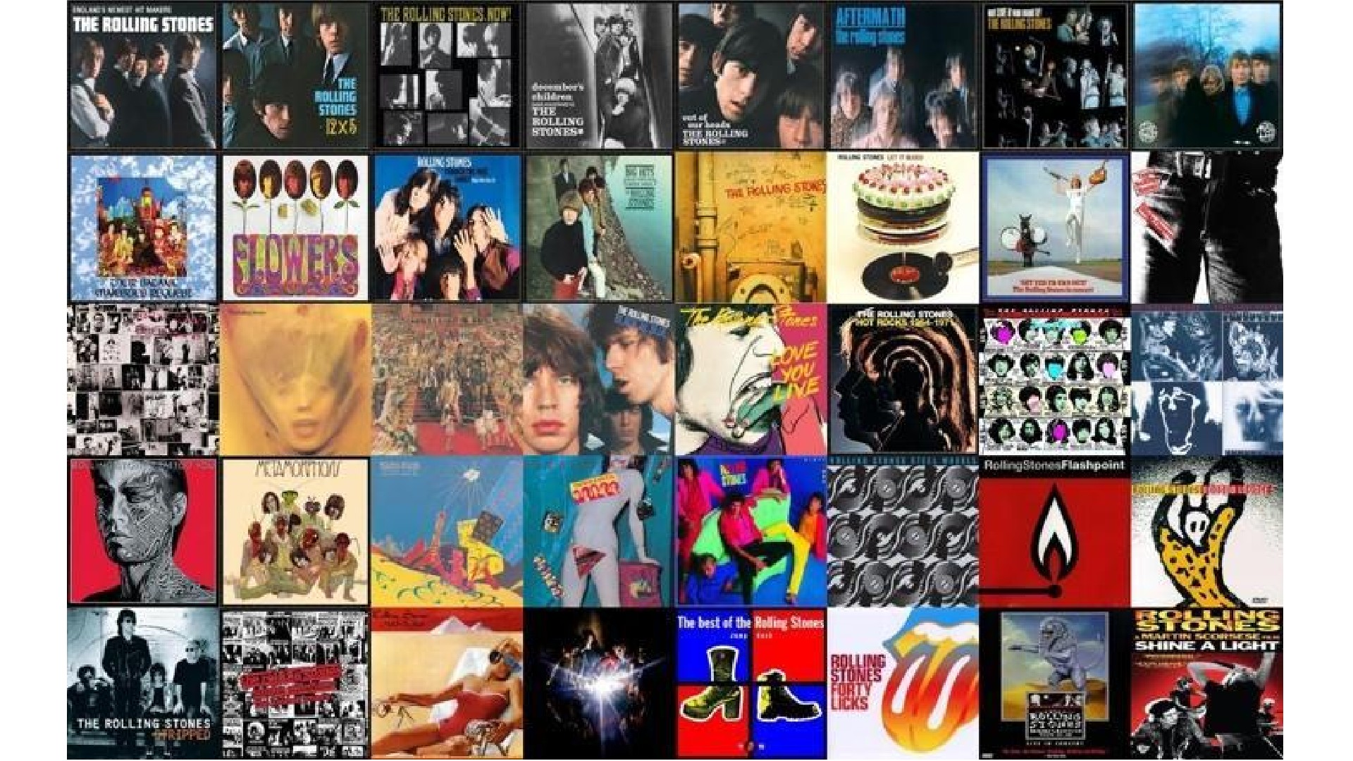
"All things Stones – posters, album covers, stage designs, merchandise – incorporate Warhol-esque grainy, overexposed images splashed with colour," she adds. "The simplicity and provocation of their '70s rebranding is a sign of the times, and continues to adapt with the band; emblazoned on t-shirts of fans and Urban Outfitters shoppers alike across the world."
03. Nike (1971)
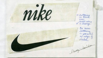
Nike was co-founded in 1964 by Phil Knight and Bill Bowerman as Blue Ribbon Sports, initially importing Japanese running shoes to the USA. Then in 1971, they transitioned to making their own shoes and needed a new name. After rejecting several options, they settled on Nike, the Greek goddess of victory.
This name change was pivotal, notes Drew Coughlan, creative director at Saffron Brand Consultants. "Naming, as most brand practitioners know, is probably one of, or the most difficult pursuits we do," he explains. "And Nike ticks almost all the criteria of what a good name is. It’s short, memorable and meaningful."
The other main strand of the rebrand was the switch of logo. As Rick Chant, co-founder of design agency We Are Pi, explains: "Prior to this, Blue Ribbon Sports had had simple yet pedestrian block-letter logo. Then in 1971, for just $35, design student Carolyn Davidson created a symbol of motion and speed, popularly known as the Swoosh, that perfectly encapsulated the spirit of athleticism. It was a rebranding that transformed a functional athletic shoe company to an emotional brand that stood for performance and innovation."
The Swoosh, he adds, went on to become so iconic that the company no longer needed its name. "That is worth repeating," he emphasises. "A rebrand so iconic. The company. No longer. Needs. It's. Name."
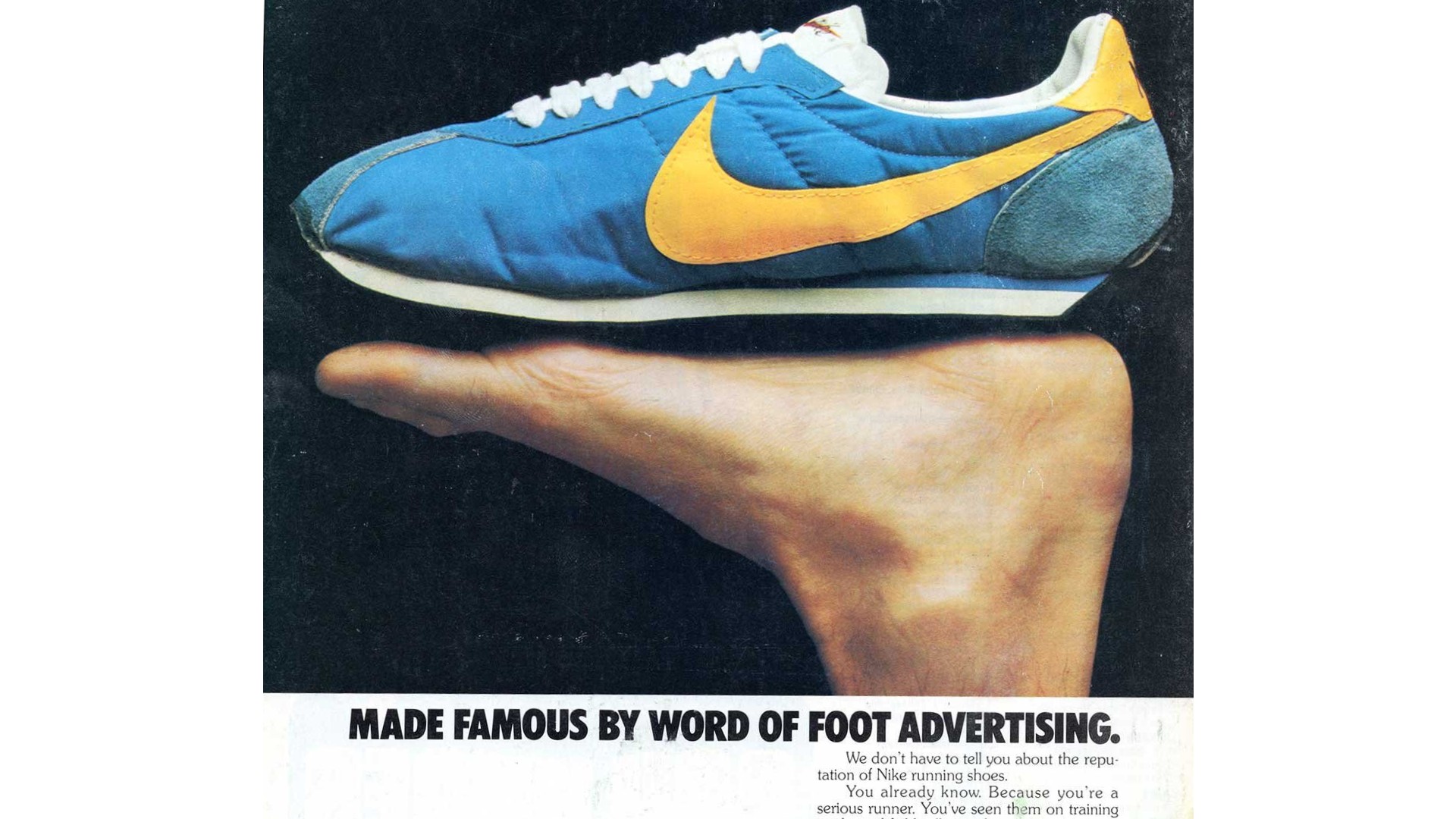
Indeed, this rebrand has even transcended the company itself; today, its influence extends way beyond marketing and appears across culture at large. "For example, 1989, the Swoosh turned up on Marty McFly's futuristic self-lacing shoes, cementing the brand’s image as a symbol of innovation and cool," Rick adds. "Both Drake and Kanye West have mentioned the Swoosh in their lyrics. And artists all over the planet have been inspired by the Swoosh to merge art and fashion.
"The Swoosh is also at the heart of Sneaker Culture, a $100 billion dollar industry in its own right, while a quick Google search for 'Swoosh tattoo' shows over three million results. This expansive influence underscores why Nike's rebrand is heralded as one of the most significant in history, transcending sport and seeping into every corner of pop culture."
Drew agrees. "The impact of this brand evolution work is still felt today," he states. " It enables the brand to be stretched and flexed across markets, verticals and technologies. And no matter what colour, typeface or art direction you use to localise, segment and target different audiences, by just having the lock-up it communicates every bit of equity you need."
04. Shell (1971)
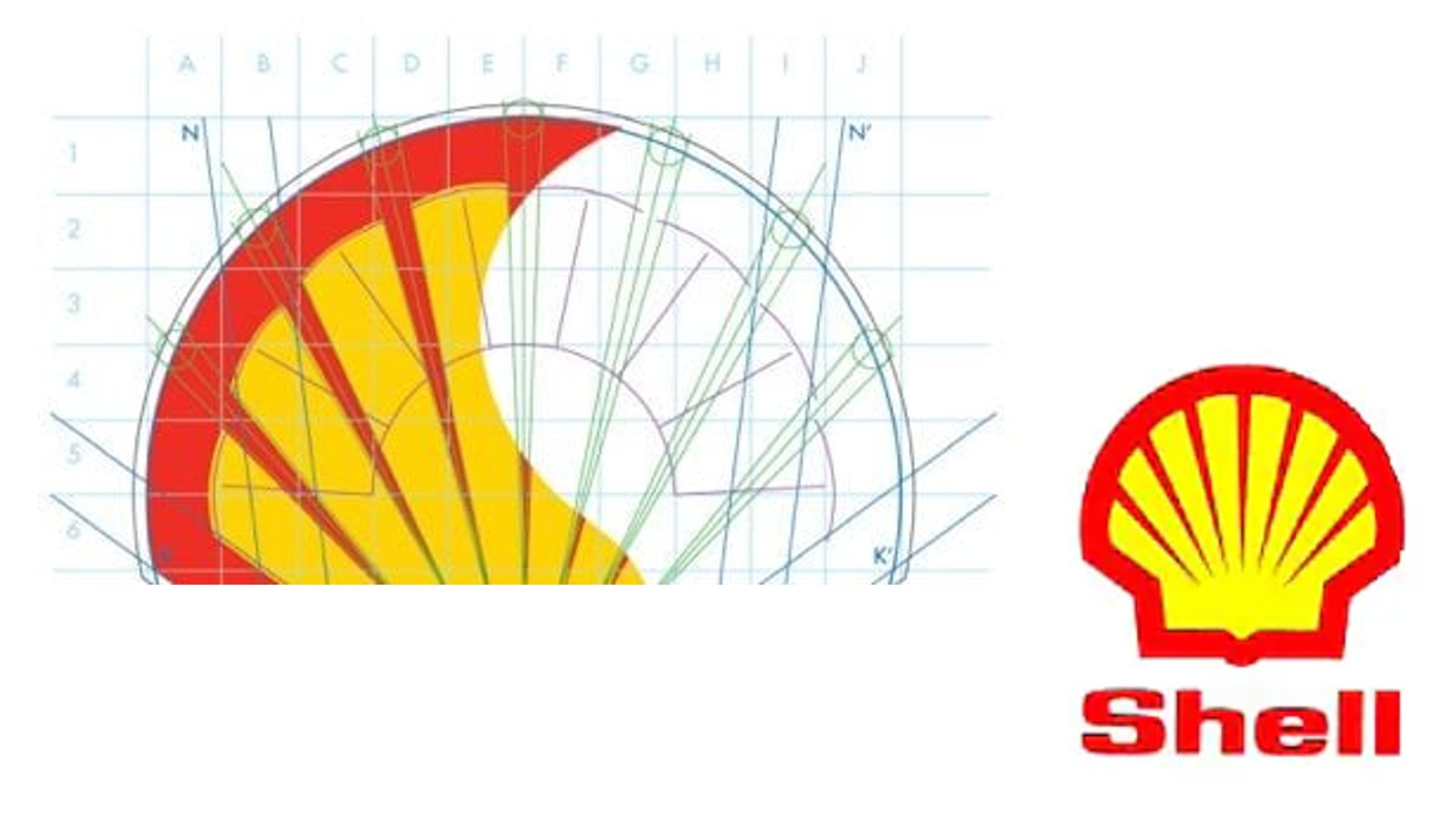
Oil giant Shell's branding has gradually evolved since the company's founding in 1981, when it was represented by a detailed illustration of a saltwater clam shell. But it's arguably its 1971 rebrand that truly changed the game for the company.
"Raymond Loewy's redesign of the logo, transitioning to the bright, simplified shell emblem, made the brand universally identifiable," explains Peter Wood, chief technical officer at Spectrum Search. "It introduced a sleek, modern aesthetic to Shell's identity that shone through all marketing elements and service stations.
"This timely rebrand was crucial," he adds, "as global visibility was gaining importance rapidly. It served to underline Shell's dedication to innovation and customer service, enabling it to keep its robust market presence."
05. IBM (1972)
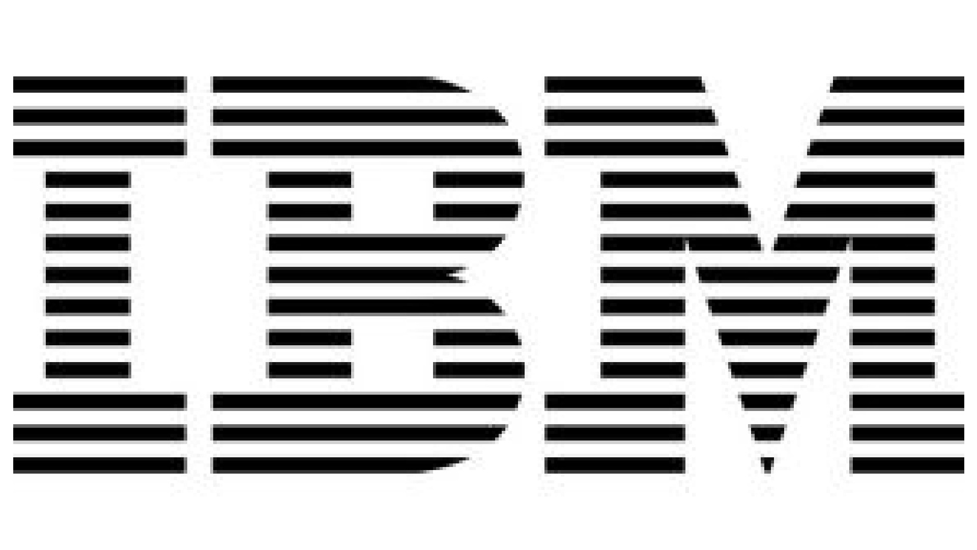
IBM, which stands for International Business Machines Corporation, is a computer giant with a rich history dating back to the early 1900s. By the 1970s, IBM had invented several important pieces of technology, including the floppy disk, the supermarket checkout station and an early form of the ATM.
To update the look and feel of the brand accordingly, they commissioned graphic design icon Paul Rand, who they'd been working with since 1956. Aiming for a streamlined and dynamic redesign, Rand created a logo featuring the three letters of the company name rendered in eight (and sometimes 13) horizontal lines, which usually appear in black, gray, white or IBM Blue, which is at the core of the official color palette, identified as Pantone PMS 2718C. This logo is now considered to be among the company’s most valuable assets (and sits in our best logos roundup).
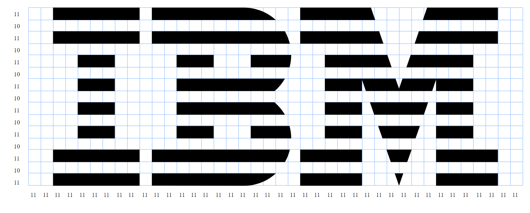
"Swapping their intricate old logo for a clear, bold eight-bar design, this rebrand marked IBM's evolution towards a modern, forward-thinking tech company," explains Peter Wood. "This new look was more than just aesthetic; it served as a statement of IBM's dedication to innovation and simplicity. With this strategic move, IBM managed to stay on top and continue influencing the ever-changing tech landscape, setting a benchmark in corporate branding."
06. Pepsi (1973)
The battle between Pepsi and Coca-Cola in the 1970s, popularly known as the 'Cola Wars', saw the intense competition between the two soft drink giants to date. And one of the biggest moments in this battle came with Pepsi's design overhaul in 1973 by Lippincott & Margulies.
"This redesign was a significant one for Pepsi, refreshing refreshed the brand's image and bringing in a whole new younger audience," says Mike Cameron, CEO at Smoko. "Shifting from a classic script logo to the bold and subversive 'Pepsi Globe', it perfectly embodied the brand's global ambitions.
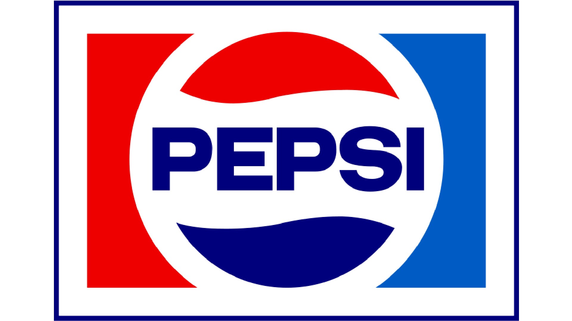
"This redesign was significant for Pepsi, refreshing the brand's image and bringing in a whole new younger audience," he adds. "The new identity captured the essence of youth and vitality, resonating with consumers all around the world. Pepsi was now relevant and competitive in the fizzy drink market like never before, all thanks to this radical reinvention."
07. British Airways (1974)
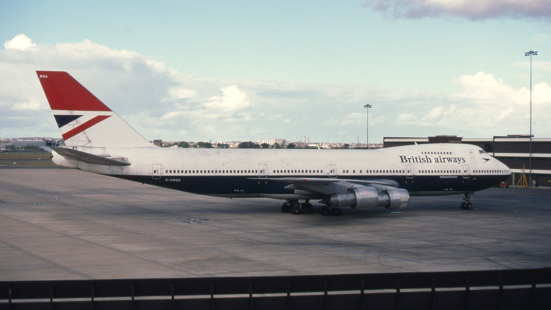
In 1974, air travel was no longer the glamorous licence-to-print-money it had once been. The global oil crisis of 1973 had severely impacted fuel costs, a significant expense for airlines. This led the British state-owned airlines BOAC and BEA into trouble, leading to their merger and the creation of British Airways. The rebranding exercise masterminded in this year by Negus & Negus was, in this light crucial. Thankfully, it was a huge success.
"The creation of polished, unified brand was instrumental in establishing British Airways as a prime player in global aviation," explains Peter Wood. "The new branding unveiled the now-famous red, white and blue livery that embodies Britain's spirit while projecting reliability and elegance. The design shift influenced everything from staff uniforms to in-flight menus, crafting a seamless, high-end experience for travellers."
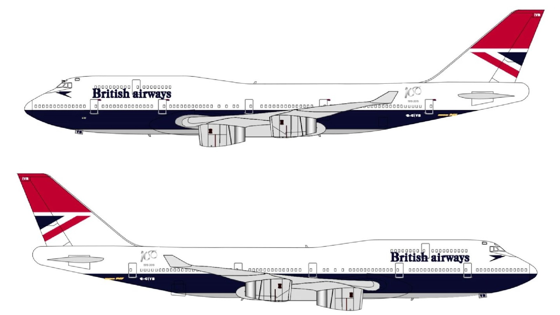
Karim Salama, director at e-innovate, is also a keen admirer. "This rebrand, characterised by the iconic Negus livery, signified a move towards modernisation and visual cohesion," he says. "The meticulous attention to detail throughout the rebranding process represented not only a shift in aesthetics but also a change in the company's ethos and aspirations.
"I believe this shift brought the company closer in line with the new era of air travel, while still doing enough to distinguish them from their competitors. In my opinion, The British Airways rebranding of the 70s remains a timeless example of how a thorough visual identity transformation can positively impact the popularity of a business."
08. NASA (1975)
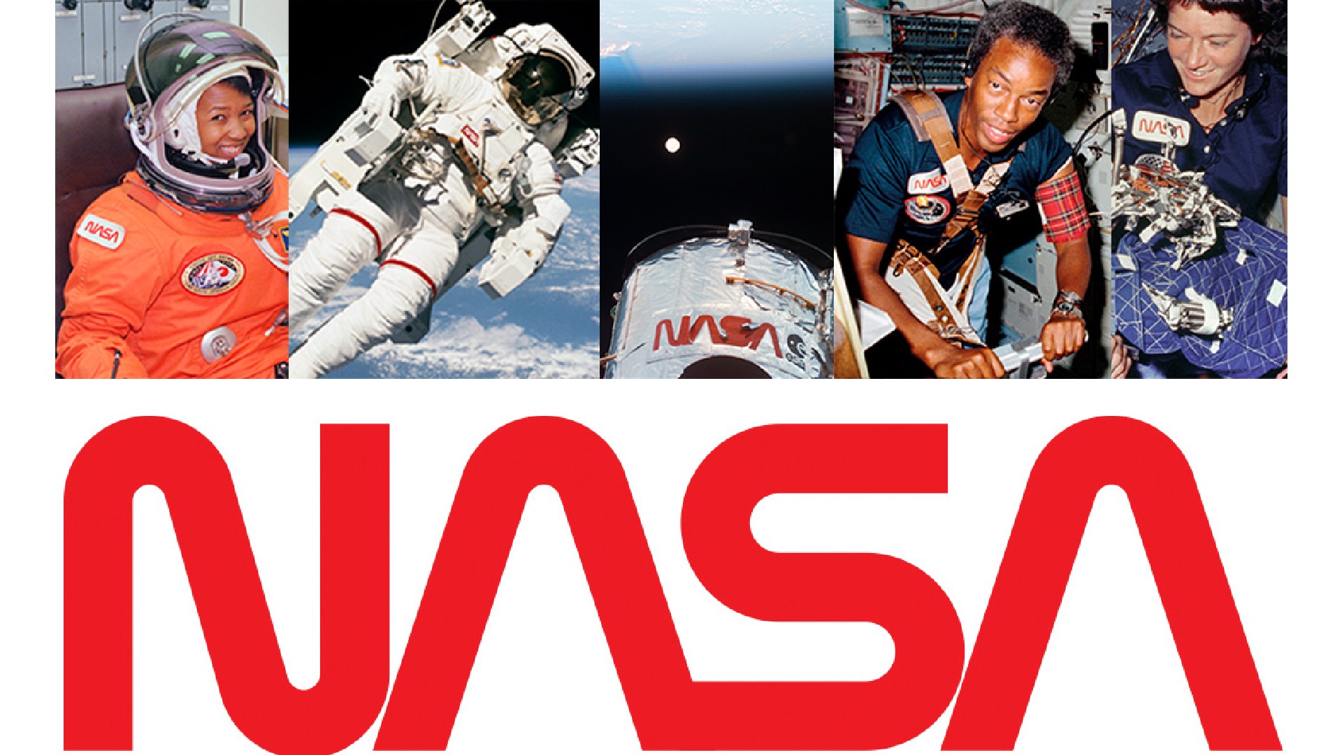
Emerging from the US Federal Design Improvement Program, Richard Danne and Bruce Blackburn's 1975 rebrand of the National Aeronautics and Space Administration was one of the biggest design stories of the decade.
Rather than just tweak what was already there, the designers aimed to centre the rebrand around a modern, minimalist logo that would better represent NASA's forward-thinking mission. Their creation, popularly known as The Worm, was a striking red wordmark featuring curved lines that gave it a suitably otherworldly appearance.
The design process wasn't without challenges. Danne and Blackburn had to convince NASA administrators of certain design choices, such as the absence of cross-strokes on the As. Once it was approved, the studio developed a comprehensive standards manual to ensure consistent usage across all NASA communications.
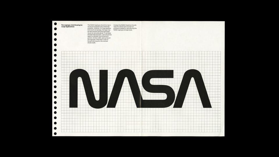
"The 1975 NASA rebrand has always been up there for me," enthuses Matteo Alabiso, design director at Droga5. "I remember being at university and having one of my lecturers showing me the book. The logo itself is timeless, but for me the most incredible aspect was the meticulous craft that went into its application across uniforms, fuel vans and aircraft, as well as the design of the brand manual itself."
The Worm logo served as NASA's official emblem for 17 years, from 1975 to 1992. It was then replaced by the original "meatball" logo, a decision that sparked controversy among designers who appreciated the Worm's clean, futuristic aesthetic.
Despite its retirement, the latter maintained a dedicated following and even made a comeback in 2020 when it appeared on a SpaceX rocket.
09. Sega (1975)
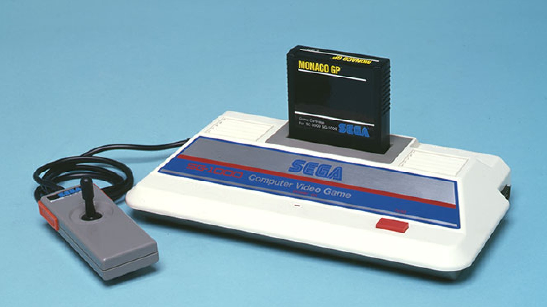
Japanese video game and entertainment company Sega is best known today as the makers of Sonic the Hedgehog and Angry Birds. The brand has long been synonymous with, as Born Ugly's creative director Rob Skelly puts it: “The striking cobalt blue, the bold type oozing nostalgia, the iconic brand sonic ‘Sayyyy-Gaaaaa!’ Not forgetting their other Sonic – sharing the brand colours and brand attitude."
You may assume, then, that it was always thus. But not so. In fact, the brand has roots tracing back to American Standard Games in 1940 and Service Games of Japan in the 1950s, both of which managed coin-operated games on military bases.
"Their rebrand as Sega in 1975, taking the first two letters of Service and Games respectively, transformed an unknown and forgettable slot machine supplier into a household name," explains Rob. "This took them from a brand that lived in the shadows of its products, to playing the lead character."
And it couldn't have come at a better time. "As home gaming transformed the industry in the 1980s, Sega’s new identity and brand positioning ensured they wouldn’t be left behind," Rob explains. "Despite one or two flops over the years, the brand has managed to stay relevant and innovative, whilst staying true to the 1970s rebrand.”
10. Apple Computers (1977)

In 1977, Apple was a young company still finding its feet. But it was a pivotal year for them, in which the Apple II computer was released. Unlike the Apple I, which was sold as a kit for hobbyists, this came fully assembled, was much more user-friendly, and featured colour graphics: an innovation for the time.
This new offering, though, demanded a whole new approach to branding. And as designer Natalia Talkowska of Natalka Design explains, the company pulled it off with aplomb.
"Apple’s rebrand in that year, designed by Rob Janoff, is a brilliant example of how changing a company’s image can lead to massive success," she explains. "At its centre, the original illustration of Sir Isaac Newton under a tree was replaced with a simple, colourful apple icon. This new design made Apple seem more friendly, approachable, inclusive, and modern."
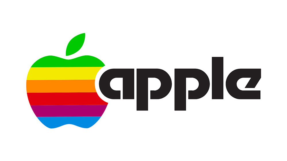
Why did it work so well? "Neuroscience shows that our brains remember simple, colourful images better than complex ones," reasons Natalka. "The rainbow icon did just that, making it easy for people to recognise and remember Apple. This rebrand helped Apple transition from a niche computer company to a global lifestyle brand, showing how a smart rebrand can drive a company’s future success."
Peter Wood agrees. "Shifting from the complicated, Newton-inspired emblem to a sleek, rainbow-striped apple symbolised Apple's commitment to making technology accessible and enjoyable," he notes. "This transformation was a significant moment, marking Apple's progression from a niche computer manufacturer to a leading mainstream tech innovator.
"This refreshed identity appealed to a broad audience, with its emphasis on creativity and simplicity; values that remain at the heart of Apple's brand philosophy today."
11. Xerox (1977)
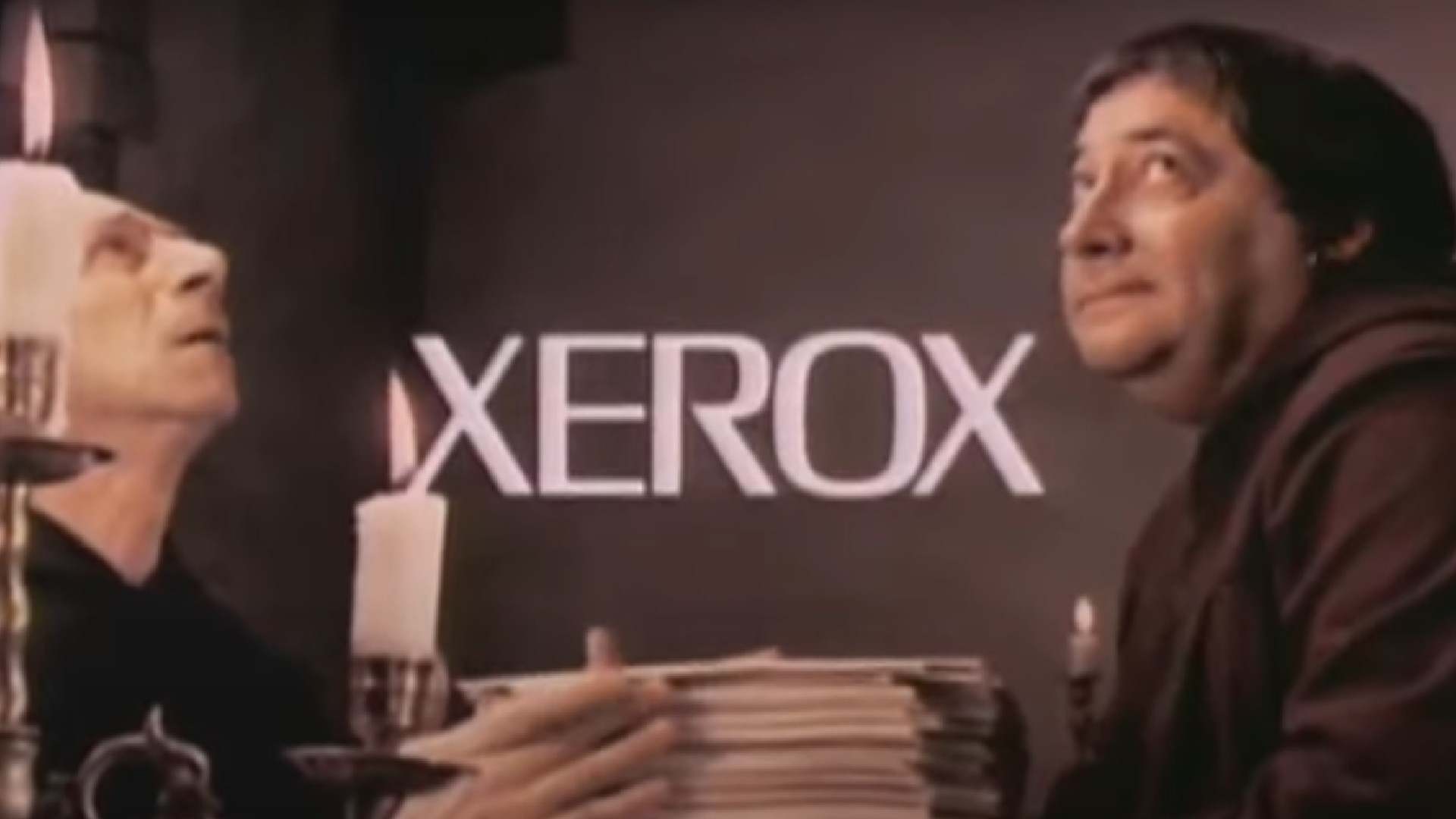
In the days before digital, photocopying was a task that dominated most offices. The brand that became synonymous with the practice was Xerox, and Adam Levine, performance coach at InnerXLab, believes the company's 1977 rebrand had a lot to do with that.
"Tasked with updating its image, Xerox engaged the esteemed design firm Chermayeff & Geismar to spearhead their marketing transformation," he explains. "The sleek rebranding helped redefine Xerox in preparation for the digital age."
"The extensive overhaul also reflected a deeper narrative of innovation and forward momentum which solidified Xerox's position as a prominent leader in the tech industry," he adds. "I'd argue that the rebrand perfectly bridged the gap between tradition and modernity, showcasing a company evolving with the times while staying true to its fundamental values.
"Overall, the Xerox rebranding of the 70s serves as a testament to the influence of visual identity in shaping perceptions and stimulating business growth."
Like this? Jump ahead to the best rebrands of the '80s.

Tom May is an award-winning journalist specialising in art, design, photography and technology. His latest book, The 50 Greatest Designers (Arcturus Publishing), was published this June. He's also author of Great TED Talks: Creativity (Pavilion Books). Tom was previously editor of Professional Photography magazine, associate editor at Creative Bloq, and deputy editor at net magazine.
