Designing for touch
Fingers and thumbs turn desktop conventions on their head. Interaction designer Josh Clark explains what you need to keep in mind when designing for mobile touchscreens and compares finger-friendly touch interfaces for iPhone, iPad and Android.
Sign up to Creative Bloq's daily newsletter, which brings you the latest news and inspiration from the worlds of art, design and technology.
You are now subscribed
Your newsletter sign-up was successful
Want to add more newsletters?
Five times a week
CreativeBloq
Sign up to Creative Bloq's daily newsletter, which brings you the latest news and inspiration from the worlds of art, design and technology.

Once a week
By Design
Sign up to Creative Bloq's daily newsletter, which brings you the latest news and inspiration from the worlds of art, design and technology.
Once a week
State of the Art
Sign up to Creative Bloq's daily newsletter, which brings you the latest news and inspiration from the worlds of art, design and technology.

Seasonal (around events)
Brand Impact Awards
Sign up to Creative Bloq's daily newsletter, which brings you the latest news and inspiration from the worlds of art, design and technology.
Great mobile designs do more than shoehorn themselves into tiny screens: they make way for fingers and thumbs, accommodating the wayward taps of our clumsy digits. The physicality of handheld interfaces take designers beyond the conventions of visual and information design‚ and into the territory of industrial design. With touchscreens there are real ergonomics at stake. It's not just how your pixels look, but how they feel in the hand.
01. Rule of thumb
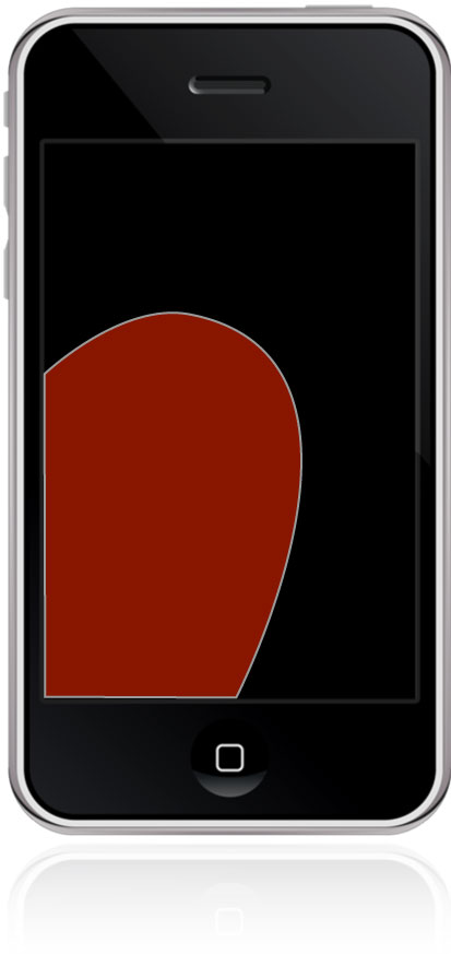
Touchscreen design demands thoughtful awareness of where fingers casually come to rest on the device. Grab a phone in one hand, for example, and unless you deploy a crazy-claw phone grip, you always tap away with your thumb. For phones, designing for touch means designing for the thumb.
Thumbs are marvelous. It's our thumbs, along with our affection for celebrity gossip, that separate us from the beasts, but they do have limited range and flexibility. While a thumb can manage to sweep the entire screen of all but the most oversized phones, only about a third of the screen is in truly effortless territory – at the bottom of the screen on the side opposite the thumb.
Place primary tap targets in this thumb-thumping hot zone. When holding a phone in the right hand, for example, the thumb falls naturally in an arc at the bottom left corner of the screen:
That's an important reason why toolbars and navigation typically land at the bottom edge of phone interfaces – the opposite of what we're accustomed to for traditional screen interfaces. Desktop software conventions put menus at the top of the screen or window, and websites typically position primary navigation at the top of pages. Our limited thumbspan, however, flips that convention around, and navigation and primary tap targets sink to the bottom.
The screen-bottom bias of the thumb is more important than left vs right. Turns out most of us easily flip between left and right hands when we use our phones. Right-handed users often favour or switch to their left hands (when writing, for example), and lefties likewise often go with their right. While a modest majority of users go with their right hand a bit more often than the left, it's not a strong enough trend for designers to fret over.
The screen-bottom rule of thumb, however, applies no matter what hand you use, and it gives you hints about how to organise the visual hierarchy of tap targets. Frequently used buttons should occupy the bottom of the screen for easy tapping, while other controls should be nudged out of harm's way. It's a convention in iOS, for example, to place Edit buttons at the top right, within easy view but just enough out of reach to make accidental changes less likely.
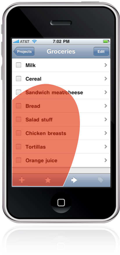
Sinking primary controls to screen bottom isn't just a matter of thumb comfort, but also the simple fact that fingers obscure the screen. The bottom is where hovering hands are least likely to cover content. To keep content in clear view, position it above your app's controls. This is a familiar, common-sense layout that applies to most physical devices: iPods, calculators, cell phones, bathroom scales, you name it. Content on top, controls on bottom.
02. I, Robot
This simple top/bottom rule is complicated by Android's "gotta be me" system buttons hugging the bottom of Android gadgets. (Prior to the Android 3 "Honeycomb" release, these were always physical buttons; starting with Android 4 "Ice Cream Sandwich" they're now virtual buttons.) These systemwide buttons belong at screen bottom for all the reasons described so far, but they also introduce finger-baffling competition for app-specific controls. Adding controls at screen bottom means stacking toolbars on top of each other; alas, tap errors are especially common for stacked controls at the bottom of the screen. In the high-traffic zone where the thumb tends to hover and obscure the view, button collisions are inevitable. This Android home-screen layout, for example, invites mistaps:
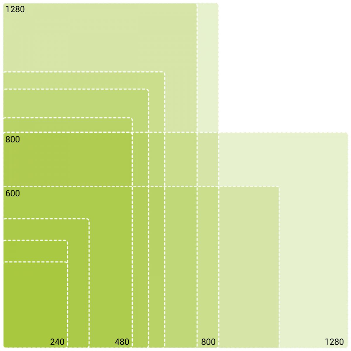
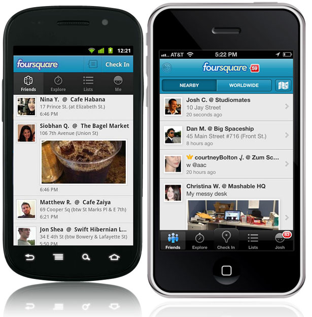
Stacking controls in a touch interface should always be avoided, especially at screen bottom. Unfortunately, that means Android apps should have their controls at the top of the screen to avoid crowding the system buttons. It's not ideal: this puts navigation outside the thumb zone, and when you tap a button, the hand covers the entire screen. But it's better than the alternative, which invites fat-finger errors.
For Android, app navigation and controls should float to the top. This is the reverse of the convention for iPhone, where the Home button doesn't create the same kind of competition as Android's buttons. Compare the Foursquare app for Android, left, and for iPhone, to see the resulting difference:
The web: an app inside an app
The anti-stacking guideline creates similar problems for websites on mobile devices. Websites and web apps operate, of course, within the confines of another app, the browser. On many mobile platforms, the browser has its own buttons and controls which can likewise create UI conflicts for web navigation. That means you should avoid "pinning" navigation to screen bottom for websites, since that would stack the website's toolbar on top of the browser's. (This guideline is conveniently reinforced by the fact that position:fixed isn't evenly supported in CSS across mobile browsers, making it a hassle to stick a toolbar to the bottom.)
Unlike Android, the solution isn't moving web navigation to the top, but instead to the bottom of the entire page. Because browser chrome is already eating real estate in some mobile browsers, the last thing you should do is crowd out content even further by choking the top of the webpage with navigation options.
In his excellent book Mobile First, Luke Wroblewski writes, "Too many mobile web experiences ... start the conversation off with a list of navigation options instead of content. Time is often precious on mobile and downloads can cost money, so get people to what they came for as soon as you can."
Web experiences should lead with content and limit primary navigation to screen bottom. Wroblewski champions a useful design pattern for this, which you can see at work in the Ad Age mobile website where all navigation is tucked behind a Menu button in a toolbar at the top of the screen. Tap the button and the entire screen fills instantly with navigation options. The menu's appearance is instant and feels like an overlay has appeared, but in reality, it's actually an anchor link to navigation at the bottom of the page.
Sign up to Creative Bloq's daily newsletter, which brings you the latest news and inspiration from the worlds of art, design and technology.
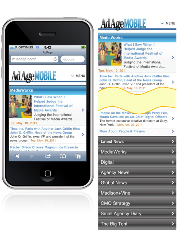
This approach has several advantages, Wroblewski writes:
"This design uses a minimum amount of navigation elements (just a single link at the top), gives people an opportunity to pivot and explore when they get to the end of content, doesn't duplicate the content of another menu, and (best of all) only requires a simple anchor link to work. That's right: no fancy JavaScript, overlays, or separate navigation pages to maintain – just an anchor that links to the bottom of the page. That's like HTML 0."
"Content on top, controls on bottom" seems like a simple rule, but as you've seen, it has varying outcomes for app designers when the operating system or the browser claims this premium real estate. In the end, it works like so:
- On iPhone, put app controls at screen bottom
- On Android, put app controls at screen top
- For the web, put navigation at page bottom (as opposed to screen bottom)
But these guidelines are specific to phones; what happens for larger touchscreens? With the iPad, the rules change yet again.
03. Tablets, take your corners
The rule of thumb still applies to the iPad, except that the thumb zone is different because we hold it differently. The iPad grip depends on your stance. Standing up, you have to use two hands to tap away. Sitting at a table, you're likely to prop it with one hand and tap with the other. Sitting in a chair, you tend to rest it in your lap and tap with the other hand. Lying down or reclining, you rest the thing on your stomach, propping it with one hand, tapping with the other.
In all of these grips, fingers fall in different places on the device, and each stance results in the device being held at varying distances. We tend to hold the iPad closest while standing, for example, and furthest while lying down or reclining.
As varied as these iPad holds are, two things are true for all of them. First, we tend to hold iPads at the top half of the device for best leverage, and that means that thumbs tend to settle at the top third of the screen, near the corners. Second, the iPad's larger screen makes it hard to take in the whole thing at a glance as you can with a phone. As with print design, the audience's visual attention naturally focuses on the top of the tablet, and the design's information hierarchy should reflect that. On the iPad, in other words, eyes and fingers naturally occupy the top of the device. (Sometimes the bottom isn't even visible at all. In the laziest and perhaps most common of positions – lying down or reclining – the bottom bezel tends to disappear into blankets, sweaters, and soft bellies.)
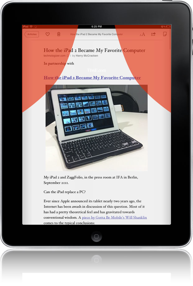
Unlike phones, primary controls and buttons should typically go at the top of iPad apps. Specifically, they should stake out the top corners, where thumbs typically hover when you hold the iPad. Instapaper and Twitter for iPad show good placement:
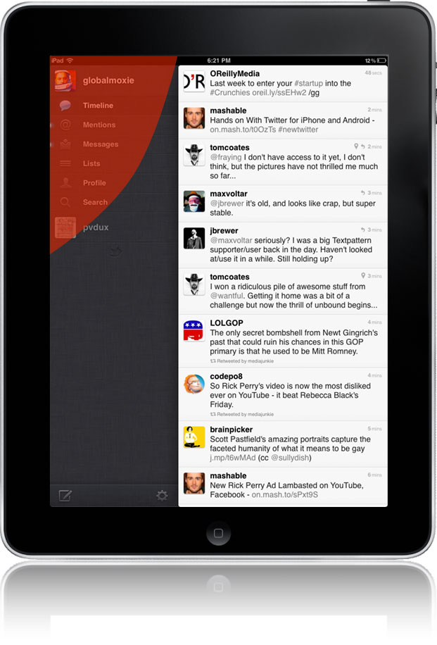
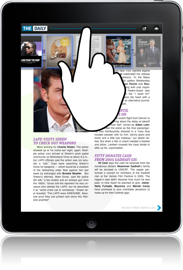
Avoid placing controls at the top centre, however, since that means your hand will cover the content when you use those buttons. Controls should never go immediately above the content they aim to affect, so nudging them to the corners is a useful pattern. The Daily for iPad, for example, offers a scrubber at top center to scan through the issue's pages, but when you do that, the hand covers the thumbnails, making the thing difficult to use.
04. The bottom line
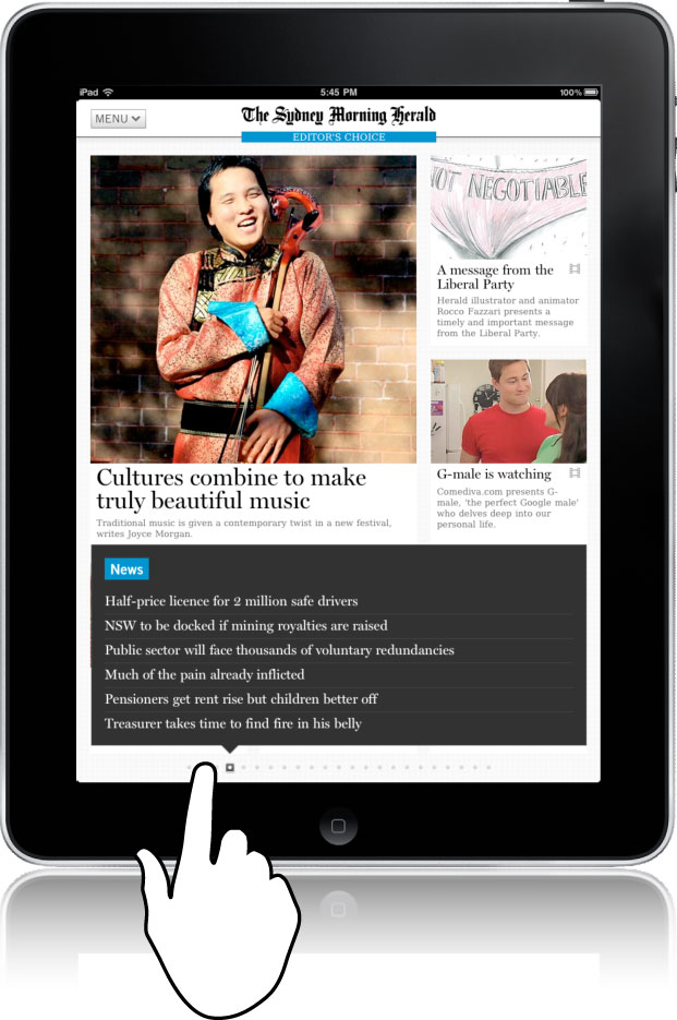
The Daily's misstep uncovers an exception to the top-corner guideline and reveals a category of cases where controls should instead go to the bottom. Whenever controls display or affect content, they should always appear below or to the side of that content, never above. The Sydney Morning Herald's iPad app, for example, has a novel way to quickly scan all of the articles in the day's issue by dragging your finger along an index of page indicators at screen bottom. Because that control reveals a tall list of headlines, it's appropriate to place those controls at screen bottom; placing them at the top would mean that your hand would cover the list when you touched the controls.
So is it top or bottom? Here's the difference:
- The iPad's top corners are ideal for navigation buttons and one-tap tools for actions like sharing, favouriting, or deleting.
- The bottom of iPad apps is best for controls that browse or preview content in the canvas above.
This is why page thumbnails for books or magazines are best placed at bottom. Similarly, if you were designing a map-creation app that included a palette of landmarks to drag into the map, that palette should go into the bottom so you can interact with your map without constantly covering it with your whole arm.
05. Too big to fail
If the way you hold the device dictates the place of controls, it's your finger size that decides how big those controls should be. Touch designers need to make tap targets too big to fail, chunky targets that people can tap without an eye-crossing level of focus.
Just how big is big enough when it comes to tap targets? Well, what's the size of a fingertip? All the platforms offer guidance here, but as usual Apple is the most opinionated, insisting on what I consider the best guideline for all mobile platforms: make tap targets a minimum of 44 points, or about 1/4" or 7mm. For the web, a 44px minimum also works well.
To designers accustomed to the desktop, controls this big feel both enormous and toylike, but just roll with it. Humongous buttons and gigantic tap targets are not only easy to hit but they're also easy to see for the occasionally distracted mobile user.
In a perfect world, all tap targets would be a minimum of 44x44. As in most things, though, compromise is sometimes necessary. Even the iPhone's standard controls fudge the 44-pixel rule from time to time. In the keyboard, for example, keys are 44 points tall but only 30 points wide – similarly, in landscape view, the buttons are 44 points wide but 38 points high. Apple doesn't have much choice here; it's crucial to include the full QWERTY keyboard in this view, but all the keys just won't fit as 44 x 44 buttons. Something's gotta give.
When limited space puts the squeeze on tap targets, here's the rule I've found works best: as long as a tap target is at least 44 points high or wide, you can squeeze the other dimension as small as 30 points if you really must. That means: the practical minimum size for any tap target is 44 x 30.
06. Don't crowd me
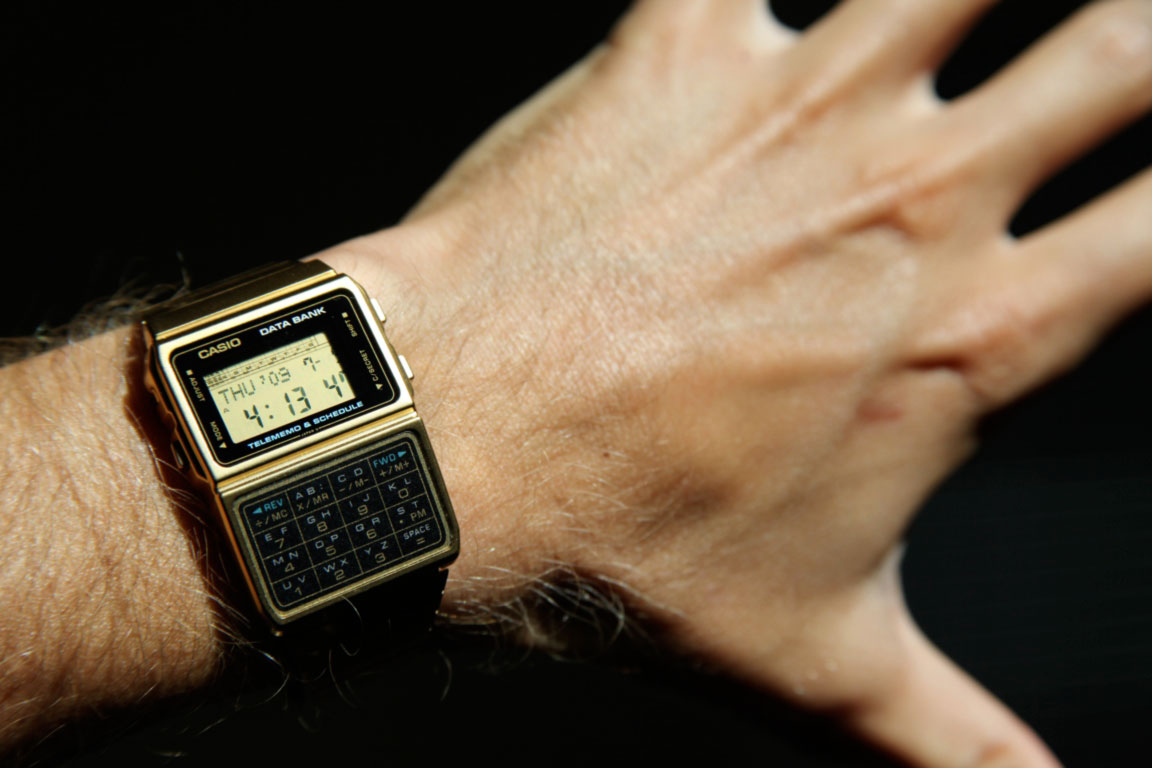
Your faithful author spent many years of his misspent youth with a svelte Casio calculator watch strapped to his wrist before finally retiring it in 1985. The problem wasn't just its tiny controls or its dampening effect on my prom-king prospects. The buttons were too close together. You'd aim for a five, but come up with a two or an eight, who knows – it was more wheel of fortune than calculator. Button size, in other words, isn't the only determining factor of tap accuracy; you have to consider spacing, too.
When designing for small screens, you'll inevitably be tempted to deal with that challenge by crowding the interface. "I'll just nudge these a little closer. I'll just add one more button to this toolbar." To quote a popular phrase of the calculator-watch heyday: "Just say no."
The closer you squeeze buttons together, the larger those buttons should be. Consider a pair of VoIP calling apps for iPhone, Skype and Call Global App. Both shoulder their keypad buttons close together, but they compensate by making them much larger than the 44x44 minimum. Despite their close proximity, the buttons remain easy to hit.
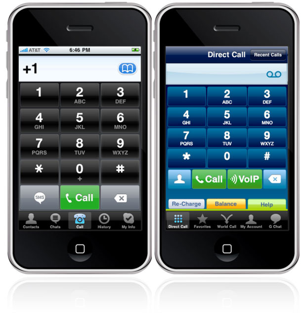
Where the two apps differ, though, is at screen bottom. Both apps stack buttons right on top of the navigation tab bar which, as discussed above, is never ideal. But because those buttons are so big in Skype (left), the problem is mitigated. In Call Global App, though, the buttons hugging the top of the tab bar are too skinny, and their proximity means that mistaps are likely. Even though they're technically larger than the 44x30 minimum, the lack of spacing and the error-prone stacking at screen bottom invite trouble. The layout calls for bigger buttons or more generous spacing.
That's the key lesson: while it might seem counter-intuitive, the success of small-screen interfaces relies on big elements, chunky buttons, and airy spacing. The screens may be tiny, but our fingers (and often, our attention spans) are not. Design with fat fingers in mind.
Josh Clark is an interaction designer specialising in mobile design strategy and user experience. He's author of Tapworthy: Designing Great iPhone Apps. Josh's outfit Global Moxie offers consulting services and training to help media companies, design agencies, and creative organisations build tapworthy mobile apps.
Liked this? Read these!
- How to build an app
- Free graffiti font selection
- Illustrator tutorials: amazing ideas to try today!
- The ultimate guide to designing the best logos
- The best free web fonts for designers
- Useful and inspiring flyer templates
- The best 3D movies of 2013
- Discover what's next for Augmented Reality

The Creative Bloq team is made up of a group of art and design enthusiasts, and has changed and evolved since Creative Bloq began back in 2012. The current website team consists of eight full-time members of staff: Editor Georgia Coggan, Deputy Editor Rosie Hilder, Ecommerce Editor Beren Neale, Senior News Editor Daniel Piper, Editor, Digital Art and 3D Ian Dean, Tech Reviews Editor Erlingur Einarsson, Ecommerce Writer Beth Nicholls and Staff Writer Natalie Fear, as well as a roster of freelancers from around the world. The ImagineFX magazine team also pitch in, ensuring that content from leading digital art publication ImagineFX is represented on Creative Bloq.
