Painting the subtle differences between sunset and sunrise
Freelance illustrator Paco Rico Torres explains how to paint the sun its two most eye-catching states.
Daily design news, reviews, how-tos and more, as picked by the editors.
You are now subscribed
Your newsletter sign-up was successful
Want to add more newsletters?

Five times a week
CreativeBloq
Your daily dose of creative inspiration: unmissable art, design and tech news, reviews, expert commentary and buying advice.

Once a week
By Design
The design newsletter from Creative Bloq, bringing you the latest news and inspiration from the worlds of graphic design, branding, typography and more.

Once a week
State of the Art
Our digital art newsletter is your go-to source for the latest news, trends, and inspiration from the worlds of art, illustration, 3D modelling, game design, animation, and beyond.

Seasonal (around events)
Brand Impact Awards
Make an impression. Sign up to learn more about this prestigious award scheme, which celebrates the best of branding.

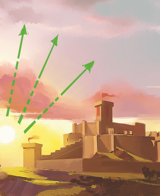
It's quite difficult to distinguish between a sunset and a sunrise just by looking at a single image. The two events are quite similar and you can't be totally sure of what you're watching unless you can see if the sun is going up or down.
That said, most people associate colder, softer and brighter colours with sunrises, and darker, warmer and more intense colours with sunsets. Technically speaking, that's not an absolute truth, but that's the way it goes most of the time.

So if you want to paint a sunrise, put some yellow in your palette, as well as bright orange, pink and blue. You can also make interesting contrasts using dark blue on the sky and yellow on the horizon. And if you want to do a sunset, use warm and dark saturated colours, like red, orange, magenta and purple.
Try to paint the sun (if it's visible in the image) a little higher in the sunrise and a little lower in the sunset. This will make it even more clearer what you're trying to depict.
Words: Paco Rico Torres
Paco Rico Torres is a freelance illustrator living in Spain who's produced art for several card games, magazines, books and role-playing games. This article originally appeared in ImagineFX issue 104.
Daily design news, reviews, how-tos and more, as picked by the editors.

The Creative Bloq team is made up of a group of art and design enthusiasts, and has changed and evolved since Creative Bloq began back in 2012. The current website team consists of eight full-time members of staff: Editor Georgia Coggan, Deputy Editor Rosie Hilder, Ecommerce Editor Beren Neale, Senior News Editor Daniel Piper, Editor, Digital Art and 3D Ian Dean, Tech Reviews Editor Erlingur Einarsson, Ecommerce Writer Beth Nicholls and Staff Writer Natalie Fear, as well as a roster of freelancers from around the world. The ImagineFX magazine team also pitch in, ensuring that content from leading digital art publication ImagineFX is represented on Creative Bloq.
