4 modern brands flying the flag for script fonts
These high-profile logo designs give the traditional cursive style a 21st century twist.
For many designers, the choice between serif and sans serif fonts is key in modern logo design. But it wasn’t always so black and white: cursive typography was once the go-to choice for a new brand.
In the 19th century, ‘branding’ as we now understand it was born. Products and services were stamped with a recognisable badge to set them apart from the competition, while gradually building up a reputation and set of values tied to that badge.
Hand-scrawled, signature-style marks were common, providing a mark of authenticity. And in the case of three examples from the early 20th century, the signatures of Messrs Kellogg (1906), Ford (1909) and Cadbury (1911) have endured to this day.
Article continues belowIn fact, the list of ‘heritage’ brands with script-style fonts at their core is substantial, ranging from Disney to Davidoff, Buick to Budweiser, Hallmark to Harrods, and Campbell’s to Coca-Cola.
Now, modern-day brands are beginning to embrace the informal vibe and added personality that a script font can bring. Here are four examples of 21st century brands that have embraced the unique appeal of cursive typography. And if you want a new typeface for your own designs, check out our round up of the best free script fonts from around the web.
01. Instagram
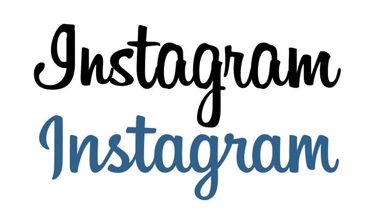
Much of the fuss around Instagram’s 2013 rebrand focused on the decision to pare back its skeuomorphic camera icon into a simple outline, married with a rainbow gradient.
But Denver-based designer Mackey Saturday also tweaked the photo-sharing app’s script mark – originally set in Billabong – and streamlined it into something more fluid, refined and elegant.
Sign up to Creative Bloq's daily newsletter, which brings you the latest news and inspiration from the worlds of art, design and technology.
As Saturday’s Dribbble post reveals, Instagram’s bespoke script logo is carefully crafted, with every curve and flourish considered to give it balance and symmetry, plus the uniqueness that an off-the-shelf font could never provide.
02. Pinterest
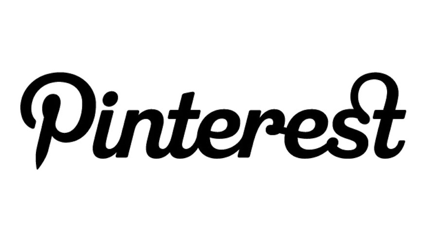
Another run-away success story in the hugely competitive social media landscape, Pinterest joins Instagram as a rep for crafty script fonts in a sea of bold sans serifs from the likes of Twitter, Facebook and YouTube.
Pinterest is another example of a tailor-made script logo that started life as a commercial typeface: in this case, Bello Script. Designers Michael Deal and Juan Carlos Pagan joined forces in 2011 to refine it into its current form, as they explain on the Pinterest blog.
It’s the details that make this logo: the distinctive pin-shaped ‘P’, balanced by the flourishing ligature between the ’s’ and the ’t’, but also the effortlessly flowing links between the letters that help the logo feel casual and creative, and nostalgic without being too retro.
03. American Idol
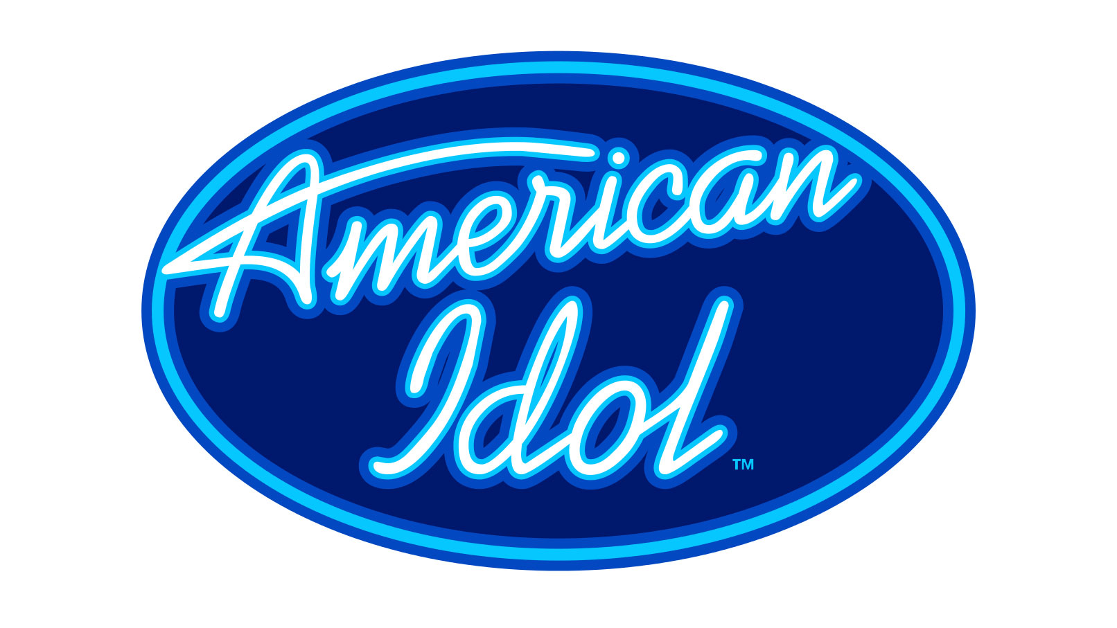
OK, bear with us here. Whatever your take on the reality music show format, you can’t argue with its impact on 21st century culture. And in the case of American Idol, a script font is proudly front and centre for one of the biggest shows of all time.
Pre-dating the X-Factor by three years in the UK – and ultimately displaced by it – Simon Fuller’s Pop Idol set the craze for televised singing contests in motion, spawning a global franchise.
Where Pop Idol fizzled, American Idol endured – enjoying a 15-season run from 2002-2016 on Fox, and moving to ABC in 2018. Its brand mark is based on Kaufmann, the distinctive casual script face designed by Max R. Kaufmann in 1936.
As with the examples above, however, bespoke flourishes are key to giving a logo mark that extra twist of uniqueness, and American Idol – as well as its fellow ‘A’ franchisees Australian and Asian Idol – features a long, stylised flick to hint at the shape of a shooting star.
04. Rapha
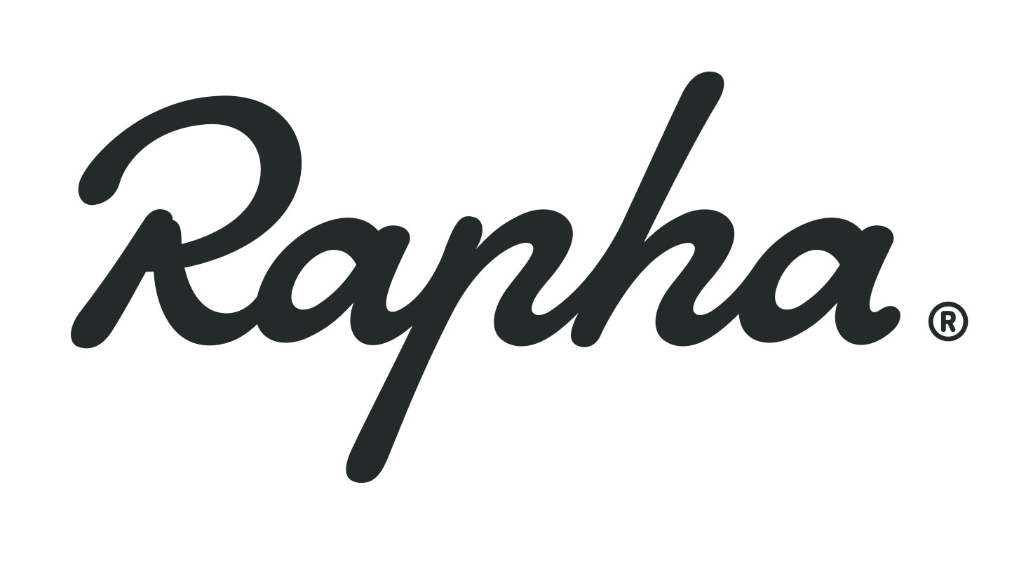
From mainstream entertainment to high-end sportswear, much of the look and feel of Rapha can be attributed to creative director Luke Scheybeler, who helped craft the premium cycling brand’s customer experience from the ground up when he co-founded the company back in 2004.
Three years later, Rapha was already collaborating with iconic British designer Paul Smith on a limited-edition range of cycling clothing. Both brands share a warm hand-written feel in their logos that adds charm, style and confidence.
The symmetry between the letterforms in Rapha’s logo is particularly satisfying, with the open bowl of the ‘p’ echoing the ‘h’ beside it in a triumph of personality over legibility. Who knows, perhaps we’ll see many more modern brands following suit.
Enter your best branding to the Brand Impact Awards
If you’ve already mastered the craft of branding, submit your best work to Computer Arts’ international awards scheme.
The Brand Impact Awards celebrate the very best branding work from all around the world. Deadline for 2017 entries is 9 June. Find out more at www.brandimpactawards.com.
Related articles:

Nick has worked with world-class agencies including Wolff Olins, Taxi Studio and Vault49 on brand storytelling, tone of voice and verbal strategy for global brands such as Virgin, TikTok, and Bite Back 2030. Nick launched the Brand Impact Awards in 2013 while editor of Computer Arts, and remains chair of judges. He's written for Creative Bloq on design and branding matters since the site's launch.
