5 fonts we love to hate (but maybe shouldn't)
These fonts have a bad rap – do they deserve another chance?
Sign up to Creative Bloq's daily newsletter, which brings you the latest news and inspiration from the worlds of art, design and technology.
You are now subscribed
Your newsletter sign-up was successful
Want to add more newsletters?
Some fonts are so maligned, they've become a running joke even for non-designers. Others are over-used to the point of near-total exhaustion, or misused so much we've forgotten their original purpose.
It takes skill and experience to choose the right typeface, and the nuances of different types of font can make a huge impact on a brand's personality, or the tone of a piece of design.
There are thousands of options out there, and yet certain fonts are everywhere. Some seem to make a mockery of the art and craft of typography in and of themselves, while others just seem like a lazy, default fall-back option.
Article continues belowBut is all the hatred justified? Read on for five of the most-hated typefaces, and why some of them might well deserve a second chance...
01. Comic Sans: the butt of all jokes
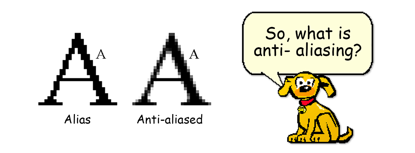
Let's get this out of the way early. Regularly mocked by designers and non-designers alike, Comic Sans is the clown in the room – the darling of children's playrooms, dodgy PowerPoint presentations, ramshackle lemonade stands and passive-aggressive workplace signage the world over.
People really love to hate this font. It's famed for being amateurish, silly, chosen by people who want something informal and jaunty, but are 'designing' their poster in Word – and Arial or Times New Roman just won't cut it.
We get it. In so many situations, Comic Sans is horrible. But consider its name: it's not called 'Comic' Sans because it's comical, but because it's based on the type in comic book speech bubbles. In fact, it was originally designed by Vincent Connare to give 'Microsoft Bob', a helpful dog bundled with Windows 95, a warmer, more playful tone in his speech bubbles – but was never actually used for that purpose.
Sign up to Creative Bloq's daily newsletter, which brings you the latest news and inspiration from the worlds of art, design and technology.
It wasn't meant for use outside of comic speech bubbles, and yet it's absolutely exploded worldwide. There are campaigns to ban it, and it's become an easy short-hand reference for bad typography. The reality? It's actually perfect for its intended use. It's also great for accessibility, and is officially recommended by the British Dyslexia Association. Its crime isn't use, it's misuse. Give Comic Sans a break.
02. Helvetica: death by ubiquity?
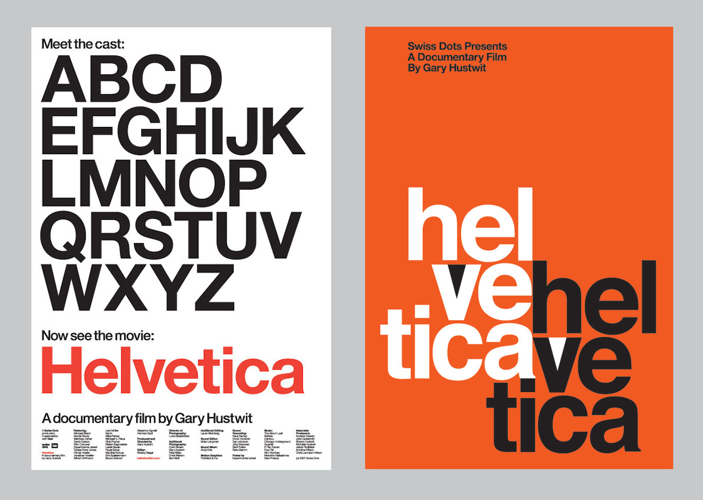
Ubiquity breeds contempt, and in many ways Helvetica is a beautifully crafted typeface that has become a victim of its own success. It has become the 'safe choice', the neutral option – or for some, an easy way to be effortlessly cool and timeless. But its ubiquity is partly due to the fact it's not always used for the right reasons.
Released in 1957 as Neue Haas Grotesk, and renamed three years later, Helvetica is the poster boy of the International Typographic Style, or Swiss Style – in fact, 'Helvetica' is Latin for 'Swiss'. It was embraced by cutting-edge designers throughout the '50s and '60s, and its popularity has continued to soar since.
A dizzying number of brands have used Helvetica, or modifications of it, for their logos over the decades – from American Airlines to The North Face, Panasonic to Post-It, and countless more besides. Clearly, that becomes an issue in terms of standout, and brand personality.
Helvetica is a great typeface. But it's not always the most appropriate choice. It's terrible for large passages of text, for instance, where its tight spacing and uniform weight interfere with legibility. It's also not as neutral as people assume: Gary Hustwit's feature-length documentary discusses how in some contexts it will blend into the background, while in others it will smack you in the face.
Apply critical thought to your type choices: while Helvetica can be a lazy default option, it can also be perfect for the right project. Don't abandon it just on principle, but remember there are alternatives to Helvetica out there.
03. Papyrus: the target of SNL parody
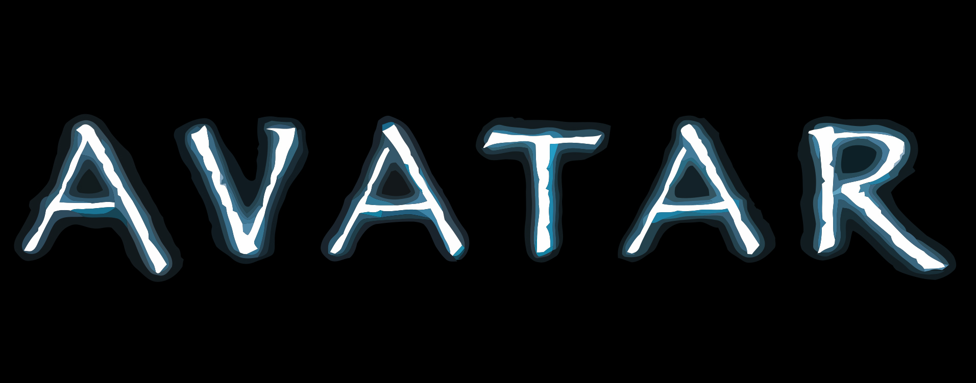
Everyone loves a bit of faux-Egyptian, slightly distressed type, right? Well... not so much. Papyrus is right up there with Comic Sans in the pantheon of hated fonts, and while Helvetica inspired a thoughtful documentary, Papyrus has the honour of being ripped into by Saturday Night Live.
The skit, starring Ryan Gosling, mocks how a global blockbuster like Avatar could seemingly just type 'Avatar' into Word, and change the font to Papyrus. Besides movie posters, the font may also be irksomely familiar from everything from faux-rustic cafe menus, to church programmes, to online captchas.
Inspired by Biblical times, Chris Costello created Papyrus in 1982 as a side-project while working in an agency. He later sold it to Letraset... who licensed it to Microsoft. It's now thought to exist on over a billion computers worldwide.
There are entire blogs dedicated to the overuse and misuse of Papyrus, but as with Comic Sans, the blame shouldn't be levelled at its creator. It's a little baffling that such a distinctive typeface, influenced by the look and feel of ancient Middle Eastern civilisations, could be applied to so many modern contexts – the fact is, it can't. That's not to say it's not fit for a purpose; it's just not fit for every purpose.
04. Mistral: the oft-misunderstood script
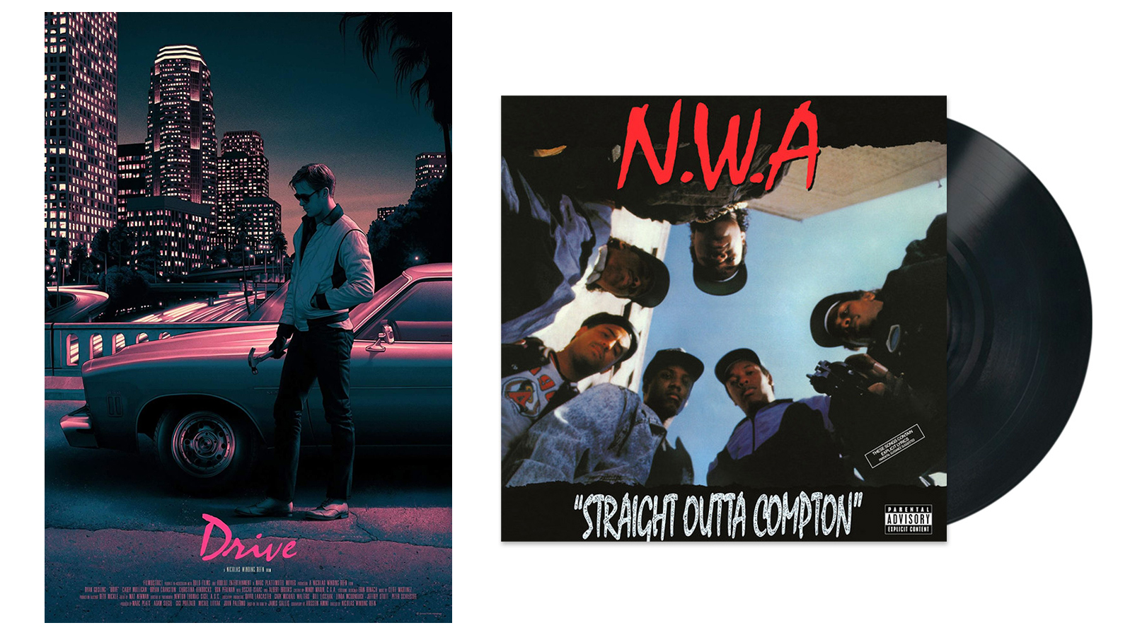
Script fonts in general, and handwriting fonts in particular, get a lot of a flak. Bradley Hand – popular amongst teenage girls in the '90s, and now splashed across all manner of invitations, school announcements and story books – is a case in point, as it actually looks nothing like natural handwriting.
Mistral, however, has a rather more interesting heritage – designed to evoke the sophistication and elegance of postwar France. But it's often tarred with the same brush as other script fonts, especially when misused. The problem is, rather like Comic Sans and Papyrus, Mistral is widely available to non-designers who don't think twice about butchering it.
Originally designed to mimic a sleek, sultry 'autograph' style of writing when in sentence case, Mistral changes tone entirely when in all-caps – and looks like it's been angrily spray-painted by a teenager.
Both tones of voice can be effective, if used properly. Once again, the issue here is misuse in the wrong hands. Set large passages of text in Mistral in an attempt to mimic handwriting and you're in trouble. And the shouty, more edgy all-caps approach is all-too-often diluted by badly designed signage. The examples above show how effective Mistral can be in the right hands.
05. Trajan: the king of movie posters

Just as the movie world seemingly keeps the same gravelly voiced individual on standby for every new trailer, the designers of its marketing materials are rather attached to one typeface: Trajan (with Bank Gothic as an eager understudy).
The range of applications are vast, and transcend genre and mood entirely. Since the 1990s, Trajan has graced disaster movies such as Titanic, sci-fi flicks including Minority Report and Stargate, touching dramas such as A Beautiful Mind, and fantasy epics Game of Thrones.
There's seemingly nothing this pseudo-Roman serif, which came helpfully bundled with Adobe Creative Suite for years, can't communicate when it comes to movies. In some ways, it's so over-used as to become little more than background noise as part of a movie poster, so you focus on the title rather than the font it's set in.
Like the gravelly voiceover man, it's become part of the short-hand vernacular of the movie world – just another familiar trope, which has its place. But it's also an opportunity for more independently minded poster designers to stand out from the crowd with something radically different.
Related articles:

Nick has worked with world-class agencies including Wolff Olins, Taxi Studio and Vault49 on brand storytelling, tone of voice and verbal strategy for global brands such as Virgin, TikTok, and Bite Back 2030. Nick launched the Brand Impact Awards in 2013 while editor of Computer Arts, and remains chair of judges. He's written for Creative Bloq on design and branding matters since the site's launch.
