5 types of font and what to use them for
How to pick the right typeface for your next logo design.
Sign up to Creative Bloq's daily newsletter, which brings you the latest news and inspiration from the worlds of art, design and technology.
You are now subscribed
Your newsletter sign-up was successful
Want to add more newsletters?
Picking the right font can be crucial for the success of a design project, whether it's a tagline on a poster or an expanse of long-form copy for a piece of editorial design. Type shapes personality, determines legibility, and achieves impact.
When you need to pick the right typeface for a brand, the importance of type is magnified as a few characters need to convey the values and personality of a brand, as well as helping to achieve standout from the competition.
So how do you make that all-important choice? There are many factors involved, from the emotional features you need, to the types of application, to the technical, linguistic and logistic requirements.
Article continues belowOne key step is choosing what class of typeface you need, so read on for our guide to how five distinctive varieties can have an impact on a brand...
01. Traditional serif
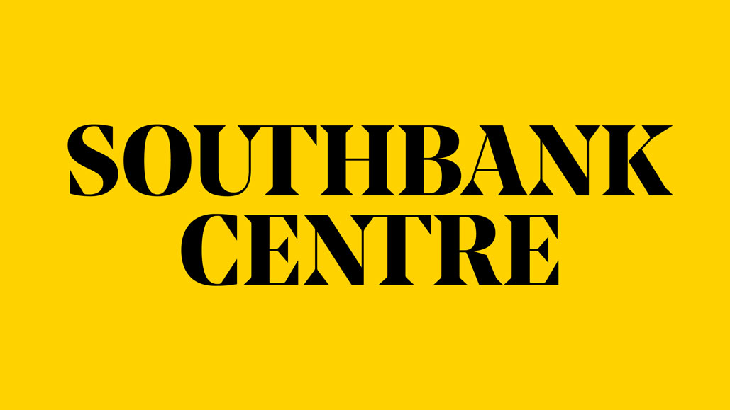
There's a good reason that serif fonts exude gravitas and class: they have their origins in the inscriptions that were chiselled into stone in Ancient Rome. Used appropriately they can make a brand feel from cultured, sophisticated, and authoritative – and are often used in fashion, academic and culture sectors.
North's rebrand of Southbank Centre is bold and confident, designed to act as an all-encompassing 'masthead' brand for the organisation. The previous condensed sans-serif marque was replaced with a modified version of Noe Display. Modern and high-contrast, its sharp, blocky serifs echo the brutalist architecture of the building. It feels authoritative and sophisticated, but still forward-thinking and edgy.
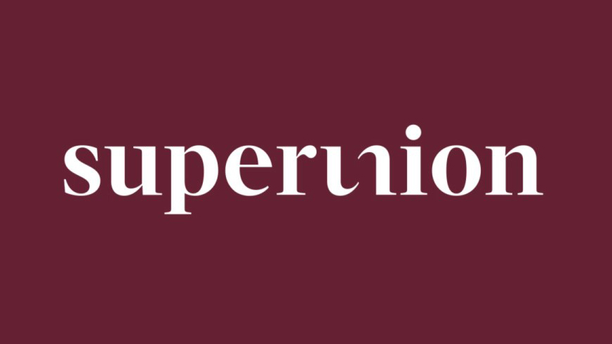
The two brands we're looking at here use serifs in very different ways. Second, we have one of the most closely-watched agency rebrands of recent years: when WPP merged The Partners, Brand Union, Lambie-Nairn, Addison and VBAT into a 750-strong mega-agency, everyone was curious to see how the new branding behemoth was to be positioned.
Sign up to Creative Bloq's daily newsletter, which brings you the latest news and inspiration from the worlds of art, design and technology.
The answer was 'Superunion', and the font choice was a crisp, traditional serif – with a playful half-ligature between the 'u' and the 'n' adding character. Given that most of the constituent companies sported sans-serif marques beforehand, the choice clearly marks Superunion as a new entity, but also feels confident, established and timeless, emphasising the team's considerable combined experience rather than wiping the slate clean and choosing something more contemporary.
02. Geometric sans-serif
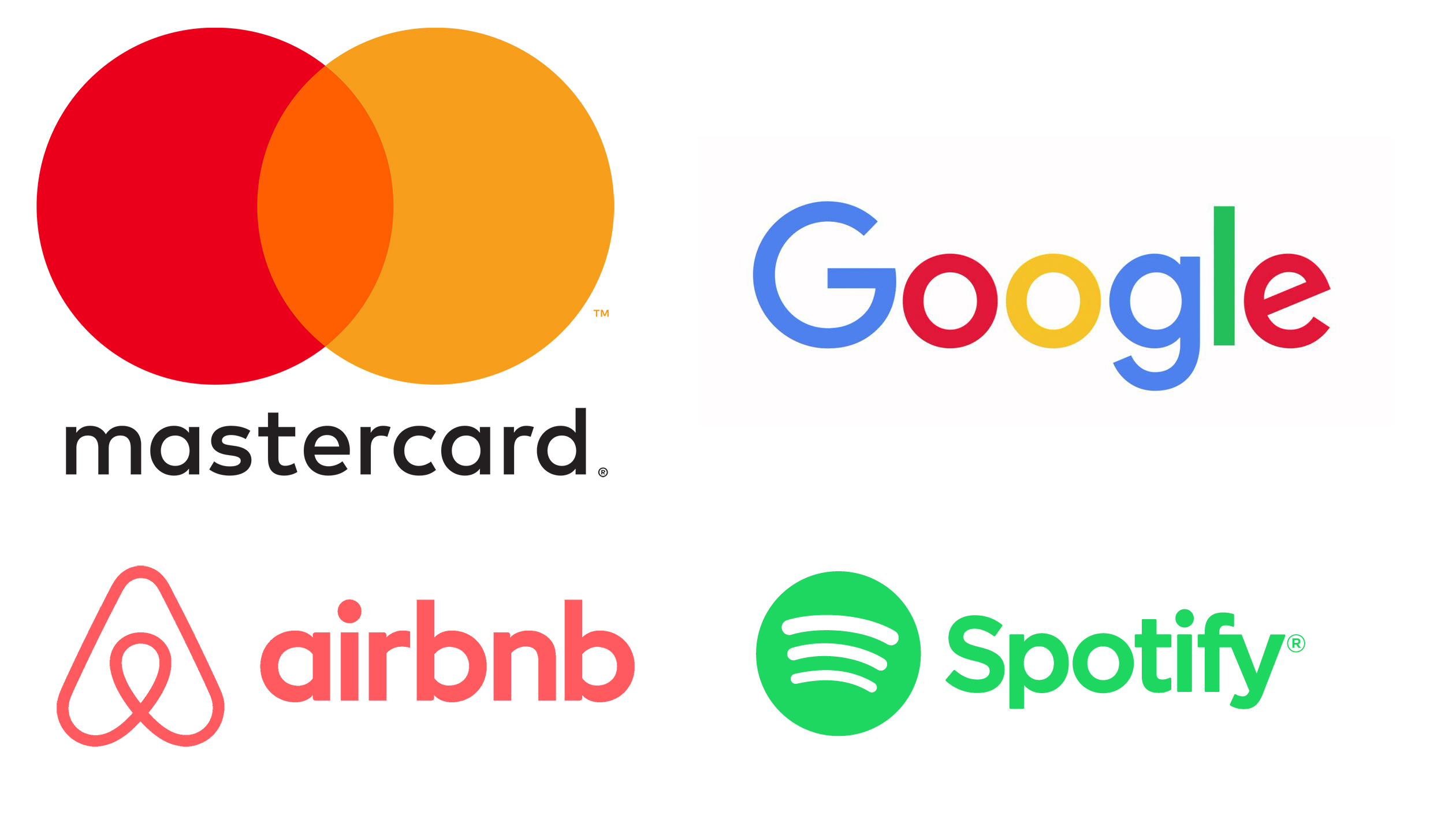
Compared to the ancient origins of their serif counterparts, sans-serif typefaces are a much more recent phenomenon that developed alongside advertising, commercial communication, and the broader Modernist movement in the 19th and 20th centuries. Rather than denoting heritage and sophistication, their smooth, clean lines convey simplicity, purity and functionality.
This is particularly true of geometric sans-serifs, whose satisfyingly homogenised proportions are well-suited to digital and technology-led companies keen to communicate values such as innovation and efficiency.
Over the past decade, geometric sans-serifs have been at the heart of a relentless drive for minimalism across many different sectors. Pentagram's pared-back rebrand of MasterCard and Google's decision to drop its distinctive serifs are symptomatic of this trend – as is DesignStudio's Airbnb wordmark, although the accompanying Bélo symbol drew most of the attention.
In short, geometric sans-serifs are everywhere – and the trend doesn't show much sign of waning. If you're planning to use one in your next branding project, consider whether there's a sound creative reason to do so – is it just the safe option, or is there scope to add a playful flourish?
For instance, the above logo for social discovery network Badoo – completed in-house – lends itself perfectly to a geometric sans-serif treatment. Structured around a line of five circles, it emphasises the complementary bowls in the characters of its name beautifully. It feels warm, playful and satisfying where a different company name, set in a similar typeface, could just feel generic and tired.
03. Chunky slab-serif
Unlike the natural elegance of many traditional serifs, slab serifs tend to have a much blockier, more workmanlike feel that is more reminiscent of clattering typewriters than ornate inscriptions. When used in all-caps at display sizes, they can also evoke the spirit of posters from the American Old West.
However, one of the most interesting recent applications of a slab serif in a branding scheme came out of Johnson Banks' extensive open-source creative process for Mozilla – which laid bare the agency's workings on several different potential solutions, and involved the online community in helping to develop them.
The fact that coding is often done in 'typewriter-style' fonts is a neat link that helped the final route be chosen, alongside the witty incorporation of the '://' protocol to replace the 'ill' of Mozilla. But crucially, the identity also bucks the overwhelmingly sans-serif route favoured by web and technology firms the world over, giving the not-for-profit a chance to 'own' that particular typographic look and feel.
04. Characterful script
Many of the world's best cursive logos are made more friendly and approachable thanks to the scrawled look and feel of handwriting – such as Virgin, Kleenex or Kelloggs – while high-end brands such as Harrods or Paul Smith are 'signed' by their founders as a stamp of authenticity. Coca-Cola is in a class of its own.
These are all well-established classics, however. Many more recently designed script-style logos have fallen in the wake of the minimalist trend – Pinterest's distinctive scrawling ligatures were replaced by an identikit chunky sans-serif, for instance.
This makes it all the more comment-worthy when a modern brand decides to go cursive. A particularly charming example is POSSIBLE's 2016 rebrand of Petfinder, which replaced a slightly jaunty, spindly serif with a smooth, rounded, upright script that's much warmer and more satisfying – although not as satisfying as the first time you spot the dog's face subtly hidden in the centre.
05. Playful stencil
There's no two ways about it: stencil fonts can be tough to get right when it comes to branding. In particular contexts – such as combined with faux-graffitied, 'dripping' paint letterforms – they're downright cliched.
Used sympathetically and appropriately, however, a more subtle stencilled approach can exude class and style, and give an extra layer of depth compared to a standard serif, for instance. One such example is DesignStudio's branding scheme for beauty brand Treatwell.
Part of the brand strategy was to shift the focus from simply 'beauty' into a broader theme of self-expression, confidence and individuality. While the stencil typeface references the traditional look and feel of a beauty brand, its treatment is more contemporary, subtle and unique.
When it comes to picking a typeface for a brand, don't be afraid to explore unexpected avenues – it can lead to some strikingly creative solutions.
Related articles:

Nick has worked with world-class agencies including Wolff Olins, Taxi Studio and Vault49 on brand storytelling, tone of voice and verbal strategy for global brands such as Virgin, TikTok, and Bite Back 2030. Nick launched the Brand Impact Awards in 2013 while editor of Computer Arts, and remains chair of judges. He's written for Creative Bloq on design and branding matters since the site's launch.
