Mozilla unveils radical new brand identity
Mozilla and creative agency johnson banks reveal the final result of the non-profit company's open-source rebrand.
You may remember a while back we reported on web browser Mozilla open sourcing a radical new rebrand. Having created seven first-round concepts alongside its creative partner johnson banks, Mozilla asked the creative community to help refine and select a shortlist, tying in perfectly with Mozilla's friendly, open source community approach.
Now, 10 months, hundreds of meetings, dozens of concepts, and three rounds of research later, Mozilla and johnson banks finally have something to share. Unveiled today, you can now see Mozilla's new logo design, proposed colour palette, language architecture, and imagery approach in all its glory.
So, without further ado, lets take a closer look at some of the components of Mozilla's new and exciting brand identity system.
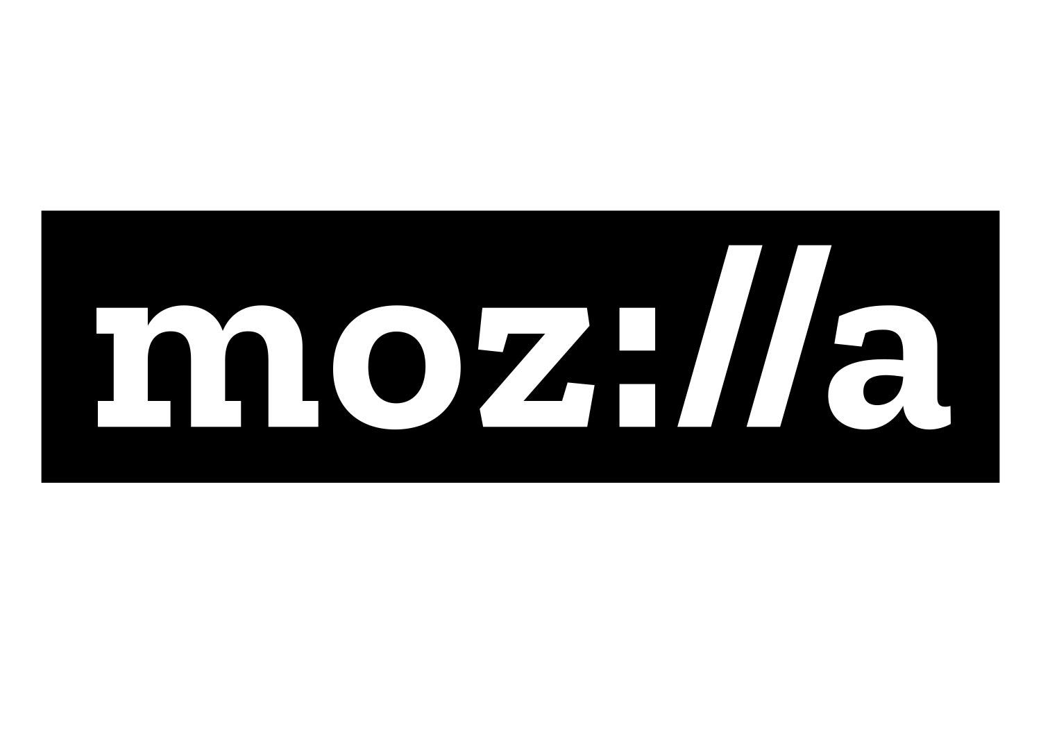
Internet-inspired logo design

Reinforcing that the internet is at the heart of Mozilla, its new logo lends a clear nod to URL language. "Right from the first design meeting, we had included an idea that built part of the code of an Internet URL into their name," Johnson comments. "An idea which represents how people and knowledge are linked in an increasingly connected world.
"The idea persisted and eventually became the backbone of the final route. It won through because it resonates well with their core internal and external audiences. The use of some of the language that lies at the heart of the Internet neatly encapsulates their desire to be the champions of a healthy Internet, stand up for what’s good about the web, and make it clear that they were and are an Internet pioneer."
A font for all
The chosen font for the wordmark and accompanying copy lines is Zilla, a typeface created for Mozilla by Typotheque. With a long and distinguished link to some of the earliest web font designs and a historic partner to Mozilla, Typotheque was the obvious font foundry to create the design, that would be then made available free of charge. "The final font is carefully customised so the details that you see in the angles and serifs of the final logo carry across the font itself," says Johnson.
Sign up to Creative Bloq's daily newsletter, which brings you the latest news and inspiration from the worlds of art, design and technology.
Changing colours

"Derived from the highlight colours used by Firefox and other web browsers, distinguishes our brand from its contemporaries." says Mozilla's creative director Tim Murray.
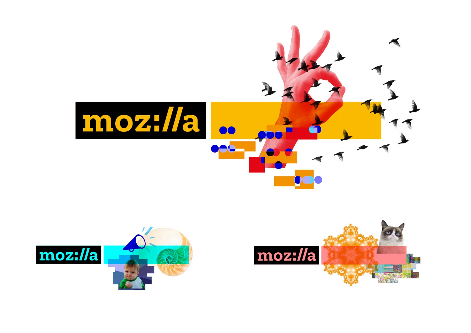
Colour flows into the new Mozilla logo, and changes according to the context in which it is used. "As we develop our style guide, we’ll define colour pairings, intensities, and guidelines," Murray comments.
Dynamic imagery

When developing the imagery for Mozilla's new look, the creative minds behind the project simply weren't comfortable with just one option. "As we looked at the elements of our brand identity, the concept of one image or icon standing for the whole of Mozilla, and the entirety of the Internet, seemed anachronistic," says Murray. "Since imagery is an important reflection of the diversity and richness of the Internet, however, we’ve made it an important component of our system.
"In digital applications, ever-changing imagery represents the unlimited bounty of the online ecosystem. Dynamic imagery allows the identity of Mozilla to evolve with the Internet itself, always fresh and new. Static applications of our identity system include multiple, layered images as if taken as a still frame within a moving digital experience.
In digital applications, ever-changing imagery represents the unlimited bounty of the online ecosystem
Tim Murray, creative director at Mozilla
As the brand develops, Mozilla intends to invite artists, designers and technologists to contribute to an imagery collective, where the team will code curated GIFs, animations and still images to flow into mozilla.org and other digital experiences.
"Through this open design approach, we will engage new design contributors and communities, and make more imagery available to all under Creative Commons," Murray adds. "We’re looking for input from creative communities to help shape and expand this idea."
Open, not closed
Computer Arts editor Nick Carson comments: "Many of johnson banks’ most memorable projects have great copywriting at their heart, and recent projects Dear World… Yours, Cambridge, Unicef UK and Cystic Fibrosis – winners at CA’s Brand Impact Awards in three consecutive years – are all great examples of this.
What makes this project so fascinating to designers is how the creative process itself really embodied the “open, not closed” philosophy
Nick Carson, Computer Arts editor
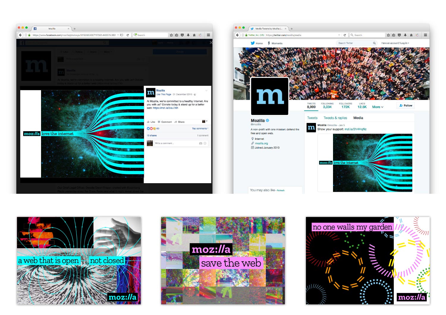
"Likewise, this Mozilla rebrand features positional taglines that position the non-profit behind popular browser Firefox confidently against its competitors: it offers “a web that is open, not closed” and declares “no one walls my garden”. The logotype itself is simple, clean and quietly smart, the integration of the familiar ‘colon slash slash’ motif backing up the assertion that "we are the internet".
"But what makes this project so fascinating to graphic designers is how the creative process itself really embodied the “open, not closed” philosophy, taking place publicly and inviting input and influence on different routes as they evolve. It’s a bold, brave and (fortunately for johnson banks) successful experiment that turns the trend for public criticism of rebrands post-release on its head, making the people part of the process itself from the outset."
Want to know more about the Mozilla rebrand? Explore the trials and tribulations of the open process in more detail in issue 264 of Computer Arts, on sale 3 March.
Related articles:

Kerrie Hughes is a frequent contributor to Creative Bloq, and was once its editor. One of the original CB crew, Kerrie joined the team back in 2013 after moving from her role as staff writer on 3D World. Since then she's written regularly for other creative publications such as ImagineFX, Computer Arts and Digital Camera World. After a stint working for the police, Kerrie is back reviewing creative tech for creative professionals.

