Pick the right font for your social campaigns
How to use typography to get your message across more effectively.
Sign up to Creative Bloq's daily newsletter, which brings you the latest news and inspiration from the worlds of art, design and technology.
You are now subscribed
Your newsletter sign-up was successful
Want to add more newsletters?
Effective social media campaigns need to catch people's attention quickly, and get a message across in a simple, but on-brand way.
Finding the perfect images for social is a big part of that, as is crafting the right message to cut through the noise, in as few words as possible.
But you also need to employ your typography skills to make sure that message punches through and has the desired effect. So read on for our pro advice for picking the right font for your next social campaign...
Article continues below01. Keep text to a minimum

First things first: social media graphics aren't geared up for large amounts of text. That's partly due to the invariably small canvases you have to work with, and partly because people won't stick around long enough to read it.
Striking visuals can grab attention more quickly, so when it comes to the message itself you'll need to cut to the chase and pare back all the clutter.
Remember, you have the accompanying post to communicate more information – so typesetting on the image itself should in most cases be restricted to short, punchy statements and calls to action.
02. Go big and bold
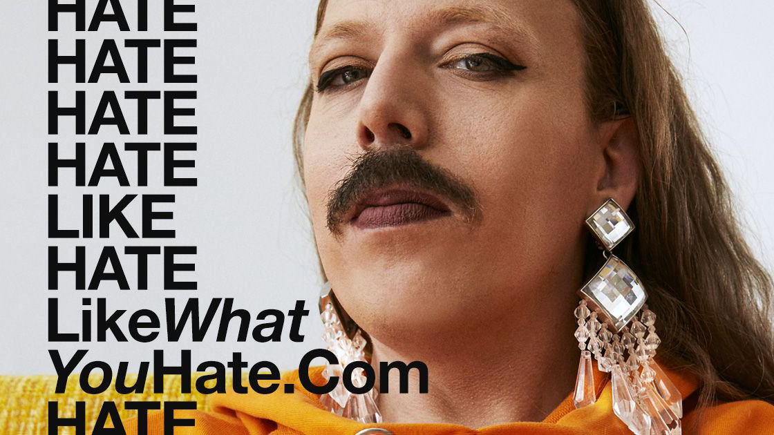
A strong hierarchy helps your social media graphics grab attention, especially if people are skimming their feed quickly and don't have time to second-guess you.
Sign up to Creative Bloq's daily newsletter, which brings you the latest news and inspiration from the worlds of art, design and technology.
If all else is equal, people will always process information from top to bottom, and most cultures will read from left to right. But variations in font weight, size, style or colour can disrupt this natural processing and draw the eye.
Research shows that US consumers spend an average of five hours a day on their mobiles, with roughly half of that time using social media apps. It's not just the canvas for the image that's small: often the size of the screen will squash it down even further, so keep the font as large and bold as you can.
Novecento is an extensive all caps font family that's perfect for grabbing attention, and works equally well shouting your message in bold, chunky letters as it does in a more subtle, light, wide-tracked application.
03. Consider readability and legibility

Bear the above points in mind when it comes to choosing a font for your social graphics. Clean, legible sans serifs abound in this type of work, often set in all caps to ensure maximum standout – especially when set over the top of an image. For this kind of use, impact and clarity is more important than aesthetic appeal.
Fonts such as Helvetica or Open Sans are safe choices if you want neutrality, but if you'd prefer to choose something with more personality to suit your brand, consider a more friendly, geometric alternative like GT Walsheim.
To improve readability, place type in an area of negative space where possible to give it more room to breathe. Let the design help frame it, so it doesn't fight with other elements in the small space – there's no point obstructing a carefully chosen image, or making a beautifully written line of copy unreadable.
As a rule, display and headline varieties of fonts can be effective as they're designed specifically for standout and impact for a line or two of large text. Body fonts may make larger chunks of copy easier to parse, but they run the risk of receding in a more promotional context.
04. Convey the right emotions
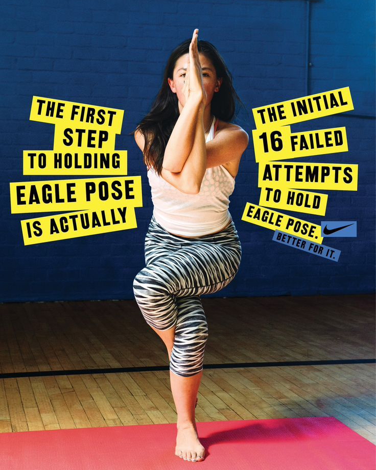
With so few design elements to play with in such a small space, your choice of font can play a very important role in setting the tone of a campaign, as well as communicating brand voice.
If the brand in question has an existing association with a particular typeface – or even its own bespoke typeface – that decision is made for you, of course.
A more humorous brand campaign could benefit from a font that has a bit more character and charm to it, so long as it's not at the expense of readability, legibility or impact. If there's a more serious undercurrent, such as an awareness-raising campaign for a cancer charity, then it's wiser to stick to something more neutral.
A useful exercise is to create the same design with three different fonts, and compare them in context. The actual emotional impact of each one may vary significantly once you see them in situ.
05. Be consistent across all graphics

If your social campaign runs as a series, consistency and clarity throughout is key. Don't assume that people will engage with the campaign in a linear way: they might miss half the posts, or join the campaign halfway through.
Each message should make sense as a self-contained graphic, and not rely on earlier posts to make sense. To test this out, try showing a graphic from mid-campaign to someone not involved with the project, to get a fresh pair of eyes.
A coherent style of art direction, consistent design structure and unified colour palette will help tie multi-part campaigns together, but committing to a particular typeface across the series will also aid brand recognition.
Related articles:

Nick has worked with world-class agencies including Wolff Olins, Taxi Studio and Vault49 on brand storytelling, tone of voice and verbal strategy for global brands such as Virgin, TikTok, and Bite Back 2030. Nick launched the Brand Impact Awards in 2013 while editor of Computer Arts, and remains chair of judges. He's written for Creative Bloq on design and branding matters since the site's launch.
