How to use imagery more effectively in app design
Select the perfect visual assets for more engaging, user-friendly apps
Sign up to Creative Bloq's daily newsletter, which brings you the latest news and inspiration from the worlds of art, design and technology.
You are now subscribed
Your newsletter sign-up was successful
Want to add more newsletters?
App design is an exercise in brutally simple, user-centred design. The sweet spot is an interface that's as beautiful as it is functional. It should be intuitive to navigate, quick to load, but also incorporate little touches that make it unique and memorable.
Thanks to the flat design revolution, and the prevalence of the pared-back aesthetic favoured by the likes of Apple and Google, many apps run the risk of looking similar.
To some extent this is a positive thing, as users instinctively know how certain functions work. But it puts even more pressure on visual elements such as illustration or photography to help define the look and feel of the app.
Article continues belowRead on for six expert tips on how to use images more effectively in app design...
01. Optimise photography for HD screens
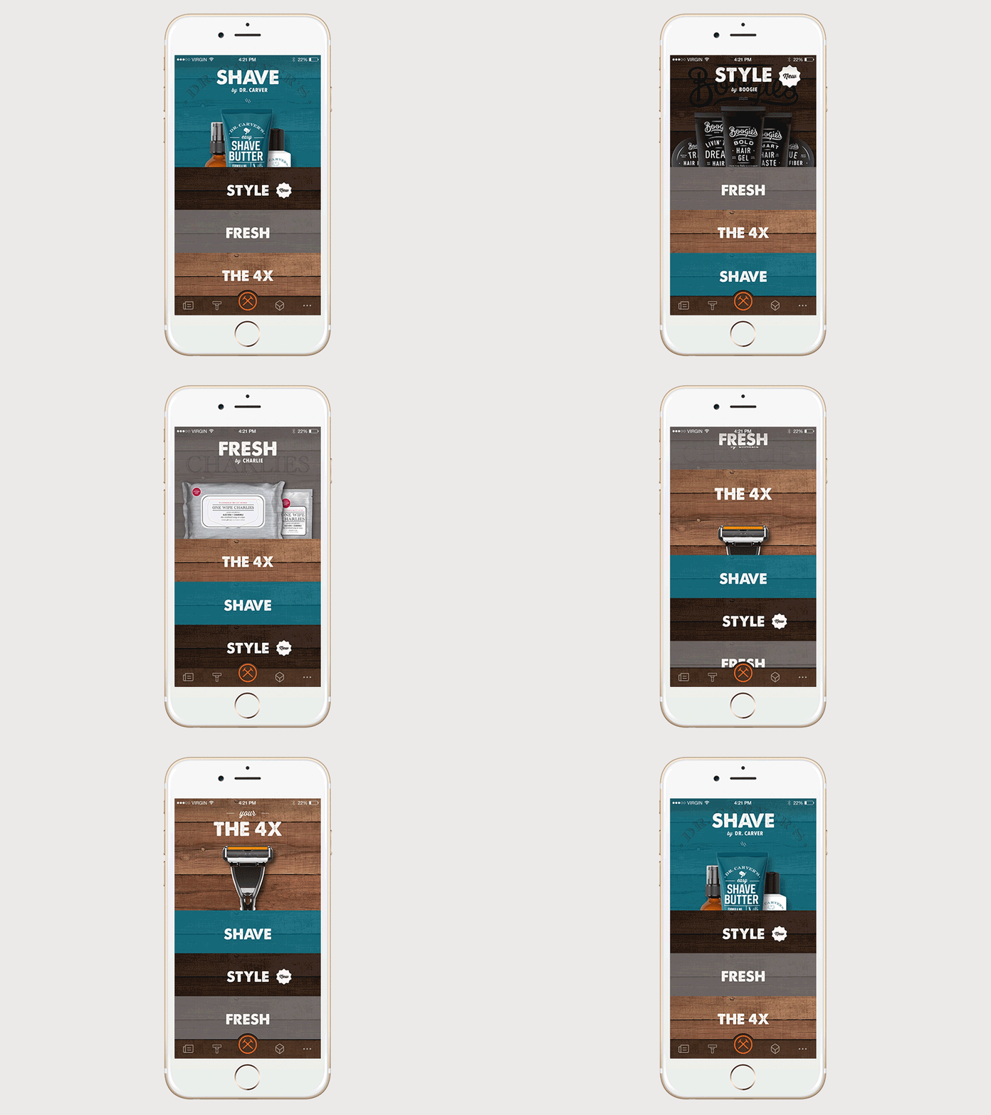
High-resolution screens are the norm now with most smartphones, which sets a bar of quality for the images you choose to use - particularly if you're using photography. For the iPhone X, you're working with a huge resolution of 1125 x 2436 pixels.
Pixellation and fuzziness will look unprofessional, but fortunately these are easy to avoid if you source some decent-quality assets. Always bear loading time in mind, however – people expect things to load in a few seconds – so don't overdo it. Make every image count.
Of course, sometimes it's inevitable that certain functions will take longer than that. That's where you need to think a bit more creatively, to make the wait more pleasant for the user – a loading spinner or progress bar is better than a blank or static screen. Another option is a 'skeleton screen' that loads information a piece at a time.
Sign up to Creative Bloq's daily newsletter, which brings you the latest news and inspiration from the worlds of art, design and technology.
02. Make savvy use of animation
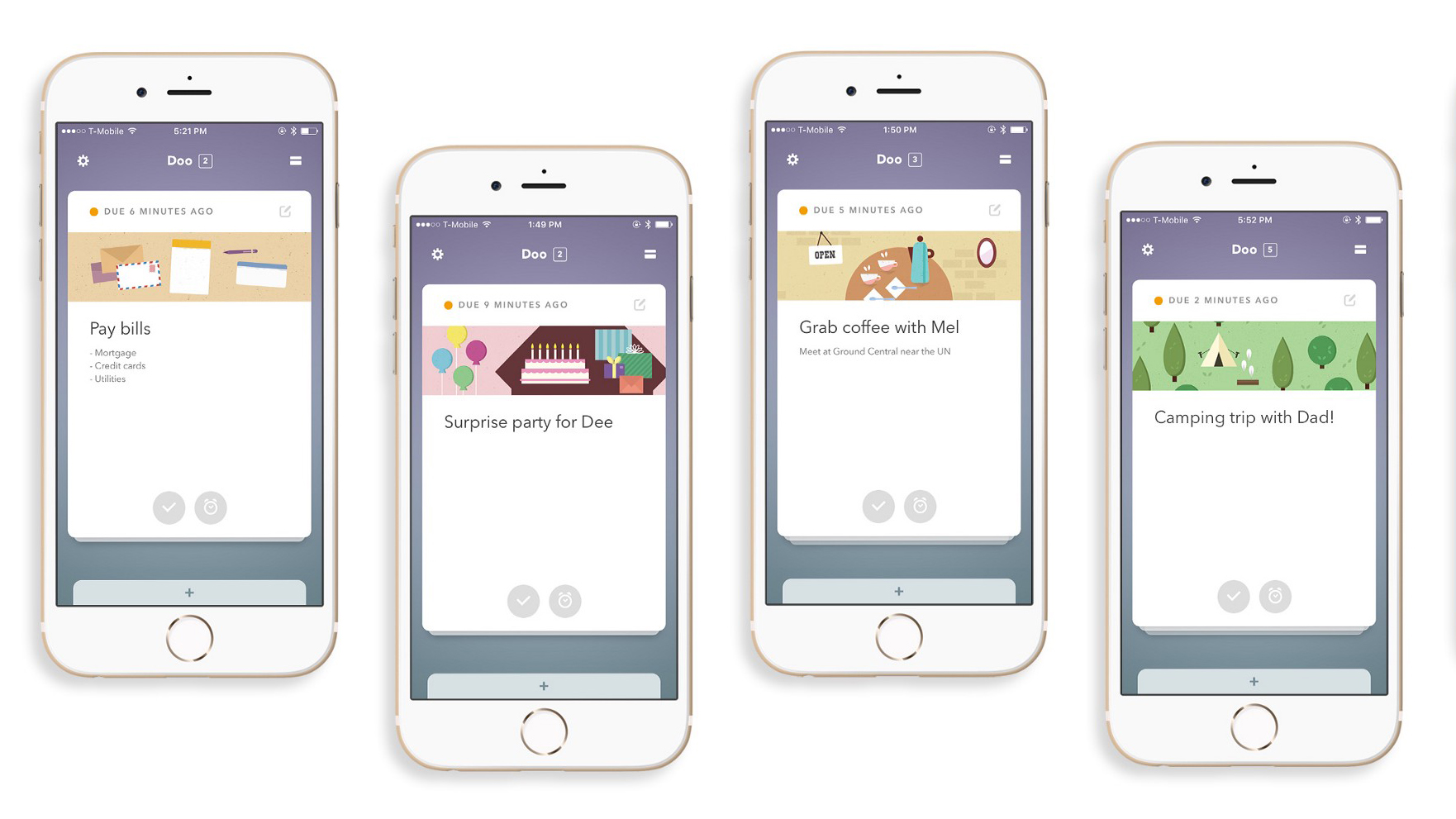
Even the most subtle hint of animation can add charm and personality to your app, whether it's as simple as a functional transition, or something more character or story-driven that can surprise and delight the user.
From a functional standpoint, animation can help people comprehend a state change in the app – what triggered it, the effect it's had, and how to initiate it again if necessary. It can also guide a user's attention to a particular point of the screen.
Certain functional animations have in-built associations. For instance, if an element vanishes, the implication is that it's been removed entirely. A transition whereby it slides off to the side implies that it's simply hidden, and can be returned to later.
The second type is known as 'delightful animation'. This adds warmth to your app, and makes it feel more human. It could incorporate anything from a playful treatment of a loading screen or progress bar, to tutorials about app features.
03. Pare everything back to basics
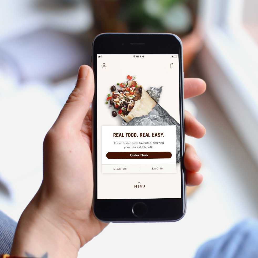
One of the most universal rules of app design is to cut the clutter. You're working with a relatively tiny screen, and the more buttons, options and functions that are present on the screen at one time, the less intuitive the experience will be.
Keep interface elements to a minimum, and only present the user with what they need to know. People want to perform tasks as quickly and efficiently as possible, ideally in a couple of taps, without scrolling through endless screens or inputting lots of data into complex forms.
04. Make all interface elements consistent
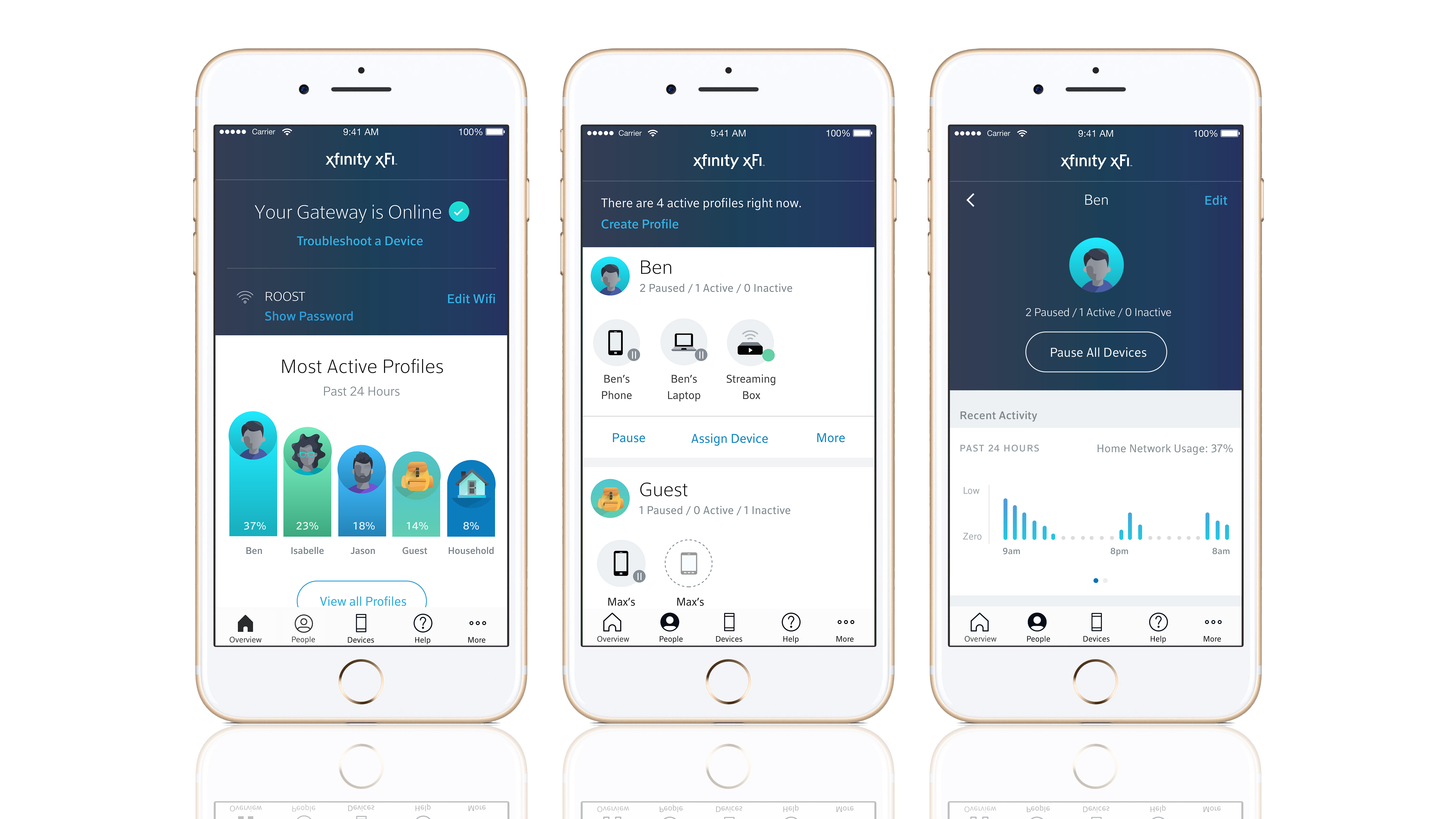
Consistency is also crucial, both in terms of visuals and functionality. A distinctive, coherent look and feel – even if the elements that define it are relatively subtle – helps users feel familiar and comfortable in the app, and ultimately make it easier and more intuitive to navigate.
From a visual perspective, this includes structural elements such as colours, typefaces, buttons and labels. But also the use of illustration or photography: the style chosen, its role in the interface, and how frequently it appears.
External consistency is important too. Where possible, an app should complement the look, feel and functionality of a brand's website – albeit simplified. Shared characteristics not only help avoid confusion, but also build brand recognition.
05. Design buttons with touch in mind
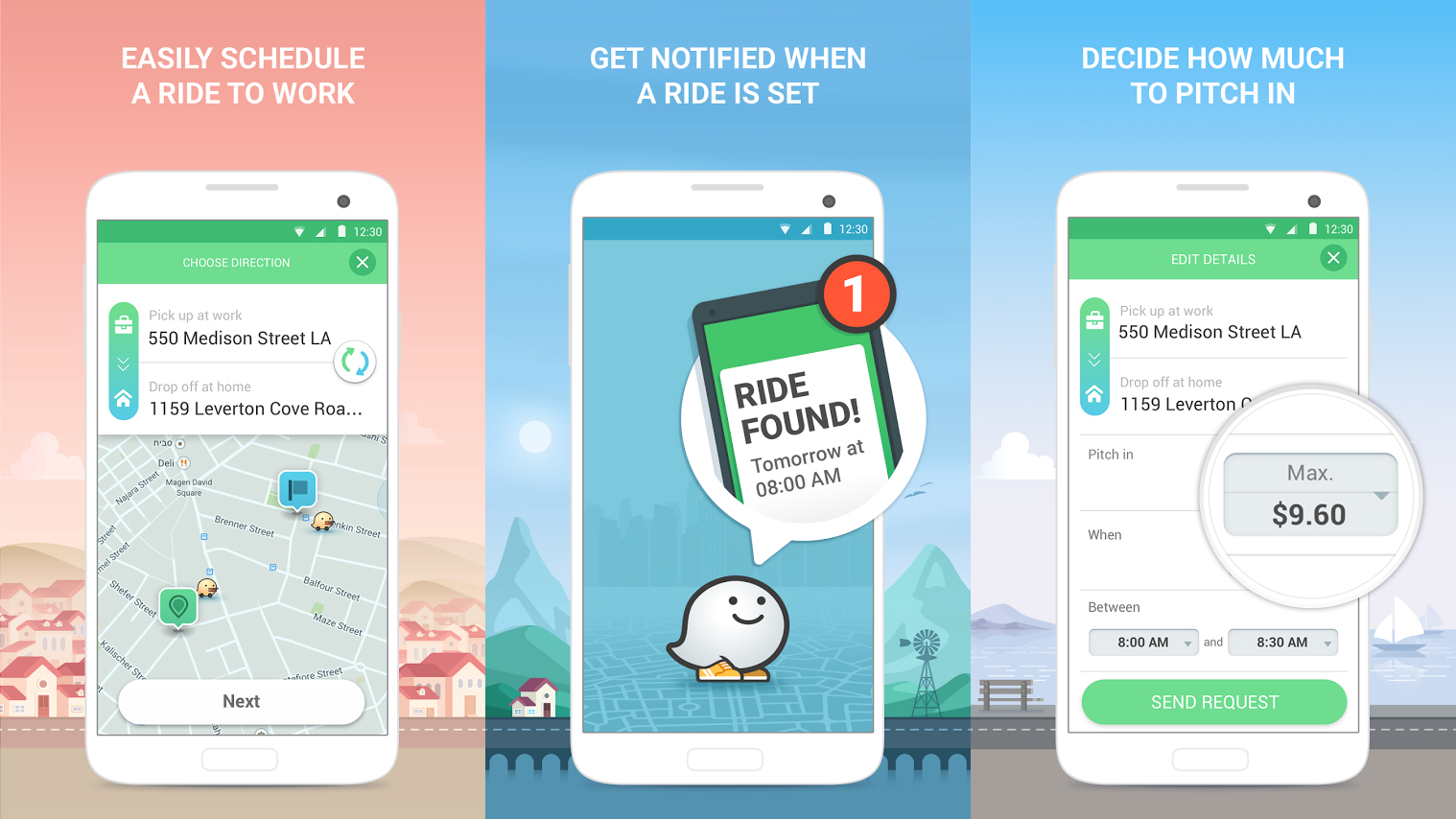
Another golden rule of app design is to design for touch screens, and particularly fingertips. Apple's guidelines state that buttons should be at least 44 x 44 pixels, but treat that as a minimum – if a buffer of an extra few pixels prevents the frustration of tapping the wrong thing, it's worth making room.
Also bear in mind the space between interface elements, particularly buttons and other functional, interactive parts of the design. Even if your buttons are a decent size, if they're bunched too close together it can make accidental tapping more likely, which can annoy users and make them more likely to abandon the app.
Different screen sizes are also a factor, particularly as high-end smartphones get larger. Held with one hand, certain areas of a larger screen are more challenging to reach than others, and may require stretching or even a readjusted grip.
Frequent interactions and key navigation elements should be comfortable to reach, while more risky options such as delete and erase – which users will want to avoid triggering by accident – make more sense to be placed slightly out of reach.
06. Create hierarchy with size and colour
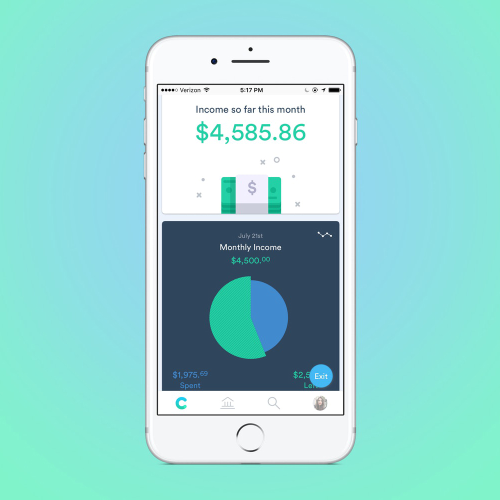
Aside from games, the majority of mobile apps are essentially lists of some form or another – lists of options; functions; things to do, watch or play. As an app designer, part of your role is to make that framework more interesting, and easier to navigate.
Even in a simple, pared-back interface with minimal design elements in play, it's important to establish a strong hierarchy to steer users towards the most important information, and make calls to action as clear as possible.
Size is one solution: the largest element on the page should, usually, also be the most important. But colour can be very effective too. If presented with a list of menu options graded from black to light grey, people will assume the darker colour is more important and gravitate towards that.
There are certain associations to bear in mind, too – particularly the colours red and green. A 'confirm' button in red next to a 'cancel' button in green will confound users' expectations and confuse them. According to W3C's accessibility guidelines, however, colour should never be the only signifier: text labels, or icons such as ticks or crosses, all help make your design accessible.
Related articles:

Nick has worked with world-class agencies including Wolff Olins, Taxi Studio and Vault49 on brand storytelling, tone of voice and verbal strategy for global brands such as Virgin, TikTok, and Bite Back 2030. Nick launched the Brand Impact Awards in 2013 while editor of Computer Arts, and remains chair of judges. He's written for Creative Bloq on design and branding matters since the site's launch.
