5 traits that define a typeface’s personality
Small details in your chosen font can make a big difference to its character.
Typography can have a crucial impact on a design’s effectiveness, and choosing the right typeface can also have a big impact on a brand’s personality, introducing subtle variations in its tone of voice, depending on the font used.
For instance, geometric, sans-serif typefaces with homogenised proportions feel pure, clean, slick and modern – which is why so many technology brands embrace them. High-end fashion brands, however, will often opt for timeless elegance, using high-contrast typefaces with smooth curves, hairline strokes and edgy, bracketed serifs.
These are two fairly extreme examples, but the fact remains that the details of a typeface – such as contrast, proportions and angles – can have a big effect on its emotional characteristics.
Article continues belowTo help you decide, here are five questions you should ask of any typeface you’re considering…
01. Is it serif or sans serif?
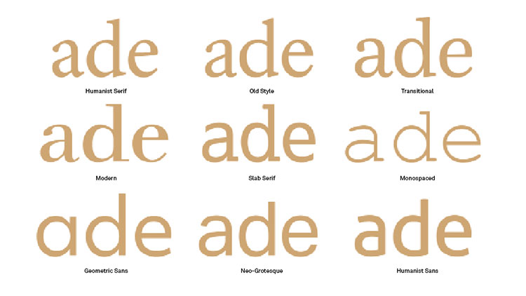
This is a pretty top-level decision, being one of the most obvious at-a-glance differences between typefaces. Purely for practical reasons, serifs are considerably better for large bodies of text as they tie words and sentences together for a smoother, more legible reading experience.
Their origins give them character, too. Serifs hark back to the days of carved inscriptions in ancient civilisations, giving them a certain gravitas, class and cultural weight.
Sans serifs, meanwhile, are a considerably more recent invention, first emerging in the 19th century for commercial use in advertisements, and latterly on screens (which struggled to render the finer details of serifs until relatively recently).
Sign up to Creative Bloq's daily newsletter, which brings you the latest news and inspiration from the worlds of art, design and technology.
In very simple terms, whether you should choose a serif or a sans serif depends on whether you’re looking for cool, clean modernity, or timeless, classical authority.
02. Is it high or low contrast?
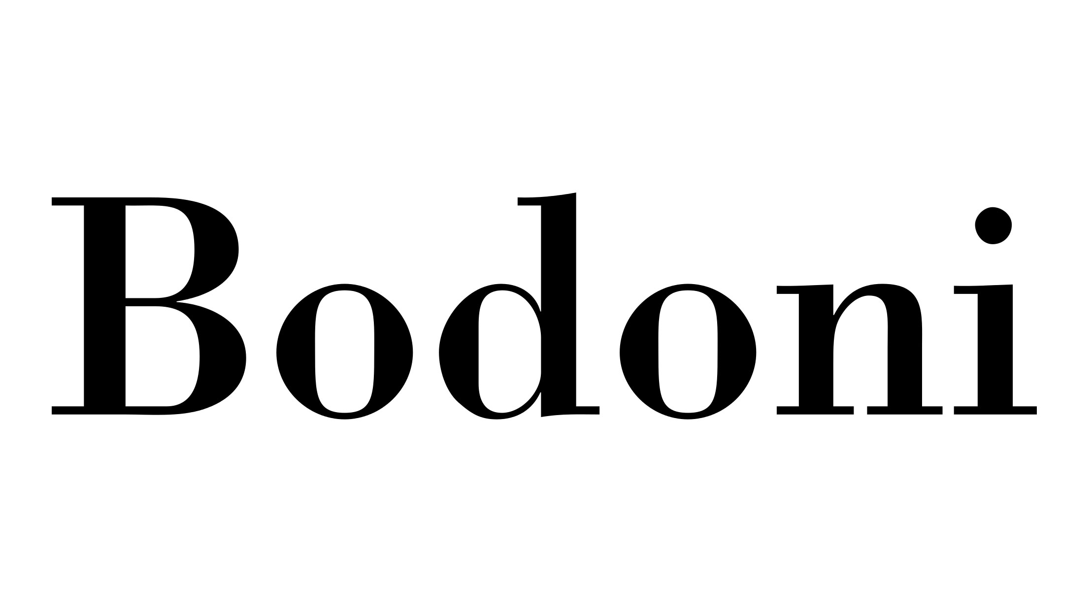
Contrast, in type terms, simply means the variation between thick and thin strokes in each letterform – a skill perfected by hand by calligraphers.
As a rule, very high-contrast fonts suffer the smaller they get, with the thinner strokes disappearing altogether if they’re scaled down too much. This makes them almost exclusively the preserve of display fonts, where their distinctive attributes can be appreciated.
At the other end of the scale, very low-contrast fonts are solid and uniform, again making for a strong statement when blown up large, but suffering for the opposite reason when used small, as individual letterforms lose definition and become blocky.
When it comes to personality, high contrast fonts – similar to serifs – can help convey dignity, refinement and elegance, rather like the calligraphic script that inspired them. Low contrast fonts have more in common with sans serifs, and are solid, confident and powerful.
While they share similar characteristics, they are not directly interchangeable. To achieve the nuanced character you’re looking for, a high-contrast sans serif or a low-contrast serif may be suitable.
03. Does it have diagonal or vertical stress?
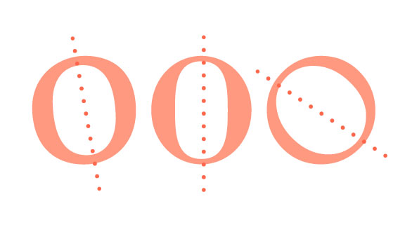
Here’s where it starts to get a little more complicated. The stress (or axis) of a font refers to the angle at which contrast occurs in its letterforms – this is usually either vertical, or diagonal.
The easiest way to determine this is by studying how the letter ‘O’ is drawn in the typefaces you’re considering. Is the bottom left thicker than the top left, or vice versa? If so, it has diagonal stress – another calligraphic throwback, with a traditional, wholesome heritage that feels warmth, friendly and inviting.
Conversely, if the contrast of the ’O’ is split horizontally, so the sides are thicker than the top and bottom, that means it has vertical stress. These characters feel bold, modern and confident, particularly at display sizes. However, they do run the risk of feeling clinical and cold compared to their vertically stressed counterparts.
04. What are its vertical parameters?
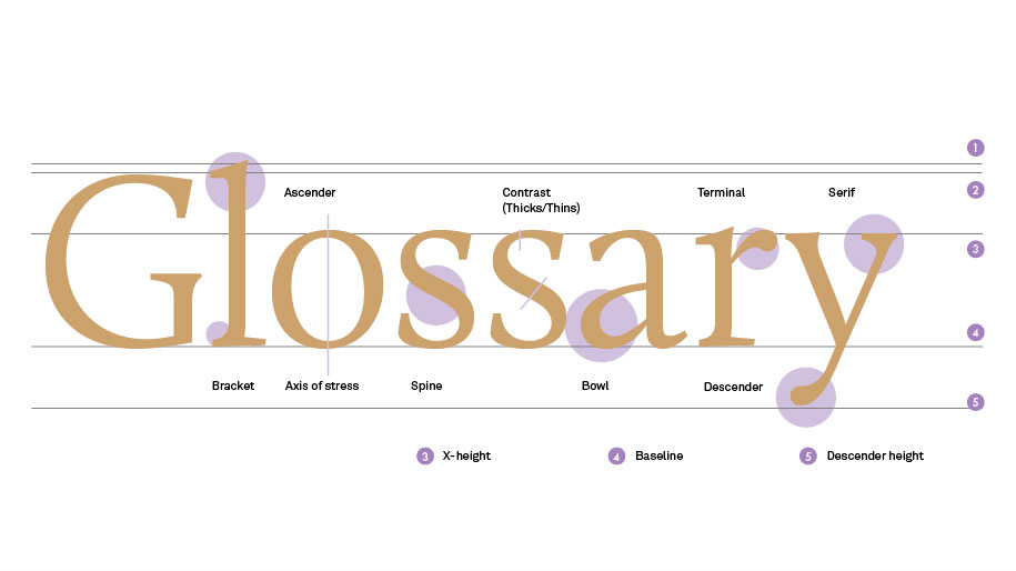
You’ll often hear type designers talking about ‘x-height’ of a font. Combined with the height of its ascenders and descenders, this can have a significant impact on both legibility and personality.
As a rule, the shorter or taller a font’s ascenders and descenders, the more distinctive it becomes, but also the more effort it takes to read. Fonts with a particularly tall x-height have clearly defined individual characters as a result, but often at the expense of word and sentence legibility.
Short x-heights have the opposite effect. Although each character might lose definition by being squashed down, particularly in bolder weights, the overall shape of words and sentences flow more easily.
So how do you achieve the perfect balance? That depends largely on the intended use, so consider this from the outset. The font needs enough x-height for lowercase letters to be defined clearly at the sizes you need it, particularly complex letters such as ‘a’, ‘e’ and ‘s’.
05. Does it have open or closed counters?
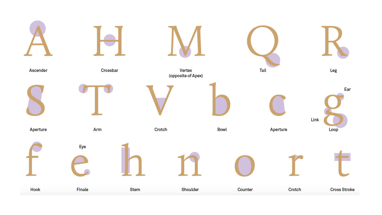
As well as the vertical lines of a font’s ascenders and descenders, the curves that define its counters – the areas of letters that are entirely or partially enclosed, such as the inside or a ‘p’, ‘b’ or ‘d’ – go a long way to shaping its personality.
Pay particular attention to whether these counters are open or closed. While the examples above are almost always closed, when it comes to a lowercase ‘g’, for instance, different variations have either two closed counters, or one open and one closed counter.
Similarly, lowercase ’a’, ‘c’, ‘e’ or ’s’ letterforms may have tightly hooked outer loops that create almost entirely closed counters inside. This can bring a distinctive twist to a font, but often at the expense of its legibility – particularly at small sizes.
An enlarged x-height can help here, as can more extreme contrast to make the definition between different parts of the letter clearer. In short, it’s only by balancing all five of the above factors that you’ll find the perfect typeface for your particular needs.
Read more:

Nick has worked with world-class agencies including Wolff Olins, Taxi Studio and Vault49 on brand storytelling, tone of voice and verbal strategy for global brands such as Virgin, TikTok, and Bite Back 2030. Nick launched the Brand Impact Awards in 2013 while editor of Computer Arts, and remains chair of judges. He's written for Creative Bloq on design and branding matters since the site's launch.
