The best logos of the 2000s
Born in a decade that changed advertising, the best logos of the 2000s ranged from vibrant and fun to edgy and futuristic.
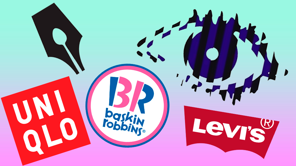
The best logos of the 2000s came at the dawn of a new millennium, when the internet revolution was spreading further and wider. Flashy fashion’s logomania was en vogue, the likes of Facebook (and MySpace) brought a new dimension to networking and consumerism, and there was a proliferation of new tech, including camera phones, and iPods.
Hand in hand with this came a boom in digital marketing, which contributed to the Y2K graphic design aesthetic. We saw vibrant hues, colour gradients, 3D shapes, neons, metallics, thick typefaces and futuristic or novelty elements. At times, it was brash and chaotic and yet many of the era’s logos endured beyond the noughties.
Here, in no particular order, designers and industry experts pick some of their favourite logos of the decade. See our video list below and then read the words from the pros who picked them. Next, explore our posts on the best logos by decade. Also see our guide to the best logos of all time.
Article continues belowThe best logos of the 2000s
01. The Levi’s logo

“The Levi’s logo we see today was designed in 2003 by Walter Landor and still feels incredibly fresh and iconic. Fortunately for everyone, they resisted the appalling 3D trend that plagued the 2000s where everything had to be a button or a badge,” says Leigh Chandler, creative director of creative agency Sister Mary. “I love how it takes inspiration from one of the most iconic aspects of the brand — the batwing stitching on the back pocket of a pair of Levi’s.” (The batwing first appeared in the iteration prior to this one, designed in 1967.)
“The logo is versatile enough to be simply embroidered on clothing, constructed in 3D for signage, or filled with variable graphics for campaigns,” she adds, “the silhouette and typography featuring the signature lowercase ‘e’ are still instantly recognisable.”
With a little red mark acting as a universal symbol for blue denim jeans, Levi’s also uses the same white lettering on red stacked vertically on labels for clothing. Alongside the current logo, the ornate 1892 badge also appears on the back of jeans, featuring the full brand name, Levi Strauss & Co, and graphic element of horses trying in vain to pull the jeans apart. The folded trademark R, which first appeared due to lack of space on small labels, has since become a signature of the brand.
02. The Channel 4 logo
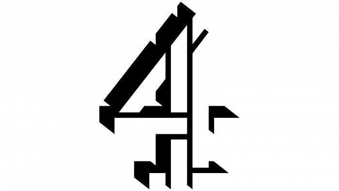
“I love this logo as the designers (Rudd Studio) brought back elements from the original (designed in 1982 by Lambie-Narin, Bo Gehring and Associates) that I remembered moving around on screen during my childhood,” says Rebecca Harrison, creative director at illustration and animation agency Loveblood Creative.
Sign up to Creative Bloq's daily newsletter, which brings you the latest news and inspiration from the worlds of art, design and technology.
When animated on air, this 2004 logo for Channel 4 was always in motion, forming for a brief moment as the number four and splitting apart again, similar to the multi-hued version when the channel launched. Off air the contoured image made use of negative space and shadows to create a 3D effect.
“Typical of many brands in the 2000s, it was a time for stripping back. After years of gradients and over-complicated designs this was the beginning of the ‘back to basics’ logo movement. What I love about this logo is that it formed the basis of a brilliant brand system that allowed designers to create a series of ‘real world’ 3D stingers that, though still 3D, had none of the overused ‘Y2K Microsoft Windows 2000’ feel. It was modern, crisp and memorable.”
03. The Uniqlo logo
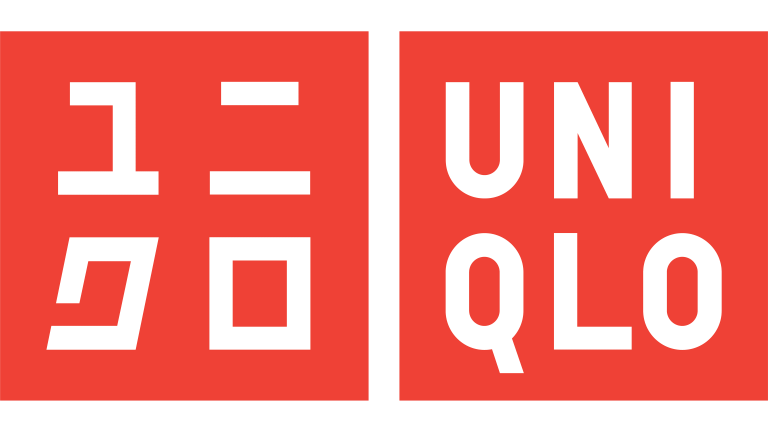
“In the mid-2000s, the Japanese fashion chain Uniqlo began its expansion into Europe and the USA. Designer Kashiwa Sato created a new logo in 2006 that harmonised the Japanese and Western spellings of the name set in two rows and placed in white in a red square,” says graphic designer Jens Müller, author of Logo Beginnings, Logo Modernism and The History of Graphic Design. “The design solved many of the brand’s communication challenges with ease and at the same time made a strong visual statement.”
Other links to Japan include the colour scheme being the same as the nation’s flag, in a move away from earlier logos for the clothing brand, in a deeper wine red. The logo is also reminiscent of modern Japanese name seals, rooting it further still in the Japanese aesthetic.
04. The Reebok logo

As one of the oldest sportswear brands, there have been many iterations of Reebok’s logo, in various fonts with a variety of emblems — including the familiar “vector”, said to be an abstract take on the union jack (the flag was also part of an earlier version). In a move to engage with youth culture, the branding became Rbk in 2004, which was ditched in favour of the original spelling in 2008 to celebrate 50 years of the brand.
“Reebok’s logo underwent a significant transformation, reverting to a type treatment from the late 1970s that extended into the 1990s while shedding many graphic elements. This change initially proved successful before they reintroduced symbols and marks alongside the typeface. While the 2008 rebrand isn't my all-time favourite, I highlight it for a couple of reasons, one of which is its capacity to evolve for new generations,” says Dyneisha Gross, graphic designer for Ogilvy.
“The brand learned from the trends of the early 2000’s and shifted to something simple. Sometimes (or maybe most of the time) less is more,” she adds. “When competing against the Apple of athleisure wear and shoes — Nike — Reebok found ways to reinvent and bring style to their marketing and campaigns launched in 2008.”
05. The Big Brother logo
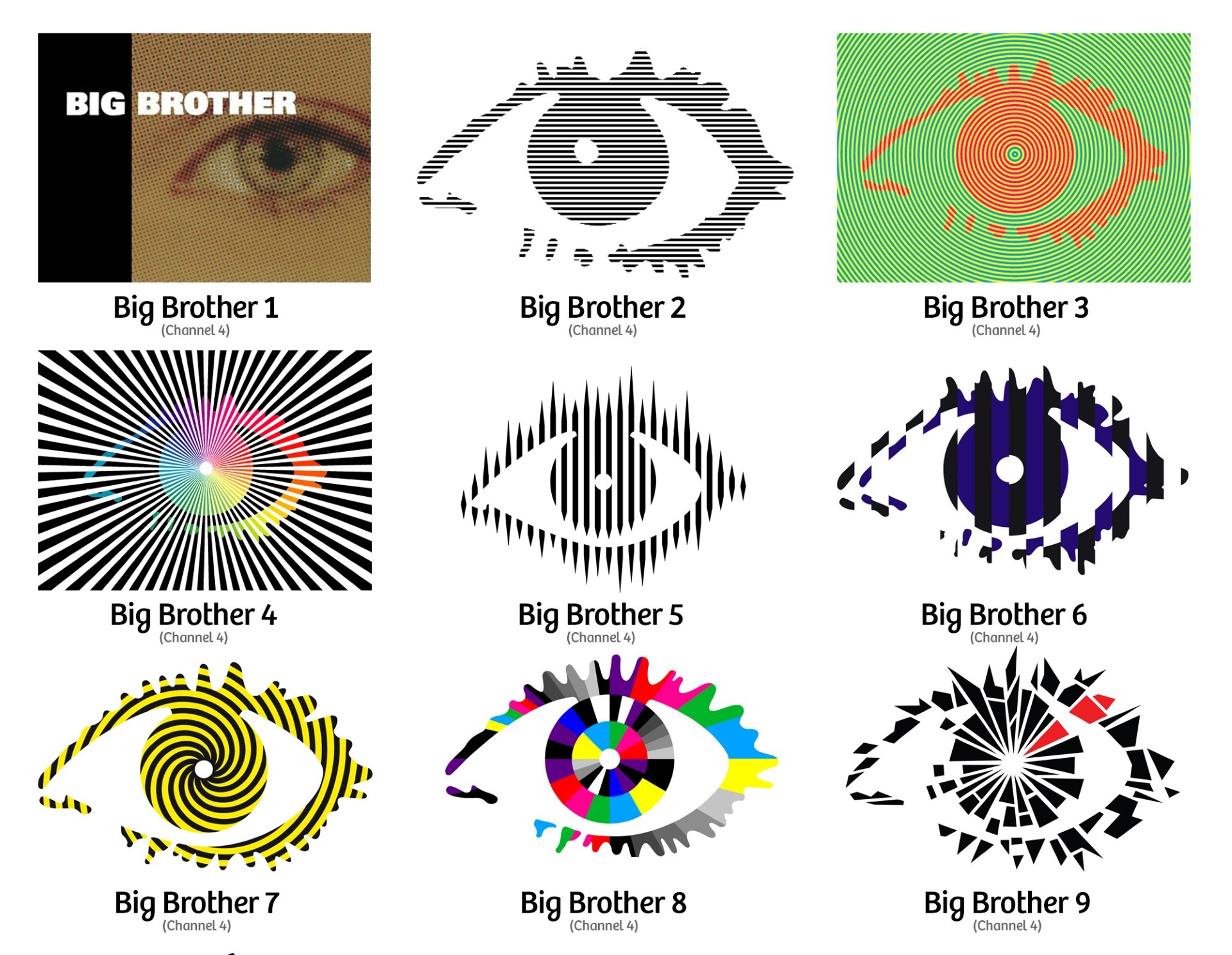
Growing up, Connor Edwards, senior designer at Jack Renwick Studio, remembers pushing his luck each night to stay up late enough to watch strangers living together in a house surrounded by cameras filming them 24/7. “In the 2000’s, one show captivated audiences across the UK more than any other. The fly-on-the-wall TV series ‘Big Brother’ was new, exciting and edgy,” he says. “After the first series, designer and conceptual artist Daniel Eatock was commissioned to design the show’s identity moving forward. Despite not thinking the show needed a logo, Eatock’s now iconic eye perfectly captured the premise of the show and the intrusive feeling of being under constant surveillance.”
“Over subsequent years the eye logo took on different looks that reflected the editorial direction of each series. In this way, it became more than a logo for a TV show, to me it captures the changing aesthetic across a decade, with each new treatment adding to the ominous feeling of the eye as a lens,” Edwards adds. “With my favourite iteration being the hypnotic radial moiré effect of the third series, it’s hard to tell if it’s to the credit of the logo or the depravity on screen that I simply couldn’t look away.”
The Big Brother 2023 logo for the franchise's relaunch in the UK attracted criticism, with some fans saying it was too loud and colourful.
06. The Guild of Food Writers logo
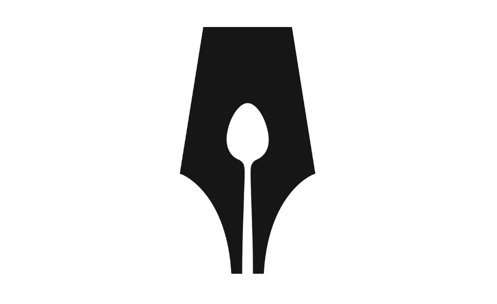
The Guild of Food Writers was founded in 1984, with the aim of bringing together professional food journalists, broadcasters and authors, at events and via forums in order to help uphold excellence in food writing and culinary education — whether through writing and publishing or lobbying and campaigning for better food awareness. The symbol combines the two aspects of the organisation, depicting both a pen and a spoon in one clever logomark.
“This is one that comes up regularly when designers are asked to name a favourite logo. For good reason. [Design studio] 300million may be no more, but the clever twist to incorporate a spoon in the negative space of the fountain pen nib will always endure,” says David Airey, logo designer and author of books including Logo Design Love and Identity Designed.
07. The Arsenal logo
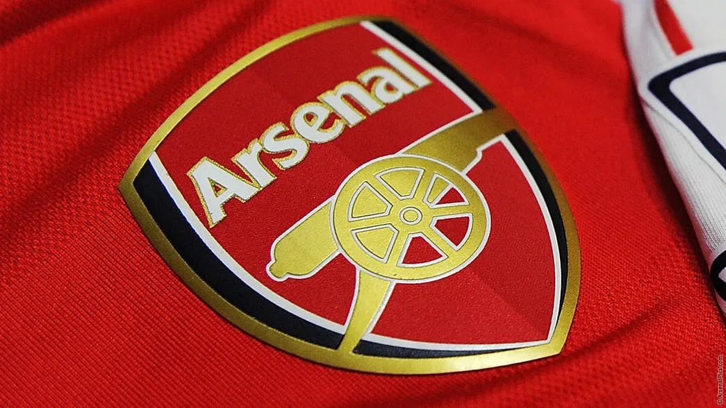
“One of the main drivers for the change [in 2002] was commercial, as Arsenal had been unable to copyright the previous badge that had been used for over half a century because various elements (like the Islington coat of arms) had been added over the years and therefore establishing its origins was difficult,” says Bill Wallsgrove, brand strategy consultant and creative director of design studio Brandad. “I was at the ground when the new brand logo was displayed to the fans on large banners walked around the ground. The reception was very mixed. Fans still argue over which direction the cannon should face — west or east?”
With the badge’s 2002 redesign, by brand experience agency 20•20, the cannon was turned to face right (forwards), in a decision made in connection with a court case over copyright infringement, with the solution being changing the cannon’s direction. “That’s when the cannon reverted back to the same direction it briefly faced between 1922 and 1925, when it first appeared on the club logo. Like the Art Deco logo that was embedded into the new Emirates stadium I suspect the lone cannon might become the new simplified identity over time. Whenever, and wherever, I wear the cannon pin badge on my jacket, people comment on it: ‘You’re a Gooner!’ ‘Yes,’ I proudly reply.”
08. The Baskin Robbins logo
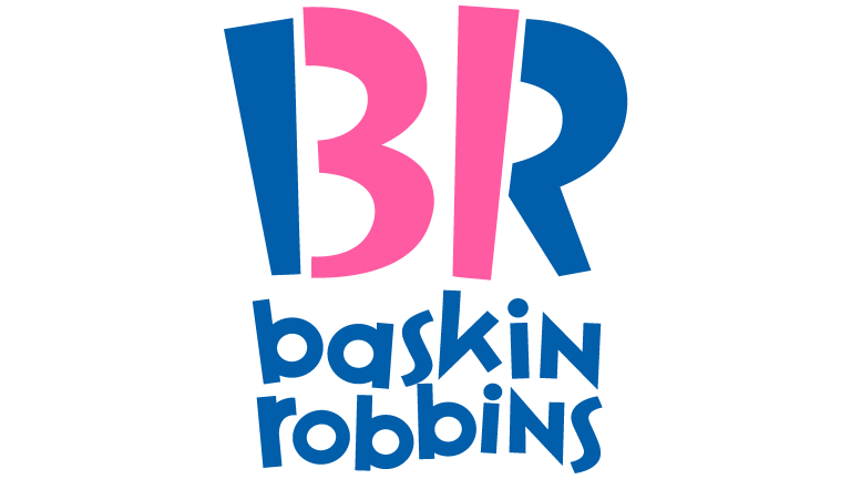
“The Baskin Robbins logo that was introduced in 2005 is often featured within blog posts that share hidden meanings within logos due the concealed ‘31’ within the BR monogram, referencing its famous ‘31 flavours’ slogan. This [brand identity] was established as part of the company’s 60th anniversary, and aimed to capture the fun and energy of the company,” says Ian Paget, graphic designer and founder of design firm and blog Logo Geek.
The company's first logo appeared in 1953, after ice cream parlour owners Burt Baskin joined and brother-in-law Irv Robbins officially joined forces. The playful pink varied in hue through the years, and various blues introduced from the 1990s onwards, but the slogan, thought up by ad agency Carson Roberts (later bought by Ogilvy & Mather), remains the same to this day and has been a clear influence in all the iterations.
09. The Snookerhallen logo
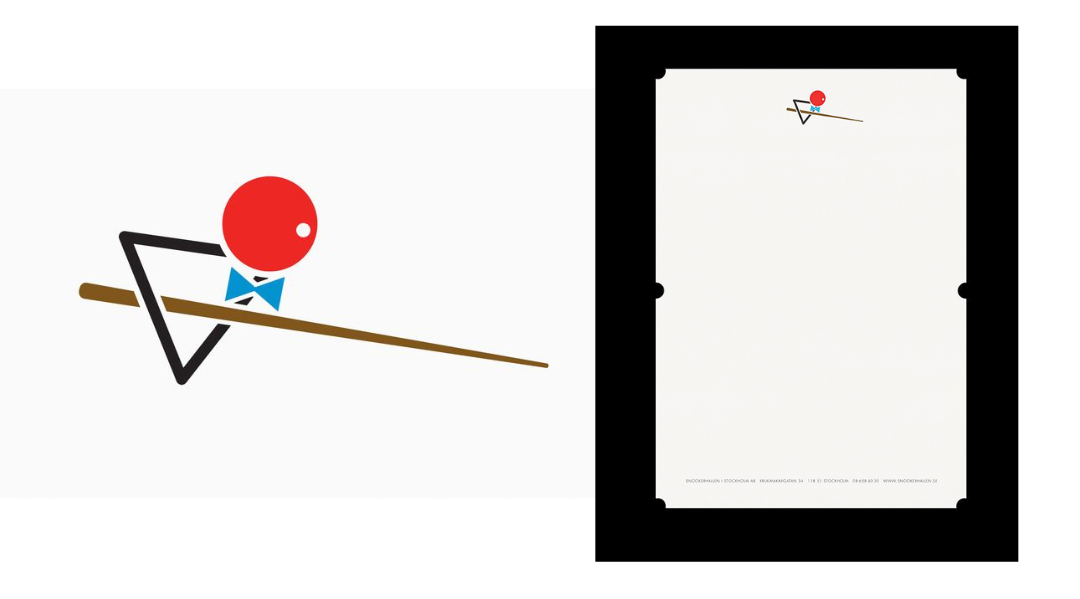
“Firmly among my all-time favourite logos, the Snookerhallen Logo by Stockholm-based design and branding studio Bedow stands out as an absolute masterpiece. Crafted solely from the tools of the game, it encapsulates the essence of joy in its purest form,” says John Randall, senior graphic designer at design agency Magpie of the 2007 logo designed for the snooker and pool club in Stockholm, Sweden.
“What makes it even more remarkable is its brilliant application in print, with die-cut elements alluding to holes on a table. It's a stroke of genius that really leaves you wishing you had thought of it first. Perniclas Bedow and his team landed this one right in the pocket.”
10. The Delta Air Lines logo

This 2007 rebrand for Delta by creative consultancy Lippincott Mercer, including the new all-red 'Delta Widget' symbol, was the last in a line of more than 20 logos during the airline's almost 100-year-long history.
“I remember being particularly amused by the ‘3D but flat’ approach to the new symbol introducing depth and dimension with one simple colour shift, avoiding any gradient tricks or effects that would certainly feel dated today,” says John Clark, co-founder of strategy and design studio Team.
“I think about this rebrand a lot for one reason: the bold colour choice. At the time of this rebrand in 2007, Delta had just emerged from bankruptcy after fending off a hostile takeover from US Airways. Public companies, especially those wary of being “in the red”, are terrified of the colour (a reason why the corporate landscape is awash in blue, a colour purportedly associated with reliability). Colour theory in branding is mostly garbage, and the Delta logo is a wry nod to prioritising customers over shareholders.”
For more recent logo designs, see our pick of the best new logos.

Antonia Wilson is a freelance writer and editor. Previous roles have included staff writer for Creative Review magazine, travel reporter for the Guardian, deputy editor of Beau Monde Traveller magazine, alongside writing for The Observer, National Geographic Traveller, Essentialist and Eco-Age, among others. She has also been a freelance editor for Vogue and Google, and works with a variety of global and emerging brands on sustainability messaging and other copywriting and editing projects — from Ugg and Ferragamo to Microsoft and Tate Galleries.
You must confirm your public display name before commenting
Please logout and then login again, you will then be prompted to enter your display name.
