Create a striking wildlife image with pastel
Discover the process of developing fur and eye detail with these fascinating techniques.
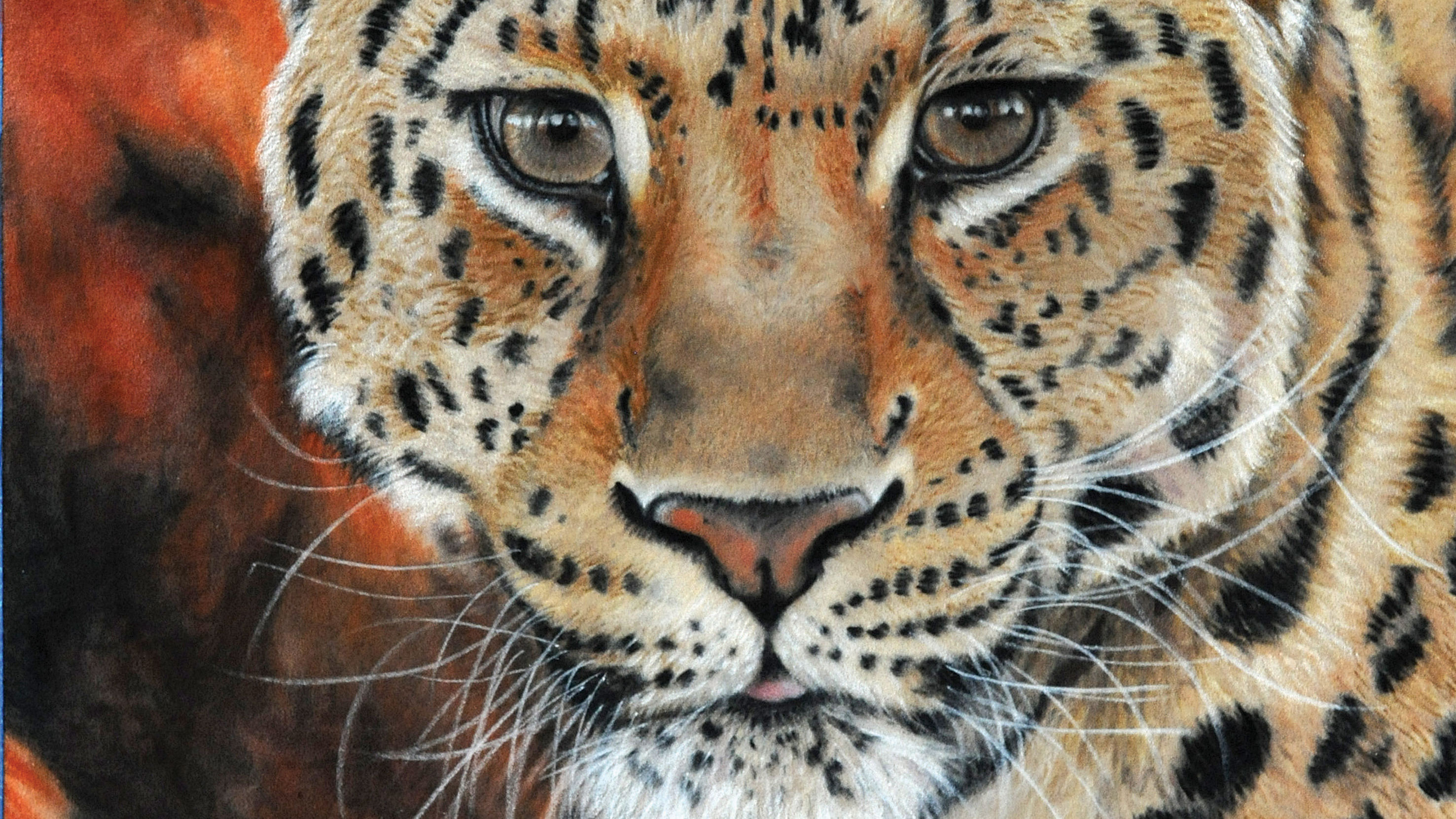
Working with pastels on velour is a bit of a “Marmite” subject. I often hear comments about the difficulty of how to draw detail on velour, but it’s one of my favourite surfaces to work on, so I hope to give another perspective on it and encourage you to have a go. Velour can take plenty of layers of pastel, allowing you to create rich colour and depth in your work.
Also, the nature of the surface helps create the natural textures found in the great outdoors, so it’s a good choice for rendering wildlife. If you have difficulty adding in details on velour, I find that having sharp pencils really helps – so scalpel and sanding block at the ready!
For this project, I chose this stunning reference image of a Chinese Leopard because I love the vibrant colours and the expression on the cat’s face. Typically I work from a digital reference because I can zoom in and out for detail, but I also print off colour and a greyscale copies – the greyscale is handy for checking tonal values.
Article continues belowIf you are going to paint from a photo, make sure you have the photographer’s permission. This image was taken by my talented husband at the Wildlife Heritage Centre in Kent, so a plate of homemade cakes secured the rights...
01. Transferring the image
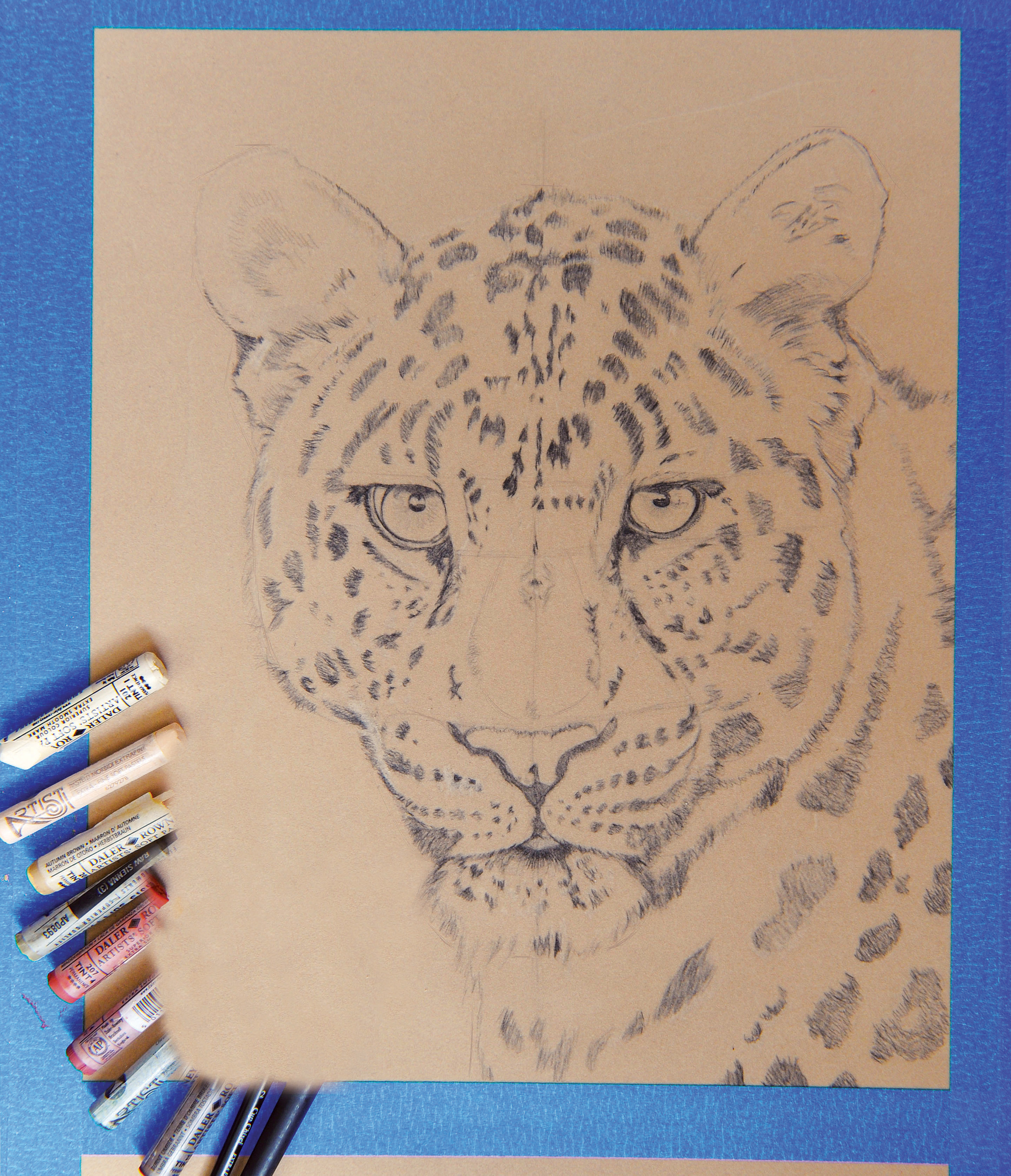
You can sketch directly onto the velour, but it’s often very difficult to make corrections if you are not a confident drawer, so tracing from your sketch can be a good alternative. I use proportional dividers to ensure that I get the correct proportions, because I enlarged the image directly onto velour using a 2B pencil. I work from both colour and greyscale printouts, as well as a digital reference photo.
02. Block in the background
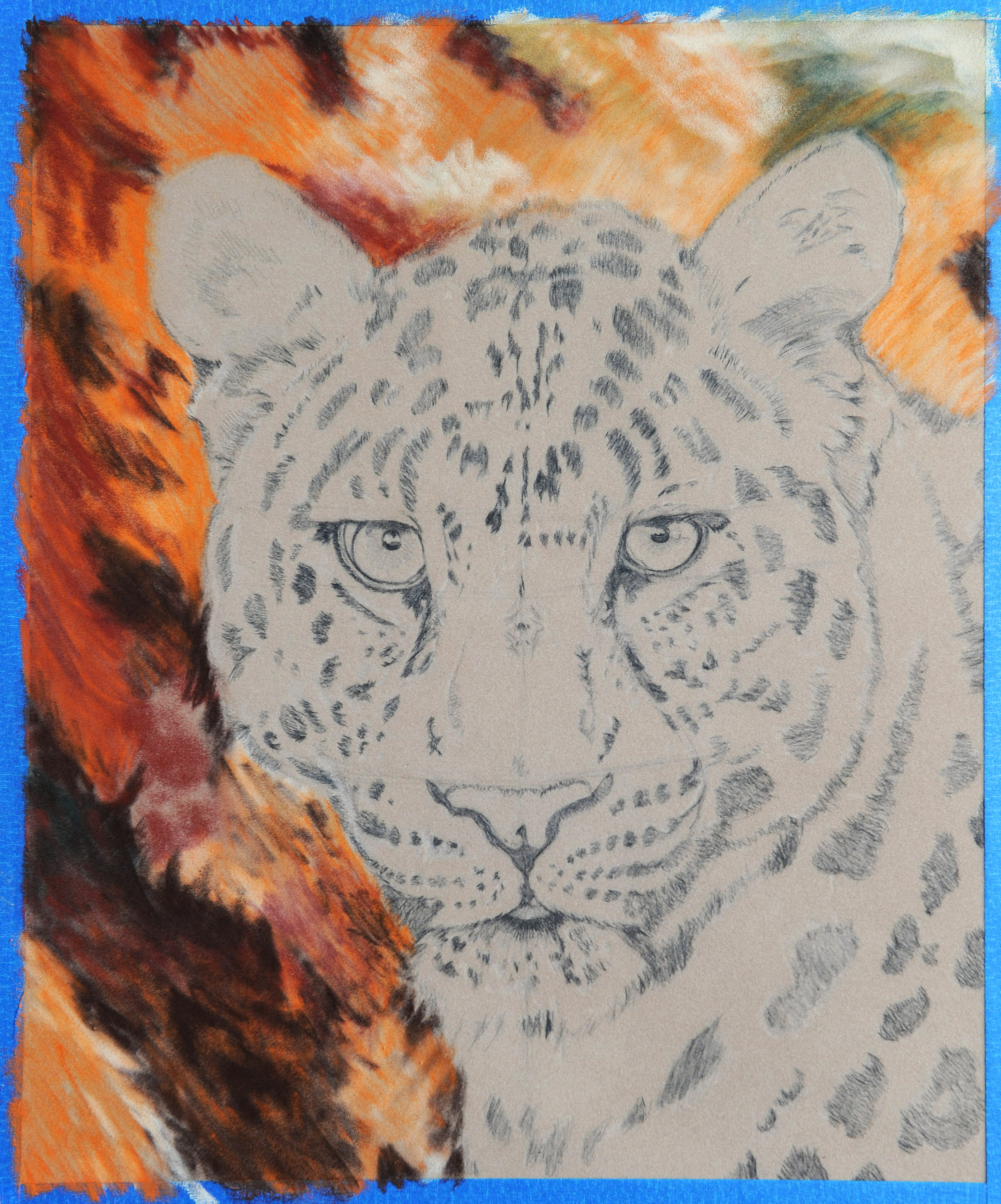
I usually begin with the background – this allows me to better judge the colour balance of the main subject (plus I’d smudge the leopard if I painted it first!). I start with Burnt Umber 4 and Madder Brown 4 pastels to develop the darkest areas in the background, then I use Autumn Brown 1 for the lightest areas. I fill in the gaps with Conté Orange.
03. Blending the background
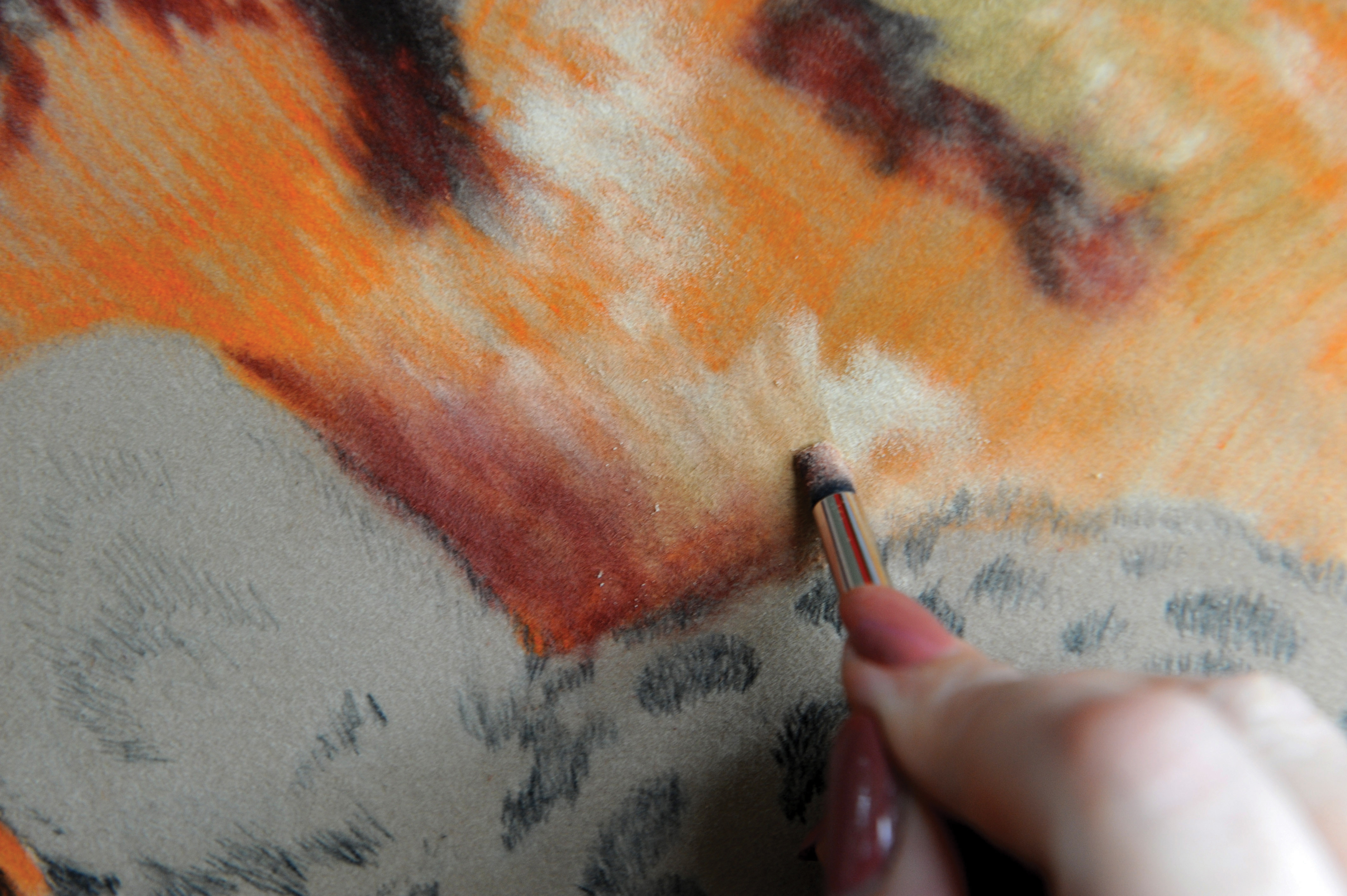
The background currently looks very patchy, but stay with it – it’s now time to blend. The goal is to sufficiently blur the hard edges and transitions between colours to preserve the shallow depth of field. I use a hard (black) colour shaper so that I can apply a bit of pressure. I adjust colours as I go and, when I’m happy with the result, I’m ready to move on to the main subject.
Sign up to Creative Bloq's daily newsletter, which brings you the latest news and inspiration from the worlds of art, design and technology.
04. Quickly block in dark areas
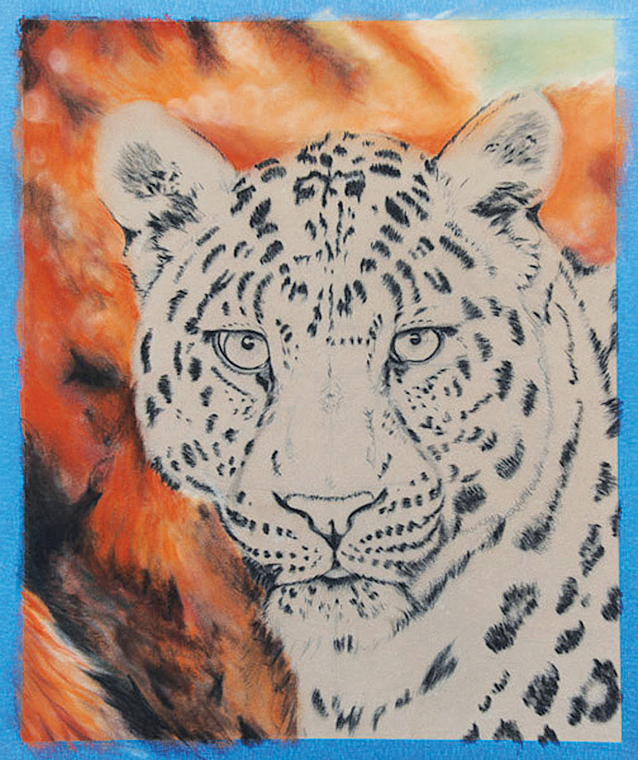
For the main subject I’ll change to pastel pencils. Depending on the brand, they can vary greatly in hardness and saturation. For the under-painted layers I mainly use Caran d’Ache as they have a beautifully creamy consistency and give lovely strong colour. The first thing I do is quickly block in the darkest areas with black, so that I don’t lose the positioning of the spots.
05. Working on the eyes
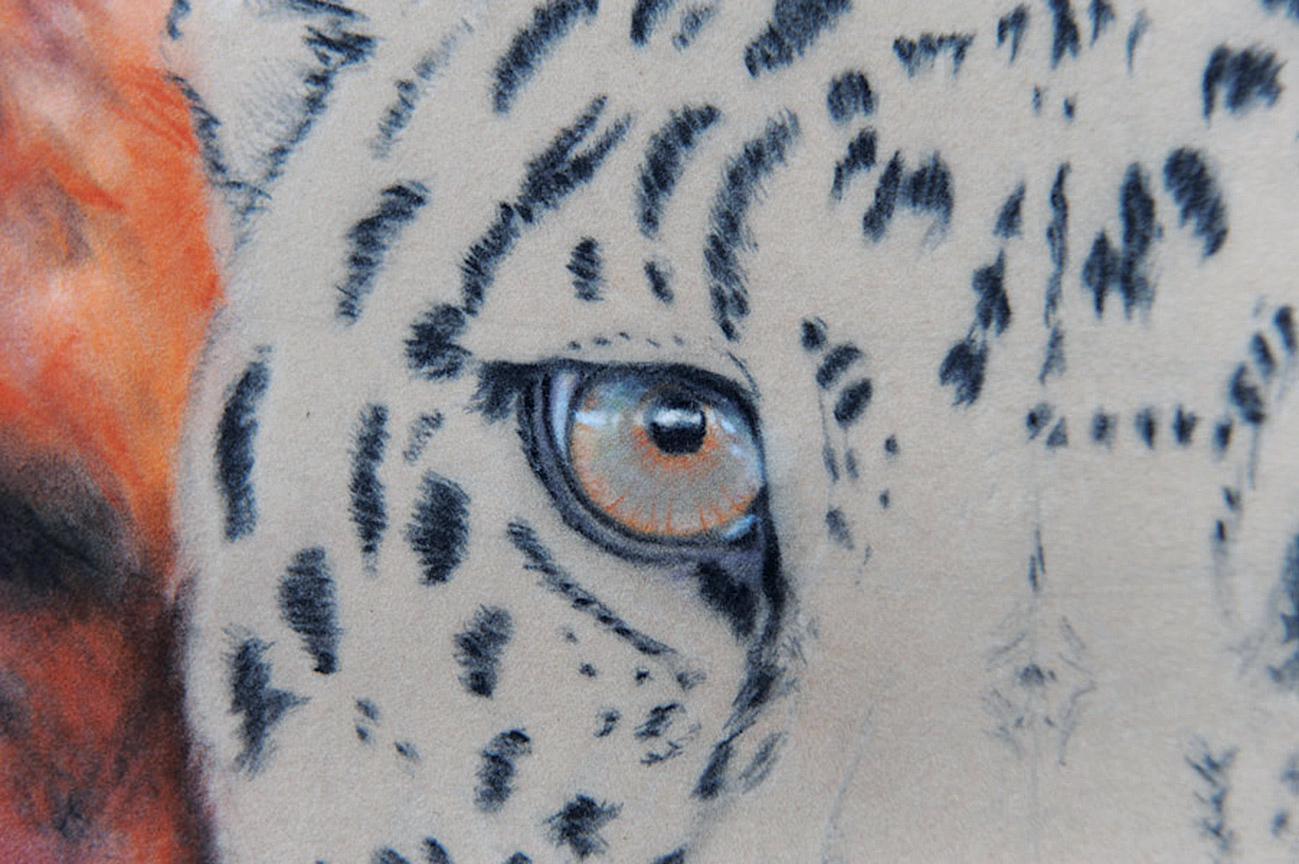
The eyes are my favourite part – this is where you can start to breathe life into the subject. I start with the orange because it’s quite a fierce colour and will be subdued by the other colours of the iris. Carefully observe the highlights and the shadows because they are key to making the eyes look real.
06. Iris and highlights
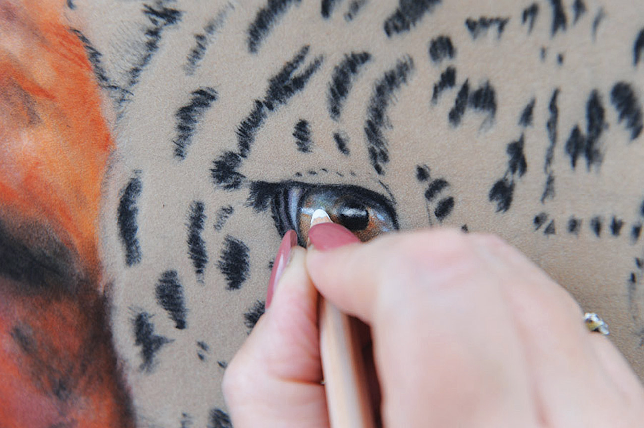
The highlights are reflections of what the leopard is looking at. When this shot was taken, there was blue sky with white clouds, so the highlights are made up of a very light blue with white. The eye itself is obviously nestled in an eye socket, so I need to capture the shadow that the eyebrow will cast over the top of the eyeball and the darkness around the rim.
07. Detail and blending
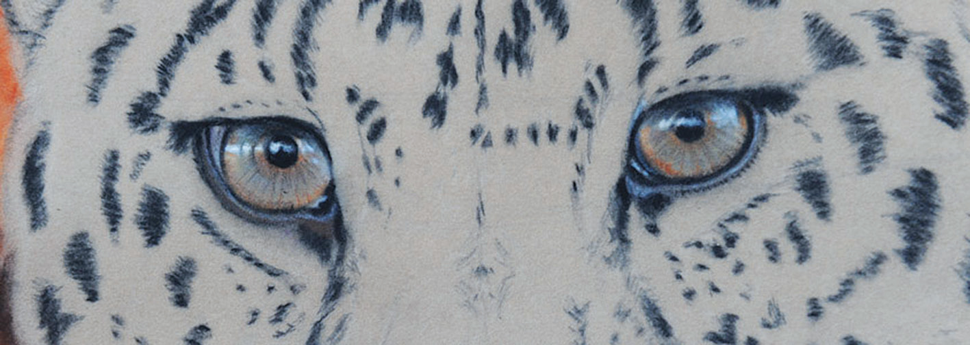
The reflection on the eye rim is a very light cobalt blue. When first applied the blue looked a little too strong, so I gently blended it with my finger. After adjusting the values I am happy with the eyes and can move on to the nose.
08. Nose and tongue
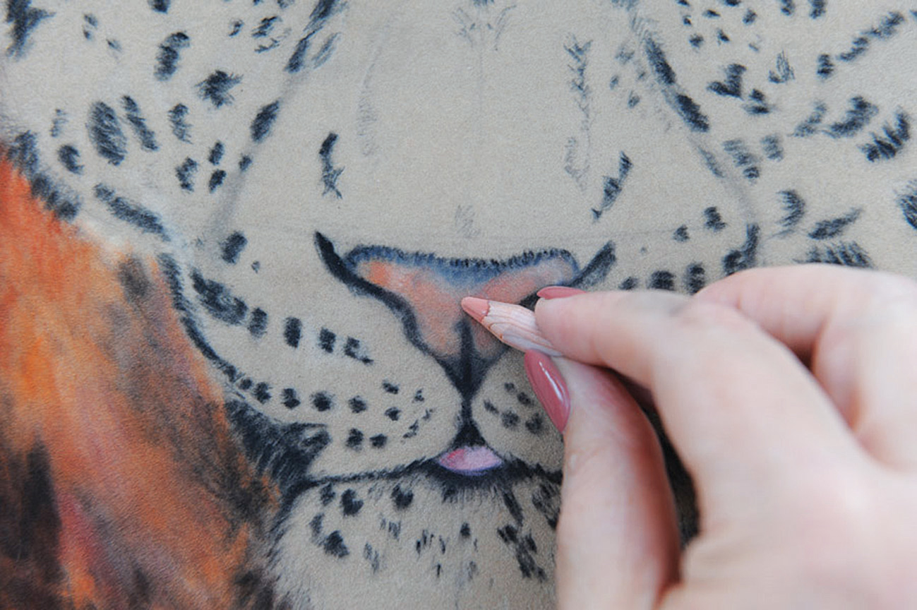
For the nose, I start with a light peach base, then darken with a flesh colour. I then use Caran d’Ache’s Pastel Pencil in Payne’s Grey 50%. Holding the pencil sideways creates subtle shading. Finally, I blend the whole thing together with a light glaze of flesh colour. I use a light pink to quickly lay a base for his tongue and dark pink to add the shadow to the left.
09. Blocking in fur lights
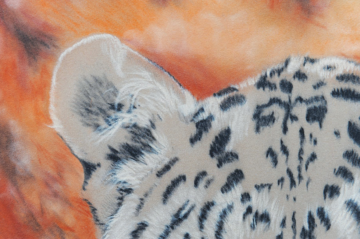
It’s now time to give our leopard some fur. Velour can take many layers of pastel, which helps create depth, so I usually tackle the fur in four layers: darks, lights, midtones, and detail. I’ve already blocked in the darks, so I can go straight to the lights, paying attention to the fur direction.
10. Blocking in fur - midtones
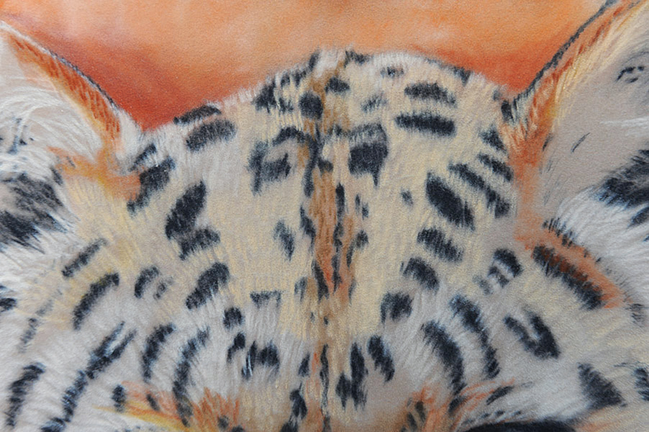
I then add the midtones and block in the main colour areas so I can get a rough base of the leopard’s colouring to build on. Even with a few basic shades, the form really begins to take shape. The fur direction and length is crucial here because underlying bone and muscle will cause the fur to stick up and form ridges. The colour may look a little fierce in places, but it will soften as I work over it later.
11. The detail layer
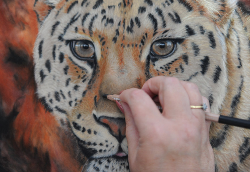
In this final layer, I start to work over the fur to blend the transitions between colours and adjust the values to create shadows. For subtle darker shading, I use a darker grey held horizontally to gently skim over the existing colour.
12. Finishing touches
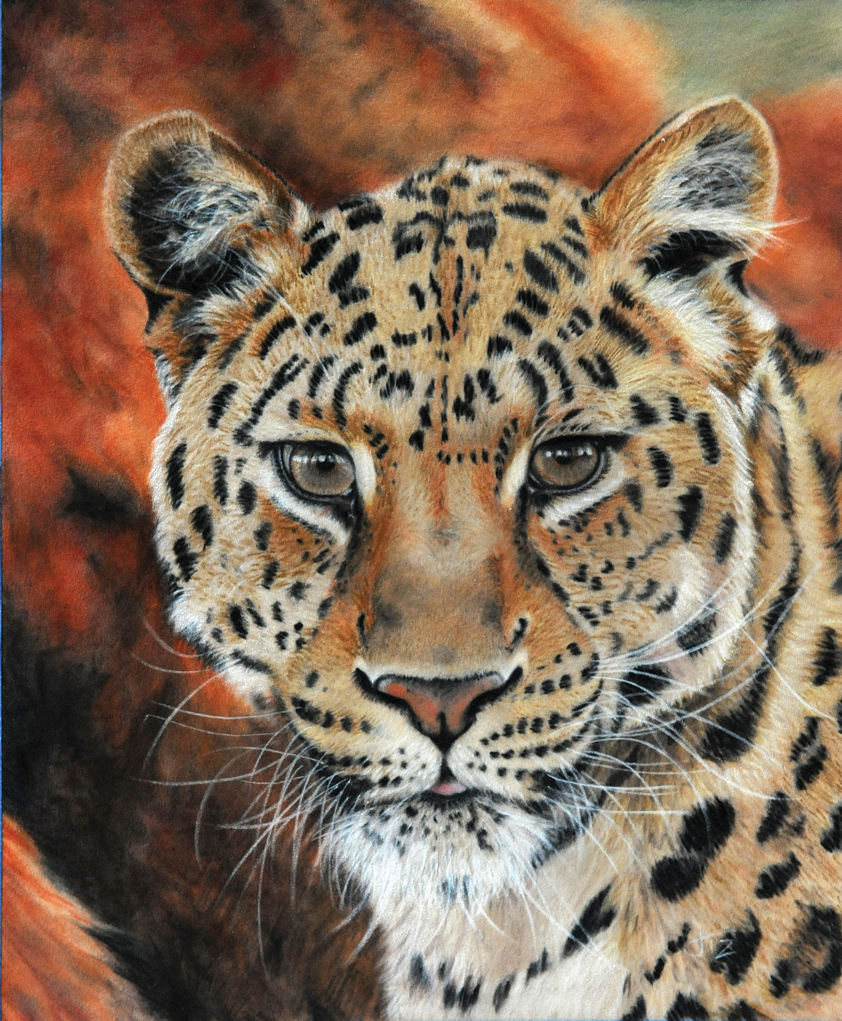
First I use a pastel pencil to add the whitest chin hairs. I create them by pushing downwards quite firmly, almost in a stabbing motion. For the whiskers I use a sharp white watercolour pencil and again push outwards from the root of the whisker. Don’t forget to add ear hair and eyebrow whiskers. Finally adjust and blend any changes to the background tonal values. The leopard is now complete!
Related articles

Jill Tisbury has been drawing and painting since she could hold a pencil. She loves to experiment but her two main passions are pastel on velour and airbrushing (acrylics).
