How to make a brand more human
Sign up to Creative Bloq's daily newsletter, which brings you the latest news and inspiration from the worlds of art, design and technology.
You are now subscribed
Your newsletter sign-up was successful
Want to add more newsletters?
Remember when branding used to be called 'corporate identity’? It spoke to one of the key branding rhetorics of the day: ‘you can trust me because I’m a big, global business.’
But last year’s damning research by Ipsos Connect revealed that 42 per cent of people claim to distrust big brands and 69 per cent distrust advertising. As a result, brands don’t always want to look big, corporate and powerful anymore. They want to look real and personable and reflect their true values and roots.
Some attempts to do this can be very successful, building brand loyalty and bolstering beliefs in what a brand stands for. But equally, some attempts to appear more human can be met with massive scepticism and at worst, fury. So, how can brand designers successfully navigate this minefield?
Article continues belowApologise when necessary
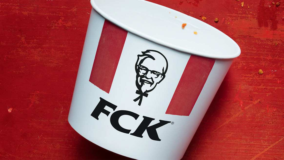
Success comes from telling the human story and getting the tone just right. An example of brilliant thinking when it comes to this was KFC’s response to the recent ‘chicken crisis’. In a genius print ad by Mother, the letters of the ‘KFC’ identity were playfully rearranged to read ‘FCK’.
It expressed a genuine, human reaction to the issue with the brand holding its hands up and acknowledging its failings with a perfect, relevant tone of voice for the moment. Implicit in the art direction is the idea that KFC’s chicken is so good that it’s unsurprising supplies ran out. It’s one of the best brand apologies we've ever seen, and has since won awards.
Make it obvious
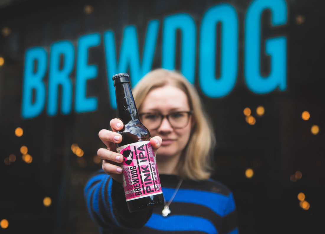
Other attempts to reflect a brand’s ‘human’ values through design do not always hit the mark. BrewDog recently created a ‘beer for girls’ to raise awareness of the gender pay gap, available a fifth cheaper for “those who identify as women” to make the point. Unfortunately, many viewed the pink packaging and ‘beer for girls’ slogan patronising and stereotypical.
BrewDog explained the ‘Pink IPA’ product was a pun on its flagship product ‘Punk IPA’, and the branding was deliberately satirical and ironic. However, if you have to explain the rationale behind a creative ‘big idea’, it’s probably not the right idea.
Sign up to Creative Bloq's daily newsletter, which brings you the latest news and inspiration from the worlds of art, design and technology.
Don't patronise your audience
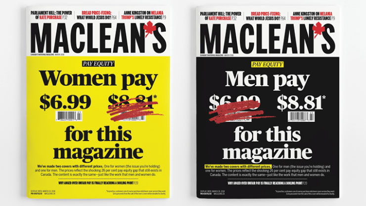
The Canadian magazine, Maclean’s, had the same idea as BrewDog in addressing the gender pay gap, but it was executed without feeling at all patronising. It made the point clearly, without gimmicks that ran the risk of being misinterpreted.
Another brand that didn’t quite hit the mark when addressing gender inequality is McDonald’s. It flipped its logo upside down for International Women’s Day, causing a backlash from people claiming the brand should spend more time addressing its own pay and equality issues, and less on creating symbolic gestures of ‘corporate feminism’.
Make it personal
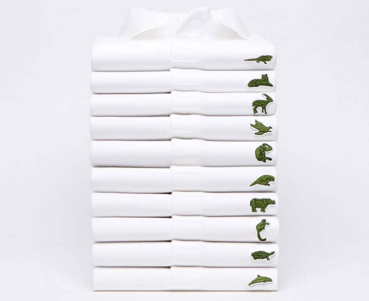
Showing that a brand cares about more than just its profits carries through to broader issues. Earlier this year, fashion brand Lacoste launched a range of polo shirts that replaced the iconic crocodile logo with various endangered species, to raise money for their protection as part of a three-year commitment.
It’s a great creative execution. The shirts look good and build on the brand’s equity, but issues can arise if there is not complete transparency around the results or how much the initiative will actually make a difference. Consumers are now so cynical about brands with a ‘human purpose’ that they will question everything.
Burberry got it right when it incorporated rainbow-hued stripes into its classic tartan to show solidarity with the LGBT community. It avoided being seen as a ‘big brand’ jumping on the bandwagon by making it about one individual, creative director Christopher Bailey, who designed the special edition tartan for his final collection for the brand. This made the story a human one. In parallel to announcing the rainbow tartan, it also announced donations to three LGBT charities.
Discover what makes the brand human
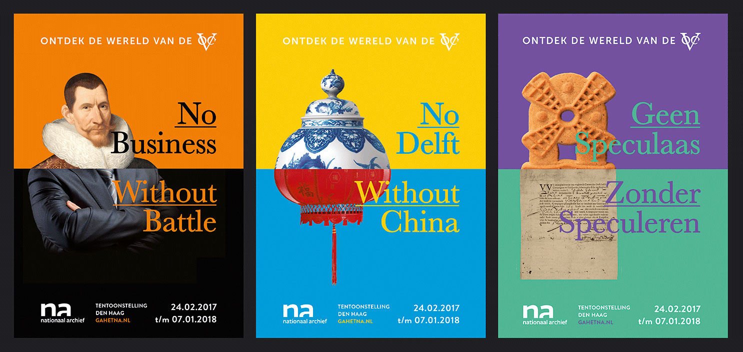
It doesn’t always have to be about cause-related issues. Another approach is for brands to celebrate what it means to be human. At Design Bridge, our recent work for The National Archive of the Netherlands celebrates human connections.
Once seen by many as an irrelevant institution, the new identity places the archive at the heart of the Dutch national identity. A compass logo, and supporting visual language, positions the archive as the nation’s ‘true north’, helping people discover where they’ve come from – as an individual, a family, and a nation.
Some of the big digital players have also managed the human touch really well. YouTube’s recent rebranding shows an understanding of how to connect to consumers in a more human way: it’s turned the red play button that millions of people engage with everyday into its main visual asset.
Ultimately, it’s all about discovering what makes you – as a brand – human, expressing this with clear creative execution that’s relevant to the people you’re trying to reach, and then backing it up with transparency about how you act and what you do as a brand. The era of distrust may not be set to change anytime soon, but brands have the power to make changes, big and small, to ensure they help keep people engaged.
This article originally appeared in issue 282 of Computer Arts, the world's leading graphic design magazine. Buy issue 282 or subscribe here.
Read more:
