Top 5 typography trends of 2016
All designers should have a strong grasp of the fundamentals of typography. And even if you do, the rapid evolution of the discipline means you can never totally relax and rest on your laurels.
New typographic styles, technologies and business models are continually emerging, and it’s easy to miss new information, hidden beneath the blizzard of online noise.
So in this post, we list 5 of the biggest typography trends of 2016. If there’s a trend you feel we need to add to the list, though, please let us know in the comments below.
01. Geometric fonts
We’ve long had a love affair at Creative Bloq with design based on elementary shapes – squares, circles and triangles – from geometric patterns to geometric book covers to geometric logos. And so we were pleased to see an increased popularity for geometric fonts in 2016, as big names like Pepsi, Virgin Atlantic and Adidas harnessed their outward simplicity to convey a sense of honesty and trustworthiness in their branding.
There were some alluring new geometric fonts released this year, too, including Fontsmith’s FS Lucas, Marcus Sterz’s Publica Sans, Hey Studio’s custom font for ESPN, and Pentagram’s bespoke typeface for the Resonate festival.
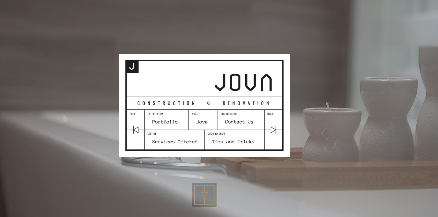
But as with any type trend, it’s all about using a font in the correct context. This beautiful website (above) for construction company Jova, for instance, makes clever use of geometric type to convey a sense of precision and professionalism.
02. Custom fonts
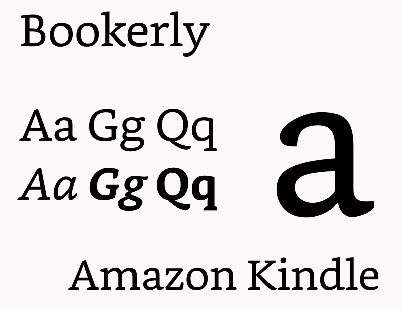
With an increasing number and diversity of devices populating our world, it’s not surprising that tech firms were hard at work creating custom typefaces in 2016. So we saw Amazon introduce Bookerly: a serif typeface designed by Dalton Maag for reading on Kindle, with a stated aim of reducing eyestrain. Elsewhere, Apple spread its new San Francisco typeface, which debuted with the Apple Watch, across the MacOS, iOS, watchOS, and tvOS platforms, while Google continued to roll out its own custom typeface, Product Sans.
Sign up to Creative Bloq's daily newsletter, which brings you the latest news and inspiration from the worlds of art, design and technology.
And it wasn’t just the tech world where new custom typefaces were making an impact. They even played a cameo in the US election, with the creation of Unity, a custom typeface for Hillary Clinton, in April. Then as her rival’s campaign hotted up in October, Buzzfeed and Font Bureau teamed up to bring us BF Tiny Hand, a fun font that apes Donald Trump distinctive handwriting.
Meanwhile, for those who want to make their own custom typefaces, that became easier than ever in 2016 with new (albeit basic) tools such as Prototypo and FontArk, a trend we can only see continuing into 2017, especially when and if Adobe’s Project Faces emerges from its development phase.
03. Responsive typography
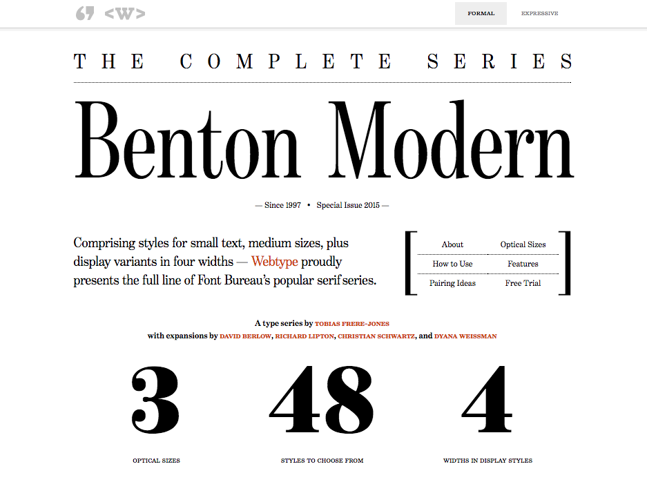
The giants of tech may have the resources to create a custom typeface for every different device. But ordinary web designers have to go about things in a different way. You’ve no doubt heard of responsive web design; a way of building websites so they adapt their content gracefully to different screen sizes. Well, 2016 was the year of responsive typography, which extends this notion to ensure readability across a wide variety of devices and viewports. You can see it in action on the Benton Modern sample site.
Responsive typography has been around for a while, but this was the year it went mainstream. That said, it’s still early days; as much an artform as a technical approach, responsive typography is an evolving discipline, and so there’s no one set of rules to follow. Plus it’s not only about making typefaces adapt to screen sizes, but also making words accessible in other ways, as this infographic shows.
You can discover more about how to get on board with responsive type in our article Responsive typography: 9 top tips, while there’s a handy list of tools to help make your typography more responsive here.
04. Variable fonts
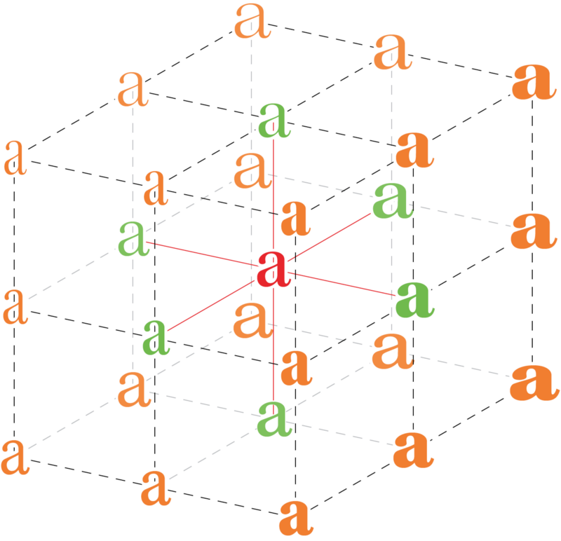
When Apple, Google, Microsoft and Adobe all get together to work on something, you know it must be a pretty big deal. Launched at the ATypI conference in Warsaw this September, variable fonts are quite simply the future of web type.
A variable font is, in the words of Tiro Typeworks font designer John Hudson, “a single font file that behaves like multiple fonts”. This sounds like the stuff of sci-fi, but it now exists thanks to an improvement to the OpenType font file specification allowing type designers to interpolate a font’s entire glyph set, or individual glyphs, along up to 64,000 axes of variation (weight, width, etc) and define specific positions in the design space as named instances (bold, condensed, etc).
Admittedly, it’s going to be a while before we can actually start designing with variable fonts, and nobody’s yet worked how the business models will work. But it’s certainly an exciting development, and on a par with the original move from system fonts to web fonts. To learn more, read the launch post on Medium and follow the continuing discussion at TypeDrawers.
05. New business models
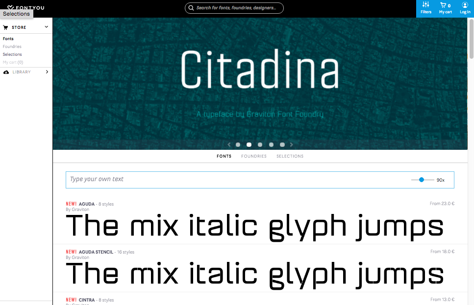
With competition for designers’ business hotting up in 2016, new font services have been multiplying, and the major players have been innovating like never before. They’re making it easier and easier for designers to trial fonts in their browsers, and within their designs, before committing to purchase.
So for example, August saw the launch of what was dubbed the ‘iTunes for typography’, Fontyou: a cloud-based type manager that allows users to find and test new fonts. Just last month Hoefler&Co launched its own new tool, Try.typography.com, which enables you to pick any font from its catalogue and try it out at different sizes, with different line spacings and in a range of styles. And here are four other try before you buy font services.
Font providers are also battling to provide you with the most choice in the way you pay for your fonts. So for instance, this month Adobe Typekit launched Typekit Marketplace, which makes more than 6,000 of its fonts available for individual purchase, without the need for a subscription.
While some of these new business models may seem confusing, in general the increasing competitiveness between font providers can only be a good thing for designers going forward into 2017.

Tom May is an award-winning journalist specialising in art, design, photography and technology. He is the author of the books The 50 Greatest Designers (Arcturus) and Great TED Talks: Creativity (Pavilion). Tom was previously editor of Professional Photography magazine, associate editor at Creative Bloq, and deputy editor at net magazine.
