The best free logo maker: no-cost tools for designing eye-catching logos
With the best free logo maker, you can get started with logo design on zero budget.
Sign up to Creative Bloq's daily newsletter, which brings you the latest news and inspiration from the worlds of art, design and technology.
You are now subscribed
Your newsletter sign-up was successful
Want to add more newsletters?
Five times a week
CreativeBloq
Sign up to Creative Bloq's daily newsletter, which brings you the latest news and inspiration from the worlds of art, design and technology.
Once a week
By Design
Sign up to Creative Bloq's daily newsletter, which brings you the latest news and inspiration from the worlds of art, design and technology.
Once a week
State of the Art
Sign up to Creative Bloq's daily newsletter, which brings you the latest news and inspiration from the worlds of art, design and technology.
Seasonal (around events)
Brand Impact Awards
Sign up to Creative Bloq's daily newsletter, which brings you the latest news and inspiration from the worlds of art, design and technology.
The best free logo maker will allow you to design an attention-getting icon or mark for your business at no cost to you. While you will get better results from using a professional tool or a professional designer, a free logo creator can be the ideal way to get started and make something that's good enough for now.
✅ We are solely focused on what creatives need
✅ Benchmark tests based on real workflows
✅ We consult actual designers and creative pros
✅ Programs tested for their intended purpose
In this guide I've catalogued what I think are the best free logo designers you can use right now, having evaluated them with my own designs to assess how easy they are to use, and the quality of the final result. The list comprises a mix of free image editors and AI logo generators.
Some of the tools I've picked are free plans on paid-for platforms, meaning certain features will be limited, but all of them can be used to create a striking, unique logo – for free. And if you're starting to get a taste for design, check out our guides to the best laptops for graphic design and the best monitors for graphic artists.

I've been writing on all things tech since 1995, and all things design since 2005, and in that time I've seen plenty of logo-making tools come and go. This list only includes the free logo-making tools that I think are genuinely worth your time – either they provide an excellent all-around platform for logo design, or they do something unique that other free tools don't offer. If you want to design a logo on zero budget, here's my best advice for going about it.
The best free logo makers at a glance
Adobe Express' free plan includes access to various tools that can be used to design a logo for free, including templates and the option to import your own assets. And you can do more than just logo design, too.
Read more below
Canva's a popular choice for social media assets, and it also has a template-based free logo maker. Paid plans give you loads of features, but the free tier is highly usable, and it lets you download logos at larger sizes than some other free tools.
Read more below
This free logo maker aims to make it quick and easy to come up with a logo. It takes you through various options, allowing you to decide which designs you like and which you don't. Then you can buy your logo in a few clicks (yes, you have to pay if you want a decent size).
Read more below
Tailor Brands is powered by AI and offers an incredibly quick and easy way to get a basic logo off the ground. You have to pay for high-resolution, though the pricing is pretty reasonable, and a small low-res is free.
Read more below
Formerly known as Hatchful, Shopify's in-house logo maker is great for anyone who wants to quickly build a digital storefront – plus, you get a free high-res transparent PNG! Now that's a win.
Read more below
While it doesn't offer as much free flexibility as Ucraft, LogoMakr is also a credible free vector editor that's worth consideration. You get a free PNG – but size is capped at 250 pixels unless you open your wallet.
Read more below
See more products
With a big, generous template library, DesignEvo has plenty to offer the absolute newbie who wants to quickly put something together. But it also lets you start your design from scratch if you prefer.
Read more below
We did not come away overly impressed from the AI-powered MarkMaker logo generator, however it does have one unique quality on this list – it lets you download your logo as an SVG file, for free.
Read more below
The best free logo makers in full
Why you can trust Creative Bloq
The best free logo maker overall
Reasons to buy
Reasons to avoid
✅ You want plenty of options: Adobe Express has a huge range of templates, or you can make yours from scratch.
✅ You want the option for animation: Thankfully, Adobe Express offers this option!
❌ You want a clean and easy interface: Adobe Express can be a little cluttered.
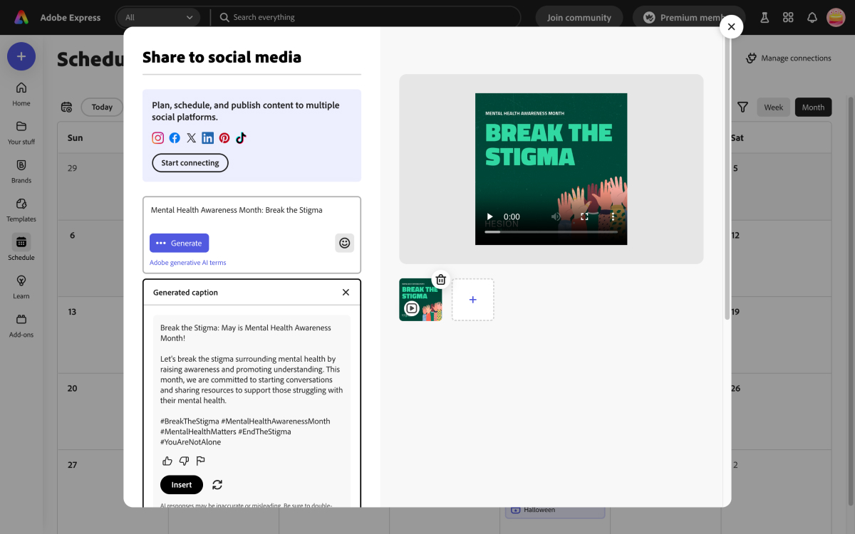
🔎 Adobe Express is a varied toolkit offering far more than logo design; from video editing to animation, it's a great platform if you're in the throes of a business redesign. ★★★★
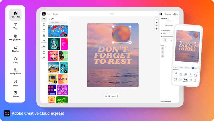
Need to know: Adobe Express tops our list of the best free logo makers because it has several options for creating a logo. It was clearly designed to compete with Canva, our number-two choice, and as such it offers a lot of free and user-friendly functionality for amateur designers in a similar manner.
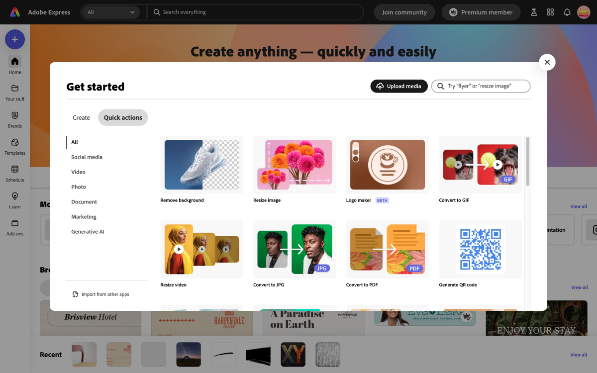
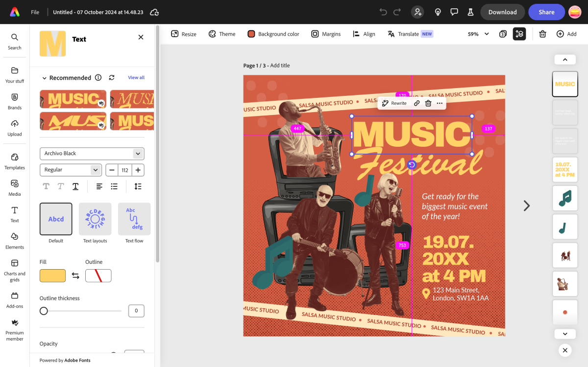
Ease of use: Available both in-browser and as a mobile app, its main use is for designing social media posts – to that end, it even includes a video editor. There are so many tools that we find the interface can feel a bit cluttered, sometimes making it hard to navigate. However, you'll probably need other design pieces for your business as well as a logo, making this a good option.
Features: There are two ways to make your logo on Adobe Express. The first is to browse a range of templates, pick one you like and customise it. Alternatively, you can choose to create a logo from scratch. We found that this second option allows a lot more versatility and creativity than Wix and Tailored Brands, although it still doesn't provide anything like the range of tools you get in fully blown graphic design software, and it doesn't allow freehand drawing like Canva does (see below).
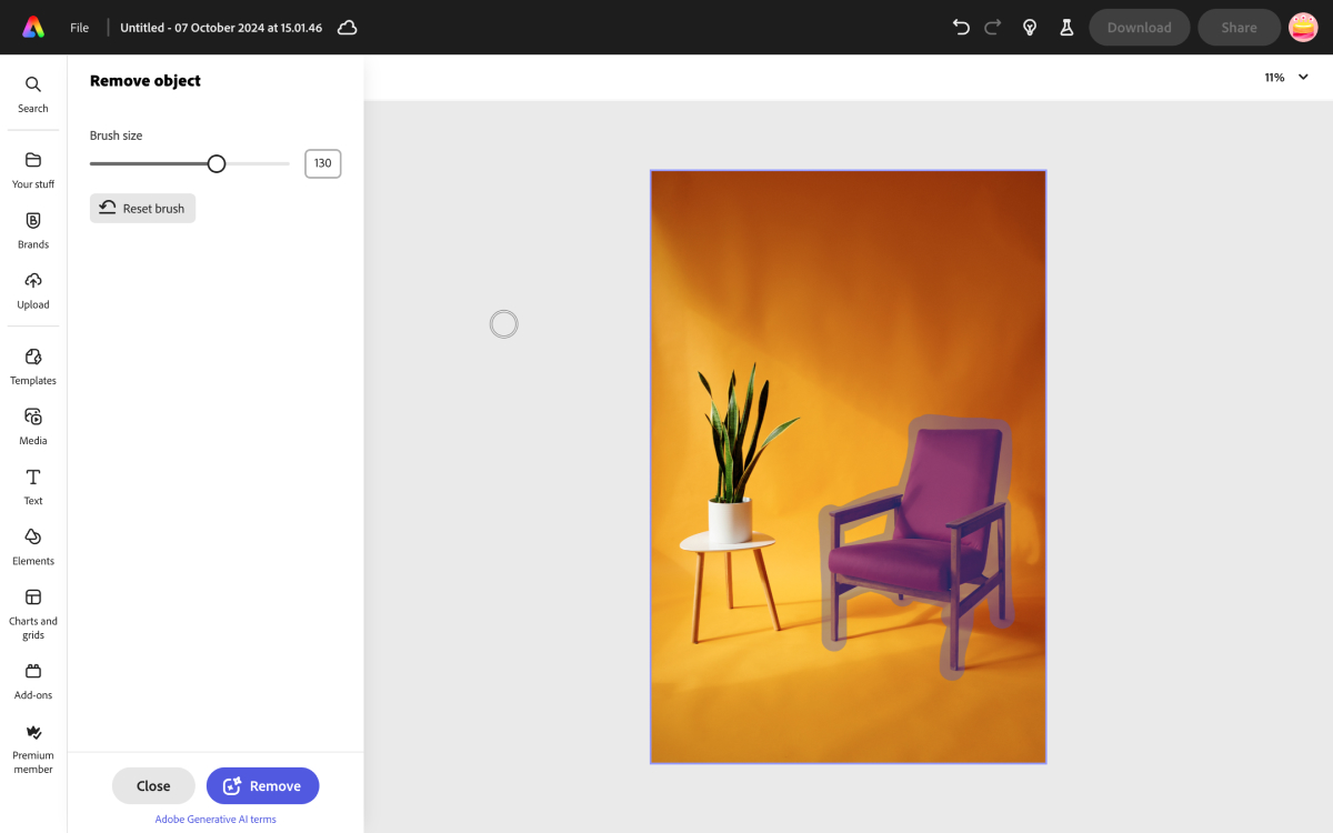
Part of the flexibility includes the ability to upload your own assets, something that's not possible in the free version of Canva. There are also stock photos available for inclusion, or you can even use the Adobe Firefly AI-powered text-to-image generator to generate images and logos.
As is often the case, these tools are quite hit and miss. Our reviewer was able to use Adobe Express to generate logos, but the results were a bit of a mess – confusing mish-mashes of multiple concepts, riddled with that tell-tale AI 'smear'. For my money, you're much better off using the intuitive design interface to try and make a simple logo for yourself.
Paid plan benefits: If you find yourself needing more tools, a premium subscription is available, unlocking reams of further customisation and creation options.
Read our Adobe Express review for more details.
Attributes | Notes | Rating |
|---|---|---|
Ease of use | A bit cluttered, but easy enough | ★★★★ |
Features | Varied toolkit, and different ways to get started | ★★★★★ |

"Adobe Express is user-friendly with customisable templates and highly useful ‘quick actions’ for file conversion and resizing. While the AI tools can disappoint, the interface is attractive."
The best free logo maker for lots of options
Reasons to buy
Reasons to avoid
✅ You want a super easy interface: Canva has one of the most user-friendly interfaces of any logo editing app, free or otherwise.
✅ You're making multiple assets: With Canva's wide range of asses it's easy to achieve a cohesive look across designs
❌ You want to work offline: Canva requires inernet access to function.
🔎 Canva provides a comprehensive online design suite that does much more than logos. ★★★★
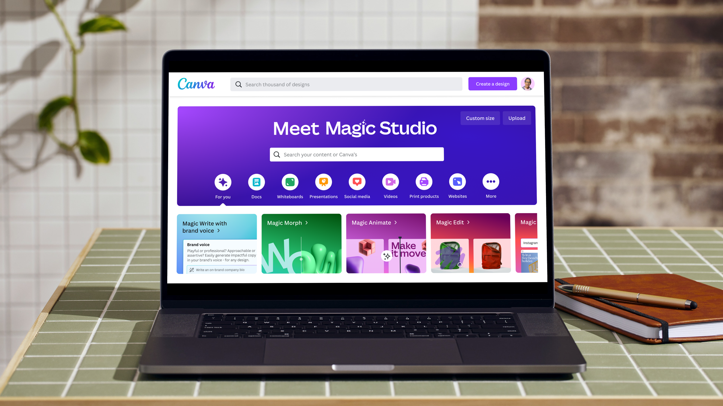
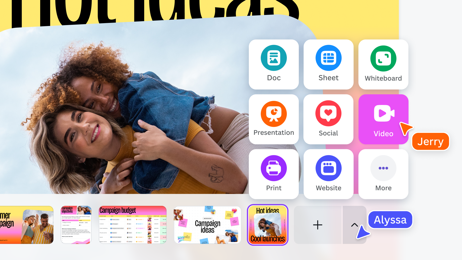
Need to know: While a lot of Canva's tools might not interest you if you only need a logo, it's our pick as the most versatile free logo maker because it offers more more options for customisation than most other options on our list. It also works entirely in browser, with no download required, which is handy for convenience, though of course means you can't use it offline.
Canva has become a popular tool among modern comms and marketing teams for its accessibility, its ease of use, and the fact that the free plan offers quite a generous selection of features.
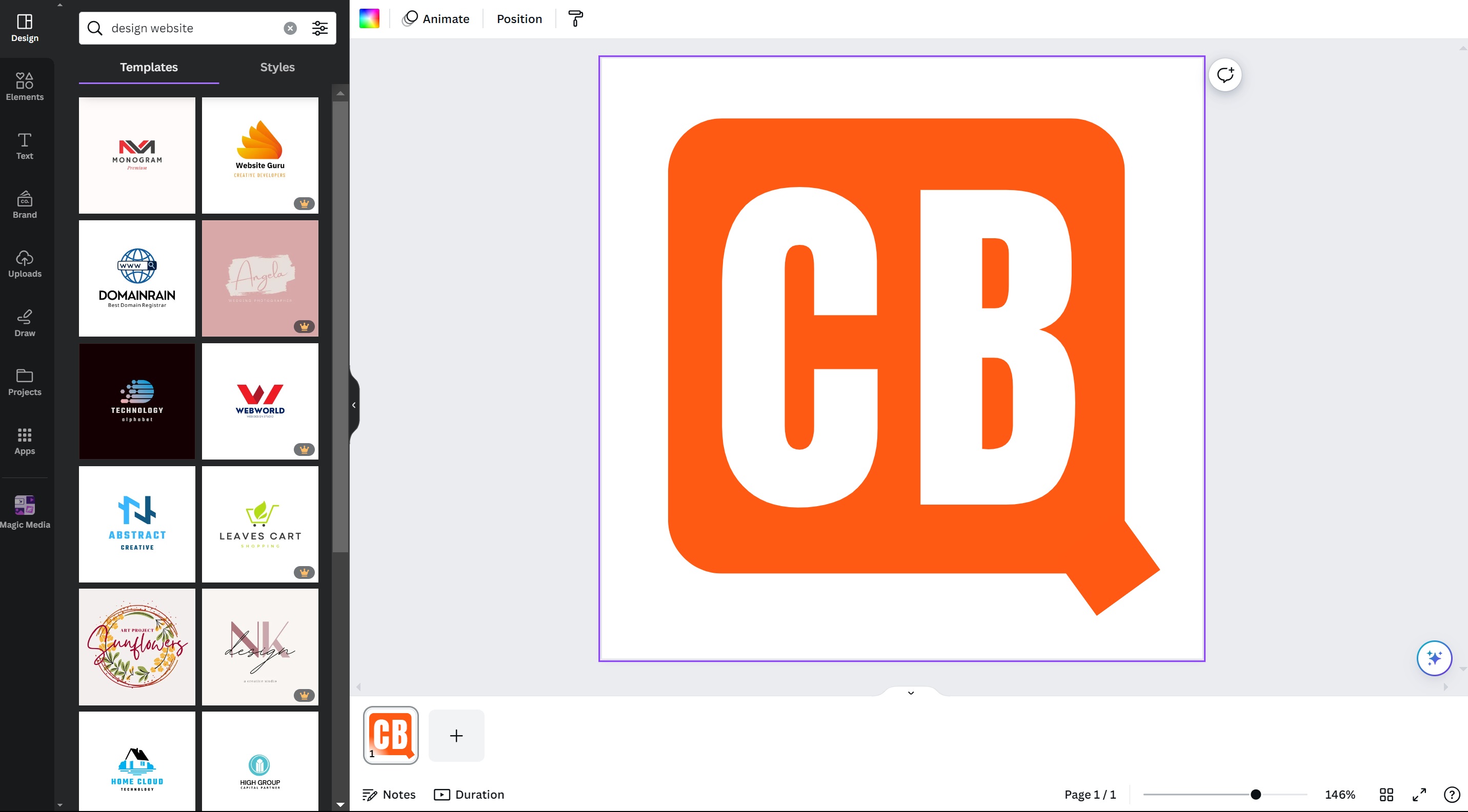
Ease of use: Canva is broadly speaking very easy to use if you've tried just about any editing or drawing software in the past. It offers a huge range of templates, a larger and better selection than any other on this list, including Adobe Express. However, I felt that it would be quite easy to get lost in the many, many templates provided, which aren't organised in any particular way: you simply have to search by trying keywords in the search field. If you're not sure what you're looking for, you might not know where to start. If you do know, you might not be sure how to find it.
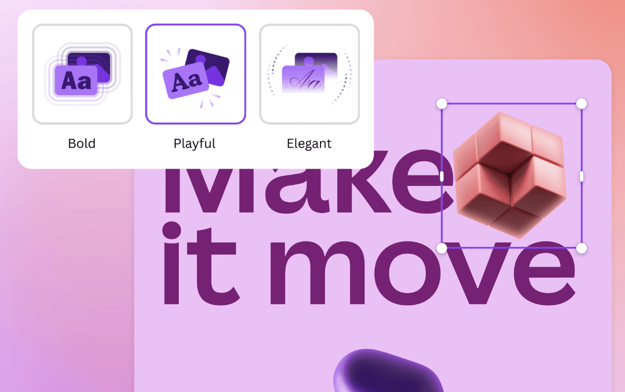
Features: It goes for a template-based approach that lets you choose the style you like rather than trying to magically come up with something suitable by asking you a few questions. But you can also draw freehand and add shapes, text. When we tested it, we liked that flexibility since you can generally play with the designs more than with other options, which allows you to create something more unique.
It's also handy if you already have a design in mind that you want to try to replicate. I was able to create something that looks like the Creative Bloq logo in a matter of seconds, but then I could have done something similar in Microsoft Paint. We also liked the collaborative features. These enable you to share the design you're working on with others so that they can add feedback or make contributions themselves.
Paid plan benefits: If you need more choice, you can pay to use a larger selection of premium elements, but you can actually do quite a lot in the free tier. Although one thing you'll likely miss is the fact that you can't make a logo with a transparent background in the free tier; that's one you have to fork out for. Regardless, once you're done, you can download your finished logo as a 500px PNG or JPEG, or a print-ready PDF, for free.
See our full Canva review for more information.
Attributes | Notes | Rating |
|---|---|---|
Ease of use | Easy to get lost in sprawling library | ★★★★ |
Features | Great variety of features, but online-only. | ★★★★★ |

"The free version of Canva gets you 250,000 free templates, over 100 design types, some free photos and graphics, and you also get 5GB of cloud storage. This will be more than enough for casual users to design logos."
The best free logo maker for beginners
Reasons to buy
Reasons to avoid
✅ You want plenty of options: With a wide range of customisation options on offer, Wix is pretty versatile.
✅ You just want to make the one logo: Wix allows you to buy your logo for a one-off cost.
❌ You want high-res results: The free version of Wix offers a very low resultion result if you don't want to fork out for the full file.
🔎 Wix offers a wide range of customization options, templates and a beginner-friendly step-by-step approach, allowing you to focus more on your ideas than the nitty-gritty of designing them. ★★★★
Need to know: With Wix, you get two options for creating a logo online: the option to hire an actual designer who'll do the work for you, which really ought to be the solution you go for if you're serious about branding for your business. The other is Wix's a free logo maker option – though be aware that in this case, 'free' comes with a few qualifiers.
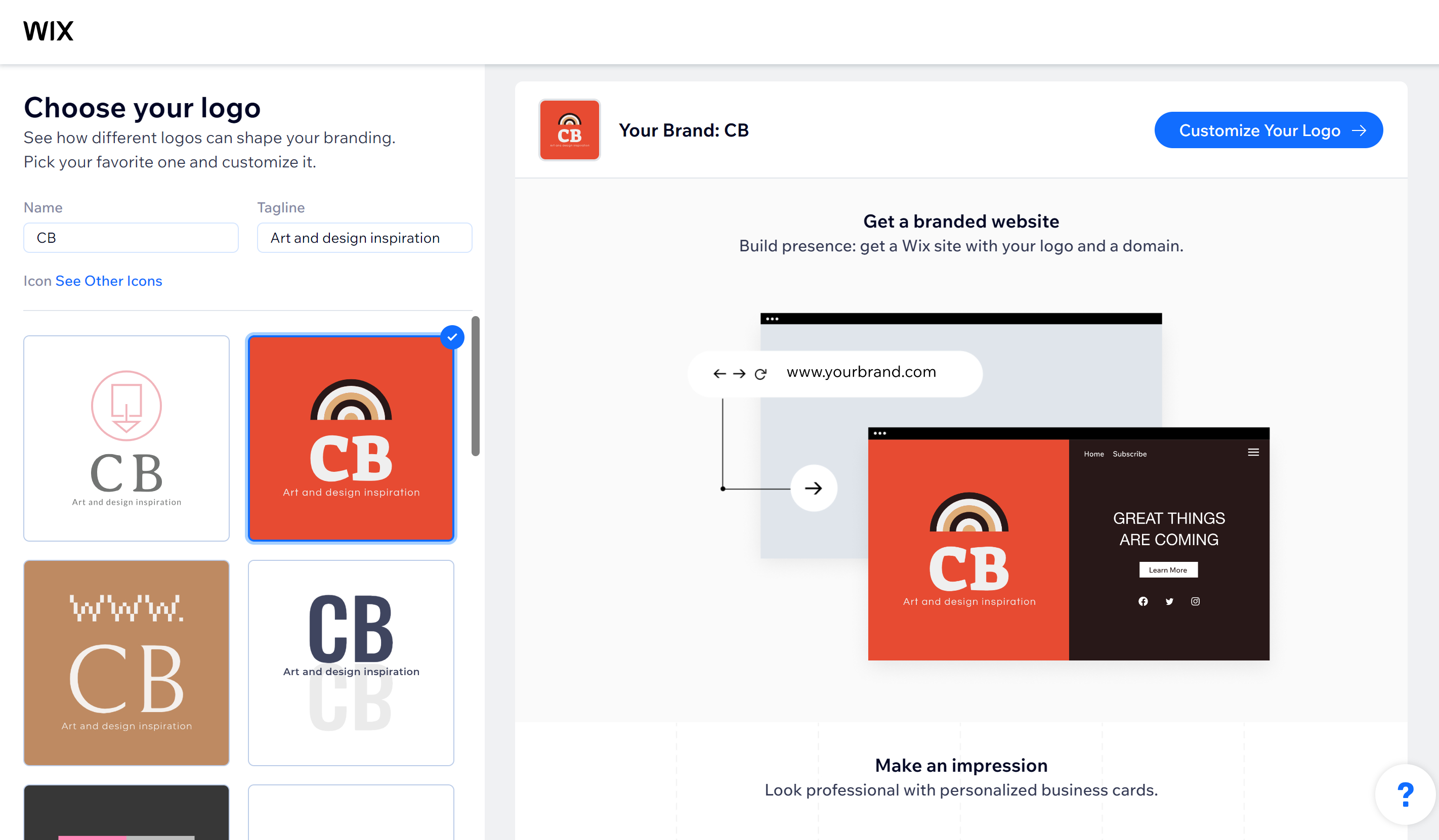
Ease of use: We've chosen Wix's tool as best for beginners because it takes a more step-by-step approach. It starts by asking for some basic information about your business. In fact, it even can even suggest names and taglines for your business, if you haven't reached that stage. I don't think I would leave such an important decision to AI myself, but it could help give you ideas of what to avoid since the suggestions tend to be very cliched.
Features: As we found out when we tested it, Wix provides a huge variety of suggestions for icons, colours and fonts to start working with, in a variety of styles. This is useful for newbies as it enables you to view and assess a number of different ways you could go with your logo. Other software, like Tailor Brands, featured below, ask you to pick your icon from the outset so you don't get that influx of inspiration.
Once you've done that you'll be presented with your own custom logo that you can then edit until it looks the way you want. When you're done you can download image files so that you can use your logo design wherever you want.
However, there is a pretty serious drawback here, and that is that Wix's free plan will only let you download a very low-res version of your logo, one that isn't very useful for anything beyond as a small website icon. If you want a useable size, you need to pay – and while Wix at least does let you pay a one-off fee rather than placing you in hock to a subscription, it still means that there's a limit to how much I can recommend Wix as a free logo editor.
Paid plan benefits: If you're happy with a low-res logo, Wix will suffice even in its free format. Otherwise, prepare to pay.
See our full Wix Logo maker review for more details.
Attributes | Notes | Rating |
|---|---|---|
Ease of use | Offers a step-by-step process that's easy to follow | ★★★★★ |
Features | Wide range of options, but limits to the free tier | ★★★★ |

"As far as automated logo makers go, Wix's offering works fairly well and offers a decent amount of control and customisation... an affordable option that lets you fine-tune the end result."
Best for efficiency
Reasons to buy
Reasons to avoid
✅ Speed is of the essence: Tailor Brands' Logo maker is super quick and easy to use.
✅ You'd consider a low-cost paid option: Pricing is pretty approachable, should you be willing to forgo your free logo maker dreams.
❌ You want options for customisation: This logo maker is a little bland in terms of designs, and there are limited customisation options.
🔎 Tailor Brands is a super easy option if you don't need much flair or creative control over your logo, however the results do come in a small file size ★★★½
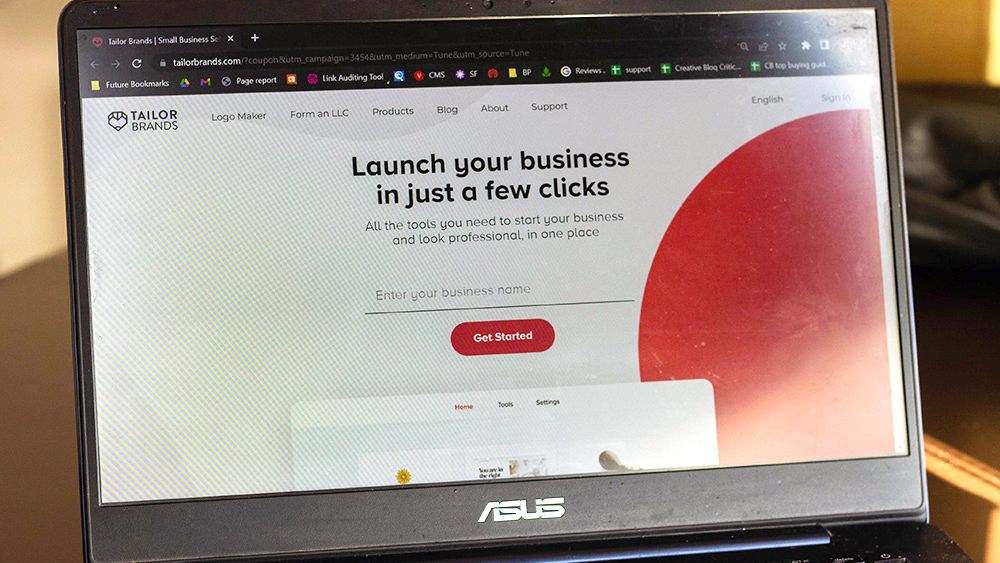
Need to know: Can't be bothered scrolling through a load of templates when you're looking for the ideal logo for your brand? Tailor Brands' Logo Maker is more step-by-step, getting you set up in no time at all with its quick and easy process.
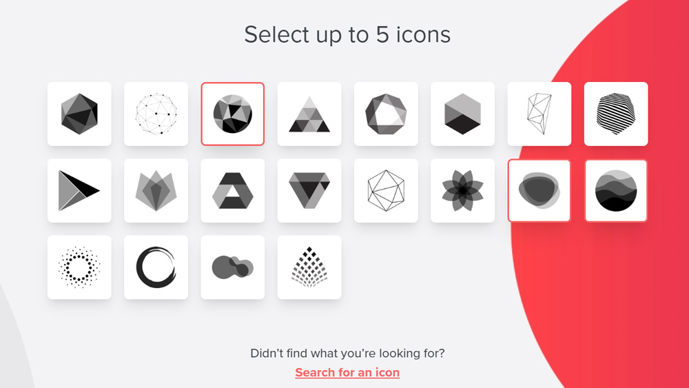
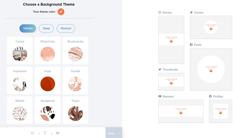
Ease of use: Tailor Brands' logo maker is super easy to use. lt starts by asking you for your a 'logo name' (strange phrasing, but it means your business name), and then gets you to decide whether you want an icon, text or initial-based logo, then it'll try to pin down the sort of design style you want by choosing three from a somewhat limited range of options. So, for instance, I set about designing a logo for a hypothetical cosmetics brand, and chose 'elegant', 'delicate' and 'classy'.
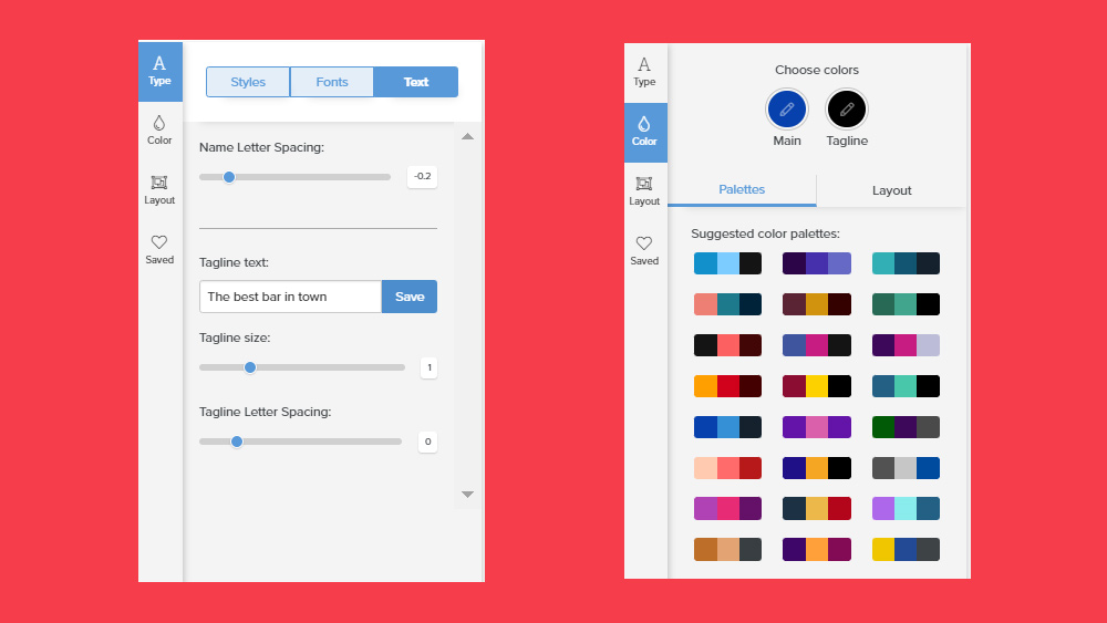
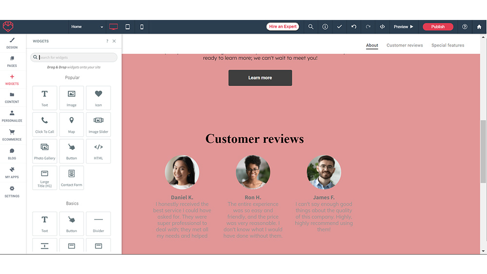
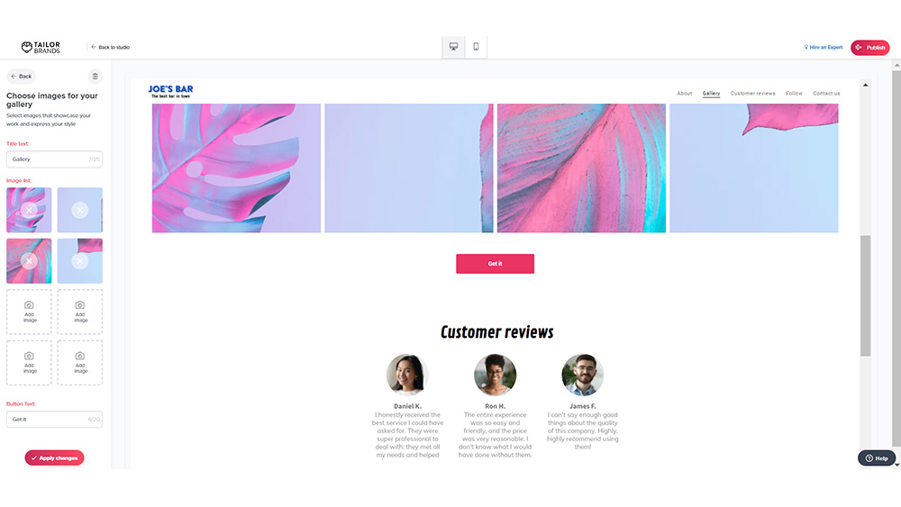
Features: With that information, it goes to work on creating a logo that you can then customise if you want – and I think you will want, because in my experience, the initial results you get are not the most attractive. The software chooses colours for itself, and seems to do so quite randomly. However, you can either reject this first suggestion entirely, or start customising it using the easy-to-use (if a little limited) customisation tools.
When you're happy with it you can download a low-resolution for free, or pay for high-resolution files. Bear in mind though that this is a similar situation to Wix's logo maker in that the free file you get really is very small: 192 pixels along its longest edge. It might do for an app store or a small website badge, but if you need anything larger then you'll need to open your wallet.
Paid plan benefits: If you do decide to upgrade, Tailor Brands can become a one-stop-shop to start and run your business, offering a platform that can also create merchandise, business cards and social media templates. It can also help you set up your own little corner of the web with an online store or website, web hosting, a business mailbox and more. We found customisation options to be limited, especially when compared to Canva, and we don't think the designs will be winning any awards, but it gets the job done for very small businesses.
See our full Tailor Brands review for more details.
Attributes | Notes | Rating |
|---|---|---|
Ease of use | Very easy with minimal steps | ★★★★ |
Features | Basic results, limited customisation | ★★★ |

"Tailor Brands offers a very quick, free and very easy, way to create a logo (you'll need a subscription to download it at a decent resolution). There are a lot of extra tools, but the designs aren't going to be winning any awards."
Best for online stores
05. Shopify
Our expert review:
Reasons to buy
Reasons to avoid
✅ You're setting up an online store: Shopify also lets you quickly set up a store theme to match your logo.
✅ You want the easy road: It's very quick and easy to use.
❌ You want customisable file exports: You get a pre-made zip file with PNGs in a few sizes and that's it.
🔎 Shopify Logo Maker is primitive but quick, and if you're after the best free logo maker that offers options to export in a range of sizes, it at least has that going for it. ★★★½
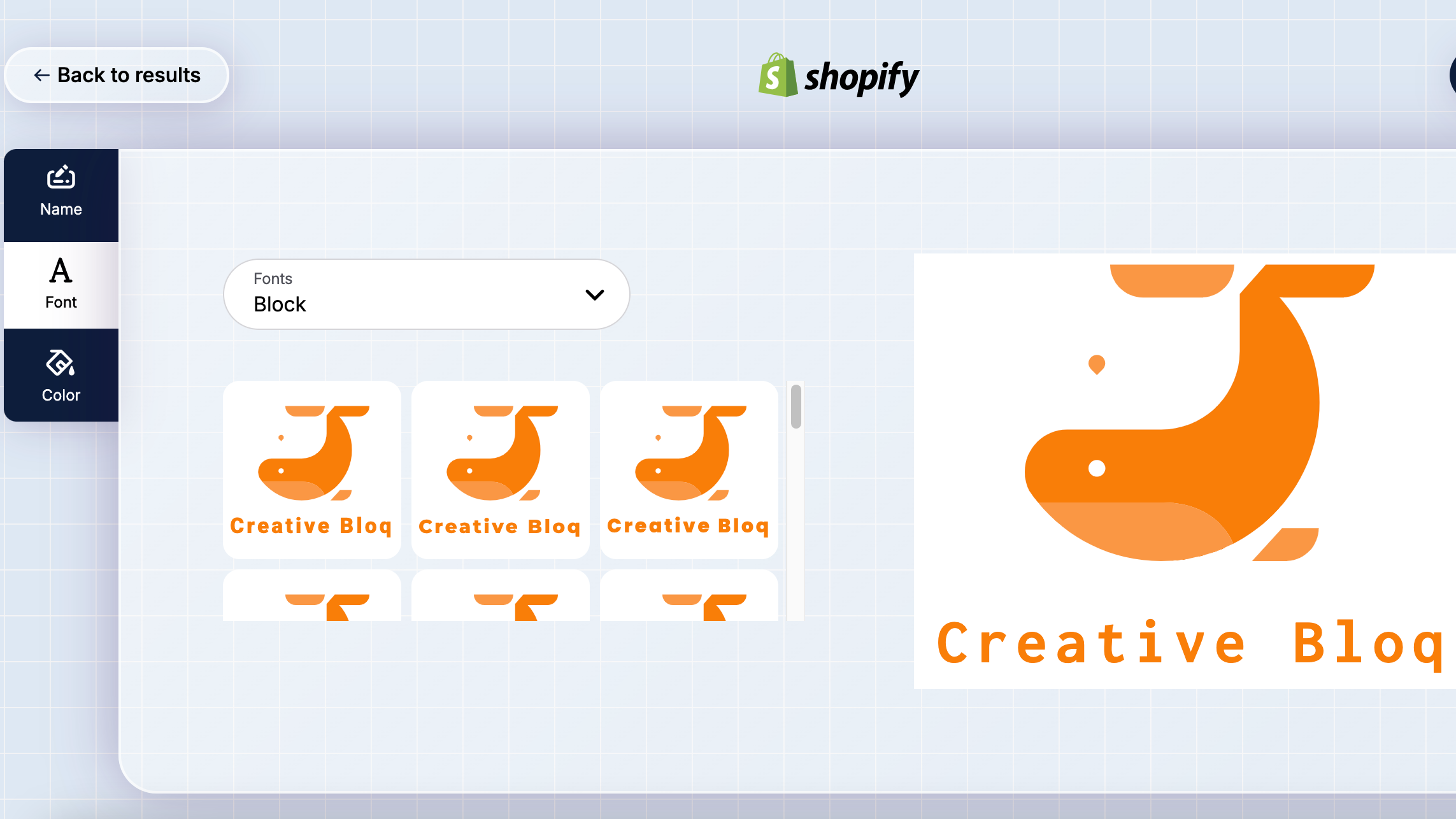
Need to know: Formerly known as Hatchful, Shopify's logo maker is designed to put together a quick range of logo options for you based on a few keywords. Once you've picked one you like, gives you a quick zip download of your logo in a range of shapes and sizes, in PNG format. It's useful if you want the logo pre-made in the right dimensions for a range of social media platforms and you also get a high-res PNG (transparent included – the holy grail).
Ease of use: It's also extremely easy to use, although perhaps a little too easy. Like with Wix and Tailor Brands, you answer a few basic questions about your business, and then you pick a logo you like the look of. And that's about it. And unlike those two, you don't have to pay to download your logo in a useable size – even better!
Features: All you can customise afterward is the icon, font and colour. You can't modify spacing or any of the other design elements, and the spacing and sizing of the elements in many of the designs that it offered me really weren't ideal. The range of icons is quite limited too. The good news though is that you don't have to have a Shopify account to get hold of your logo – just enter your address and it'll be along within minutes. Within a few minutes, a folder arrives in your email inbox.
Paid plan benefits: There is no paid plan, but it does connect with Shopify's wider range of business tools. We love that it's truly free, though in this case it could benefit from some more detail-oriented features.
Read our full Shopify review for more detail on this powerful ecommerce platform.
Attributes | Notes | Rating |
|---|---|---|
Ease of use | Very, very easy, but that's because it's so basic. | ★★★★ |
Features | Very basic with incredibly limited customisation. | ★★★ |
Best vector editor
06. LogoMakr
Our expert review:
Reasons to buy
Reasons to avoid
✅ You want plenty of freedom: LogoMakr offers a good amount of creative control and ample tools
✅ You want PNG files: LogoMakr offers free PNG download
❌ You want larger file sizes: Max free size is 250px
🔎 LogoMakr is another tool that offers a couple of different ways to create a logo, with varying degrees of ease and ample customisation options ★★★
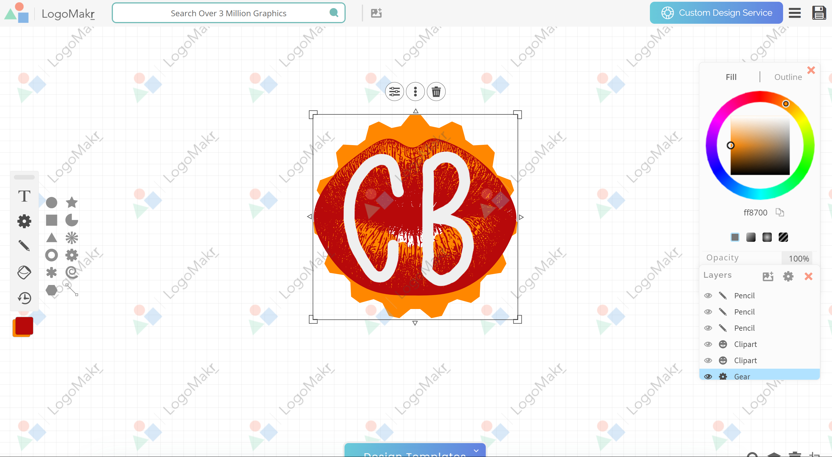
Need to know: LogoMakr offers templates you can customise, or you can create your own design from scratch using an open canvas. This latter option is a similar approach to Ucraft's Logo Maker but with a lot more tools and options.
Ease of use: We found the interface friendly and intuitive to use despite the increased options. You can use shapes and icons or draw freehand. There's even a paintbucket like in Paint, and there's a decent number of fonts to choose from.
Features: The customisation options are a lot more flexible than with many of the other programs we tested. You can modify the number of sides in shapes, skew them and cut them out. We'd like it even more if it allowed you to use gradients as well as flat fills, but you can't have everything. And the same platform does offer a range of other tools, including an icon maker that allows you to create vector icons from your own raster designs.
There's an AI logo generator option as well, which will deliver you a few options based on your business name and a few other keywords. If you already have an idea of a particular image or icon you want to use, you can request that to be worked into the design. I found the results it delivered to be bland but acceptable
Paid plan benefits: Alas, this is another platform like Wix or Tailor Brands where the free option gets you only a fairly small version of your finished design (a 250px PNG). You can download it at larger sizes and as a SVG and PDF if you're prepared to shell out $21.
Attributes | Notes | Rating |
|---|---|---|
Ease of use | Very user-friendly | ★★★★ |
Features | Ample tools, but results might look flat | ★★★ |
Best of the rest
07. DesignEvo Free Logo Maker
Our expert review:
Reasons to buy
Reasons to avoid
✅ You want plenty of options: DesignEvo offers a library of over 6,000 templates.
✅ You want an easy editor: It's simple, even without design experience.
❌ You want a larger file: Design Evo's max free size is 300px.
🔎 DesignEvo is user-friendly, offering vast templates and easy customisation, but it'll cost you if you want bigger files. ★★★
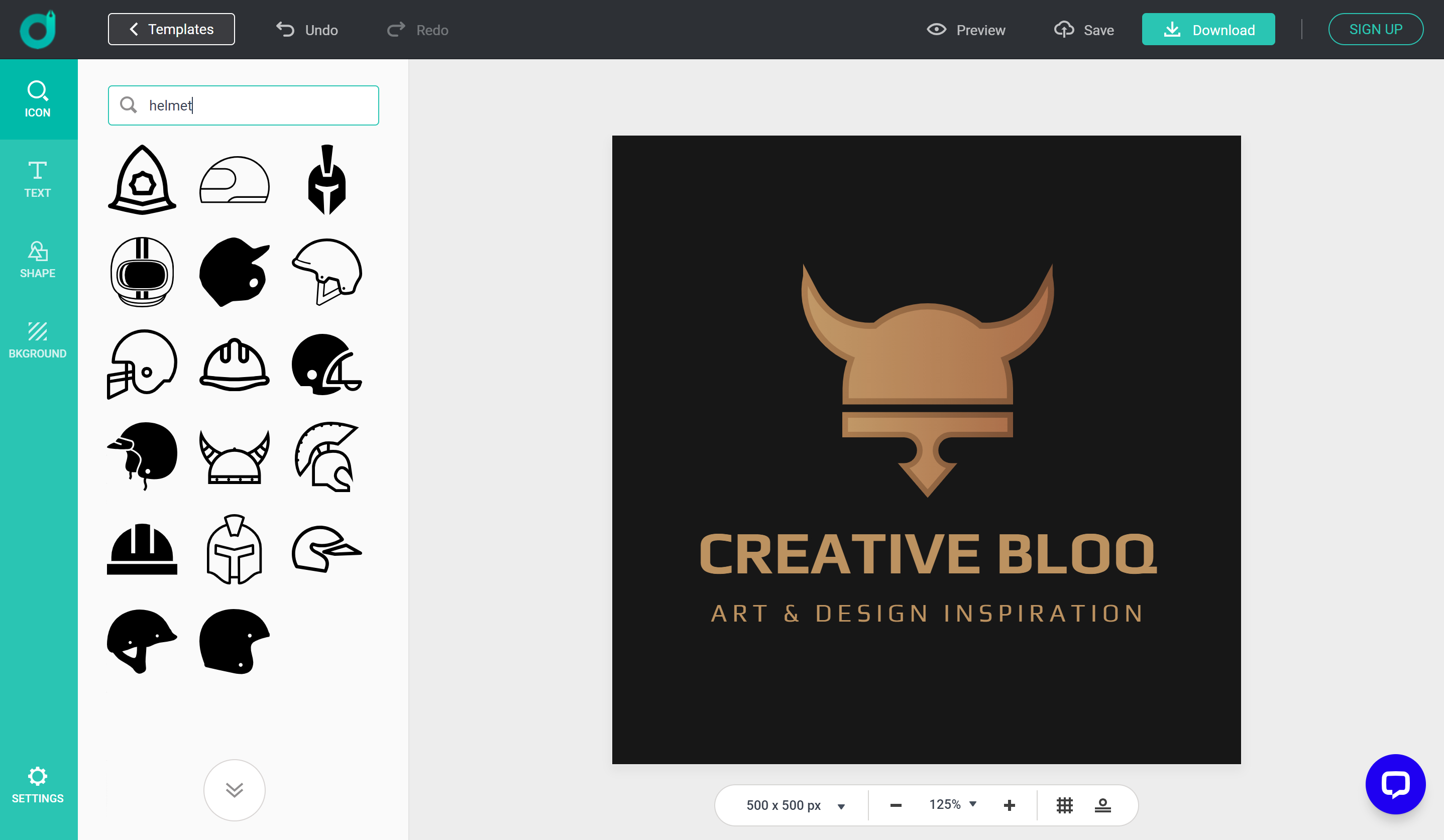
Need to know: Want to keep your options open when you're choosing one of the best free logo makers? DesignEvo's Free Logo Maker lets you work however you want. Like Canva, it offers plenty of templates, giving you flexible options for putting together your logo.
Ease of use: DesignEvo has an intuitive interface and powerful editing features, but you don't need any professional design skills to create a logo. There's no step-by-step guidance, which newbies might miss, but it's so simple to use we doubt you'll need it.
Features: There are over 6,000 templates that you can browse if you want a head start on your design, but if you're set on going it alone you can start from scratch too, with a blank layout and build a logo using symbols, shapes and fonts.
Paid plan benefits: When you're done you download a free low-resolution logo (a 300px PNG); for scalable vector versions, prices start at $24.99.
Attributes | Notes | Rating |
|---|---|---|
Ease of use | Simple to use, but no set-up wizard | ★★★ |
Features | Plenty of templates and a free-form mode. | ★★★★ |
08. MarkMaker
Our expert review:
Reasons to buy
Reasons to avoid
✅ You want an SVG file: While we weren't too impressed with MarkMaker, it merits inclusion as offering the only genuinely free SVG download.
✅ You enjoy the generative process: The system of 'liking' designs you like and seeing more designs in that style can be fun.
❌ You want pro-grade results: It's not going to give you anything earth-shattering.
❌ You're in a hurry: There's a fair amount of AI jank to wade through before you get to something decent.
🔎 MarkMaker is another option that does all of the work for you since there are no customisation options whatsoever. ★★★
Need to know: MarkMaker is a super simple generative tool that will do all the legwork, like many of the other options on this list like Tailor Brands. However the results are peculiar at best.
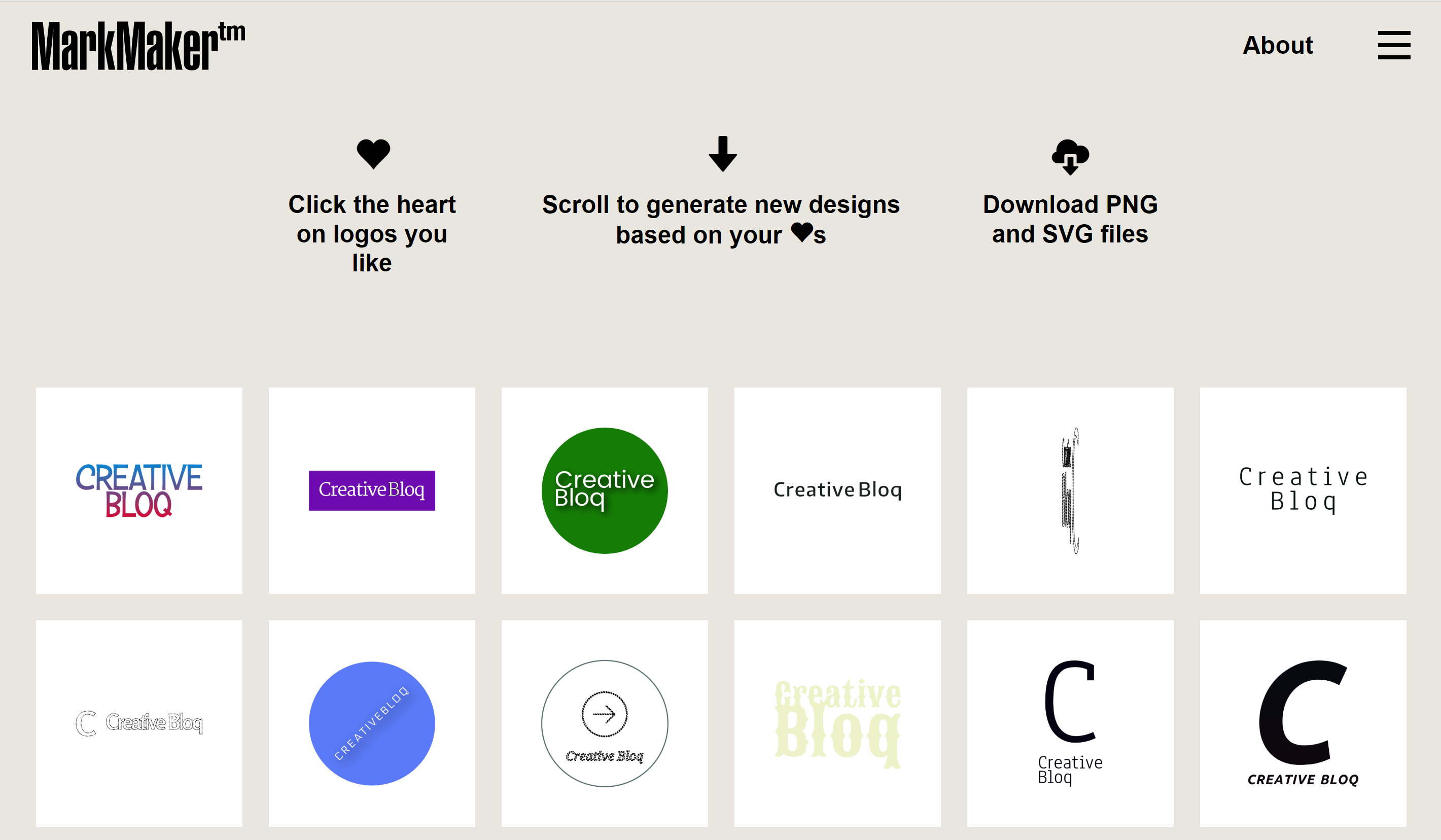
Ease of use: MarkMaker simply asks you for your business name, and then starts generating random logo suggestions. The neat part is that, you can click on the ones you like to 'like' them, which will lead it to generate more options along the same lines if you scroll down.
Features: At least in theory, it's a neat way of doing things, that should get you closer to a logo design you like as you scroll down clicking designs that appeal to you. Unfortunately, we found the designs tend to be quite poor. There's some very, very, let's say, unconventional kerning going on and even some bizarre stretching of text, sometimes to the point of rendering logotypes that look worse than an illegible Captcha. If you're patient, there's a chance you might find something you like.
Paid plan benefits: The good news is that you can download your logo as a PNG or SVG; both are free. That makes it the only genuinely free logo maker on this list if you need an SVG file to have the option to resize (the site welcomes donations).
Attributes | Notes | Rating |
|---|---|---|
Ease of use | Effortless to use... | ★★★★ |
Features | Little customisation for the poor results. | ★★ |
How to choose the best free logo maker
When looking for a top free logo maker, ask yourself some key questions and see if the features and process of the logo maker match what you need. Some good questions include: What are you goals and aims from the final design? Who is your target audience? What brand values need to be represented? How will your logo be viewed? What should the logo accomplish?
Once you've done that, evaluate the customisation options. The best free logo makers offer a range of fonts, colours, and icons to personalise your design. Look for a platform that allows you to tweak every aspect of your logo, from size and placement to orientation and colour palette.
Additionally, assess the quality of the templates available. A diverse selection of templates can provide inspiration and cater to various industries and styles. Make sure the templates are modern and adaptable to your brand's identity.
Finally, consider the output quality and format options. The logo maker should allow you to download your design in high resolution and offer different file formats for versatile use across digital and print platforms.
How we tested the best free logo makers
As with all design software, curating our list of the best free logo makers involves a thorough testing process. We created a logo from start to finish using all the options above. First, we evaluate the user interface to assess with its intuitive, user-friendly, and caters to individuals with varying levels of design expertise.
Furthermore, we assess the depth of customisation, ensuring users can tweak every element to align with their brand identity. We look for platforms that provide modern, high-quality templates catering to a broad spectrum of industries and design styles. We also consider output quality, sizes and file types available for download and scrutinise each tool for hidden costs or limitations in the free version.
FAQs
Is there a 100% free logo maker?
Most of the free logo makers on our list above are only free if you're happy to walk away with a very small version of your finished design, typically around 250px. That could serve you if you only need a social media avatar or a favicon, but it's not going to cut it if you want to use your logo design on posters, merchandise or anything else that requires resizing.
For that, you'll normally want your logo in a vector file format like SVG or EPS. Vector files allow you to resize your design without it becoming distorted and losing quality. However, the only logo maker in our list that offers an SVG file for free at the time of writing is MarkMaker, which is at the bottom of our list because its results are very hit and miss.
The good news is that most of the other logo makers on the list do let you access all or most of their tools for free. Which means you can see what they are capable of and ensure you're completely happy with your design before you have to pay to download your finished design. And in most cases, what you pay to download the design, is very cheap compared to what it would cost to buy more capable software. However, note that some logo makers also have limits on what tools you can use in their free versions.
Are free logo makers any good?
While an online logo maker is no replacement for an experienced graphic designer, free logo makers can be good places to start. They can provide ideas, and they could even come up with a finished design that will serve your needs if you are just starting out as a very small business and don't have the resources to employ a designer just yet.
Our list features some reputable free logo makers such as Wix, Ucraft and Canva. All can be used for commercial purposes. Some will ask for payments for full use of their features or to download your logo design at a decent size.
What is the most professional program for logo design?
The industry-standard graphic design software for professionals is Adobe Illustrator. It's not free, but you can get a free seven day trial of Adobe Illustrator. If you don't want to pay a subscription after that, then check out Affinity Designer, one of the best Adobe Illustrator alternatives available for a one-off price.
Sign up to Creative Bloq's daily newsletter, which brings you the latest news and inspiration from the worlds of art, design and technology.

Jim McCauley is a writer, performer and cat-wrangler who started writing professionally way back in 1995 on PC Format magazine, and has been covering technology-related subjects ever since, whether it's hardware, software or videogames. A chance call in 2005 led to Jim taking charge of Computer Arts' website and developing an interest in the world of graphic design, and eventually led to a move over to the freshly-launched Creative Bloq in 2012. Jim now works as a freelance writer for sites including Creative Bloq, T3 and PetsRadar, specialising in design, technology, wellness and cats, while doing the occasional pantomime and street performance in Bath and designing posters for a local drama group on the side.
- Joe FoleyFreelance journalist and editor
- Jon StapleyFreelance writer
