10 incredible drop cap designs
Drop Caps have been around for thousands of years, but they’ve still got the power to wow, as these examples demonstrate.
Sign up to Creative Bloq's daily newsletter, which brings you the latest news and inspiration from the worlds of art, design and technology.
You are now subscribed
Your newsletter sign-up was successful
Want to add more newsletters?
Since before Roman times, calligraphers have used ornate lettering to help draw attention to passages of text, highlighting and illuminating important sections with the use of illustrative, often dazzling letterforms and creative fonts.
After the introduction of Gutenberg's printing press in the 13th Century, much type was set mechanically but the drop cap remained, completed by hand by artists after the page had been printed. Typically the printer would leave a space for the illustration, marking it with a single character to indicate the letterform required. Alternatively a wood-cut block featuring the display character would be inserted alongside the metal type.
As a typographical technique, drop caps are still extremely popular today and are one of the printing terms you should know. Magazines use them to highlight the beginning of an article, or to transition to a new section, while books continue to employ them to add visual panache to an otherwise plain passage of text.
Article continues belowFlourishing community
While we're a far cry away from the original gold-leaf illuminations of the renaissance, even the modern reading platform has embraced the idea of the drop cap: the web has a flourishing community of drop-cap enthusiasts and proponents. You can see examples in the wild from newspaper websites to designers' blogs.
We've pulled together ten of our favourite drop cap letterforms here for your inspiration and visual enjoyment - check them out below.
- Read all our typography-related articles here
01. 'C' by Maxwell Lord
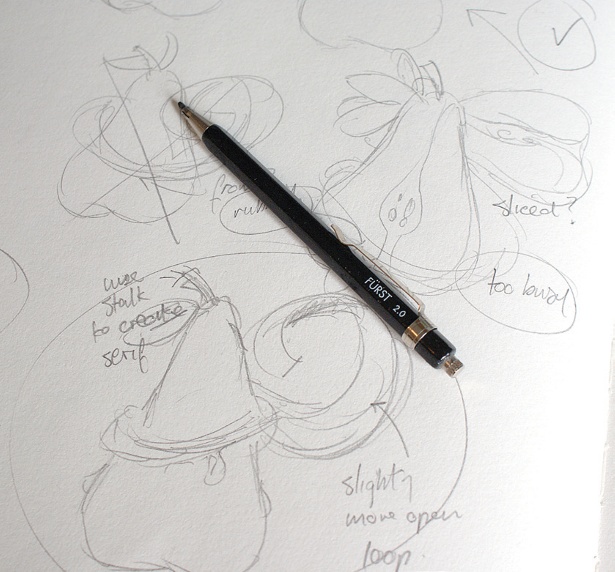
Crafted by designer Maxwell Lord, this blackletter-styled uppercase 'C' features clean lines with lovely detail. The artwork was created for Jessica Hische's Daily Drop Cap website after the pair had collaborated in an art project.
02. 'A' by Jessica Hische
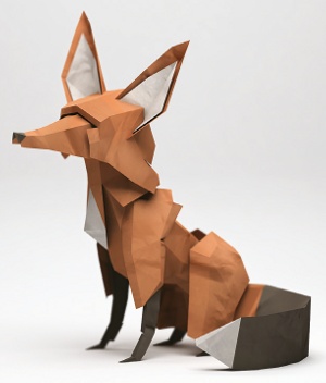
Jessica Hische is a well-known typographical designer, who runs typographic workshops teaching designers how to generate vector letterforms, and is also responsible for the Daily Drop Cap project. This uppercase 'A' features wonderfully simple line work that, despite its basic construction, feels sophisticated, open and light.
Sign up to Creative Bloq's daily newsletter, which brings you the latest news and inspiration from the worlds of art, design and technology.
03. Tree of Jesse 'L'

This gorgeous example of a drop cap is featured in an illuminated biblical manuscript dating from 1180. The letterform depicts the Jesse Tree, in which the ancestors of Jesus Christ are shown in a genealogical tree, stemming from Jesse of Bethlehem. The artwork here is especially rich, featuring regal blues and golds, helping to tell the story. It also shows that you don't need to limit your search for inspiration to contemporary artwork.
04. Alphabetica 'H' by Bobby Haiqalsyah

This sumptuous blackletter H was created by Bobby Haiqalsyah for the Alphabetica exhibition in Sydney. Haiqalsyah details his process in his Behance post, showing the level of detailed work that went into creating the form.
05. Paper 'A' by Sabeena Karnik
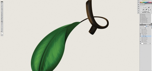
Although not a dropcap in the traditional sense, this wonderful paper art letter A forms part of an entire alphabet constructed by designer Sabeena Karnik. This letter is typical of the set, showing intricate details and careful choice of colour to create an incredibly accomplished illustrative, tactile letterform.
06. 'M' – Album Cover by Hannah Morrison
We love this painterly letter 'M' which forms the cover art for a debut EP released in 2012 by Madeon. Designer Hannah Morrison's artwork is incredibly detailed under close examination, but feels simple and accessible from distance. The choice of colour is especially evocative, drawing attention to the iconography Morrison has included.
07. 'D' for Dickens' Great Expectations, by Jessica Hische
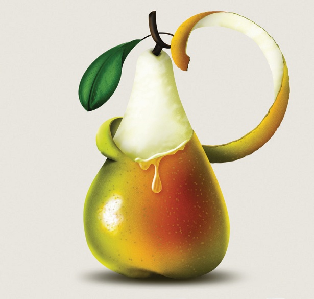
We featured these brilliant Penguin book covers designed by Paul Buckley and Jessica Hische back in September last year, and the artwork is still just as fresh and appealing now as it was then.
08. Alphabetica 'A' by Matthew Tapia

Another contribution to the Alphabetica exhibition, this strong letter 'A' by designer Matthew Tapia is available to view in both the original sketch form and the completed artwork, via Dribbble. The letterform itself features a heavy-set 3D effect to create a strong, eye-catching character.
09. Floral 'M' by Marcelo Oliveira

Portuguese designer Marcelo Oliveira specialises in typographical work and illustration, and as his Behance profile shows his work includes a range of excellent letterform work. This floral letter M particularly catches the eye with its fleur-de-lis motif and crisp monochrome lines.
10. Chromolithographic letterforms
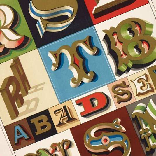
These beautifully rendered characters come from a sign-maker's book plate, printed in 1898 as part of The Sign Writer and Glass Embosser, by William Sutherland. This plate shows intricate shading and dimensional depth-enhancing work that, although intended to illustrate window or sign painting, equally applies to drop caps.
Words: Sam Hampton-Smith
Like this? Read these!
- The best free fonts for designers
- Gratis graffiti font selection
- Tattoo fonts - and they don't cost a penny
Have you seen any nice drop cap designs recently? Let us know about them in the comments!

The Creative Bloq team is made up of a group of art and design enthusiasts, and has changed and evolved since Creative Bloq began back in 2012. The current website team consists of eight full-time members of staff: Editor Georgia Coggan, Deputy Editor Rosie Hilder, Ecommerce Editor Beren Neale, Senior News Editor Daniel Piper, Editor, Digital Art and 3D Ian Dean, Tech Reviews Editor Erlingur Einarsson, Ecommerce Writer Beth Nicholls and Staff Writer Natalie Fear, as well as a roster of freelancers from around the world. The ImagineFX magazine team also pitch in, ensuring that content from leading digital art publication ImagineFX is represented on Creative Bloq.
