Micro trends: Graphic design aesthetics
FranklinTill reveals the seven key visual styles that should be gracing your studio’s moodboards over the coming year.
We’re not interested in trends for their own sake. For many designers, the very word ‘trend’ is something of a taboo, conjuring up images of blind imitation of whatever’s hot at any given time, rather than encouraging genuine innovation and independent creative thought.
Rest assured, you won’t find any of that here. Rather than looking at seasonal, fleeting trends, FranklinTill focuses on longer-lasting movements that have genuine impact on creative professionals.
“This is a visual run-down of seven major visual directions currently manifesting within graphic design,” explains FranklinTill’s co-founder Kate Franklin. “It’s also an identification and celebration of the key designers and studios responsible for driving these emerging visual landscapes.”
In this Computer Arts Collection trend report we’ll be presenting the fruits of their labour: from naïve hand-drawn type to minimalist monochrome, Bauhaus-inspired shapes to retro nostalgia, this is your indispensable guide to the aesthetics that will be getting clients excited, and most importantly, what makes them significant. Keep it close by in the studio.
01. The art of reduction
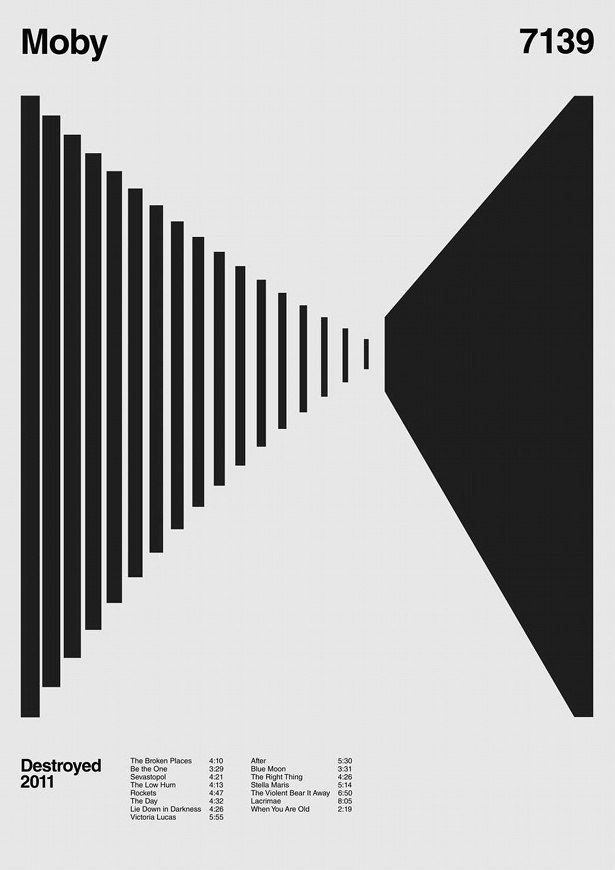
As a reaction to our participatory culture, in which we are always switched on, connected and increasingly overloaded with data, designers are exploring new and simplified ways of refining and simplifying visual information. They are experimenting with the art of reduction, discarding superfluous information and breaking down graphic artwork and typographic information into their purist forms.
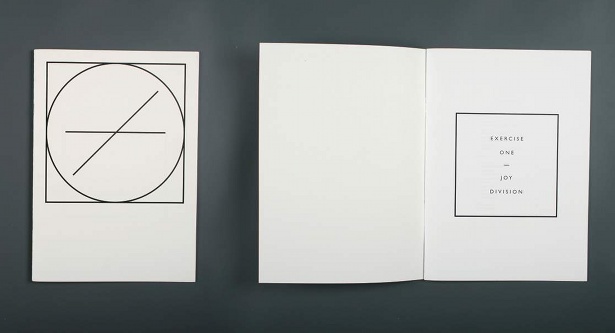
Through his Exercise One project, Josep Roman explores the reduction of information into the most nominal form. The publication forms a biography of the Manchester band, Joy Division, a story filtered down to sophisticated infographic material, in which the line becomes the leading protagonist.
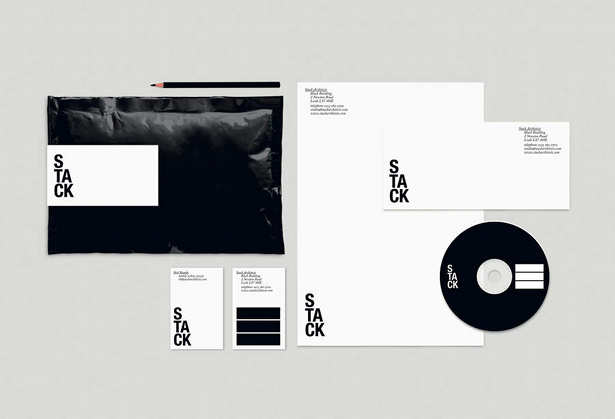
Reducing logos to their most simplistic form creates a solid and often authoritative brand identity. For example, brand design agency The Consult has created a playful, yet stripped bare, identity for London-based architectural practice stack. The effective monochrome identity visualises a stacked logotype and graphic icon, drawing upon a childlike representation of the profession.
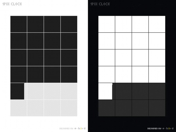
A digital clock display has been simply reduced to pixel form by Japanese design agency E-Bird. The 1pxclock is an iPhone app conveying time ticking away one pixel per second. It’s made up of 24 squares, each representing an hour, which are formed of 60 rows of 60 pixels to represent seconds and minutes.
02. Hand-drawn
As an antidote to highly-polished perfection, the raw product of the human hand has become increasingly alluring. It sits in stark contrast to slick digitally-produced graphic design.
The hand.written.letter.project by Craig Oldham has slowly gathered momentum since it began in 2007. It started life as a reaction to the depersonalisation of email, texts and tweets. Designers and creative thinkers were invited to send a handwritten note with comments relating to their thoughts about the handwritten word.
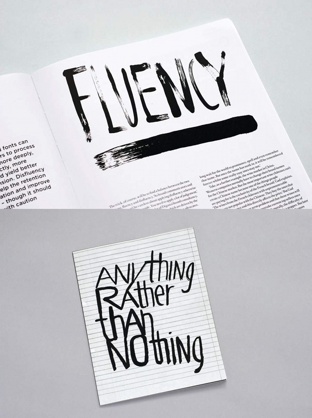
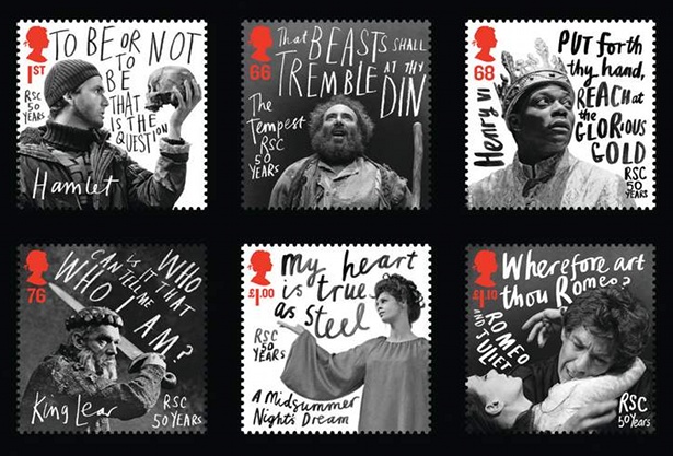
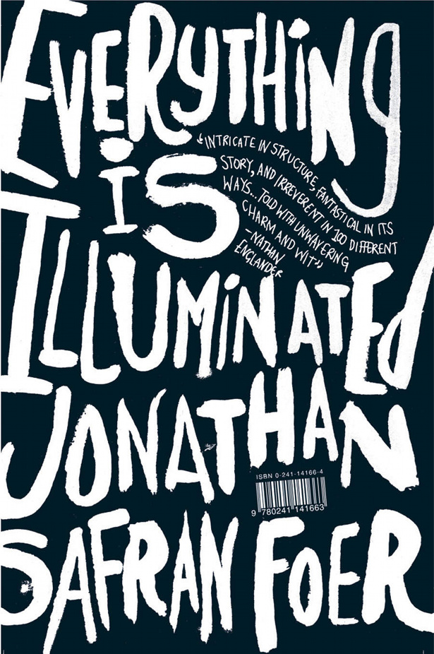
Another artist embracing this aesthetic is Jonathan Gray, who has worked under the name Gray318 for the past 12 years. His distinctive hand-drawn type has graced the covers of many books, the dramatic, painterly images resonating with the reader and drawing them into the novel. Similarly, Marion Deuchars’ hand-painted typography for the Royal Shakespeare Company’s Royal Mail stamp collection effectively captures the dynamic nature of the iconic quotes she scrawls.
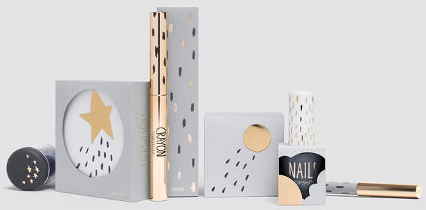
Capturing an air of authenticity and invitation, Spanish design studio Mllongo’s scribbled labels for Au Yeah beer capture a free-spirited quality. Illustrator Sarah Thorne combines naïve shapes with hand-drawn dashes and scribbles to achieve a playful, experimental approach for Topshop’s make up range. The resulting whimsical feel stands apart from the average sleek cosmetic packaging.
03. Bauhaus inspired
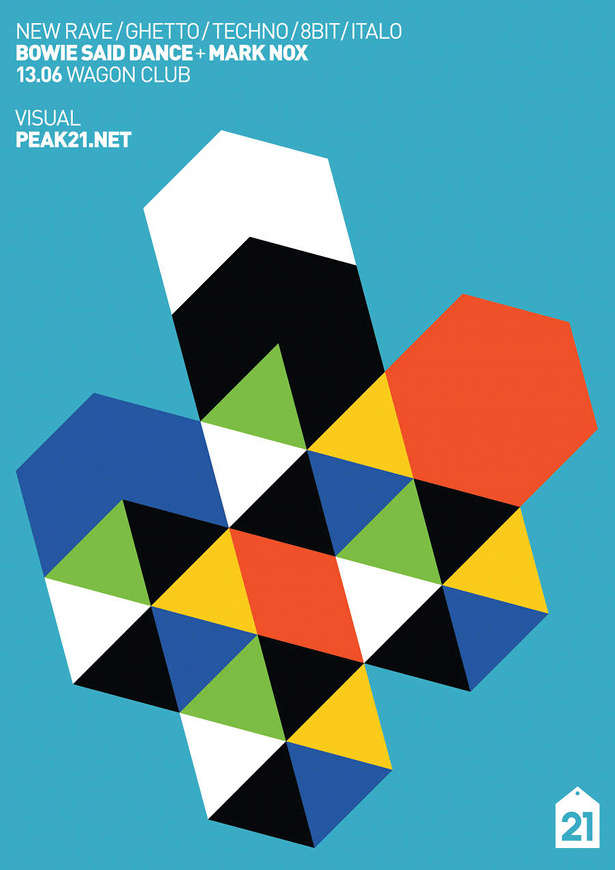
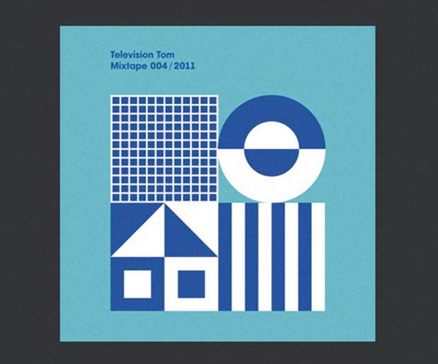
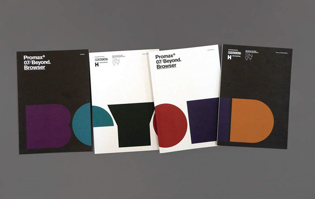
Simple, strong, graphic pattern typifies this trend direction, inspired by the purism of the Bauhaus aesthetic and its emphasis on straight edges and smooth, angular forms. Bold, playschool-style triangles, circles and hexagons suggest a cohesive and clean brand message. Block shapes replace linear patterning, suggesting clarity and authority in tone of voice. A clean, simple colour palette in which black acts as an important accent bouncing off bright, saturated primary red, turquoise and yellow, makes for a youth-inspired combination.
As seen in the work of Ryan Atkinson, the layering and segmentation of shapes to form abstract typography heralds a more sophisticated take on the recent Nu Rave typographic trends, fusing elements of 80s graphic design with Bauhaus Modernism. With similar reference to a love of 80s and 90s design, Polish design studio Peak21 has developed a trademark confident graphic style based around the deconstruction of bold, geometric shapes, resulting in the creation of minimalist, reductionist and clean-yet-expressive graphic communication.

04. True authentic
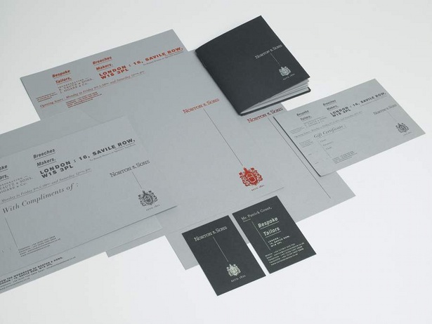
We have recently witnessed a renewed motivation amongst consumers to support independent producers, makers, craftspeople and artisans, moving against ubiquitous, mass-manufactured products. consumers continue to find reassurance in heritage brands that appear to have borne the test of time and, as a result, both young and established brands are reviving historical design cues to create on-the-spot heritage. communicating the craft story of a product, celebrating specialist, artisanal techniques and processes reconnects consumers with the product.
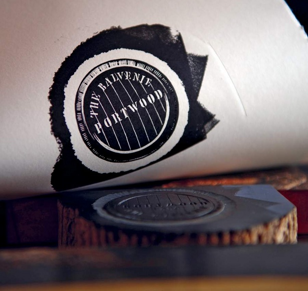
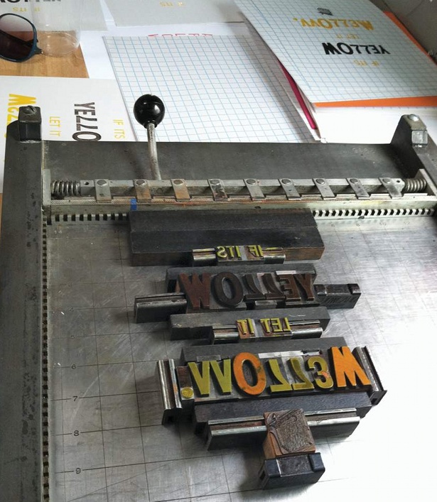
To launch a small batch of 150 bottles of Balvenie Forty single malt scotch whisky, Here Design collaborated with cabinet-makers, engravers and calligraphers to create packaging that reflects the quality and craftsmanship of the product. Meanwhile, American print designer Karl Durrie set up Type Truck – a travelling letterpress print shop to spread the word about the beauty of printing the old fashioned way.
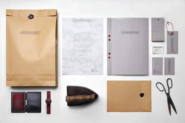
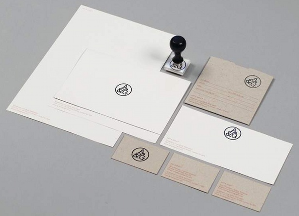
Hoping to communicate notions of utility and fitness for purpose, Swedish studio Planet creative employs several nostalgic materials and processes in its identity design for clothing brand Another Shirt Please. Utilising cues such as traditional wax seal stamps and utilitarian brown envelopes across business cards, swing tags and stationery, the aim is to communicate the brand’s pedigree for artistry, craftsmanship, and attention to detail.
Sign up to Creative Bloq's daily newsletter, which brings you the latest news and inspiration from the worlds of art, design and technology.
05. Refined grace
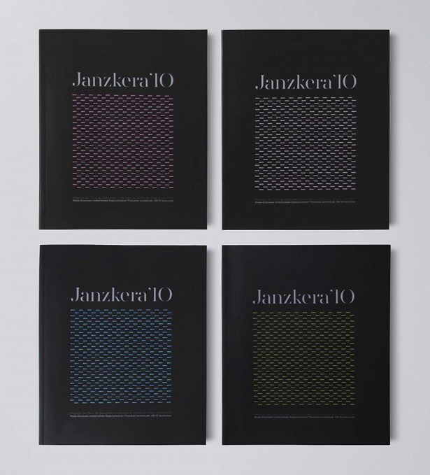
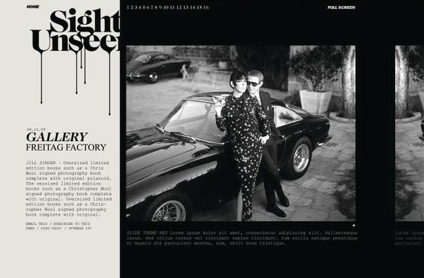
Satisfying consumers’ desire for pure, clean and simple design, this trend maps an elegant, feminised graphic landscape. Subtle graduations of texture and a soft, soothing palette exude calm, elegance and a smooth modernity. The resulting aesthetic is clean and thoughtful, as conveyed in the work of Spanish graphic design agency La Caja De Tipos. Their recent publication Janzkera 10 features a subtle stitched cover pattern, the textured detail providing a more intimate and tactile experience.
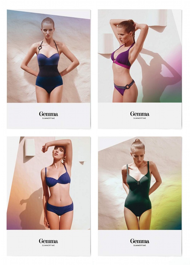
Bold photographic content set against full-bleed pages of colour in a palette of dusky pinks, pale aqua and pigeon grey creates a sense of calm. This can be seen in the work of Ruiz and Company in its treatment of swimwear brand Gemma’s lookbook. Gradations of colour and minimal, bold graphics create a pleasing contrast against 18th century Didot-inspired fonts. These in turn give a nod toward tradition, heritage and quality.
06. Retro chaos
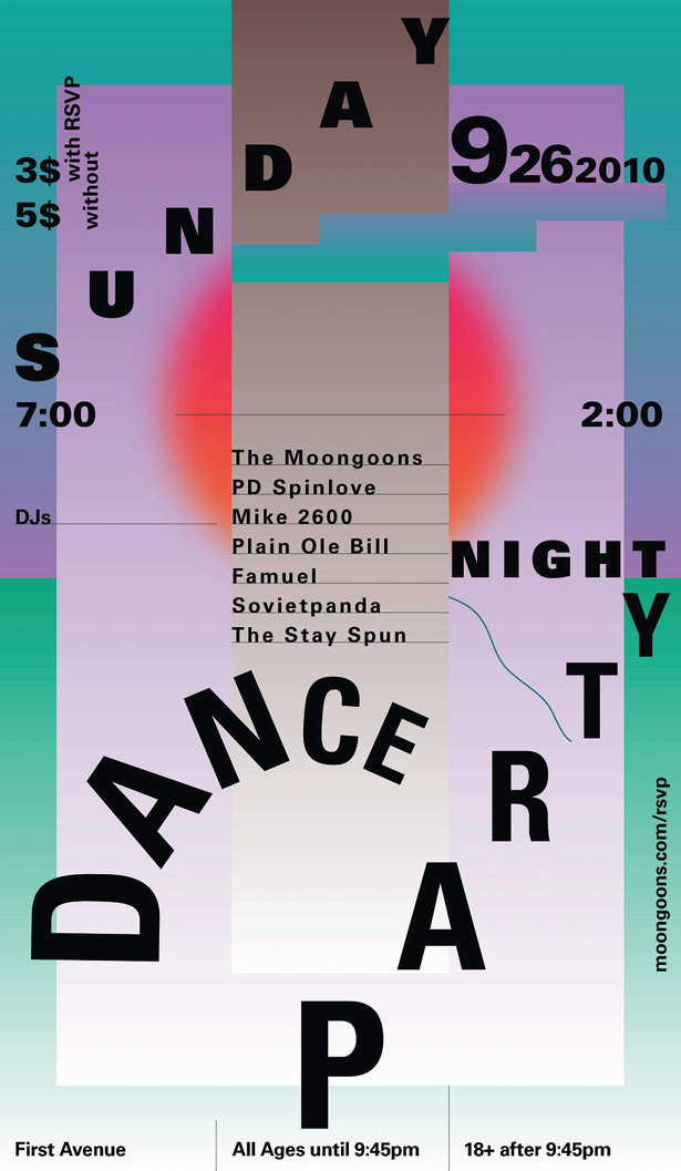
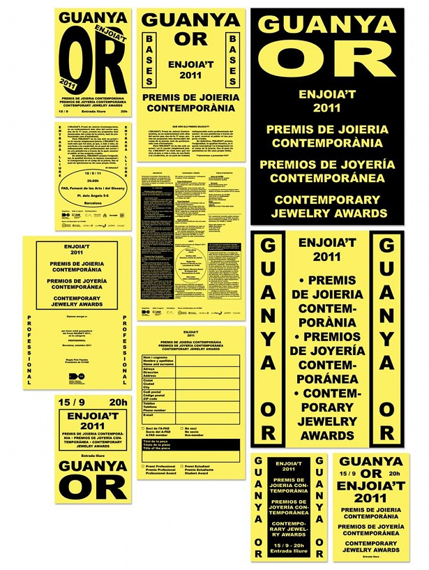
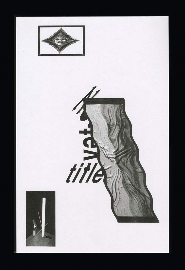
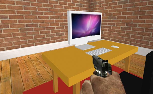
The celebration of glitches, failures, errors and mistakes is driving a new style direction in graphic design. Designers are embracing chaos in their creative practices, and as a result we can see the rise of a growing trend towards an intentionally chaotic and confusing visual language. Michael Bojkowski, editor of the blog LineFeed, sees this new shift being driven by “nostalgic references to early digital design that might have first appeared in broadcast or online, or even as early digitally-generated clip art.”
Epitomising this trend is the unconventional identity for wine makers Casa Mariol, created by Spanish design agency Bendita Gloria. Aiming to reflect the handmade elements of the wine, the studio utilised tools such as Wordart, Excel and clipart, creating retro-inspired graphics.
Nostalgia is not the only driver for this trend. According to Bojkowski, “This new form seems to be based on unearthing the mistakes of the past and turning them into graphic motifs.” citing the corrosion of the gulf between professional and amateur designers, Bojkowski details how seemingly tacky Photoshop effects such as bevels, drop shadows, and rainbow gradients – once considered ‘mistakes’ by an older generation of designers – have now become coveted tools by a new breed of designer.
07. Monochrome clarity
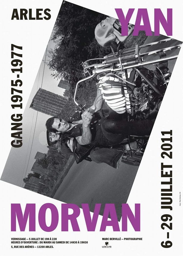
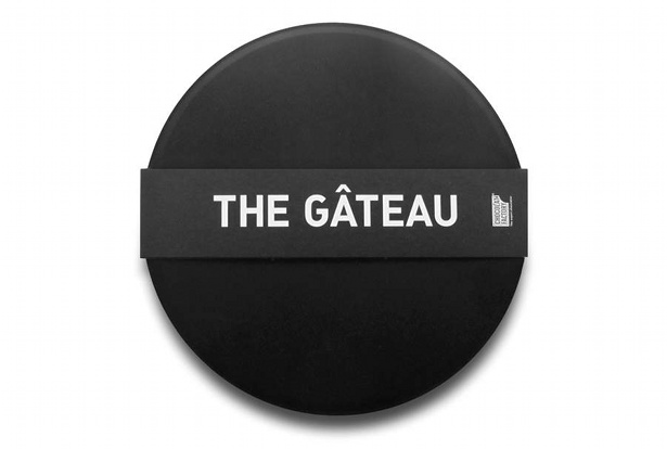
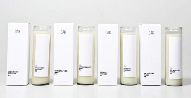
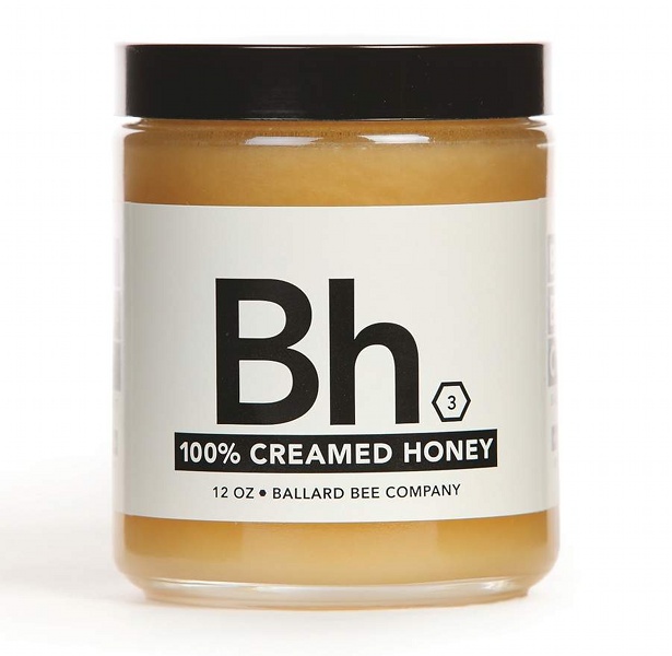
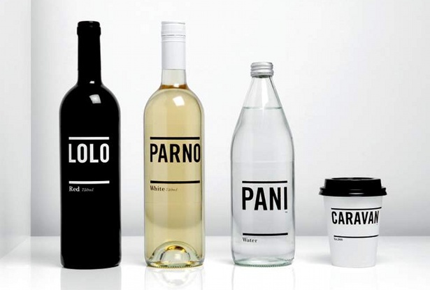
Simplicity reigns within communication design while packaging takes a sober turn, adopting a no-nonsense approach to attract a choice-weary consumer. Limited colour palettes, and bold typography with little ornamentation and patterning, offer clarity in a sea of choice. They provide a sincere tone of voice that suggests a considered product of value lies within. Unfettered sans-serif fonts suggest clarity and strength, while confident use of negative space creates a fresh, authoritative brand image.
This shift towards simplicity, functionality, and no frills is creating a new clean aesthetic where the modern day mantra is to consume less rather than more – reminiscent of German industrial designer Dieter Rams’s mantra “less, but better.”
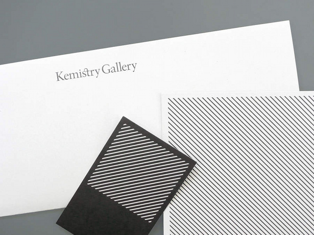
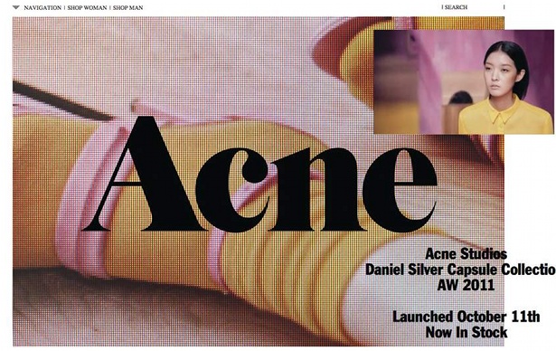
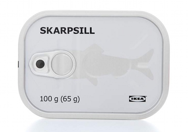
A monochrome palette exudes a modern day sobriety. Devoid of any decoration or superfluous detailing, simple messages are communicated without frills or fuss. Stockholm Design Lab’s packaging design for IKEA Sweden reflects IKEA’s product values – reliability, quality and value articulated using a clear, honest and contemporary aesthetic. The black, white and silver colour palette for All About Tea’s identity, designed by Moving Brands, adopts an honest and functional approach. The monochrome colours combined with the Orator font reference the kind of utilitarian infographics usually associated with import and export.
Liked this? Read these!
- Create a perfect mood board with these pro tips
- The ultimate guide to designing the best logos
- The best free web fonts for designers
- Useful and inspiring flyer templates
- Download free textures: high resolution and ready to use now

The Creative Bloq team is made up of a group of art and design enthusiasts, and has changed and evolved since Creative Bloq began back in 2012. The current website team consists of eight full-time members of staff: Editor Georgia Coggan, Deputy Editor Rosie Hilder, Ecommerce Editor Beren Neale, Senior News Editor Daniel Piper, Editor, Digital Art and 3D Ian Dean, Tech Reviews Editor Erlingur Einarsson, Ecommerce Writer Beth Nicholls and Staff Writer Natalie Fear, as well as a roster of freelancers from around the world. The ImagineFX magazine team also pitch in, ensuring that content from leading digital art publication ImagineFX is represented on Creative Bloq.
