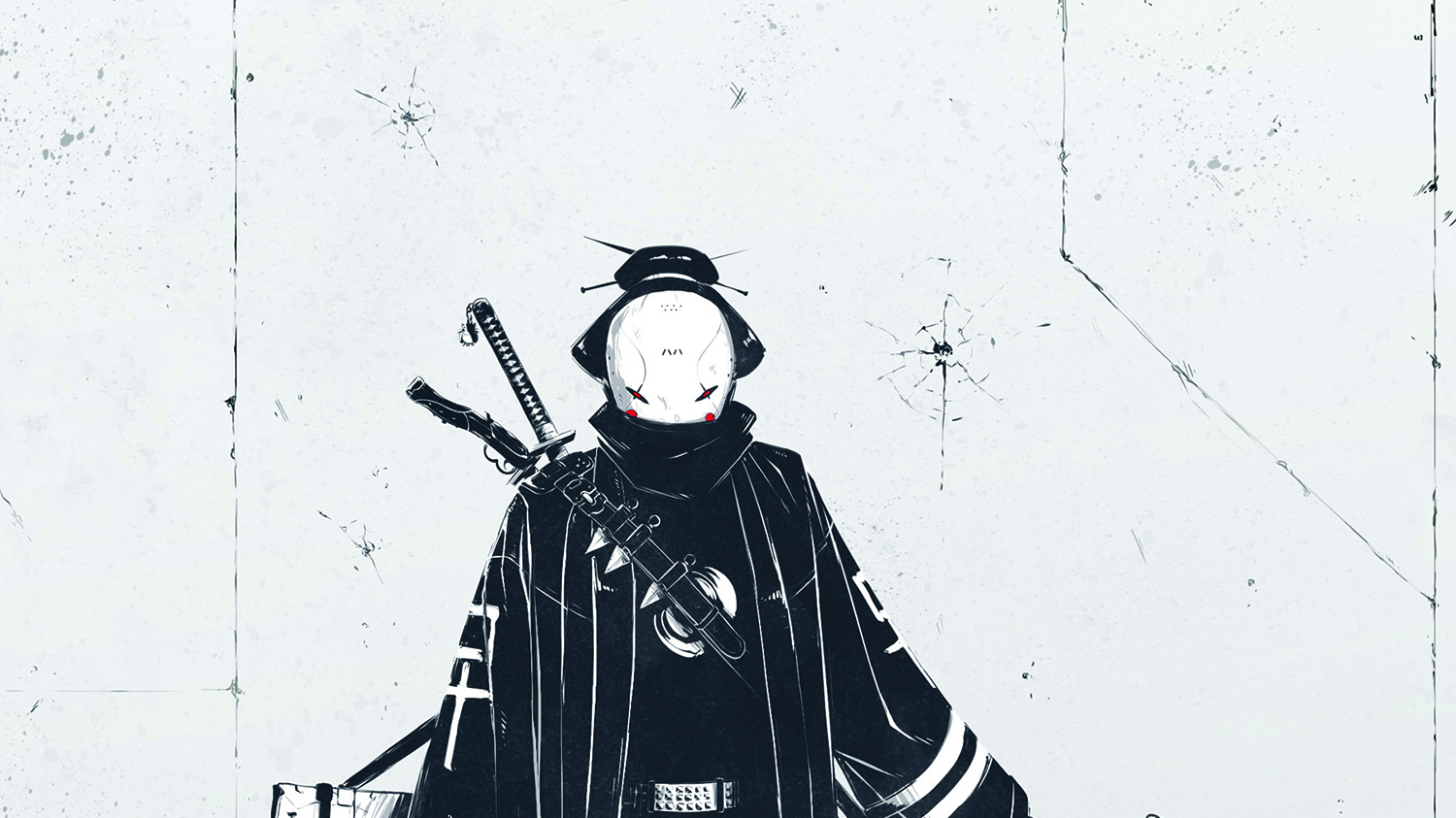
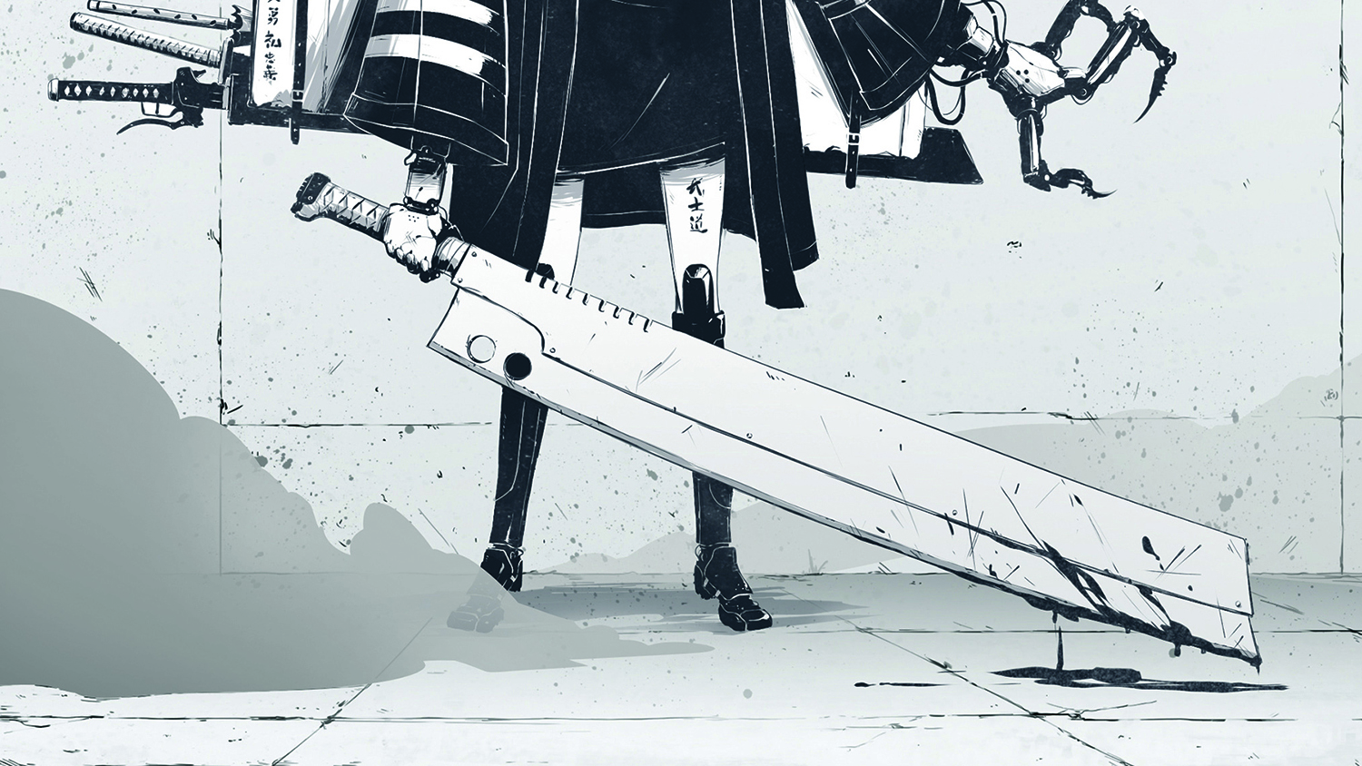
Draw a bad-ass geisha
Use these pro character design tricks to boost your concept art and draw a cyberpunk vigilante geisha.
Sign up to Creative Bloq's daily newsletter, which brings you the latest news and inspiration from the worlds of art, design and technology.
You are now subscribed
Your newsletter sign-up was successful
Want to add more newsletters?
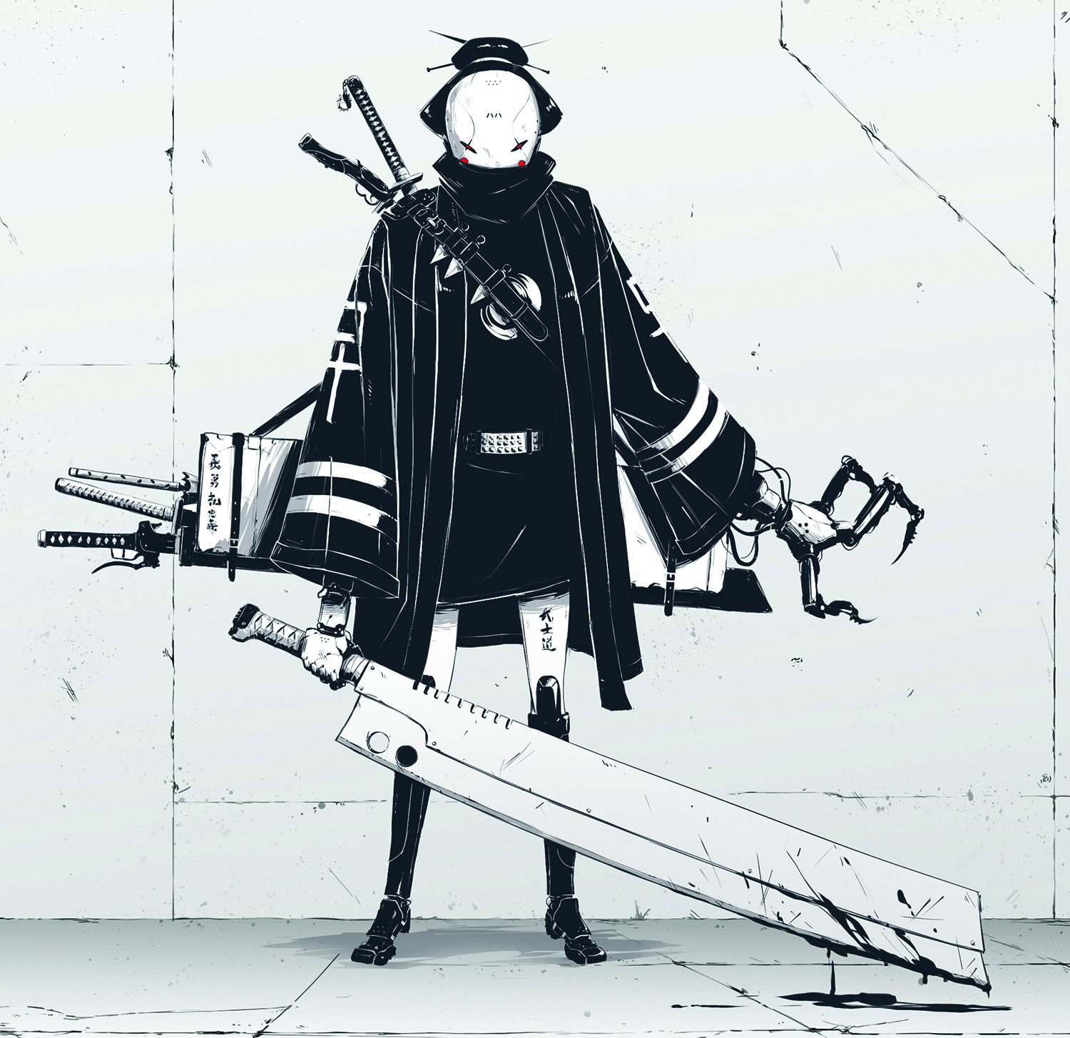
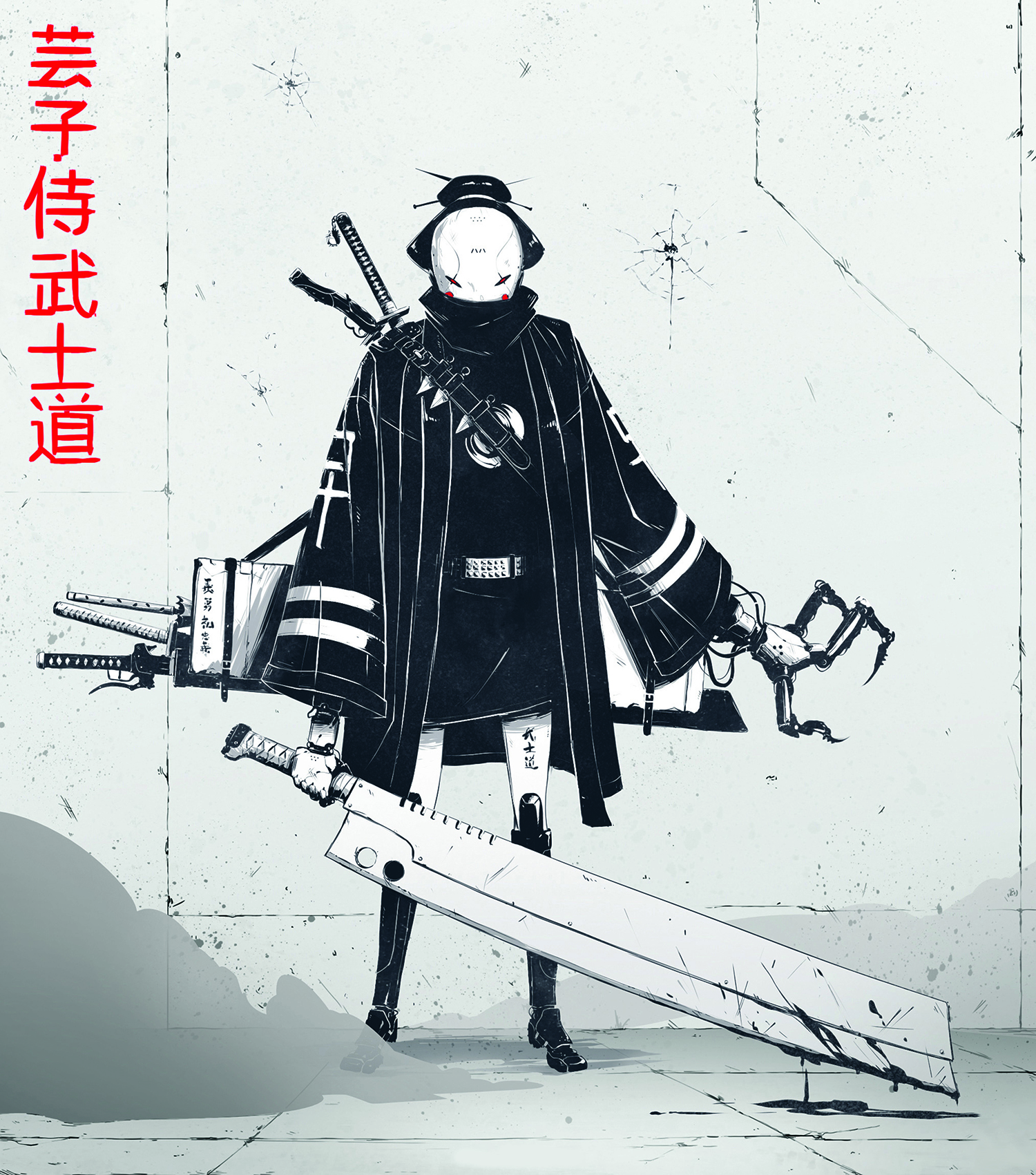
In this geisha illustration I wanted to capture a grungy, dark, urban vibe, laced with elegant traditional Japanese elements. I thought about how to draw people to make them as interesting as possible, and the idea that kept coming up again and again was to make her ‘bad-ass’. That’s the core essence of Geiko – she's a geisha turned self-serving samurai, a vigilante within a dangerous cyberpunk universe. I got the idea from a competition to design a geisha or samurai character.
Here, I’ll explain how I developed this Geiko illustration, and my whole thought process and approach to the character design. You’ll pick up tips on how to push your ideas forward and craft the final details. I want to leave you with concepts and art techniques you can adapt and use in your own work. So let’s start with the most crucial bit...
01. Visualise the big idea
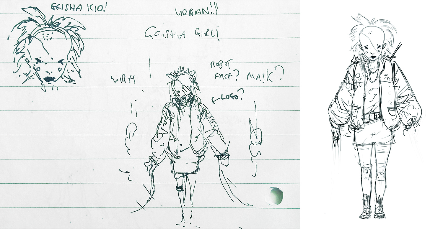
The very first step is deciding the look and feel of the character and capturing it all with a rough sketch. The most important thing is knowing exactly how you want your audience to feel about your character, because this will drive your whole thought process from start to finish. My core idea was to design Geiko so that people’s gut reaction to seeing her is: “That’s bad-ass!”
02. Generate thumbnails
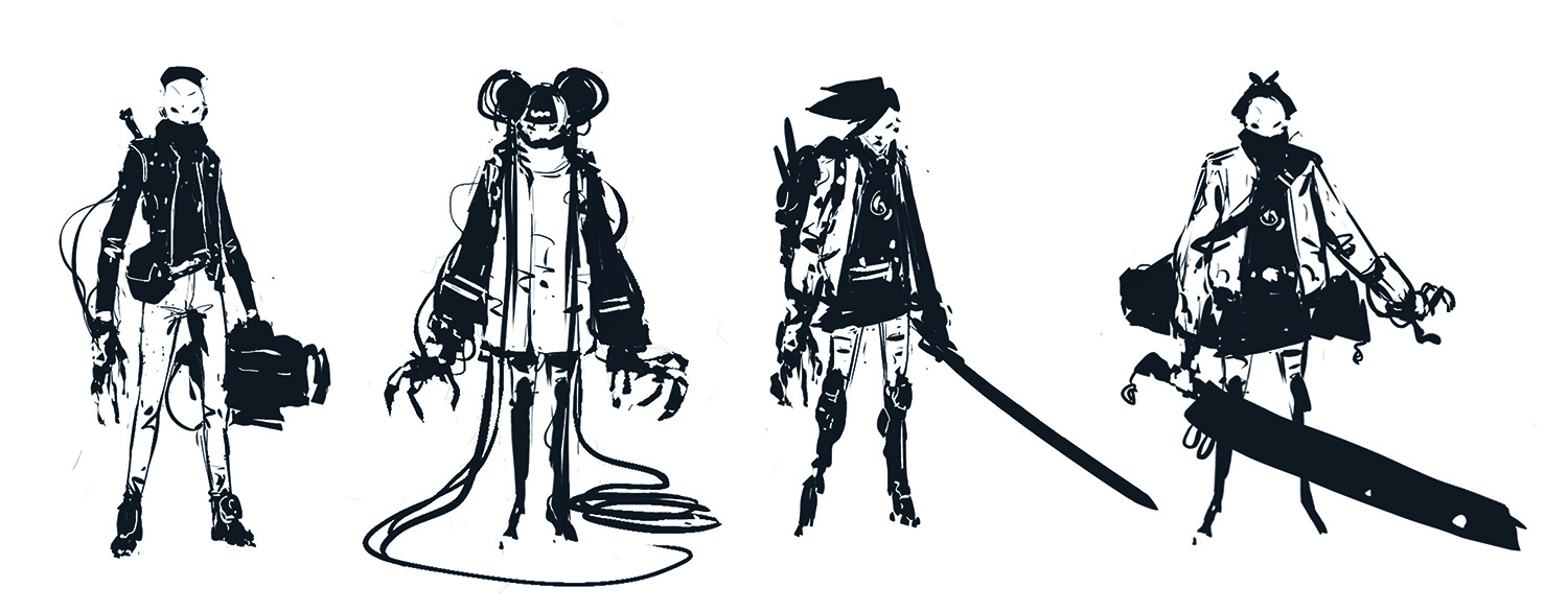
With that clear goal in mind, I jump into SketchBook Pro and use the Triangle brush to sketch my ideas out, exploring and pushing them further while staying true to the original Geiko essence. I keep it loose and gestural at this point, making notes on the ideas that I’d like to take forward. Throughout this process I keep asking myself, “Is she bad-ass enough?”
03. Finalise the idea
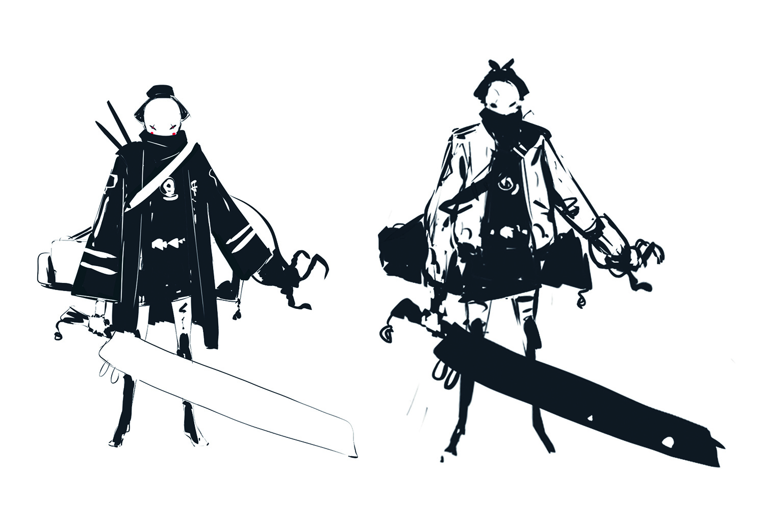
This is where I take all my favourite ideas that came out of the thumbnail process and explore how they can better capture Geiko’s essence. I duplicate my favourite thumbnail several times and try out those ideas, mixing more Japanese cultural elements back in with an urban cyberpunk twist. Don’t add too many details just yet. All you want to do here is finalise your big idea.
04. Polish and craft the design
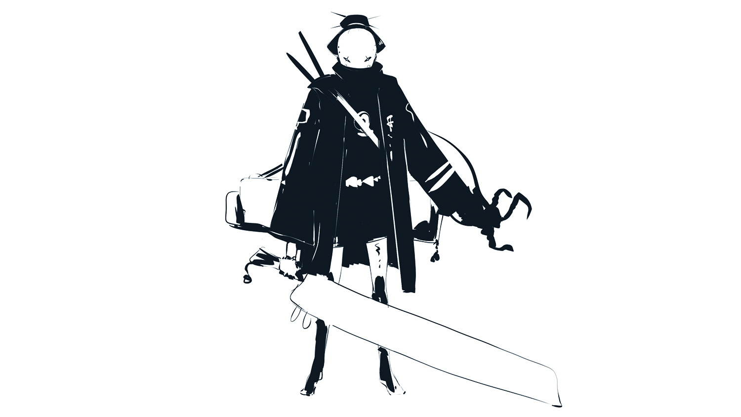
Everything from this point on is just polishing up. You’ll still be making some design choices, but the core essence shouldn’t change. I usually start with the face, because it’s the most important part of any character. If I get it right, the rest falls into place. There are no secrets here. I sketch with the Triangle brush and Eraser, pressing S to quickly flip between the two brushes.
05. Refine the clothing
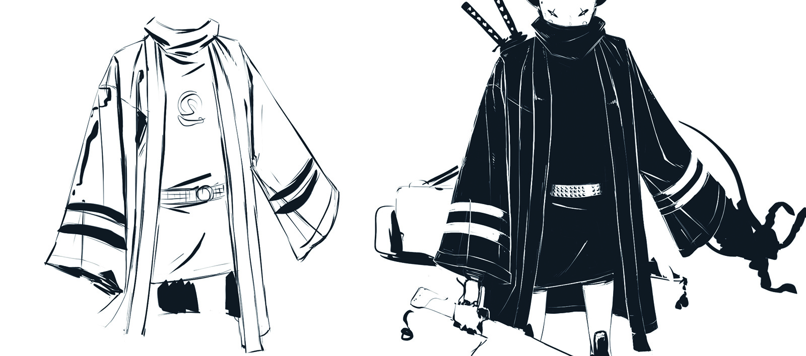
The next major element to get right is her kimono. I start by grabbing some references. (But remember: references are just guides, so don’t feel bound by them.) Then I create a new layer and make a rough sketch, focusing on the design and flow of the wrinkles. For the final look, I use the Eraser to follow my initial line work on the black kimono and create the white-on-black effect.
Sign up to Creative Bloq's daily newsletter, which brings you the latest news and inspiration from the worlds of art, design and technology.
06. Accessories and props
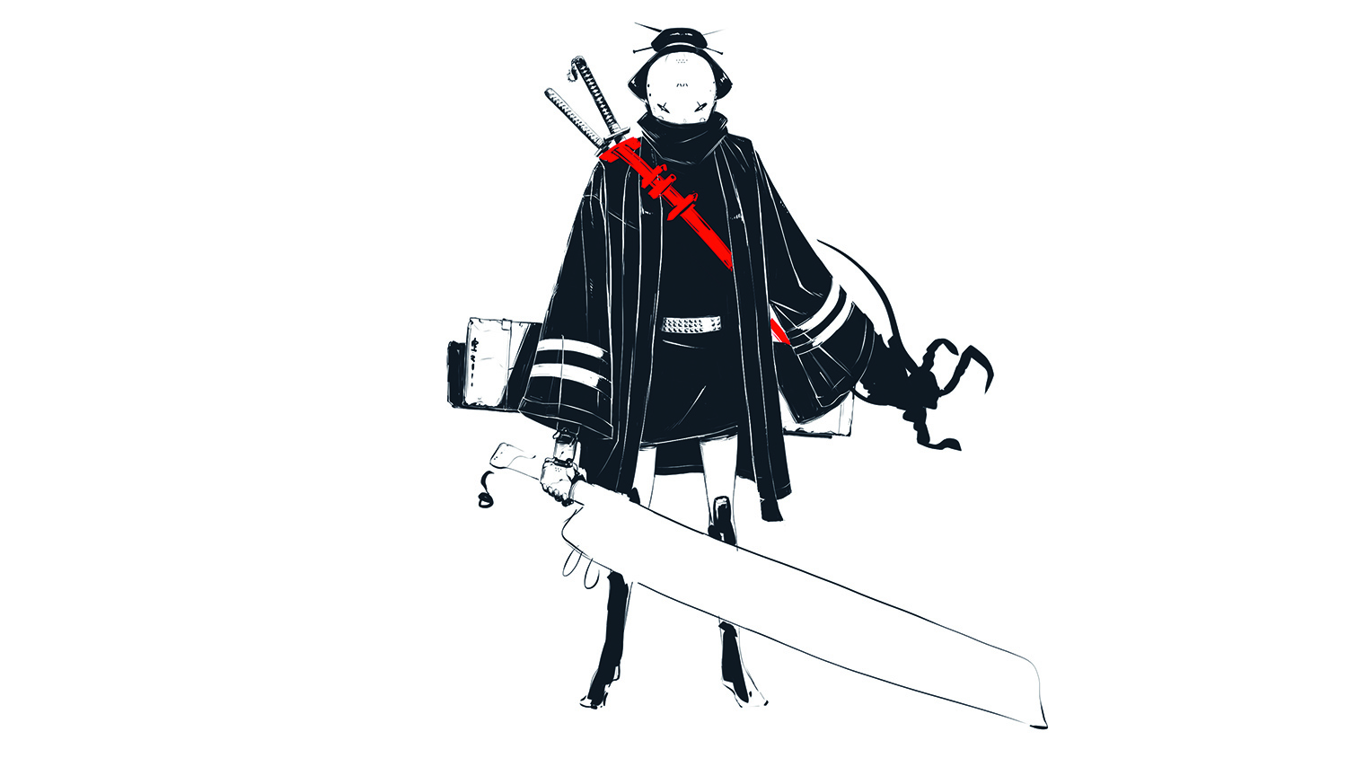
Using references, I work on the swords on her back, making a quick sketch in red to explore the function of the strap, while also playing with the idea of adding kunai knives. I also try to add clues about her personality, like a Totoro charm at the end of one of her swords. It’s subtle, but it helps make the character seem more well-rounded.
07. Bring in detail on her boots
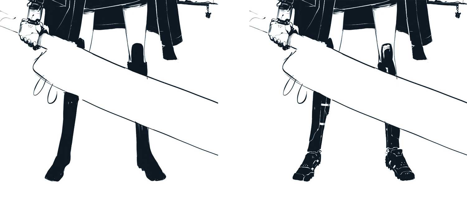
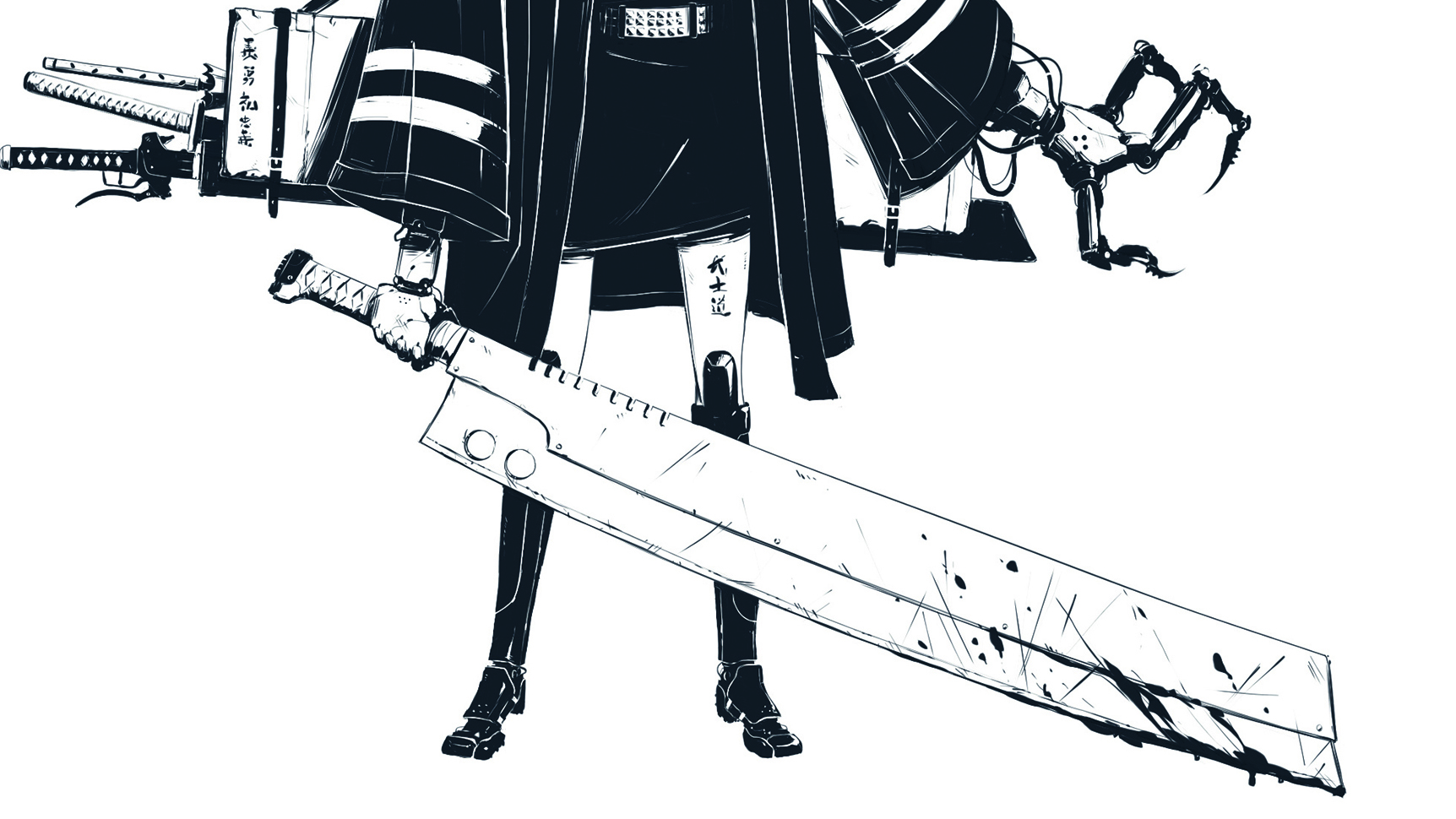
Next I start cleaning up Geiko’s boots. In a similar way to how I did the clothing, I use the Eraser to create the line work, which is consistent with the style of the image. Her footwear is inspired by a mixture of high-heeled boots with a sporty twist and Japanese ninja sandals. I want to create a glossy type of material for her legs, so I add white highlights to achieve that look.
08. Create the mechanical gauntlet
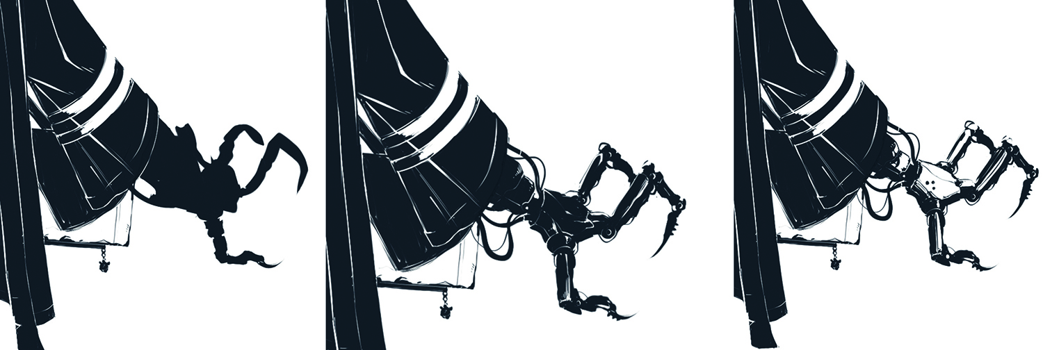
I want to keep the essence of my sketch, so I use the base silhouette of the gauntlet and start cleaning it up, erasing panel lines in, and drawing exposed wires to make it feel more customised instead of being built in a factory. I flick back and forth with the S key throughout, drawing lines in and erasing where necessary. I realise that the silhouetted gauntlet is blending in too much with her kimono, so I opt for a lighter version that helps to create a better read.
09. Stop… it’s paintover time!
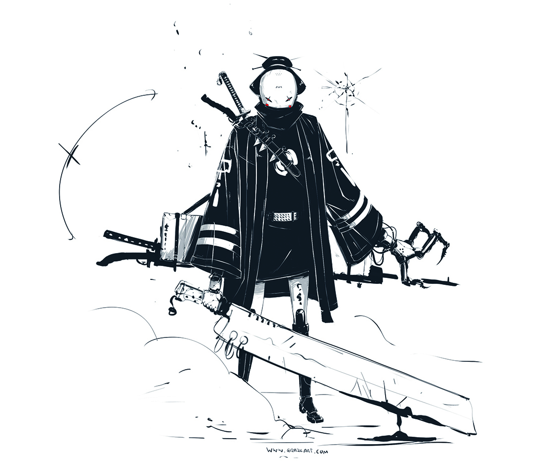
Now that I’m almost done with the design, I take a step back and look for any bits I can push further. A quick paintover enables me to explore how I can exaggerate Geiko’s bad-assery. I add a more well-rounded toolset of weapons including samurai gun-swords and a traditional Japanese umbrella. Then I push the storytelling with dripping blood and bullet holes, along with a smoke trail that adds movement, mystery and depth.
10. Detail Geiko’s primary weapon
From the loose sketch done in the paintover stage, I begin to finalise the main sword design. I don’t want her weapon to be elegant or well-crafted, but to feel more imposing and threatening, so I choose to go with an exaggerated butcher’s knife. I use the Ruler and Lazy Mouse features in SketchBook Pro to create the long, sweeping arcs in the blade, ensuring the line work feels rough and grungy.
11. Add the finishing touches
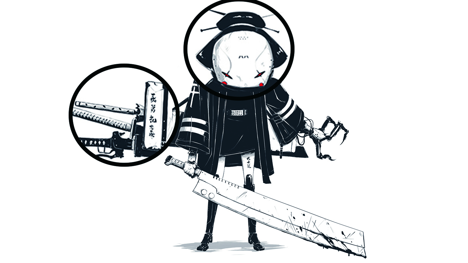
Before finishing up the design, I take the time to polish it up. I decide to add more details to her mask and sword, tweak the design of her cross-body strap and give her some branding and tattoos, making sure I use the correct Japanese phrases. Details like these count. I also include a shadow pass to add more depth, as well as the juxtaposition of her red demon eyes and rosy red cheeks.
12. Establish the background
With the character done, I jump into Photoshop to create the background and atmosphere to round off the piece. I imagine Geiko in a back alley, fresh from a fight. So I add a floor and wall pattern, making these more sci-fi and grungy looking to enhance the cyberpunk feel. I add a quick gradient to them, which helps pop the character from the background and add more depth to the image.
13. Build background details
I now add extra details and textures to the environment. Bullet holes, dust particles and dripping blood help tell more of Geiko’s story and push the final illustration. I use masks to blend some of the line work out, and use texture on the background and character with custom brushes to help it appear less digital.
14. Bring in action cues to push the mood
For even more depth and mood, I add action cues like smoke at Geiko’s feet. I use the Lasso tool to create the shape of the smoke, taking into account the wind direction that may tilt it slightly. I do this quickly to capture the motion, instead of lingering on it too long and making it too refined. Once I fill in my selection, to make it appear more like smoke I reduce the Opacity and use a mask to blend out specific parts even more, letting the background elements pop through.
15. Add a brand to your work
Branding, like your logo or signature and website URL, helps make your illustration yours wherever it ends up. People will always know whom to credit and future clients can contact you easily. Don’t forget to give it a title, too. It’ll help finish it off and make the piece feel more considered and complete.
This article originally appeared in ImagineFX, the world's best-selling digital art magazine. Subscribe here.
Related articles:
