How to draw a female figure
A step-by-step guide to drawing the female form from reference.
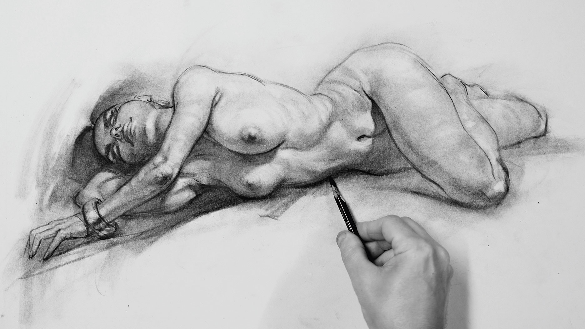
Figure drawing is a fundamental skill for artists, but one of the hardest to truly master. In this article, I explain my personal process for drawing the female form and offer some advice to help you improve your figure drawings. Also see my guide to how to draw the male form.
Although having knowledge of the proportions of a human figure is important, bear in mind that these are only a guide. Trying to shoehorn every person you draw into an eight-head-high ideal is a shortcut to uninspiring figure drawing.
To achieve style we need to work with gesture, the spirit of the pose, the fluid nature in line. If we take gesture too far, though, our drawing will look wobbly. To counter that we need to also work with a solid structure, but too much structure can make for a stiff drawing. Therein lies the great balancing act of figure drawing that we will explore here.
For a more basic guide, see how to draw a person or general how to draw tutorials. And stock up your pencil case with this best pencils guide.
Above you can watch one of my-depth video tutorials where I explore how to get the most from references. For step-by-step written instructions on how to draw a female figure, read the tutorial below.
Click the icon in the top right of each image to enlarge it.
01. Start with simple shapes
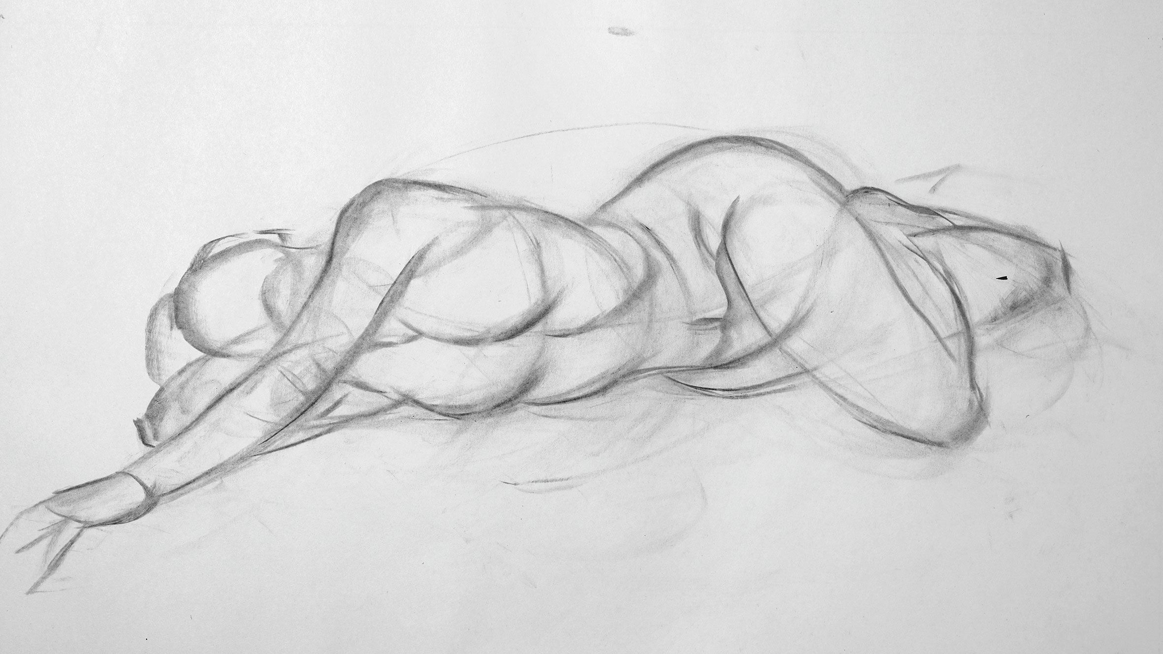
Start with your attention level set to high. I use a small, two-finger wide piece of charcoal for my initial sketch. Draw the basic proportions, making any adjustments required – especially if you're working from a photo.
Sign up to Creative Bloq's daily newsletter, which brings you the latest news and inspiration from the worlds of art, design and technology.
02. Add more sophisticated lines
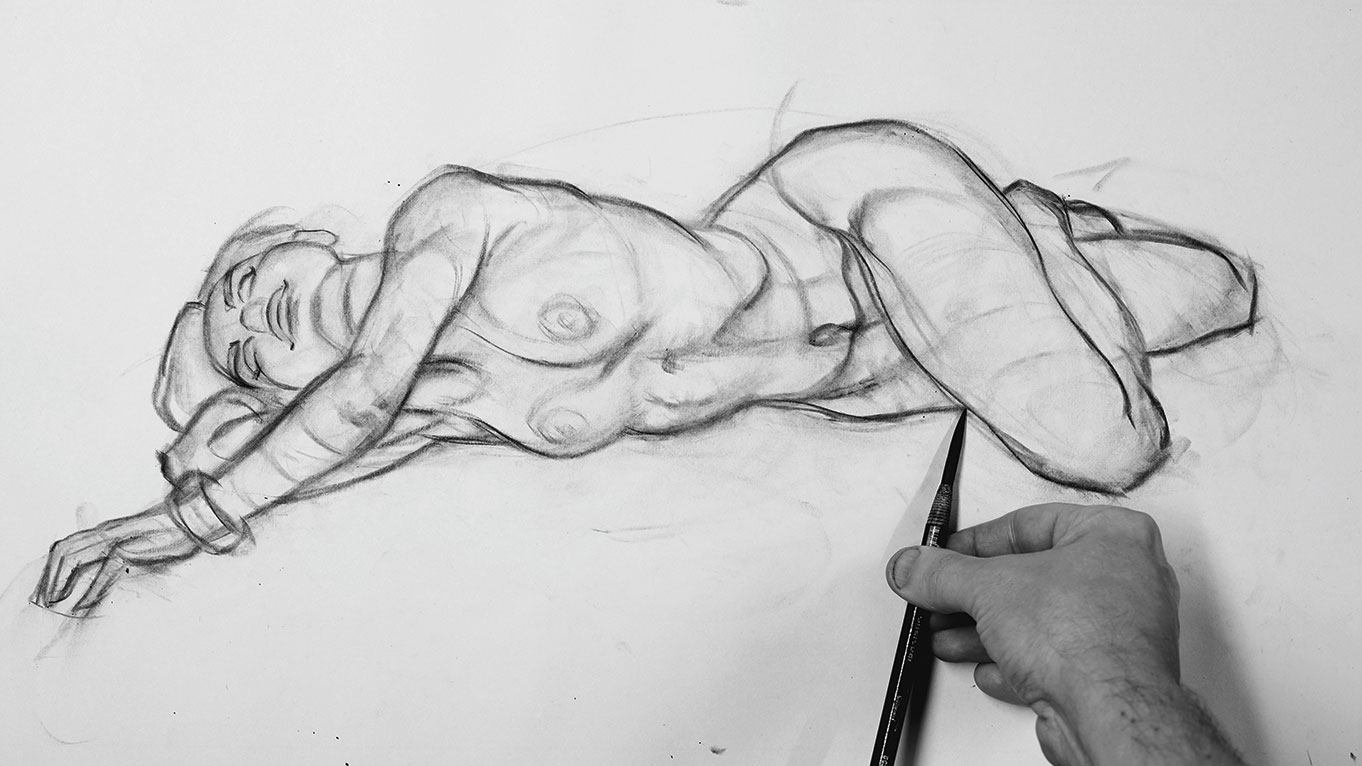
Starting your figure drawing with basic shapes makes it easier to draw more sophisticated lines on top. Here, I've drawn the face using small shapes inside a big shape. This is two of my disciplines in action at once: big to small; and simple to sophisticated.
Note the gestural grip in action. Drawing with our gestural hand enables us to use the rhythm of our arm rather than our stiff wrist to make our marks. It gives us the freedom to draw long fluid lines on the paper (for more advice, see this article on how to hold a pencil correctly).
03. Exaggerate the curves
I'm constantly analysing the photo reference. On closer inspection, what appears to be a foot is actually the ankle twisting. I decide to draw the classic shape of a foot to make the drawing more clear. I'm improving what I observe in the photo in terms of artistic mark-making. Note how many times I exaggerate the curves to make the drawing more lively.
04. Lay in broad tones in charcoal
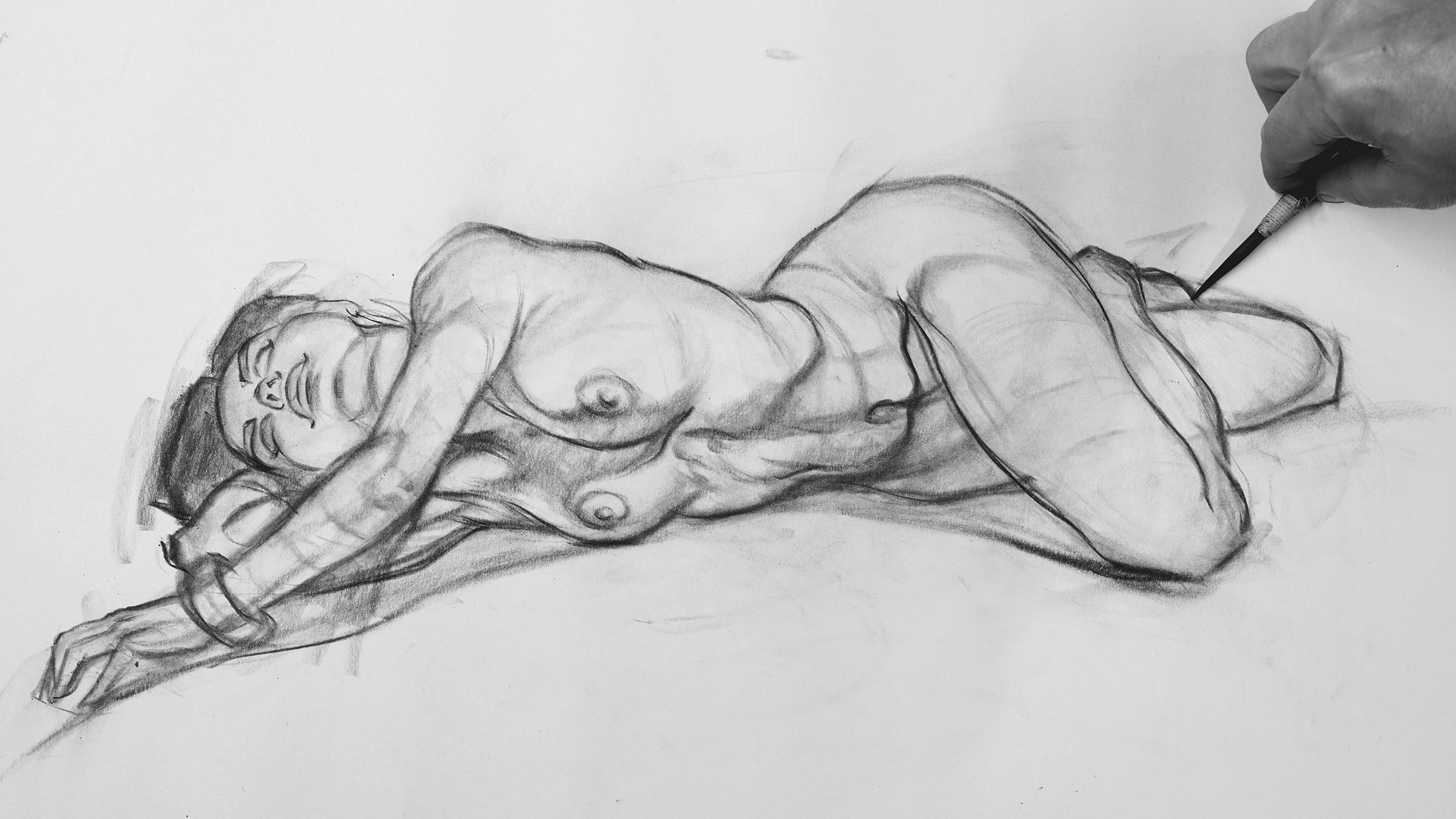
At this stage I step back from the art to check the drawing has solid structure. I lay in broad tones with my charcoal. Remember, our goal here is to interpret the reference. If we gauge success on how close we copy, we'll end up with a stiff drawing that looks like a distorted photo.
05. Blend tone into form
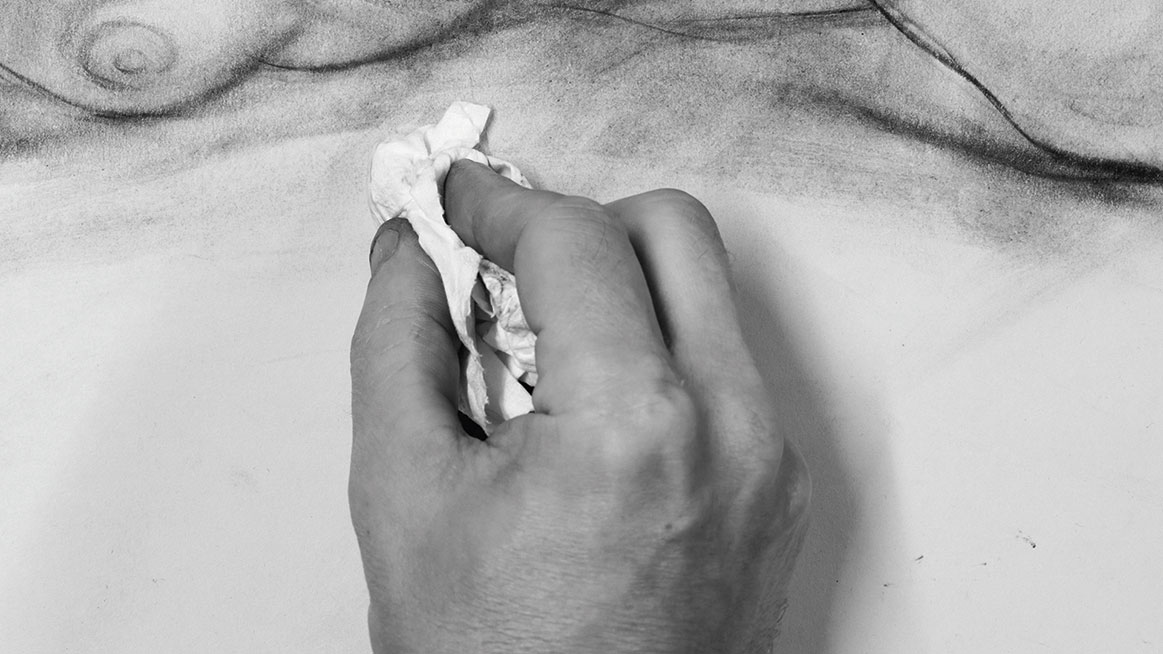
Up until now I've juggled gesture with structure. It's an okay drawing, but nothing stylish. This is the journeyman stage, from which we can stamp our own style. Using tissue, I blend tone into form, this also fades the drawing and gives me a second chance to draw better on top.
06. Add more tonal gestures
Here I'm making small structural adjustments and adding more tonal gestures. This second time around goes quickly – just a matter of minutes, which is a small investment for an hour-long drawing. From this point onwards, my quest is to further explore style in the drawing.
07. Remember, if it looks wrong, it is wrong!
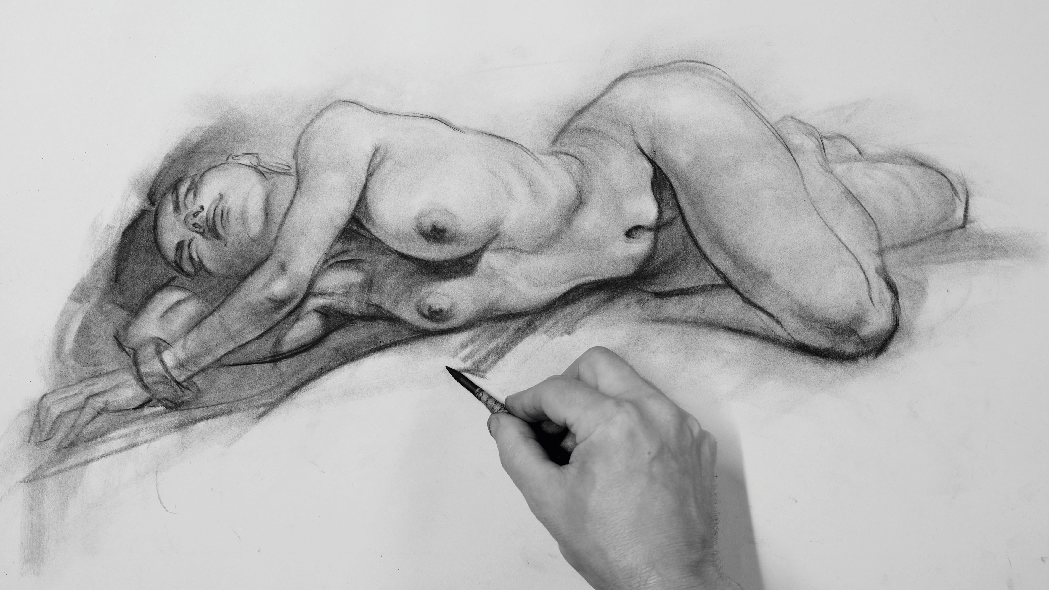
I use shadows to push the gesture, but omit the shadow of the xiphoid process (the small bone under the pointed arch of the ribcage). It looks odd here. Even though it's correct, it violates one of my art laws: If it looks wrong, it's wrong, even if it's right!
08. Use a paper stump for adjustments
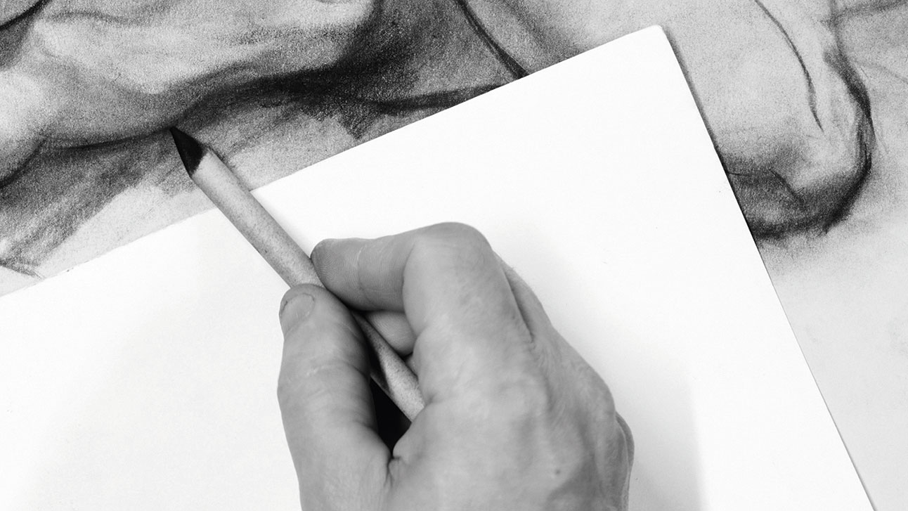
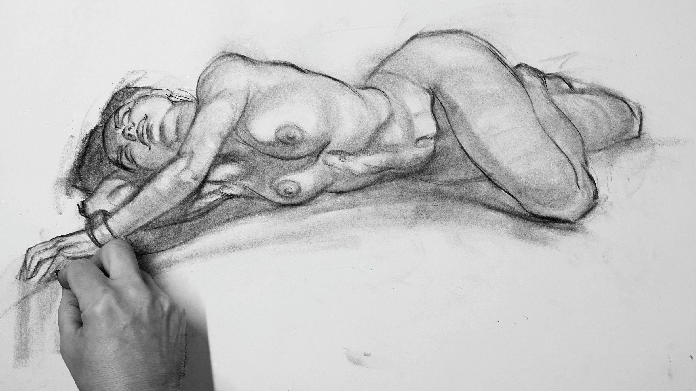
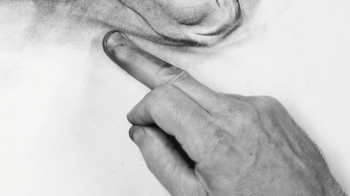
Using a paper stump, I push around the charcoal that's already on the paper rather than lay more charcoal down. This keeps the drawing light and fresh. I'm also mindful to always be drawing even when blending. I use a sheet of paper to prevent me smudging the drawing.
Struggling with to make the medium work for you? Check out our ten expert tips for charcoal drawing.
09. Create highlights with an eraser
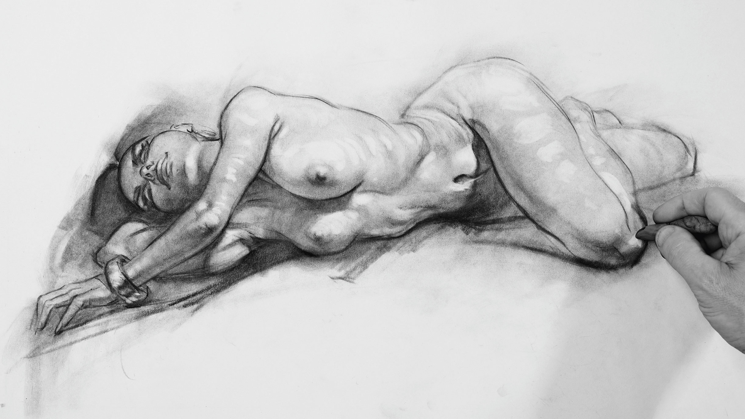
I 'draw' highlights with a kneadable eraser. I think of the eraser as a drawing tool rather than a correction tool. Slowly does it, especially in the early stages. Drawing fast is a false economy – if we rush a drawing then we inevitably spend most of our time fixing mistakes.
10. Take a break

I take a short coffee break away from the drawing and come back with a fresh eye. A break helps me see the bugbears more clearly when I return. I see the breasts are too close in shape while the lower rib cage is too smooth. I make minor changes to both bugbears and am ready for the big finish.
11. Add in a background
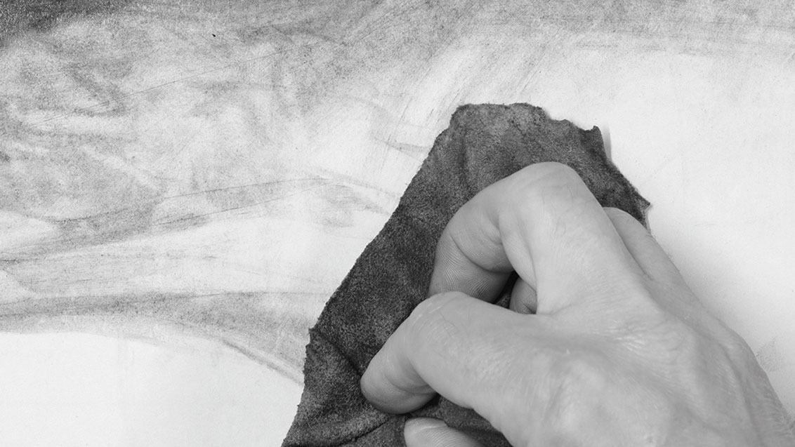
I lay down a large swath of charcoal, then smudge it with a chamois leather cloth, playing with textures as I go. I learned of the chamois from Glenn Vilppu a few years back and it's been part of my drawing arsenal ever since. Here I use it for abstract marks to ground the figure and add style.
12. Introduce the elements of fantasy
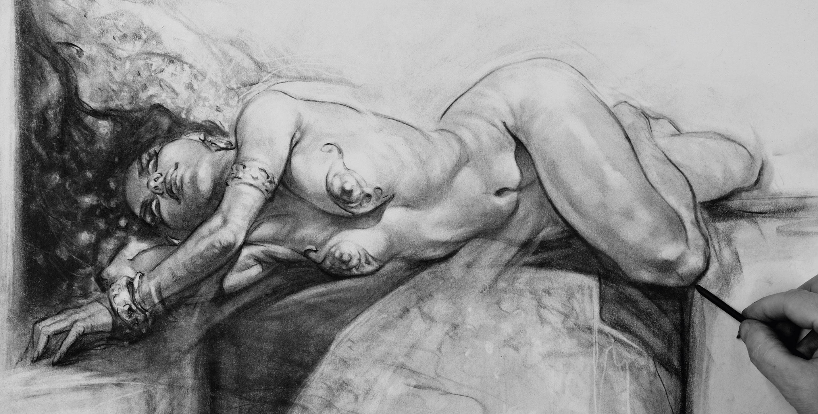
For my image, I imagined a vampire in a bloodlust trance. With large charcoal sticks I draw abstract shapes then pencil in the breast plates and jewellery using hard erasers for highlights.
This article originally appeared in leading digital art magazine, ImagineFX. Subscribe to ImagineFX.
Below are some general questions and answers, not by Patrick but these are common advice and in-keeping with the artist's approach.
What are the correct proportions for drawing a female figure?
A realistic female figure is usually around 7 to 7.5 heads tall. The pelvis is typically wider than the ribcage, the shoulders slightly narrower than a male figure, and the waist curves more visibly between the ribcage and the hips.
How do you avoid over-sexualising a female figure drawing?
Focus on structure first: gesture, balance, and anatomy. Build the skeleton and muscle forms before refining curves. Prioritising weight distribution and posture keeps the drawing grounded and avoids exaggerated proportions.
What’s the best way to practise drawing female poses?
Start with timed gesture sketches (30–90 seconds) to capture movement. Then develop longer studies focusing on anatomy and light. Mixing quick sketches with slower tonal drawings builds both confidence and accuracy.
How is female anatomy structurally different from male anatomy in drawing?
The key structural difference is the pelvis: it’s generally wider and tilted differently. The shoulder line is often narrower, the muscle mass distribution is softer, and transitions between forms are usually less angular.
Should beginners use photo reference or draw from imagination?
Use reference. It trains your eye and builds anatomical understanding. Once you’re comfortable with proportion and structure, begin combining references or simplifying them to develop your own style confidently.
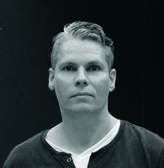
Patrick J Jones is an artist, teacher and the author of Sci-fi & Fantasy Oil Painting Techniques, The Anatomy of Style and The Sci-fi & Fantasy Art of Patrick J Jones.
You must confirm your public display name before commenting
Please logout and then login again, you will then be prompted to enter your display name.
