How to illustrate for an event
Pro advice on how to adapt your drawing style to create enticing event graphics.
Sign up to Creative Bloq's daily newsletter, which brings you the latest news and inspiration from the worlds of art, design and technology.
You are now subscribed
Your newsletter sign-up was successful
Want to add more newsletters?
Creating illustrations for an event is a fantastic creative challenge that involves telling stories with your drawings that feed into the event's narrative, adapting your illustration style and working closely with the client to set the tone of the event with your artwork. I'll share my experience of illustrating for the Green Man festival, as well as my tips for illustrating for events.
- Christmas offer: Save up to 49% on a subscription to Computer Arts
While exhibiting at the Pick Me Up graphic arts festival in London last year, I was spotted and chosen as a candidate to create illustrations for Green Man's promo materials in 2017. I had known about the festival for quite some time and was jealous of the people who had illustrated it in the past. So I was really stoked when I got the email. It's a dream project, and a lovely portfolio piece.
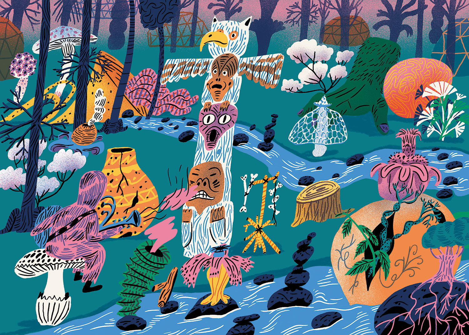
The overarching theme in the brief was 'discovery'. The client wanted the illustrations to reflect the spirit of the festival and the inquisitive nature of its attendees. The brief also called for the illustrations to explore the unique, weird and wonderful things the festival has to offer.
Article continues belowThe imagery could have a historical reference or be more abstract. It could show an imagined world, or artefacts that lie beneath the Black Mountains of Wales, where the festival is. Other possibilities included a fictional parallel universe. The client also wanted a little humour and some dark undertones added to the mix.
01. Know when to change your idea
My clients had liked the hand-painted pieces I exhibited at Pick Me Up, and we considered that choice of media. However, in the end it just wouldn't have been practical for a huge project like this. I thought up plenty of characters, doing lots of crazy things, but one of the guidelines was that I should focus on the environment and strange objects rather than characters. The client didn't want the images to look too 'childish', or too 'human'.
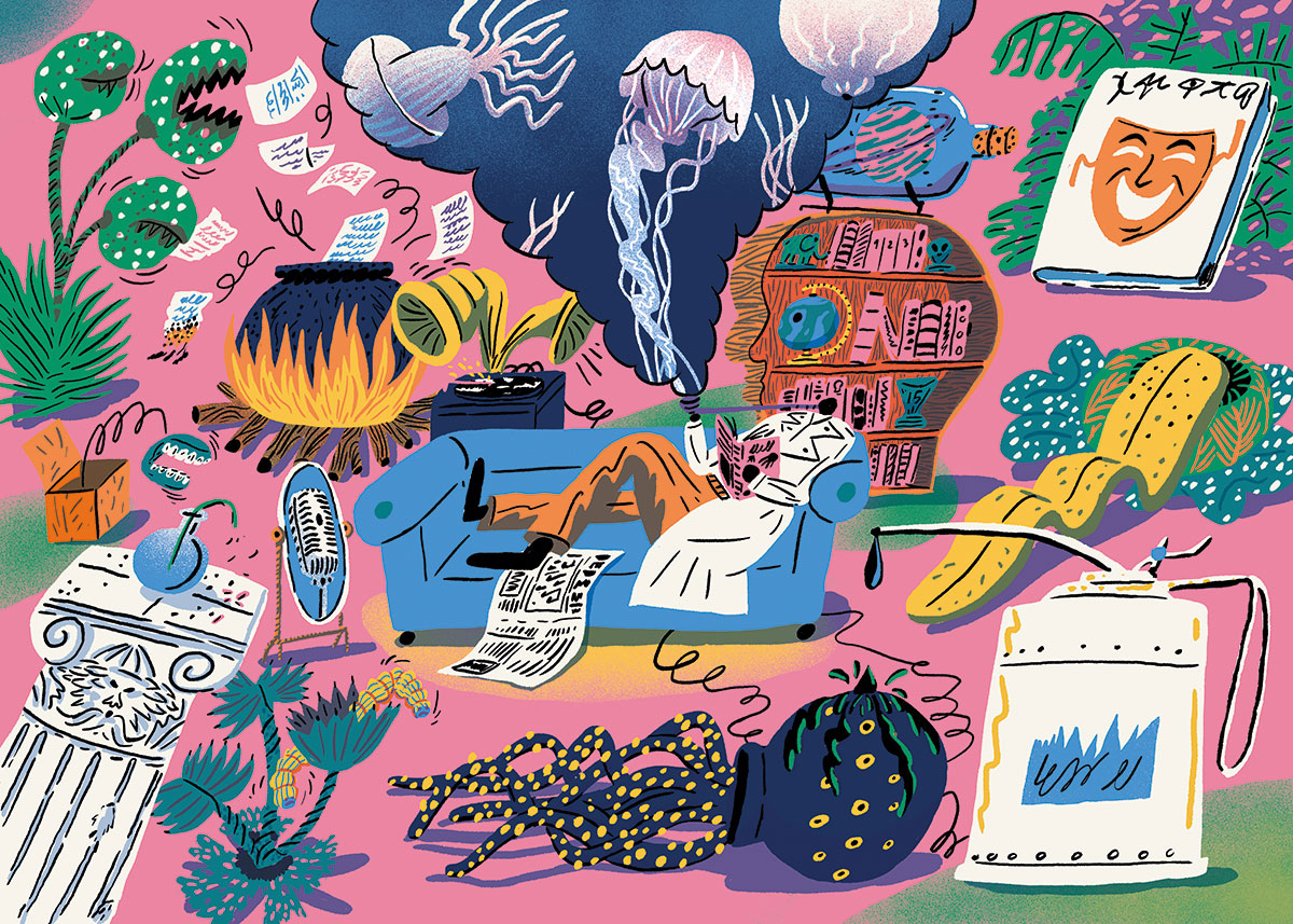
Consequently, one of the key challenges was to change my mindset and use objects and plants to deliver the narrative, looking for ways to give them character. I came up with lots of masks and helmets to add visual appeal. A real lifesaver was the book Art Forms in Nature by Ernst Haeckel, and from it, I discovered new ways to draw scenery. I also received a huge 'inspiration' folder from Green Man.
02. Define the style early on
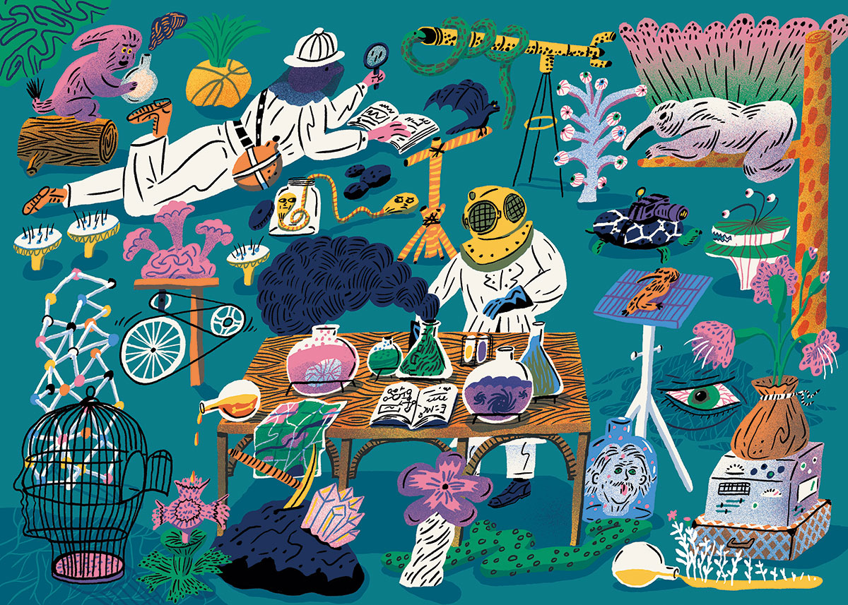
The advice I'd give others trying to tackle artwork for a major event is to create a test piece, show it to people and find out where you can go from there. Make lots of changes until everyone is completely happy. With a solid framework, it's much easier to work quickly. If the style is established early on, you don't have to revisit the question with each piece.
Sign up to Creative Bloq's daily newsletter, which brings you the latest news and inspiration from the worlds of art, design and technology.
03. Adapt your idea for different uses
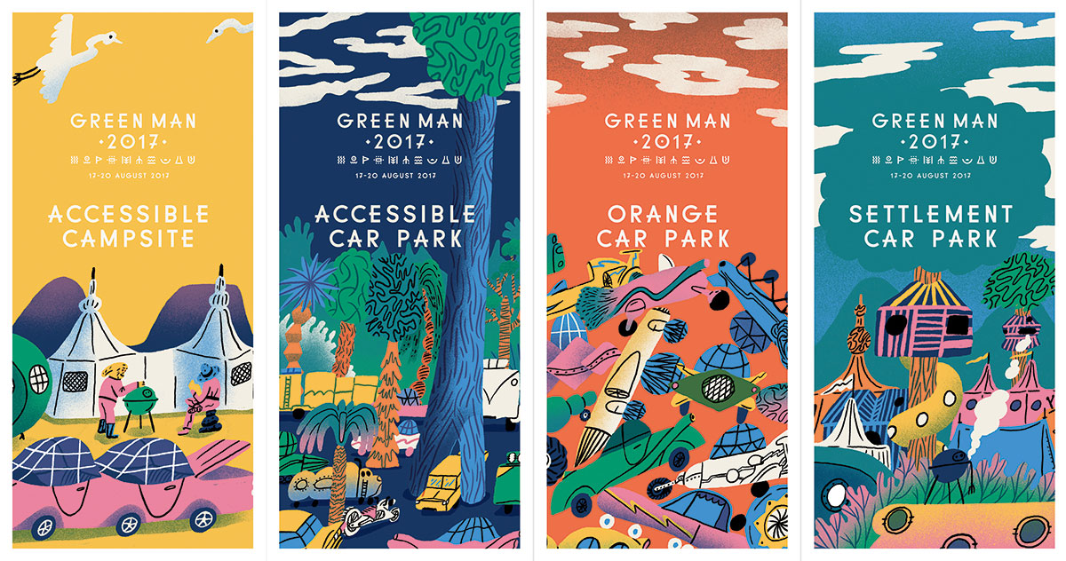
For the website I had to do the area illustrations. For this I had to make up a whole world, which we could use as a basis for all the other outings as well.
The tickets were a different thing. Because there's so much info and text that needs to be readable, I had very limited space to really draw something.
The wrist bands were woven in about eight colours, and Green Man was really keen on lots of details, so it was a challenge to get as much information as possible on a really small surface too. For the parking permits, I had to get cars in the mix. It was fun to see in what kind of cars my characters would attend the festival.
04. Experiment with tools and colour
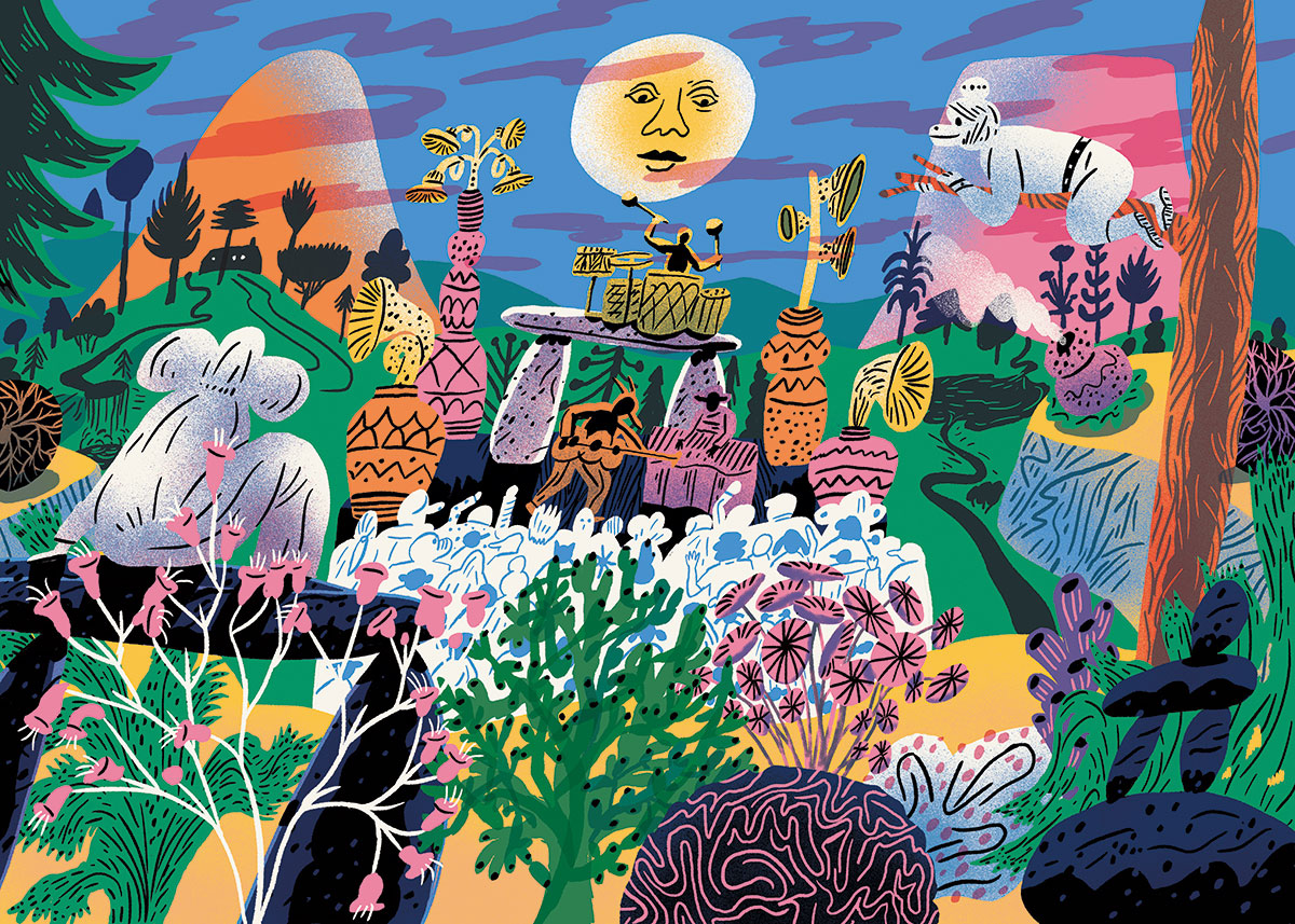
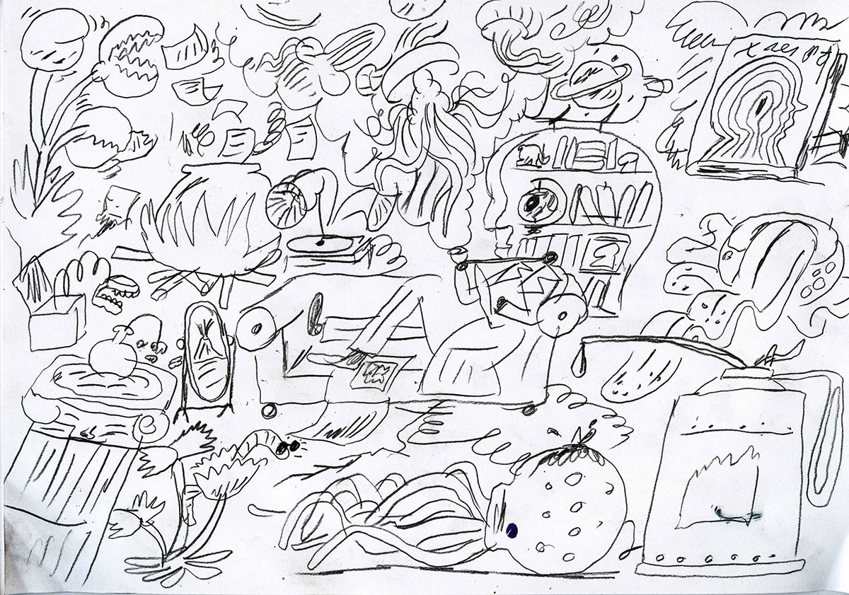
Each image began with sketching in pencil. I drew lots of versions until everything felt right so I didn't have to worry about composition when painting the illustration.
Usually I work in Procreate on an iPad Pro, but for this job I switched to a Wacom Cintiq and Photoshop. My first versions were really textured to resemble my painted work, but in the end we went for a fairly simple version with only one texture. The colours were set by Bread Collective and Green Man, and I added the blue. Usually I wouldn't use a palette like this, but I'm pleased I was forced to and can now see myself using it again.
The main feedback I received was to go 'weirder' which turns out to be a lot harder than making things more 'normal'. It was refreshing to push myself to the limits, though.
I learned a lot doing this project. For one thing, I was able to create a really consistent series of pieces, and have my work carry the look of an entire festival. I'm very happy with it. If I had to do it again, I would make my PSD files a bit cleaner, which would have saved time when preparing them for the animator.
- The best Wacom Black Friday deals (UK)
- The best Wacom Black Friday deals (US)
- Creative software Black Friday deals
This article was originally published in issue 270 of Computer Arts, the global design magazine – helping you solve daily design challenges with insights, advice and inspiration. Buy issue 270 here or subscribe to Computer Arts here.
Special Christmas offer: Save up to 49% on a subscription to Computer Arts for you or a friend for Christmas. It's a limited offer, so move quickly...
Liked this? Read these:
