10 great ways to make your content portable and accessible
Martha Rotter, freelance web developer and co-founder of Idea magazine, explains how you can make your content portable but discovers quite a few accessibility issues with digital magazines
When Kerie types on her iPhone, she looks like she's playing the flute. She holds it close to her face, and her fingers move at an incredible pace. She finishes writing and hands me her phone to read the message she just typed. It has perfect spelling and grammar, and was typed much more quickly than I could have done while using the iPhone's touch keyboard.
Kerie uses an app called Fleksy to help her move her fingers across the face of the phone in patterns that turn in to words. She also reads the news, listens to radio apps, checks Twitter and searches for train times with her phone. She is completely blind.
'Publishing' means different things to different people. To some people, it means producing a printed, physical volume of work. Other folks associate publishing with the ability to distribute written works via devices and apps. More and more frequently, people think of publishing as making content available for enjoying in any format, whether that means pushing an article to a blog or updating a Google Plus post.
Article continues belowThe reality is expectations differ among users, and these expectations morph over time. Readers who once voraciously consumed the latest post on a blog now expect that they can read that blog post, or any article or book, wherever and whenever it is convenient for them. Today content follows us around from a blog to Reeder on a phone to Instapaper on an iPad to an emailed version sent via Whispernet to a Kindle.
Everyone's reading workflow is different, and for those who require accessibility features like a screenreader, high contrast or enlarged text, that workflow is broken, sometimes irreparably, when authors and publishers fail to consider minor but necessary formatting details. Don't think of this as not 'checking the accessibility box'. Instead realise that you're effectively turning your content into a black box for many potential customers.
Accessibility is not a 'feature'
While it's true that accessible controls are used by individuals with reduced hearing and sight, there are many other people who benefit from them as well. Someone with low vision will adjust font sizes to read content on a screen more easily. A person who is colour-blind appreciates the ability to adjust the colour palette so that things such as red warning text actually do stand out. People with long commutes use screen readers to listen to articles being read to them. Non-native speakers use captioned video and audio to aid them in understanding a new language. All of these scenarios represent a broader scope for your content, improved user experience and empathy, and possibly even more revenue.
For a great overview of what accessibility means, see Ian Hamilton's article.
Sign up to Creative Bloq's daily newsletter, which brings you the latest news and inspiration from the worlds of art, design and technology.

Defining platforms
Let's start with some definitions about what formats we can focus on to make our content easier to read:
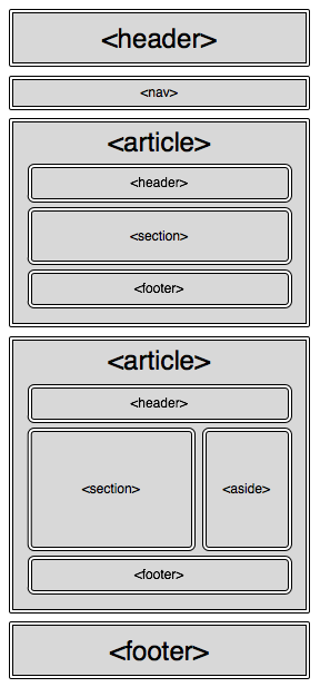
- HTML: With HTML5, the web is an even better place for writers and publishers to showcase their work. New tags like article, section, header and footer are now implemented in many browsers and can be used semi-reliably to add semantic context to your writing. Additionally, the upcoming CSS3 page module may also be of interest to those looking for a more fixed-page reading experience to enable.
- EPUB: EPUB is the official standard of the International Digital Publishing Forum (IDPF). EPUB3 was approved in October 2011 and allows for publications to have more styled and customisable content, closer to what is capable with HTML/CSS, rather than the previous, more static guidelines.
- MOBI: MOBI, short for Mobipocket, is a format used by Kindle and other digital readers. It is less customisable again than EPUB, but we cover it here because you can use it in publishing content to Amazon if you choose. According to Robin Christopherson of AbilityNet, some models of the Kindle are accessible for blind users; however the Kindle app on iOS is not. KF8, Kindle's new format, is currently supported by the Kindle Fire and will soon be rolled out to latest generation Kindle e-ink devices and Kindle reading apps.
- PDF: PDF has become a ubiquitous entity on the web. I include it here because most tablets do have good, built-in tech for reading PDFs and enabling assistive technology with them. With a PDF, the deciding factor is how it was created. According to Alan Dalton, accessibility development advisor at Ireland's National Disability Authority, "You can make PDFs accessible; however many people don't. They don't realise their tools are producing bad products. If I had my way, everything we do would be HTML." Navigation and accessibility aside, PDFs also don't adapt well to different sizes, and anyone who has tried to read a PDF on a smartphone is familiar with the awkward pinching, zooming and panning required to do so.
What doesn't fall into this category are apps that take your content and turn it into large images. While this might ensure the look and style is the same across platforms, you're blocking out a lot of your audience while also creating a very heavy download. This problem is exacerbated when we start talking about Retina displays and double-sized images. To get a feel for what it's like to be denied something you want to read (yet still have to pay for it anyway), see the comments about Newsstand apps being mostly inaccessible via VoiceOver in iOS.
To see what these types of magazines look like for an accessible tech user, see my video embeds, which show the frustrating experience of trying to read these magazines with an
accessibility tool such as VoiceOver:
Keeping content portable and accessible
Focusing on portable formats enables us to handle our content to live happily on more browsers, phones, digital reader devices and reading applications. What do we need to do to our content to make sure it can translate well between these different formats, while maintaining a custom style and great experience?
I have put together some guidelines below for people who want their audience to be as broad as possible and who don't want to lock their content down into a black box for many users. These techniques can be applied to everything from blog posts, to long form journalism, to any other works you're considering self-publishing:
1. Start with HTML5
By creating your documents initially with HTML5, you have less to worry about in the future. HTML5 markup will help to keep your documents easy to navigate and to translate into other formats. You will do significantly less 'retro-fitting' of your publications into other formats if you have semantic information in there from the start.
2. WAI-ARIA
WAI-ARIA is the Web Accessibility Initiative - Accessible Rich Internet Applications suite. It's a set of guidelines created by the Protocols and Formats Working Group (PFWG) of
the W3C. WAI-ARIA defines a way to make web content and applications more accessible to people with disabilities, and it helps with dynamic content and advanced user interface controls developed with Ajax, HTML, JavaScript, and related technologies. Some of the techniques in this article come from WAI-ARIA guidelines, and while this article is not long enough to cover all of the specification, I'd encourage you to check it out for more detail about why these are recommended and best practices for implementing them.
3. Using doctype
While using a specific doctype itself doesn't effect the accessibility of the associated HTML code, the important reason to use a doctype is to make sure the browser's quirks mode isn't triggered. Simply use <!DOCTYPE html> to ensure that doesn't happen.
4. HTML5 document tags
Proper navigation of a document factors high on its accessibility index. Many users of accessible tech I interviewed expressed their frustration with content providers and developers not properly marking their documents for navigation capability. These tags give more context to the sections of your document than using lots of divs.
- Header and Footer can both be used multiple times in a page. They can denote the respective main header or footer of the document, or they can be used for header/footer information within articles or sections.
- Aside is a good tag to use for sections, such as sidebars in a book, that are complementary to the document but not absolutely crucial to its understanding.
- Sections are ways of breaking up ideas or grouping content together that makes sense.
- Articles are independent, standalone pieces that could exist without the rest of the content. Using these tags appropriately helps to make sure the structure of your content is interpreted correctly.

5. Bad links
With CSS, it's possible to use background images on links and buttons. This is a nice effect for web designers because it gives more control over typography. However, it has led to people forgetting to include text descriptions. Make sure that even if you're using text within the image as well to ensure it remains accessible. This can also affect things such as SEO and
internationalisation.
Example:
<a href="/contact" class="contactUs"></a>This is bad.
<a href="/contact" class="contactUs">Contact Us</a>Much better.
6. Images – ALT versus TITLE
People often include either alt or title attributes in their image, but not both as they are often misunderstood and therefore seem to be redundant. To clear up the confusion, title can represent advisory information, such as that which might appear in a tooltip. This can also give you additional information when you mouse over an image, a technique many people use on their blogs. With the growth of touch devices, however, this kind of information becomes less useful.
Alt on the other hand is used by assistive technology and gives context to the element. You must use alt on your images and make sure it's useful information. Using <img alt="" src="1348.jpg"/> doesn't add anything for the user. The best practice is to use
descriptive text for your alt text, and if the image is also a link, describe the link as well.
Example:
<img src="2347239.jpg"/>This is bad.
<img src="cuterabbits.jpg" alt="Illustration of adorable rabbits playing in a field"/>Much better.
<img src="cuterabbits.jpg" alt="Illustration of adorable rabbits playing in a field" title="I drew this when I was seven."/>Is OK if you want to have mouseover text, as in a tooltip, but may also cause confusion as some screen readers may read both title and alt.
Example of an image that is a link:
<a href="about.html"><img src="aboutLogo.jpg" alt="Click here to learn more about us!" />Click here to learn more about us!</a>Not great.
<a href="about.html" alt="About page"><img src="aboutLogo.jpg" alt=" " />About Us</a>More straightforward.
7. Media
The W3C's guide to time-based media describes guidelines and success criteria for audio and video content. Adding captions to recorded video or slides can make a world of difference to both hard of hearing and non-native speakers. It's also a great idea to provide an audio description in the video if possible, as well as a transcription detailing the visual and audio information. Make sure you provide thorough and effective text descriptions of all content, especially when it's supplementary information to the rest of the article. Effective descriptions would include whether the content was audio, video, slides or any combination of them, the length of the media, and what additional information is available such as a transcript.
Example:
<embed src="myGreatVideoDemo.mpeg" autostart="false" />Not great.
<video width="320" height="240"> <source type="video/mp4" src="myGreatVideoDemo.mp4" > <track src="demoCaptions_eng.vtt" label="English captions" kind="captions"srclang="en-us" default > </video>Much better.
For more on formatting captions files, see dev.w3.org/html5/webvtt/.
8. Text colour
The bigger the contrast the colour of the text has to the background, the better. One individual expressed her frustration with light grey text on a white background as especially difficult to read, but unfortunately often used especially for fine print. You can use something like WebAIM's contrast checker to test if the colours work well together.
9. Using custom fonts
For years the way to display typographical sophistication was through an image of text. This led to inaccessible and inflexible pages. Now with a growing number of web-friendly fonts, it is much easier to get the look and feel you want. Using CSS3's @font-face feature, you can use a custom typeface which is scalable and accessible, and allows for manipulation of the typographical display using CSS attributes such as line-height, letter-spacing, text-shadow, and others. Custom fonts can also be embedded into ePub books to maintain your style.
Example:
<img src="company name.jpg" alt="Image of our company name and hilarious slogan in a jazzy font" /> <-- bad.<style> @font-face { font-family: 'Droid Sans'; font-style: normal; font-weight: bold; src: local('Droid Sans'), url('locationOfFontFile.ttf') format('truetype'); } h2#titleFont { font: 200% "Droid Sans", Verdana, sans-serif; }</style><body> <h2 id="titleFont">Spatula City</h2> <h3>We sell spatulas. And that's all!</h3>Much better. (And easier to update if you ever start selling more than spatulas and have to
update your slogan!)
10. Check your work
You can validate your document and tags to make sure they will be interpreted and used correctly. An easy way to do this is to make sure you've used the HTML5 doctype and then validate it using the W3C Nu Markup Validation Service. While you can use ARIA markup with other doctypes, the ARIA markup may cause the validation tool to produce errors due to associated DTDs not being able to recognise ARIA markup.

Let people know
If your content is available in multiple formats, be sure that there is a way to discover this on your site. You have probably seen the "If you have trouble viewing this email, read the online
version" message at the top of many email newsletters. Make it a practice to do the same for your content. If you have an accessible PDF or an audio version as well as an ePub, make sure that users can find that information. Do user testing to make sure the content is findable and readable.
Summary
Your potential audience is growing, and it's growing fast. These are just a handful of the many techniques out there for you to keep your content available and accessible to as large a readership as possible. This is a rapidly changing area, so if you're interested in helping it develop, I encourage you to check out Nick Disabato's Publication Standards organisation.
Other great resources and articles by the groundshakers in this area are also listed below. In the follow-up to this article, I will expand from accessibility and give additional tips for ensuring your content works offline and is more portable.
As we've seen in the magazine industry in the last couple of years, if you stand still you will lose. Think creatively, build great content that people love, and make sure they can enjoy it.
Acknowledgements
My sincere thanks to everyone who has helped me with this article by taking the time to show me how they use accessible technology, describe their frustrations, and offer suggestions of things that worked for them. This list includes Shane Hogan and Alan Dalton at the Irish National Disability Authority, Joshue O'Connor, author of Pro HTML5 Accessibility, Stuart Lawler at the NCBI, Darragh " Hiligh, Kerie Doyle, Ceri Clark, Gaylen Floy, Declan Meenagh and the folks at AbilityNet and the Paciello Group for their great research.
Resources
- A simple introduction to web accessibility by Ian Hamilton
- Using ARIA in HTML
- HTML5 Accessibility
- HTML5 Accessibility Chops by Steve Faulker
- Web Accessibility Evaluation Tools
- Design for understanding by Ashley Nolan and Nicholas Oliver
- Building Books with CSS3 by Nellie McKesson
- Publication Standards, Part 1 by Nick Disabato
- Publication Standards, Part 2 by Nick Disabato

The Creative Bloq team is made up of a group of art and design enthusiasts, and has changed and evolved since Creative Bloq began back in 2012. The current website team consists of eight full-time members of staff: Editor Georgia Coggan, Deputy Editor Rosie Hilder, Ecommerce Editor Beren Neale, Senior News Editor Daniel Piper, Editor, Digital Art and 3D Ian Dean, Tech Reviews Editor Erlingur Einarsson, Ecommerce Writer Beth Nicholls and Staff Writer Natalie Fear, as well as a roster of freelancers from around the world. The ImagineFX magazine team also pitch in, ensuring that content from leading digital art publication ImagineFX is represented on Creative Bloq.
