Create a geometric logo with Illustrator
Illustrator is perfect for creating custom logos. Fabio Benedetti explains how to use it to design a wordmark with perfect geometry.
Sign up to Creative Bloq's daily newsletter, which brings you the latest news and inspiration from the worlds of art, design and technology.
You are now subscribed
Your newsletter sign-up was successful
Want to add more newsletters?
11. Create a tail

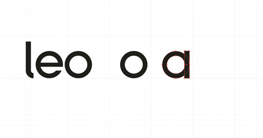
Subtract the rectangle at the very bottom from the letter 'o'. This will create the gap necessary for the tail of the lower case 'e'.
12. Merging shapes

The final step in creating this letter is to merge the top rectangle with what's left of the 'o' shape. This will give a letter 'e'. Once this is done, you should have four letters in place.
13. Keep the weight consistent

Creating the 'a' is even simpler. We only need to add a rectangle on the right-hand side of the letter 'o' – the width of the rectangle is the same as the width of the 'l', in order to keep the weight of the font consistent. We can now concentrate on the 'r', which we will also use to generate the 'n' and the capital 'E' at the beginning of the word.
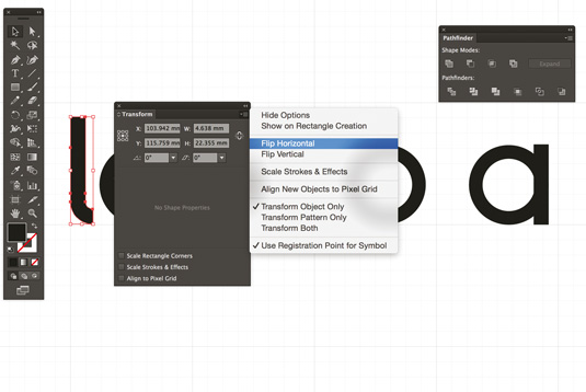
Article continues below14. Flip horizontal

Let's use the same shape we created for the letter 'l'. Right-click on the 'l', then in the Transform panel select Flip Horizontal. This step is crucial for when we go to create the 'n' and the 'r'. Because we are creating a geometric font, we want to use the same elements as often as possible and just make small tweaks.
15. Combination of shapes

The last letter to be created is, ironically, the first one. The upper case 'E' is a combination of various shapes we've used for other letters. The top and the bottom are made with the 'r'. For the bottom part, copy the 'r' and rotate it -90°. For the top part, duplicate the 'r', right-click, and go to Transform > Reflect > Horizontal. Join the two shapes and draw a rectangle in the centre of the 'E' to complete it.
16. Kerning and alignment

We finally have a first version of the logo. We just need to take care of the kerning and alignment to create balance in the logo. There are many ways to approach this, but my favourite is to use circular shapes. Imagine there are several circles of 5.5mmx5.5mm acting as dividers between each of the letters. This will dictate the spacing.
17. Pleasing to the eye

Having a perfect spacing between the letters not only makes the logo more pleasing to the eye, but also makes it more suitable for use at small sizes.
Sign up to Creative Bloq's daily newsletter, which brings you the latest news and inspiration from the worlds of art, design and technology.
18. Choosing the right typeface

Let's finalise the work by choosing the right typeface for supporting literature. This is a fundamental step in making your branding effective! Because of our mark's geometric shape, I've chosen to use the Gotham typeface, which was inspired by architectural signage. Setting copy in this font will help create a solid, modern and secure aesthetic to support the wordmark.
19. Looking after the brand

If you are presenting the work to a client, it's great practice to take care of all the aspects of the brand. As shown in this tutorial, colour, shape, spacing and typography all play a key role in any professional output.
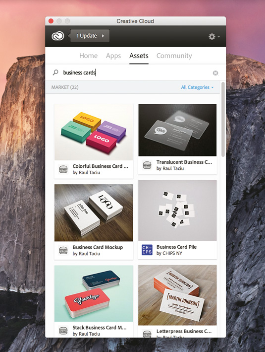
If you require templates or mockups in order to display your work at its very best, have a look in the asset panel in Adobe CC. This offers a wide range of free resources that will help you present your work in a more appealing way.
Words: Fabio Benedetti
Fabio Benedetti is a designer and illustrator who specialises in visual design, branding and icon design. This article originally appeared in net magazine.
Like this? Read these!
- Illustrator tutorials: amazing ideas to try today!
- The ultimate guide to logo design
- Download these free iPhone apps for designers

The Creative Bloq team is made up of a group of art and design enthusiasts, and has changed and evolved since Creative Bloq began back in 2012. The current website team consists of eight full-time members of staff: Editor Georgia Coggan, Deputy Editor Rosie Hilder, Ecommerce Editor Beren Neale, Senior News Editor Daniel Piper, Editor, Digital Art and 3D Ian Dean, Tech Reviews Editor Erlingur Einarsson, Ecommerce Writer Beth Nicholls and Staff Writer Natalie Fear, as well as a roster of freelancers from around the world. The ImagineFX magazine team also pitch in, ensuring that content from leading digital art publication ImagineFX is represented on Creative Bloq.
