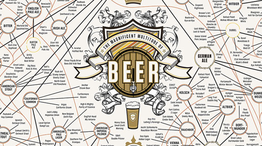
Epic infographic details (almost) every type of beer
How many types of beer are there, and how are they related? This 60x40in malty monstrosity provides the answers in a form that's easy to swallow.
Sign up to Creative Bloq's daily newsletter, which brings you the latest news and inspiration from the worlds of art, design and technology.
You are now subscribed
Your newsletter sign-up was successful
Want to add more newsletters?

Many of us are partial to a cold one after a hard day's design work. But while there's a temptation to stick to the same tipple, year in year out, there's a world of different beers out there to be tasted.
Yet the multitude of varieties, brands and tastes available can sometimes be a little overwhelming. So what better way to showcase the taxonomy of beer than with an infographic?
A favourite here at Creative Bloq, Pop Chart Lab have now built on their original beer infographic from 2010 and created a 60x40in malty monstrosity called The Magnificent Multitude of Beer. It ended up being so big that the team had to enlist the help of another printing firm to handle the job.
Article continues belowAfter all that hard work, let's hope they found time to head to the bar afterwards.
[via Fast Co Design]
Like this? Read these!
- Create a perfect mood board with these pro tips
- The ultimate guide to logo design
- Our favourite web fonts - and they don't cost a penny
What do you make of this huge infographic? Let us know in the comments box below!
Sign up to Creative Bloq's daily newsletter, which brings you the latest news and inspiration from the worlds of art, design and technology.

The Creative Bloq team is made up of a group of art and design enthusiasts, and has changed and evolved since Creative Bloq began back in 2012. The current website team consists of eight full-time members of staff: Editor Georgia Coggan, Deputy Editor Rosie Hilder, Ecommerce Editor Beren Neale, Senior News Editor Daniel Piper, Editor, Digital Art and 3D Ian Dean, Tech Reviews Editor Erlingur Einarsson, Ecommerce Writer Beth Nicholls and Staff Writer Natalie Fear, as well as a roster of freelancers from around the world. The ImagineFX magazine team also pitch in, ensuring that content from leading digital art publication ImagineFX is represented on Creative Bloq.
