Cool scrolling effect highlights compensation culture
This infographic about NHS payouts makes great use of scrolling to push its point. We find out how it was made.
Sign up to Creative Bloq's daily newsletter, which brings you the latest news and inspiration from the worlds of art, design and technology.
You are now subscribed
Your newsletter sign-up was successful
Want to add more newsletters?

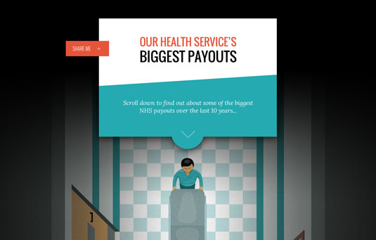
Whether medical services are provided privately or publically, the issue of huge compensation payments is a growing concern for health organisations across the globe. And this online infographic highlights the problem using an eye-raising scrolling technique.
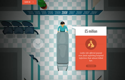
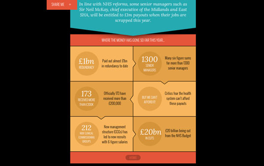
As you scroll down the page, you follow a hospital porter pushing a trolley through sections of a corridor. Each section represents a different year in the history of Britain's National Health Service, and a pop-up balloon shows details of the biggest compensation payout of that year. It's a simple device, but perfectly executed and an engaging way to convey a lot of information on a dry, albeit important, subject.
"The pieces were built using some the latest techniques in HTML5, CSS3 and JavaScript," explains Stickyeyes, the agency who created the infographic for Express Solicitors. "As animation was a key factor in this, we primarily used the Skrollr animation library for all of the motion effects. Each of the elements was manually illustrated, then we hijacked the scroll function in order to create the parallax faux-scrolling feature. This was then supported by further CSS3 animations for the finishing touches."
Article continues below 

Like this? Read these!
- Free graffiti font selection
- Illustrator tutorials: amazing ideas to try today!
- Great examples of doodle art
Have you seen a cool infographic? Tell us about it in the comments!
Sign up to Creative Bloq's daily newsletter, which brings you the latest news and inspiration from the worlds of art, design and technology.

The Creative Bloq team is made up of a group of art and design enthusiasts, and has changed and evolved since Creative Bloq began back in 2012. The current website team consists of eight full-time members of staff: Editor Georgia Coggan, Deputy Editor Rosie Hilder, Ecommerce Editor Beren Neale, Senior News Editor Daniel Piper, Editor, Digital Art and 3D Ian Dean, Tech Reviews Editor Erlingur Einarsson, Ecommerce Writer Beth Nicholls and Staff Writer Natalie Fear, as well as a roster of freelancers from around the world. The ImagineFX magazine team also pitch in, ensuring that content from leading digital art publication ImagineFX is represented on Creative Bloq.
