10 beautiful iPhone app user interfaces
Until you have the user experience for an app right, you shouldn't even be thinking of anything else. Designer and developer Aral Balkan showcases 10 beautiful iPhone app user interfaces that are more than just pretty
A lot goes into designing a great user experience for an app, starting with the basic functionality. Let’s face it, until you have that right, you shouldn’t even be thinking of anything else. But once you have it – once your app is usable – comes the really exciting time when you can layer it with beauty, fun, delight, and other awesome toppings.
The apps showcased in this article do just that. Although aesthetics matter, the beauty of the apps featured here is definitely more than skin deep. The bit that is often overlooked when we talk about the user experience of the interactive objects we call apps is the interactions. It is these interactions that determine the character and quality of the conversations you have with an app. And the apps in this showcase, ranked in no particular order, are delightful conversation partners indeed.
1. Instant Heart Rate
Instant Heart Rate by Azumio is a beautiful example of thinking outside the screen. While the UI itself is aesthetically pleasing, the true beauty of the user interface is that it determines your pulse by using the iPhone’s camera and the built-in flash to measure the colour changes in your finger. Genius.
Article continues below 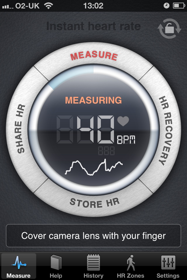
2. Gowalla
Some apps are just so shiny you want to lick them. The Gowalla app on iPhone is one of those. The app meets basic usability/functional requirements (essential functionality like checking into spots and checking recent activity is as easy as pie) and goes beyond that to layer delight into every corner. There is a feeling of playfulness and fun that permeates the whole app. From the beautifully designed icons, to a beautifully animated shiny custom tab bar and a delightful check-in receipt screen, it screams attention to detail.

3. Feathers
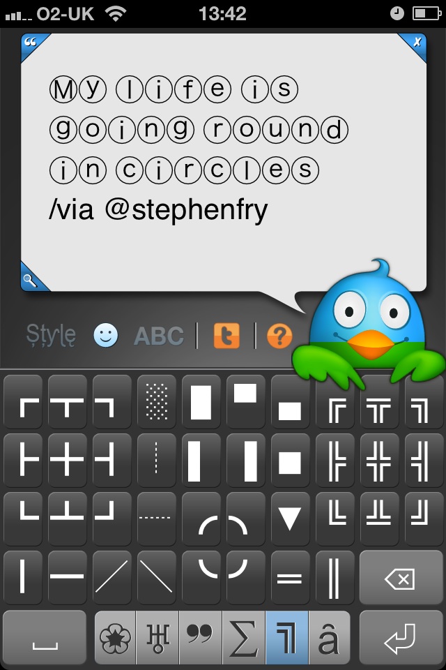
I debated whether to include my own app in this list – can you say cheeky – but when I asked my Twitter followers for apps they thought had beautiful UIs, several responded with “Feathers!” Feathers has been featured as a case study in good UX by experts like Aarron Walter and featured in talks at An Event Apart and FOWD. The UI features a cute little bird that you tap to tweet, and which changes colour as you type to indicate your character limit as well as a host of little details like pinch-to-zoom on the text (see my interview with Aarron for more background on the design).
4. NanoStudio
There are lots of synthesizer apps on the iPhone but NanoStudio by one-man-agency Blip Interactive stands apart with its polished UI featuring a beautiful layering of functionality and navigation. Visually stunning, its beauty is not skin deep. Moving between instruments and the song view is handled in the most intuitive manner I’ve seen and the whole app is a pure joy to play with.

5. Instagram
A brilliant UI doesn’t necessarily mean shiny. In fact, sometimes the worst UIs are the shiniest (especially if someone was brought in to ‘prettify’ an existing UI) and the best UIs are the ones that get out of your way and let the content shine.
Sign up to Creative Bloq's daily newsletter, which brings you the latest news and inspiration from the worlds of art, design and technology.
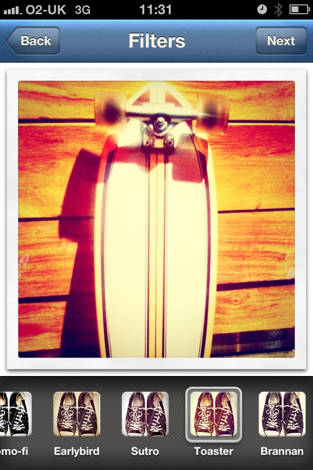
Instagram’s iPhone app is a great case-study of the latter. After you take a photo, for example, you are presented with a minimal UI that lets you concentrate on choosing the right filter for your photo. The app then shares your photo with the world with a minimum of fuss. It makes exploring your friends’ photos similarly easy: the content is front and centre with minimal noise around it.
6. Tweetbot
Attention to detail is what separates good UIs from outstanding ones and Tapbots are renowned for the attention to detail and craftsmanship of their apps. Their latest app, Tweetbot, comes from a pedigree of excellent apps, which include Convertbot, Weightbot and Calcbot.
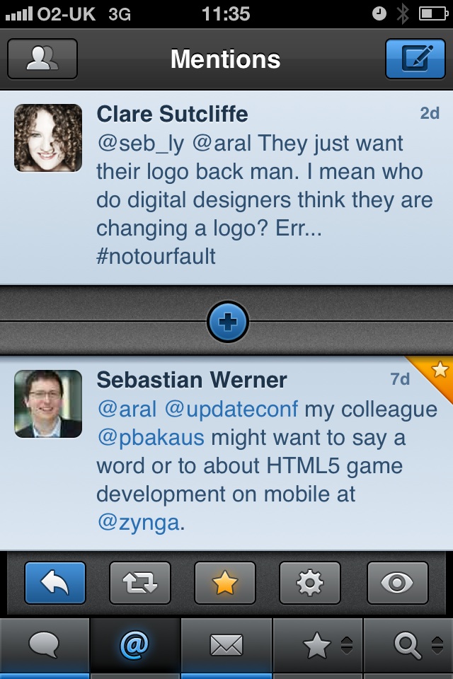
The UI for Tweetbot is both beautiful to behold and includes nifty little gestures like swipe to see replies and related tweets. While the app lacks a landscape mode, this is apparently in the works and will give an already-excellent app a usability boost when it comes to viewing web content in tweets.
7. Deep Green
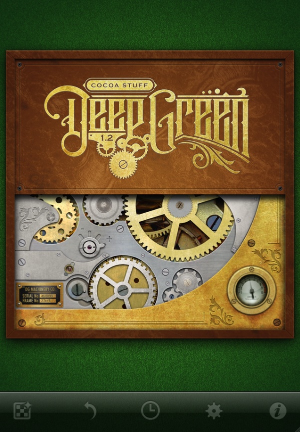
Deep Green by Joachim Bondo is a work of art graced with amazing attention to detail. If you like chess, check it out. And I’m not saying that just because Joachim happens to be one of the speakers at Update 2011 – the mobile conference that I’m organising in Brighton this September. (Joachim happens to be one of the speakers because I adore his work and his very human approach to user experience design.)
At Update, Joachim is going to talk his approach to design, including the parallels he sees between designing a beautiful watch and designing a beautiful app. And he should know because has designed both (his own watch, produced by Urban Jrgensen & Snner, currently fetches in the region of $150,000 if you’re lucky enough to find one for sale). So it shouldn’t come as any surprise that when you flip Deep Green over, you see the ‘movement’ that operates it. Attention to detail indeed.
8. Outside
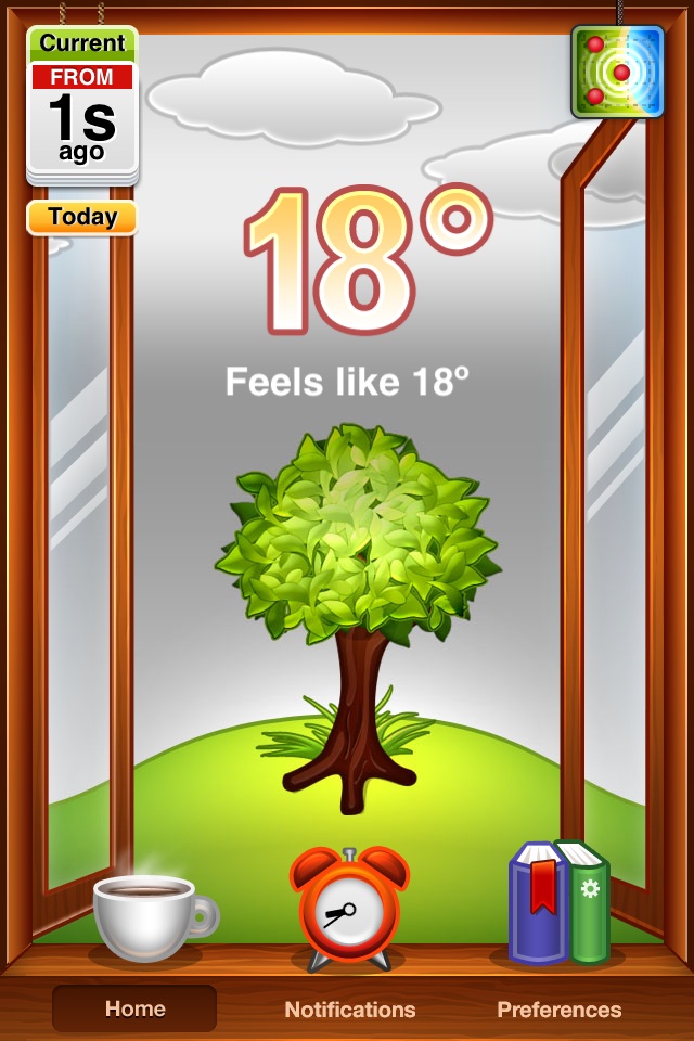
You know an app is doing something right if it manages to be successful commercially even though it duplicates the functionality of a system app that comes for free with your iPhone. Outside by Robotcat is one such app. At a glance it provides the same information as the iPhone’s Weather app. However, it’s not so much what it does as how it does it that sets Outside apart.
It presents the current weather in a beautiful, animated display that has the user peering out from behind an open window into a garden scene. And it’s not all about visual gimmicks either. Outside lets you set notifications, so you can be alerted when it’s T-Shirt weather or snowing, for example. Outside is a great example of how an app can go beyond being purely functional to layer delight into the user experience.
9. Camera+
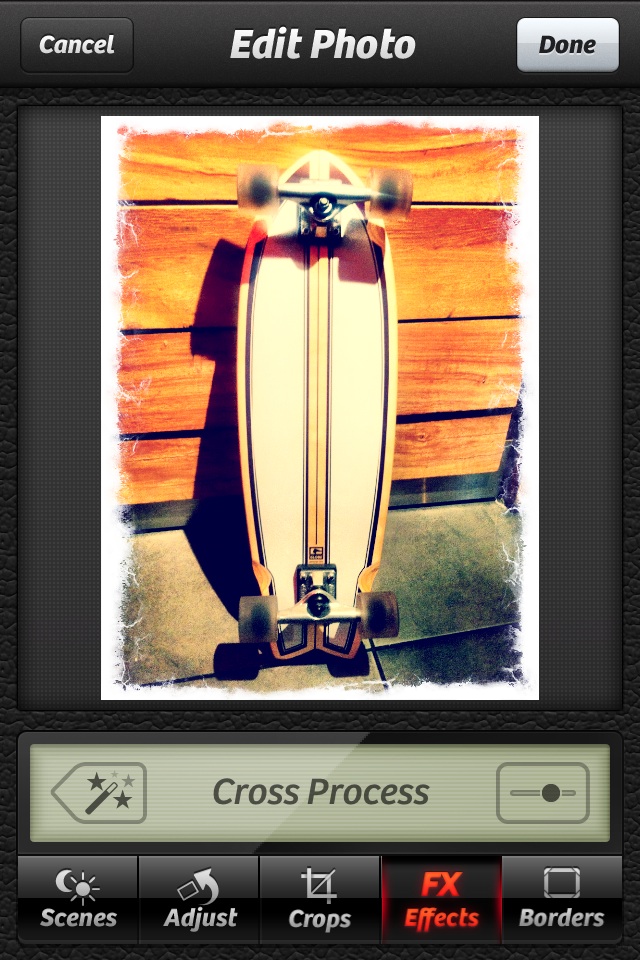
Camera+ by Tap Tap Tap makes taking beautiful photographs and editing them a seamless and enjoyable process. The user interface does everything right – so much so that you probably will not notice it. Like good camera work, acting, and editing in film, it’s invisible. What it will let you do is effortlessly take a photo, edit it to adjust its appearance, perhaps apply some effects or a border, and – should you want to – share it on Facebook, Twitter or Flickr.
Using the app, you get the feeling that the folks at Tap Tap Tap made some difficult decisions and, unlike some other camera apps, resisted the temptation to throw every whizz-bang feature in there. For example, they limit your choice of filters, effects and borders to a single screenful for each, removing the need to scroll and reducing your cognitive load. Choosing quality over quantity is the sign of good user experience design and Camera+ excels at that.
10. Halftone
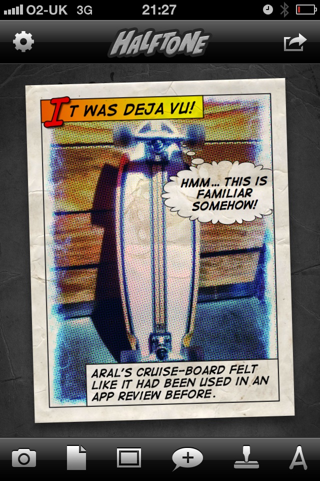
At the risk of oversaturating this article with camera-related apps, here’s one more: Halftone by Juicy Bits. Halftone is a universal app that runs on both iPhone and iPad and lets you quickly and easily create comic-book-style panels using either existing protographs or photos you take with your camera. Similarly to Camera+, the interface is spartan and beautifully layered. Like any good interface, it makes you feel empowered as you churn out great looking comic book panels in no time.
Has Aral forgotten any iPhone apps? What are your favourite iPhone app UIs? Let us know in the comments!

The Creative Bloq team is made up of a group of art and design enthusiasts, and has changed and evolved since Creative Bloq began back in 2012. The current website team consists of eight full-time members of staff: Editor Georgia Coggan, Deputy Editor Rosie Hilder, Ecommerce Editor Beren Neale, Senior News Editor Daniel Piper, Editor, Digital Art and 3D Ian Dean, Tech Reviews Editor Erlingur Einarsson, Ecommerce Writer Beth Nicholls and Staff Writer Natalie Fear, as well as a roster of freelancers from around the world. The ImagineFX magazine team also pitch in, ensuring that content from leading digital art publication ImagineFX is represented on Creative Bloq.
