How Superunion modernised Shakespeare's Globe
Superunion shares how it created its award-winning visual identity for Shakespeare's theatre.
Sign up to Creative Bloq's daily newsletter, which brings you the latest news and inspiration from the worlds of art, design and technology.
You are now subscribed
Your newsletter sign-up was successful
Want to add more newsletters?
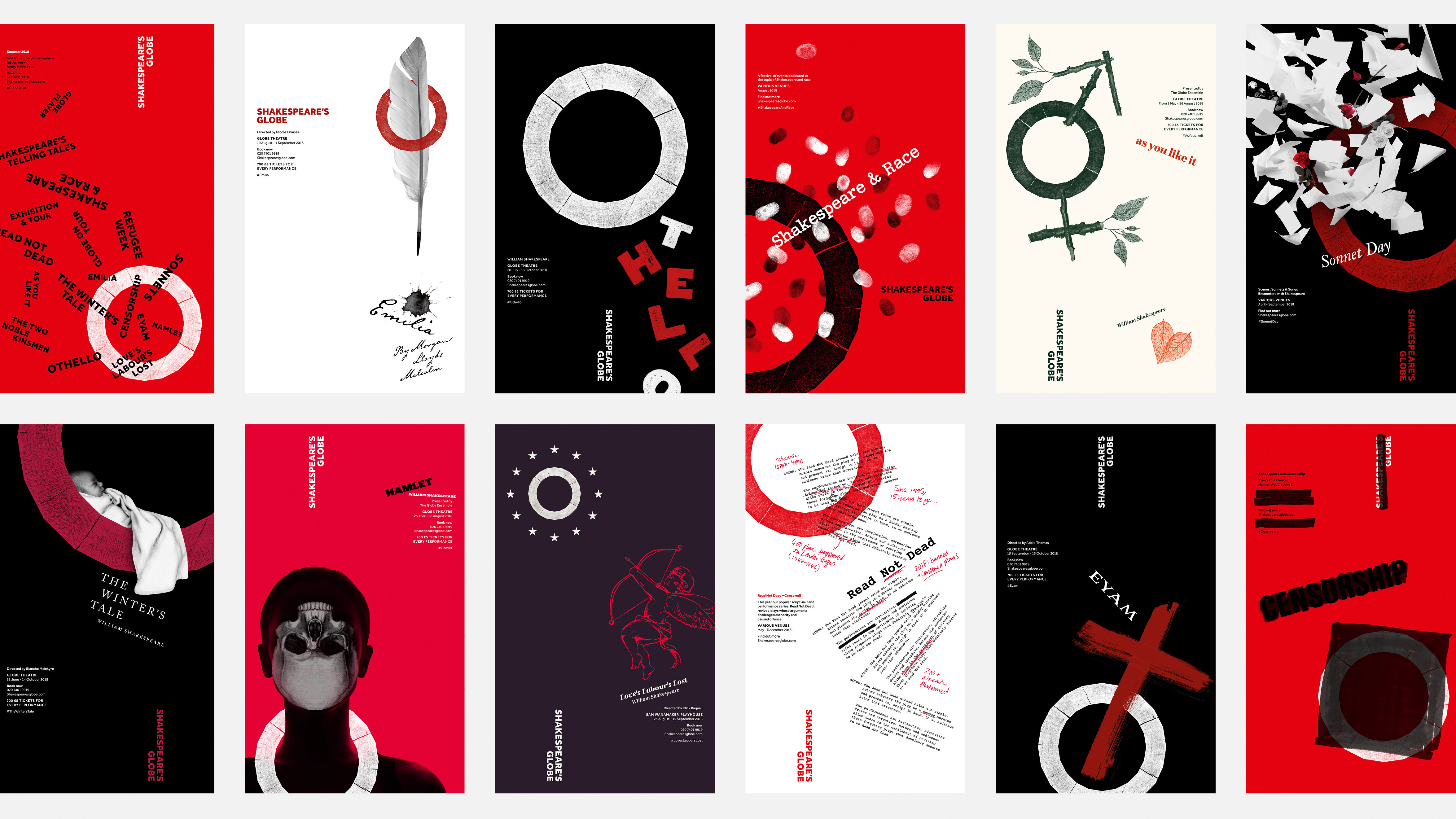
Before The Partners became part of Superunion, it created a new visual identity for Shakespeare's Globe, including a new logo design that draws inspiration from the theatre's shape. The identity is deeply rooted in the Globe's experimental spirit and history and has won several awards, including a D&AD Wood Pencil.
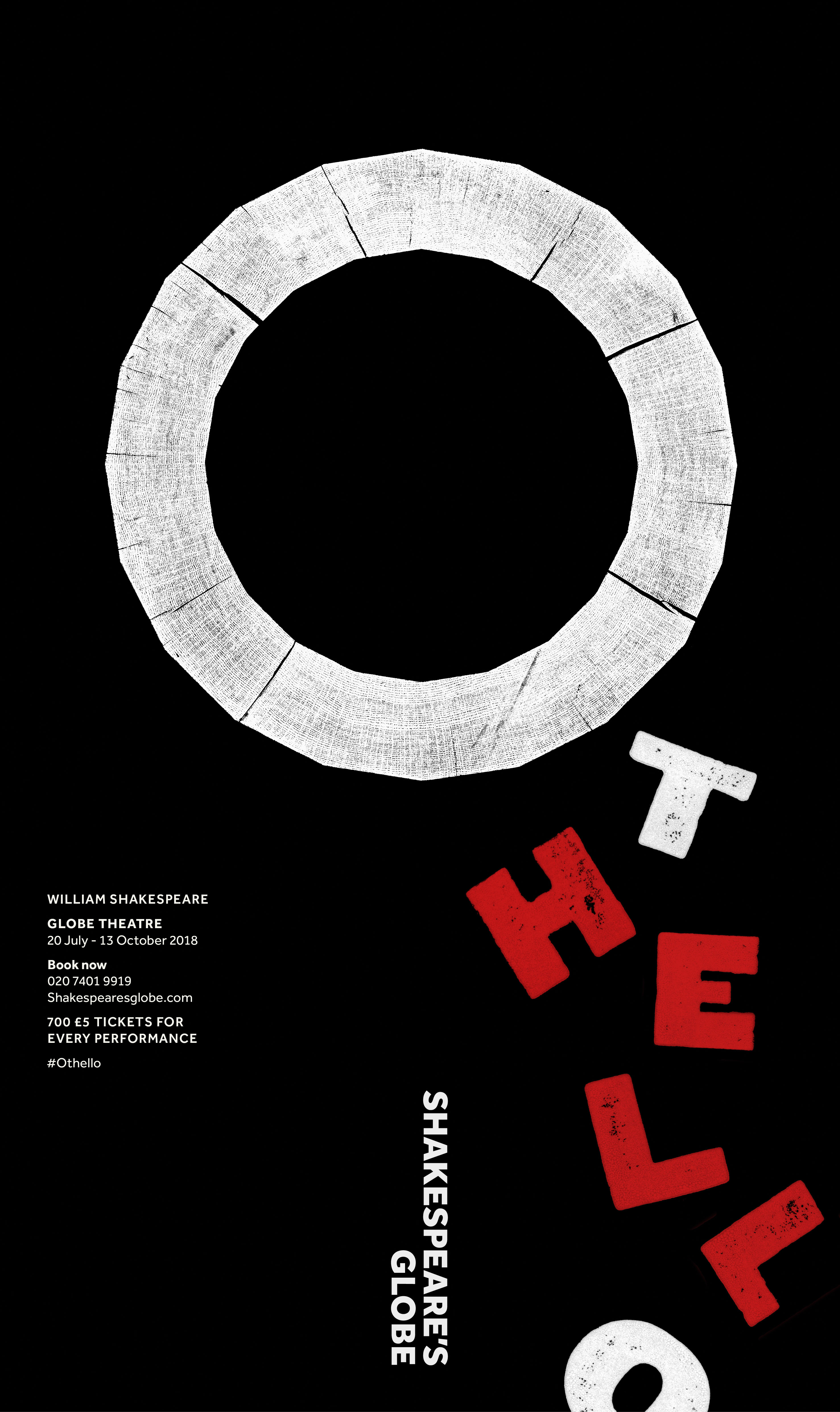
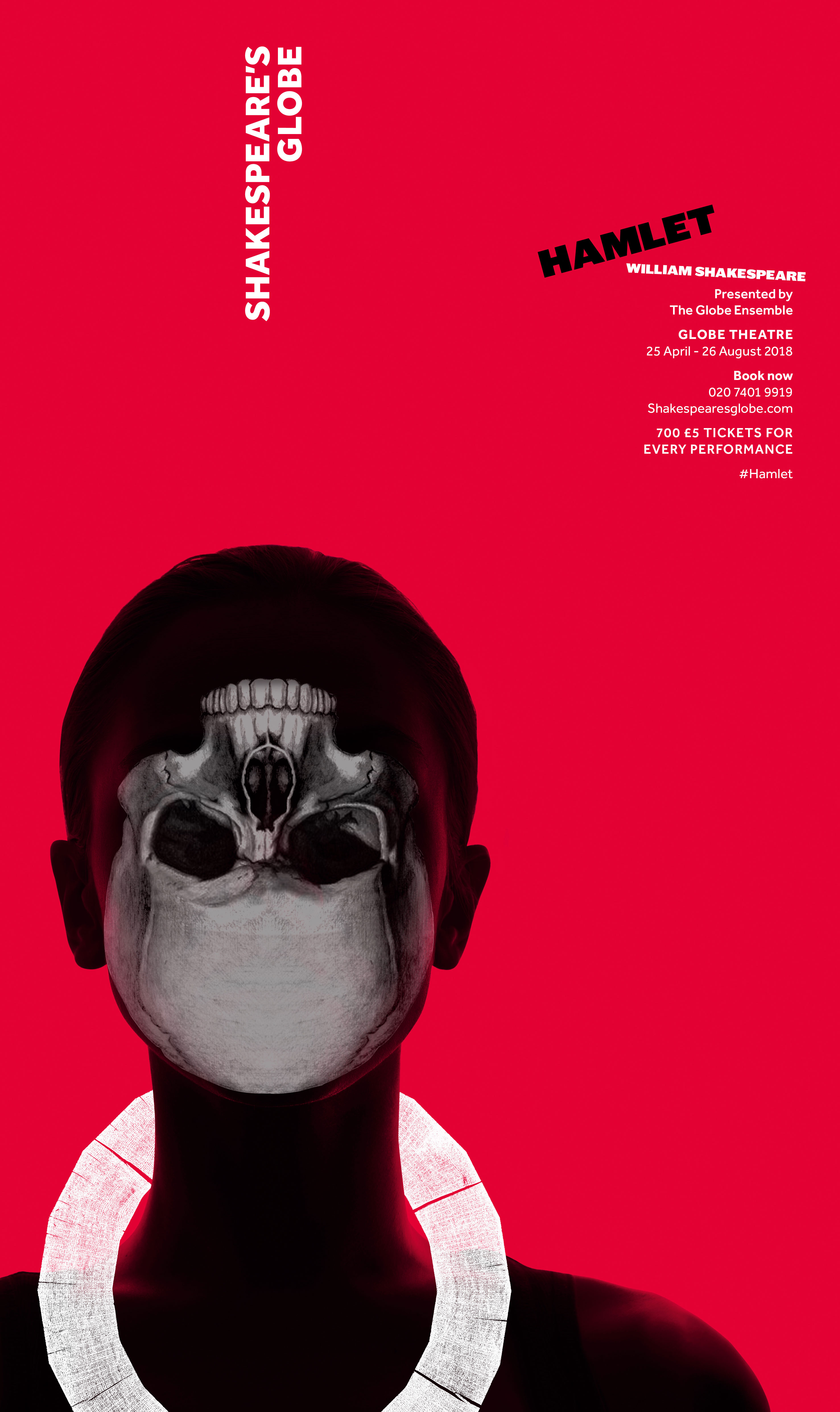
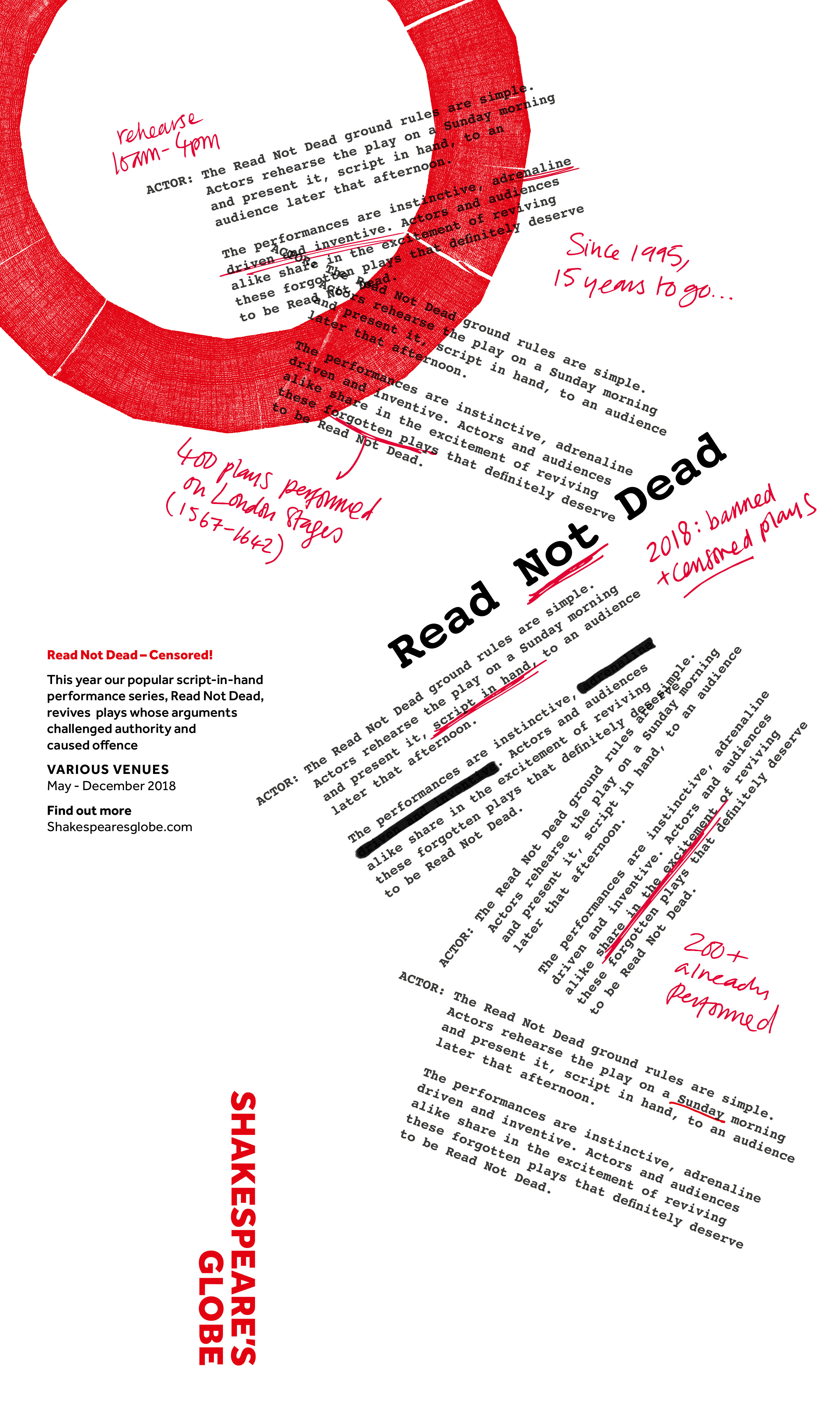
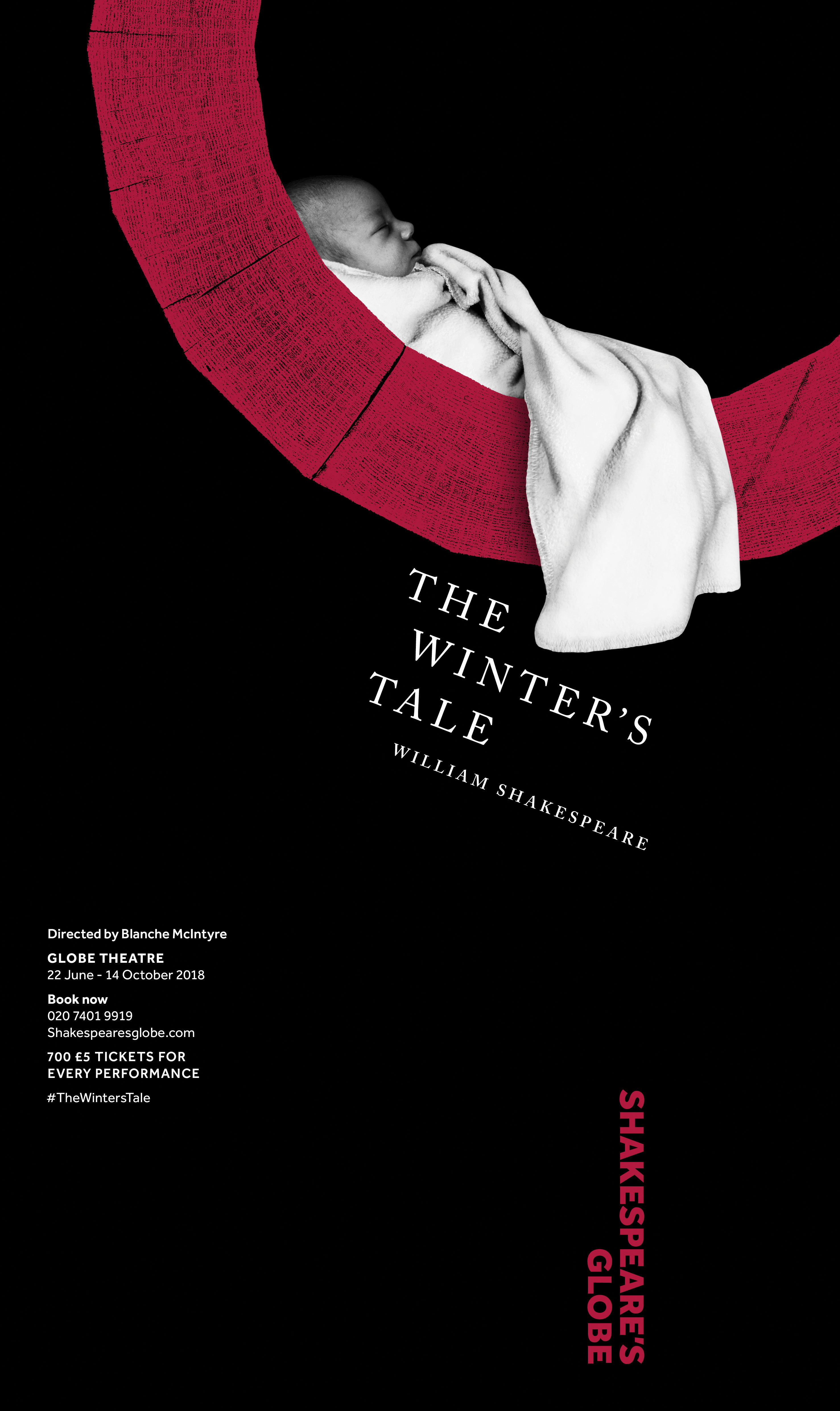
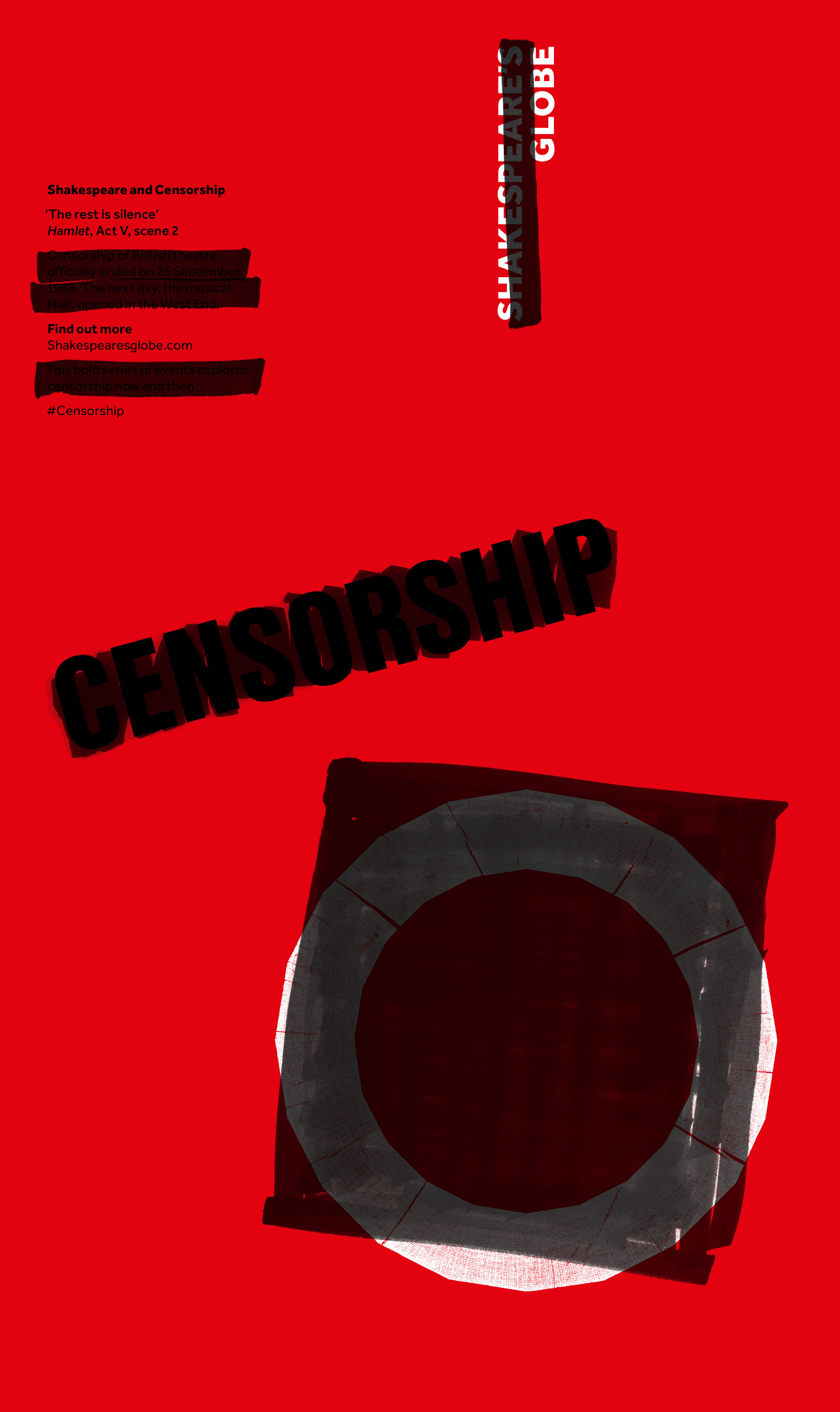
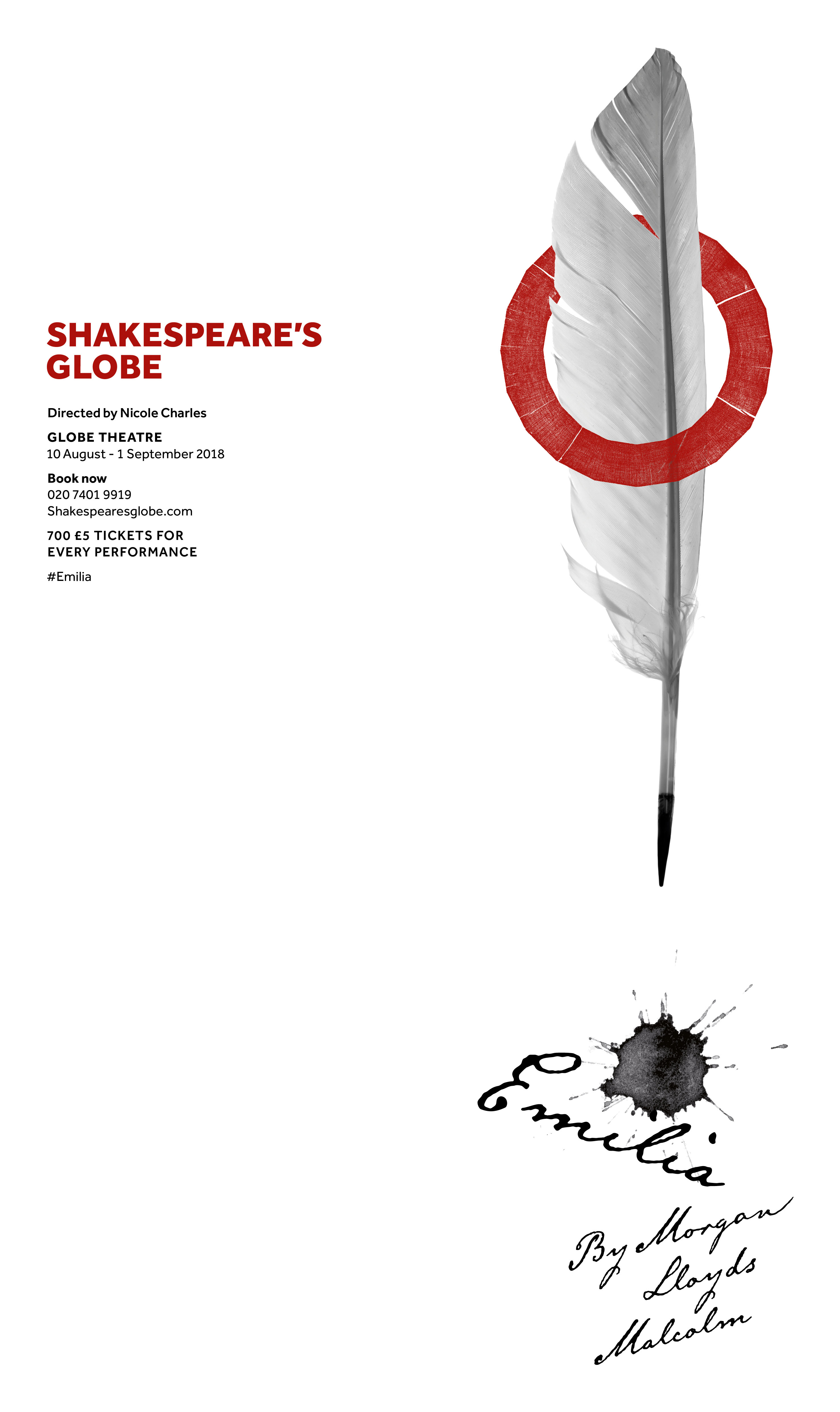
Use the arrows below to scroll through some posters from the identity scheme.
Katherina Tudball, designer director; Nick Eagleton, creative partner; and Jay Brodie, senior designer, share how they crafted the identity...
Article continues below01. Find the cornerstone of the brand
Following changes in its artistic direction, Shakespeare's Globe, a reconstruction of the famous London theatre where the Bard's plays were originally performed, asked cultural strategy specialists Morris Hargreaves McIntyre (MHM) to create a new brand model and a mission statement for the organisation.
We were brought into the process to help develop a new brand narrative for the Globe and evolve the visual identity accordingly. It wasn't clear, initially, that we'd end up radically altering the existing identity. But the freedom to totally re-evaluate everything came about during the process.
Early on, we were asked to turn the new brand narrative into words you might use in a more public facing way. In audience testing, the one word that resonated with everybody was ‘Alive'. It's the notion that going to the Globe brings theatre to life; it's visceral and unpredictable. So that became our cornerstone.
02. Experiment with different ideas
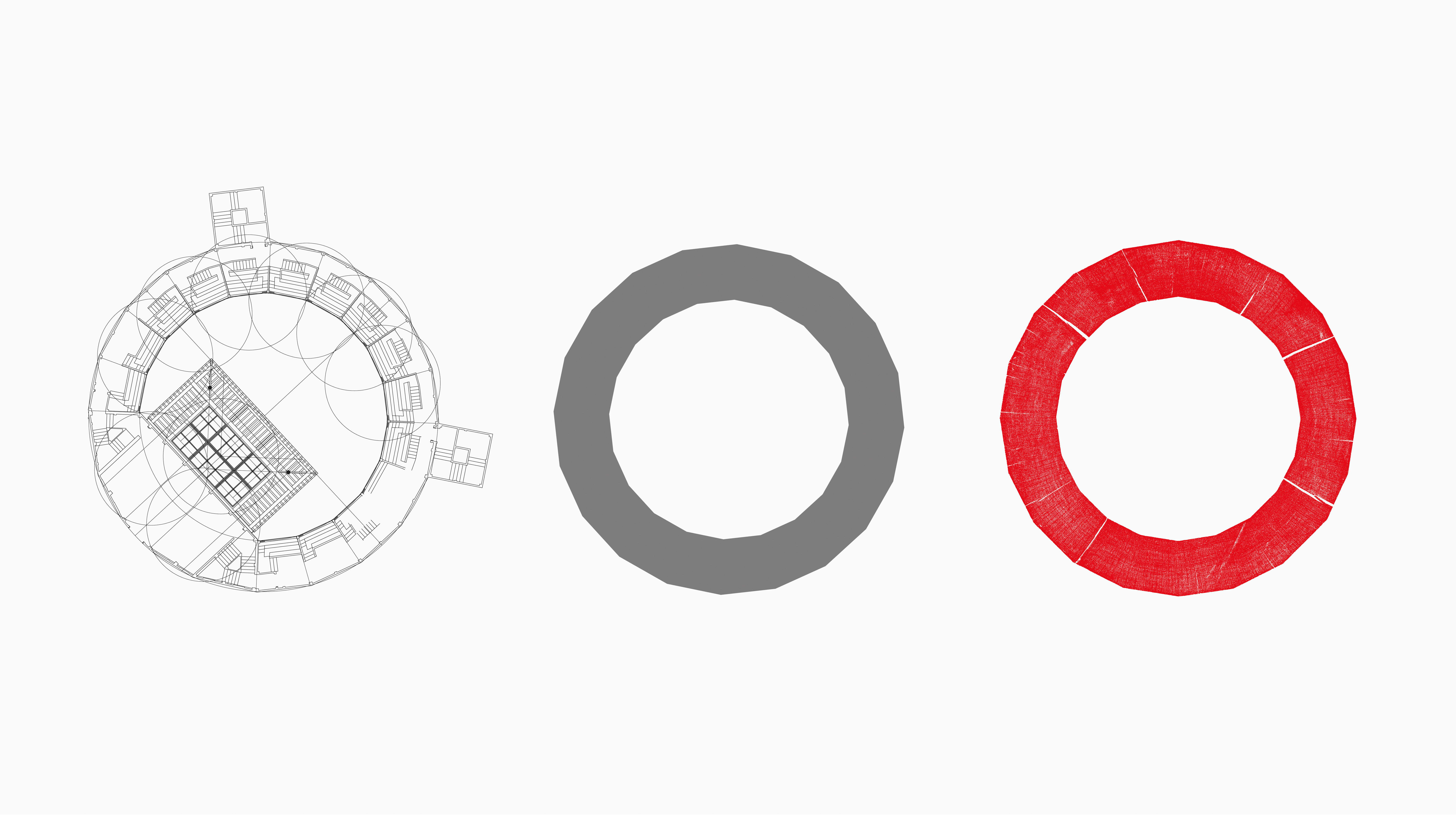
We approached the development of a new visual identity in a quite experimental way, inspired by the idea that the Globe itself was an experiment. So we shared a lot of early ideas with the team. Given the shape of the iconic building, one theme emerged around the idea of circles, but that never quite felt right. Until one day, when we realised that the building is 20-sided and not a perfect circle. That got us excited, as it would be quite a unique-looking symbol.
Sign up to Creative Bloq's daily newsletter, which brings you the latest news and inspiration from the worlds of art, design and technology.
Another concept emerged around the idea of printing. The endurance of Shakespeare's plays is due to the historical accident of them having been printed and saved. Also, after spending a lot of time visually immersed in the theatre, we felt there should be some sort of physicality or tactile aspect to the identity, and we liked the idea of using wood in some way.
03. Tie your themes together
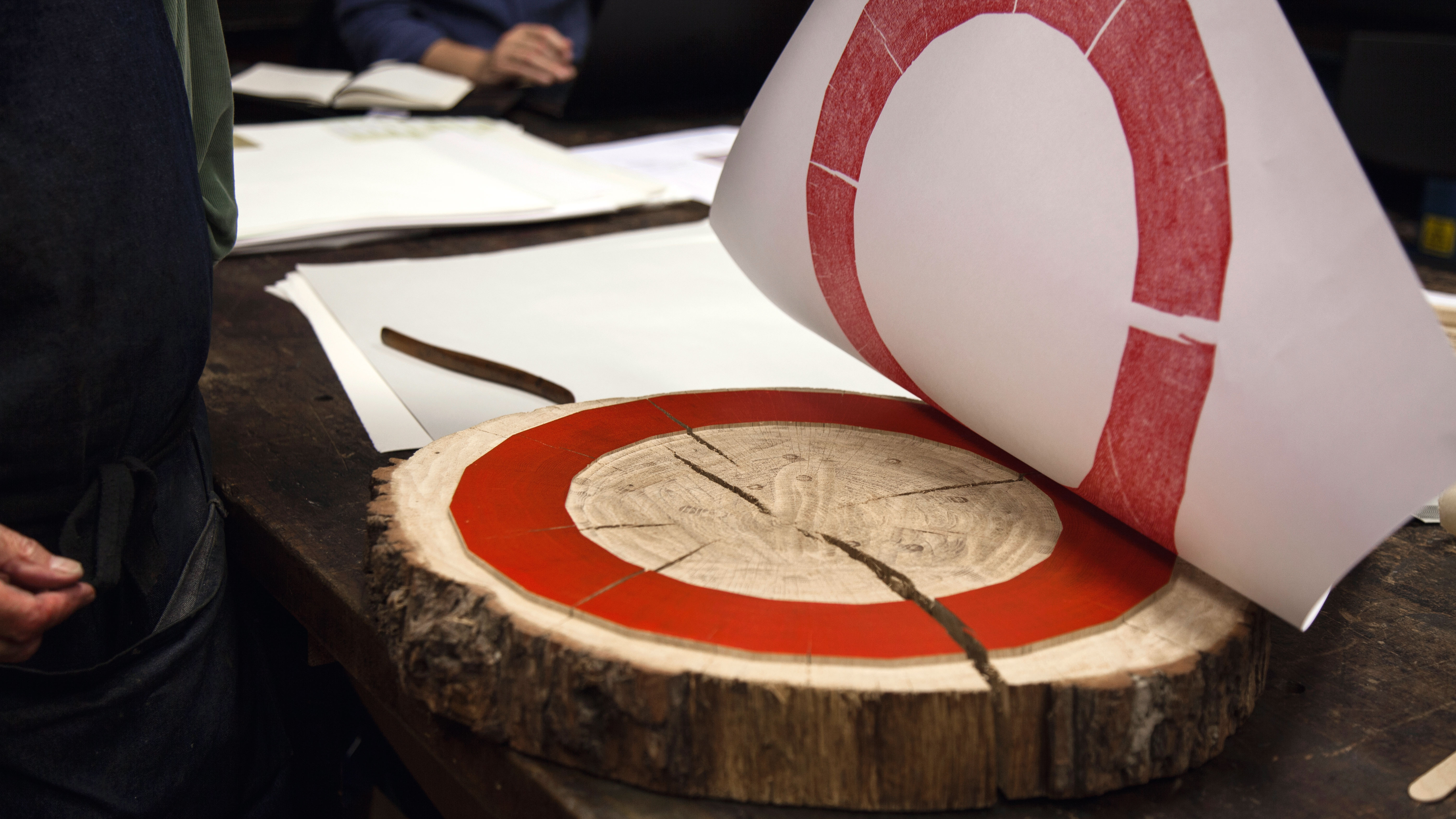
We asked if any wood from the actual building might be available, and the client loved the idea. That same day, they sent over a circular piece of oak to our offices: the only piece remaining from the timber used to rebuild The Globe. We took this and made a print block out of it in the shape of a 20-sided polygon. ‘The Wooden O' was actually the nickname of the original Globe, with the phrase even appearing in the prologue of Henry V, so this tied all these various themes together quite nicely.
The ‘holy relic' we'd been given was carefully cut up by furniture maker Nathalie de Leval, the wife of our creative director Nick Eagleton. Then printmaker Peter Smith, of St Bride Foundation in Fleet Street, covered it with red ink and rubbed paper down on it. So much wonderful granular texture was captured in the process that when it was revealed, there were gasps from the crowd.
This print was then scanned and converted into a digital format to create the logo. We didn't really correct that much, other than create the colour suite and identify what level it can reduce down to. This symbol acts as the core ‘source of the action' in the new identity and is integrated into all of the designs.
04. Look to the past for inspiration
Other elements of the new identity are also inspired by history. We limited our colour palette to red, black and white as these were the colours used in early printing. There's also a story – which is perhaps apocryphal – that in Shakespeare's time, when illiteracy was widespread, red, black and white flags were used to indicate what kind of play was on.
The typeface, Effra, is an updated version of a typeface from 1816 called Caslon Junior. As the first commercial sans serif, this was an important family to the history of English printing, but its simplicity means it's also perfect for the multimedia age.
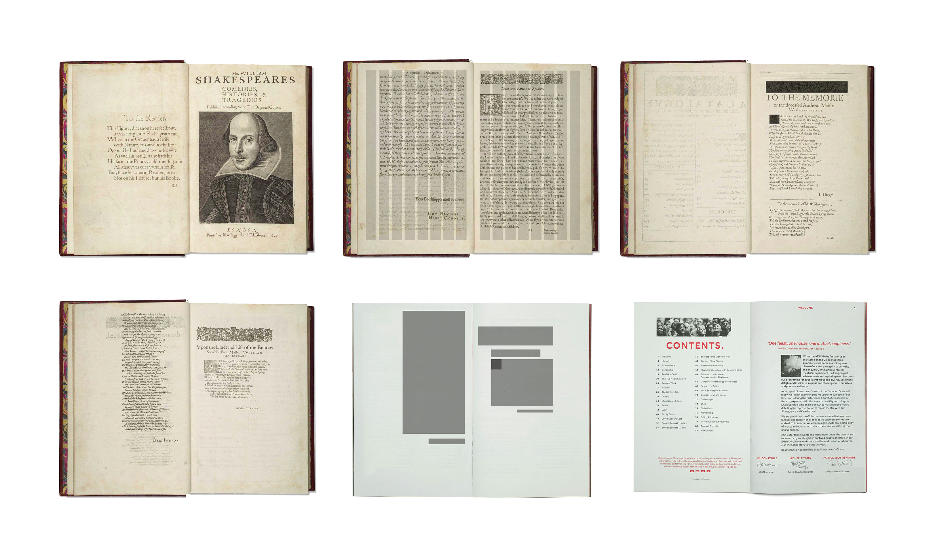
We also took inspiration from the First Folio – the original 1623 publication of William Shakespeare's plays – to create the grid for the layouts of the Globe's brochures and other printed material.
The design system is very flexible: the philosophy is to provide a kit of simple parts with very light guidance to any artist or designer and just let them play with it. This is in keeping with the whole spirit of experimentation around the project, but consistency is ensured by elements such as the limited colour palette.
05. Take your time
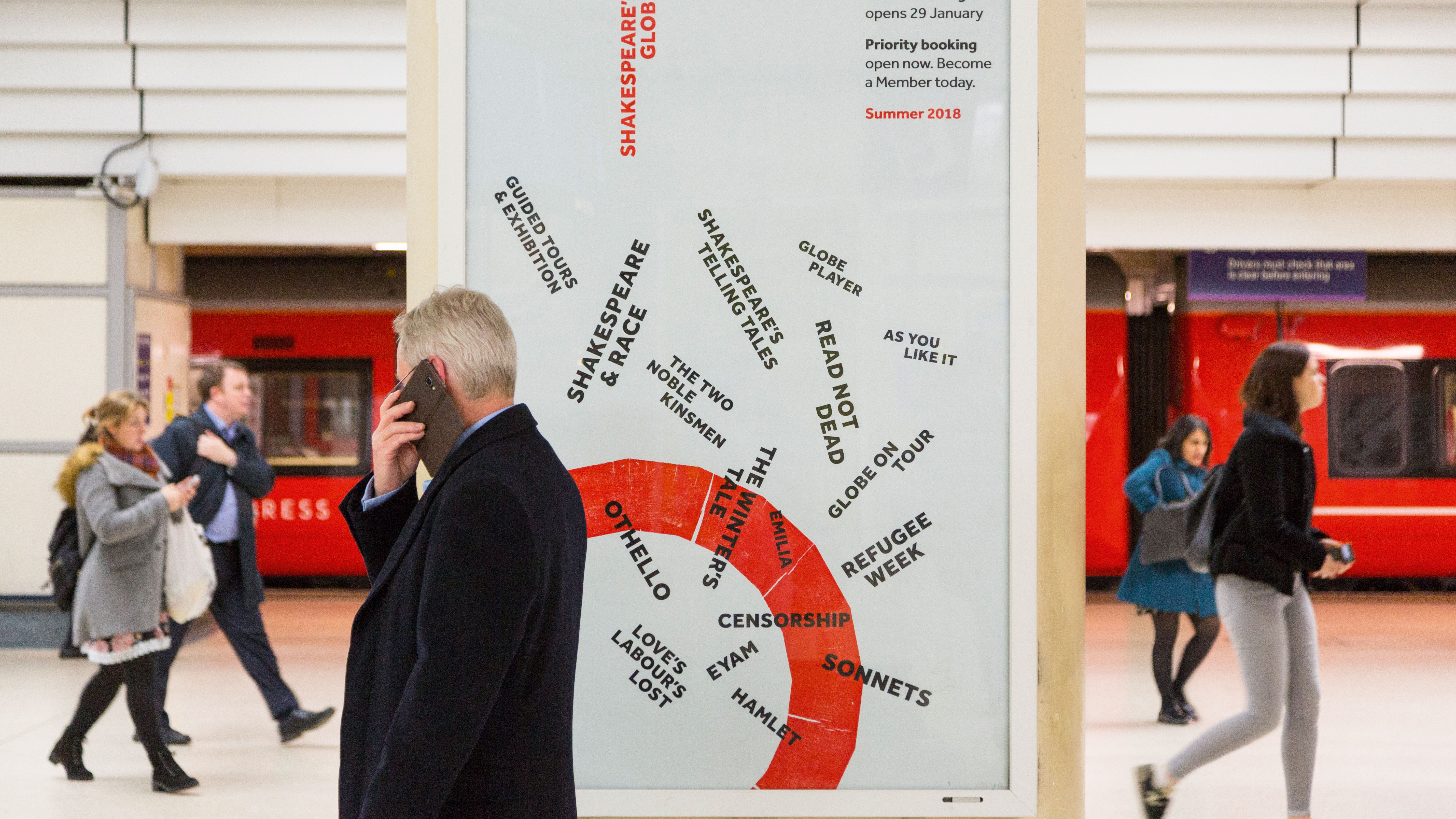
What's been so great about this project is that we've had time to pause and reflect along the way; to think carefully about how all these different strands could come together. We wouldn't have arrived at any of these thoughts if we hadn't taken that time to do the research, and just mess around and learn, without being concerned about trying to make an identity and brand system. In the end, it's actually turned into a very robust system, but that wasn't our primary goal.
The more time we've spent understanding this unique organisation, the more passionate and excited we've become. Ideas are surer and stronger when they're rooted in some sort of authentic truth from the beginning, and so the research on this has been fundamental to really immersing ourselves in Shakespeare and the history of The Globe. This project is ongoing, with the next big stage being the relaunch of the website.
Use the arrows below to scroll through some posters from the identity scheme.
This article was originally published in issue 278 of Computer Arts, the world's leading design magazine. Buy 278 or subscribe here.
Read more:
