10 unofficial Yahoo logo redesigns
Yahoo's redesigning its logo - but the design community has its own ideas. So are these alternative Yahoo logos better than the real thing?
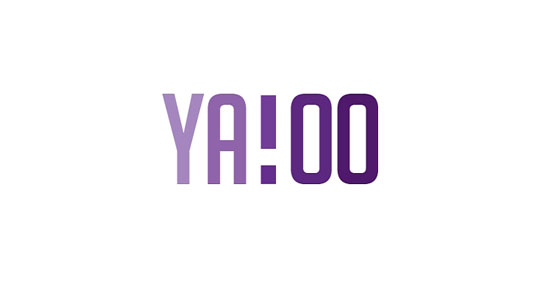
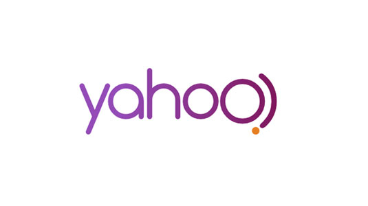
You may have heard that Yahoo is currently redesigning its logo, releasing a new design every day for 30 days. So far, though, all the official new logos all look fairly samey. So we were intrigued to hear that crowdsourcing site 99 Designs had challenged its community to come up with their own redesigns, with no limitations whatsoever.
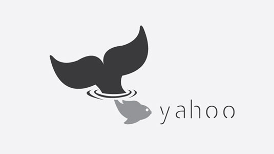
The competition attracted 136 entries, and 99 Designs has finally announced the winner (shown above), an approach based on negative space that was created by Grey Designs. Meanwhile, below are some other entries that caught our attention.
When you compare these crowdsourced designs to the official Yahoo designs here, the difference is striking. But which - if any - do you prefer? We'd love to hear your views in the comments below!
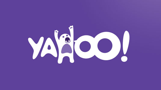
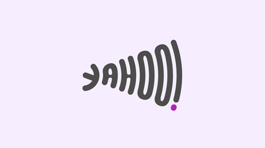
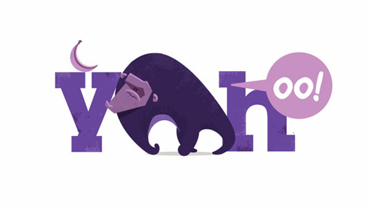
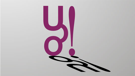

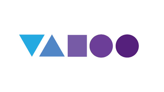
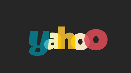
You can see all the entries here.
Liked this? Read these!
- The ultimate guide to designing the best logos
- Useful and inspiring flyer templates
- The best 3D movies of 2013
Do any of these logo designs float your boat? Let us know your views in the comments below!
Daily design news, reviews, how-tos and more, as picked by the editors.

The Creative Bloq team is made up of a group of art and design enthusiasts, and has changed and evolved since Creative Bloq began back in 2012. The current website team consists of eight full-time members of staff: Editor Georgia Coggan, Deputy Editor Rosie Hilder, Ecommerce Editor Beren Neale, Senior News Editor Daniel Piper, Editor, Digital Art and 3D Ian Dean, Tech Reviews Editor Erlingur Einarsson, Ecommerce Writer Beth Nicholls and Staff Writer Natalie Fear, as well as a roster of freelancers from around the world. The ImagineFX magazine team also pitch in, ensuring that content from leading digital art publication ImagineFX is represented on Creative Bloq.
