Colorado unveils its new logo
The Centennial State launches a major new branding campaign, with a new logo at its centre - will it help boost the local economy?
Sign up to Creative Bloq's daily newsletter, which brings you the latest news and inspiration from the worlds of art, design and technology.
You are now subscribed
Your newsletter sign-up was successful
Want to add more newsletters?

Five times a week
CreativeBloq
Sign up to Creative Bloq's daily newsletter, which brings you the latest news and inspiration from the worlds of art, design and technology.

Once a week
By Design
Sign up to Creative Bloq's daily newsletter, which brings you the latest news and inspiration from the worlds of art, design and technology.

Once a week
State of the Art
Sign up to Creative Bloq's daily newsletter, which brings you the latest news and inspiration from the worlds of art, design and technology.

Seasonal (around events)
Brand Impact Awards
Sign up to Creative Bloq's daily newsletter, which brings you the latest news and inspiration from the worlds of art, design and technology.

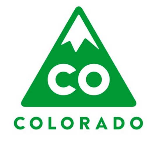
For many years, Colorado has had a state flag and seal, but until now it's never had a unified brand. Today that's all changed, with the release of this new logo design.
Based on a concept devised by Denver designer Evan Hecox, it's based around a green-and-white triangle with a snow-capped peak - purposely reminiscent of the state license plate - sitting atop the letters CO. There are two versions of the logo, one square (above) and one rectangular (below).

The new logo and slogan was created as part of a collaboration between prominent business leaders, marketing experts and graphic designers led by Aaron Kennedy, the state's chief marketing officer. Nationwide research showed that the Colorado flag was commonly mistaken for Chicago's, whereas the Colorado licence plate had high recognition.
The new logo has been trademarked, so businesses need to apply for permission to use it. Colorado will also incorporate the new logo into every aspect of state government, including signs, letterheads, tourism promotion, vehicle emblems and business cards.
[Via the Denver Post]
Liked this? Read these!
- Our favourite web fonts - and they don't cost a penny
- Useful and inspiring flyer templates
- The best 3D movies of 2013
What do you think of the new logo? Let us know your views in the comments below!
Sign up to Creative Bloq's daily newsletter, which brings you the latest news and inspiration from the worlds of art, design and technology.

The Creative Bloq team is made up of a group of art and design enthusiasts, and has changed and evolved since Creative Bloq began back in 2012. The current website team consists of eight full-time members of staff: Editor Georgia Coggan, Deputy Editor Rosie Hilder, Ecommerce Editor Beren Neale, Senior News Editor Daniel Piper, Editor, Digital Art and 3D Ian Dean, Tech Reviews Editor Erlingur Einarsson, Ecommerce Writer Beth Nicholls and Staff Writer Natalie Fear, as well as a roster of freelancers from around the world. The ImagineFX magazine team also pitch in, ensuring that content from leading digital art publication ImagineFX is represented on Creative Bloq.
