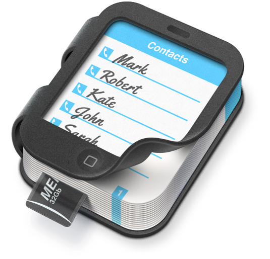
A new icon for YouTube
...and Skype, and Facebook, and Google. This set of reinvented social icons breathes new life into the symbols we see every day.
Sign up to Creative Bloq's daily newsletter, which brings you the latest news and inspiration from the worlds of art, design and technology.
You are now subscribed
Your newsletter sign-up was successful
Want to add more newsletters?

They're the social icons we see everyday so it's natural we don't pay too much attention to them anymore. Although their designs are now infamous, it's always interesting to see these icons in a new light. For their latest project, American agency Artua have reinvented the icons for the likes of YouTube, Facebook, and Skype.
Soon to be available to download, the agency set out to redesign icons that we're all used to. This is just the beginning of the series, with Artua aiming to release more in the coming weeks.
We love the simple approach to the project, with the shadow work making all the difference. Sticking to the definitive colour scheme for each icon allows them to remain instantly recognisable.
Article continues below 


See more of Artua's work over on their website.
Like this? Read these!
- The best 3D movies of 2013
- Discover what's next for Augmented Reality
- Download free textures: high resolution and ready to use now
What do you make of these icons? Let us know in the comments box below!
Sign up to Creative Bloq's daily newsletter, which brings you the latest news and inspiration from the worlds of art, design and technology.

The Creative Bloq team is made up of a group of art and design enthusiasts, and has changed and evolved since Creative Bloq began back in 2012. The current website team consists of eight full-time members of staff: Editor Georgia Coggan, Deputy Editor Rosie Hilder, Ecommerce Editor Beren Neale, Senior News Editor Daniel Piper, Editor, Digital Art and 3D Ian Dean, Tech Reviews Editor Erlingur Einarsson, Ecommerce Writer Beth Nicholls and Staff Writer Natalie Fear, as well as a roster of freelancers from around the world. The ImagineFX magazine team also pitch in, ensuring that content from leading digital art publication ImagineFX is represented on Creative Bloq.
