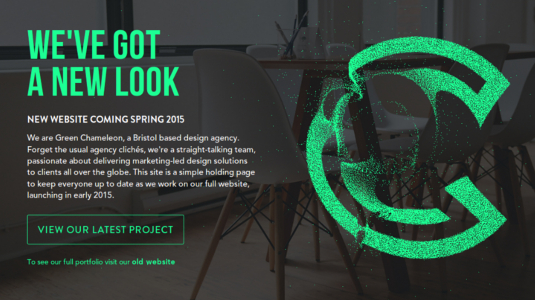
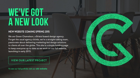
Green Chameleon's addictive new logo
Web design agency Green Chameleon have made clever use of creative coding techniques for their new branding.
Sign up to Creative Bloq's daily newsletter, which brings you the latest news and inspiration from the worlds of art, design and technology.
You are now subscribed
Your newsletter sign-up was successful
Want to add more newsletters?
For their upcoming rebrand, Bristol-based Green Chameleon wanted to create something that would attract attention, so they decided to make their new logo interactive. The mark is composed of a cluster of dots that are extremely averse to contact from your mouse pointer, flying away as it approaches before reverting to their original position once the coast is clear.
We spoke to design director Nathan Riley about how they came up with the idea, and what they used to create the effect.
Where do you look for your creative coding inspiration?
As a team we often browse through code sharing sites such as Codepen and Codrops for inspiration and ideas. A lot of the time the exact examples wouldn't necessarily work in the real world however it's great to keep track of what's going on in the dev community as it might spark another idea in the process.
Tell us how you came up with the idea for this logo.
The rebrand of our company was a really big deal for us, the idea for the logo came from a need to have a brand mark that could be used across a wide range of media and also stand the test of time. With this in mind we opted for a bold letter-based icon.
After finalising the brand elements we needed to find a way of making a splash and announcing our new image to the world and so the idea of making an interactive version was formed.

How did you make it?
Whilst prototyping our new holding page design we stumbled across a nifty plugin called Particle Slider, although it's original usage seemed to be more geared up for a carousel type display we were immediately drawn in by the interactive particle element. After realising we had already spent 10 minutes just playing with the effect it occurred to us that this could be the perfect method to announce our new logo and add another dimension to our website.
Was it difficult to get it working across different browsers and devices?
For some time during development we had the particle effect running on mobile devices too, but as the launch deadline approached we weren't happy with its performance on all of them.
Sign up to Creative Bloq's daily newsletter, which brings you the latest news and inspiration from the worlds of art, design and technology.
We wanted the rebrand and the new logo to be memorable for visitors to the site, and to have a sluggish effect on it that didn't respond well to interactions would do that for all the wrong reasons. In the end we fell back to a nice, crisp SVG for mobile devices and resolved to plan more time for such optimisations in future projects.

People can go overboard with special effects that can distract from the site's content. How do you make sure you've struck the right balance?
There is definitely a fine line between obscuring content and adding to it with interactive effects. I think our use case was slightly different to most as essentially our goal was to get users to interact with the logo as much as possible.
The only true test is conducting user testing to establish exactly what people take away from a web experience, if they come away impressed by visuals but can't remember what the site topic was then you know you've missed the mark! For us the goal is creating that wow factor by using interactive effects to emphasise core message not distract from it.
How did this fit into your rebranding strategy?
Our plan with the rebrand was to make as big of a splash as possible and really get people connecting with our new look. We sent out various marketing materials to our existing clients to spread the word and had a short animation producing showing the transformation of the old logo into the new.
The interactive logo on our website was the last piece of the puzzle and really hammered home the brand and allowed us to connect with a much wider audience.
Words: Tanya Combrinck
Like this? Read these!
- The ultimate guide to logo design
- The 15 best photo editors
- How to build an app: try these great tutorials

The Creative Bloq team is made up of a group of art and design enthusiasts, and has changed and evolved since Creative Bloq began back in 2012. The current website team consists of eight full-time members of staff: Editor Georgia Coggan, Deputy Editor Rosie Hilder, Ecommerce Editor Beren Neale, Senior News Editor Daniel Piper, Editor, Digital Art and 3D Ian Dean, Tech Reviews Editor Erlingur Einarsson, Ecommerce Writer Beth Nicholls and Staff Writer Natalie Fear, as well as a roster of freelancers from around the world. The ImagineFX magazine team also pitch in, ensuring that content from leading digital art publication ImagineFX is represented on Creative Bloq.
