Iconic logos reimagined with handwritten type
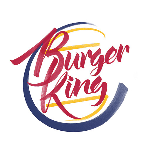
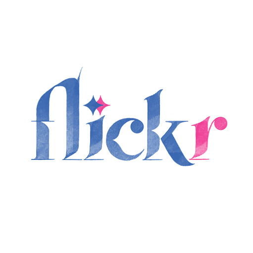
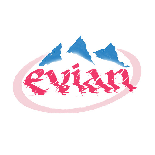
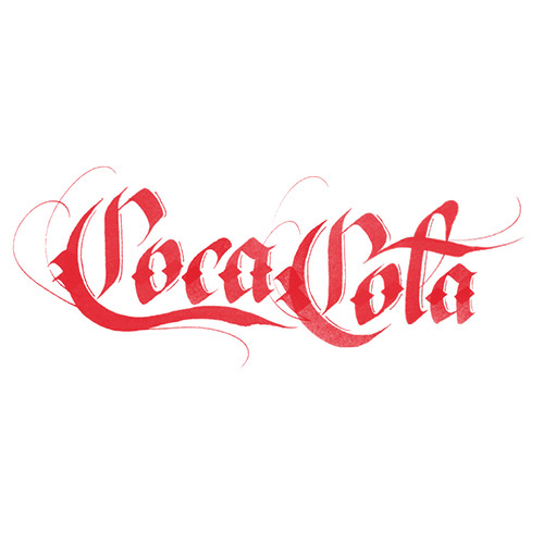
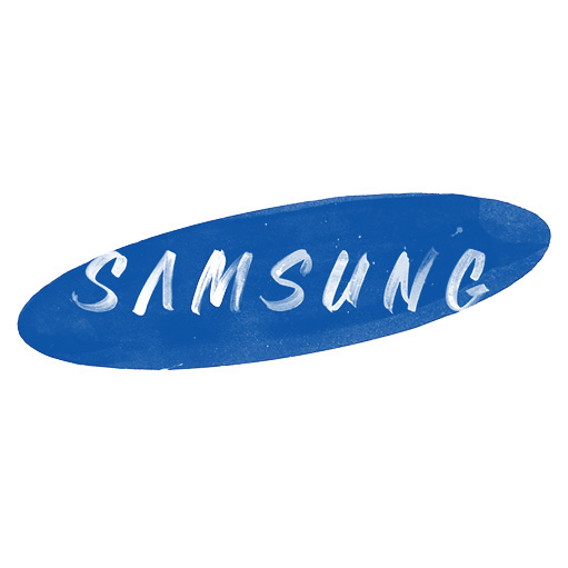
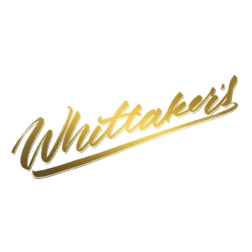
The likes of Fed-Ex, Burger King, Flickr and YouTube are reimagined with handwritten typography.
Sign up to Creative Bloq's daily newsletter, which brings you the latest news and inspiration from the worlds of art, design and technology.
You are now subscribed
Your newsletter sign-up was successful
Want to add more newsletters?

Most of the corporate logo designs you're familiar with, focus on a clean and minimalist approach – think Apple and Google, with the likes of Starbucks pulling back on their initial identities to conform with this more minimal trend. Less colour and use of negative space has seen a big rise in hand-lettering.
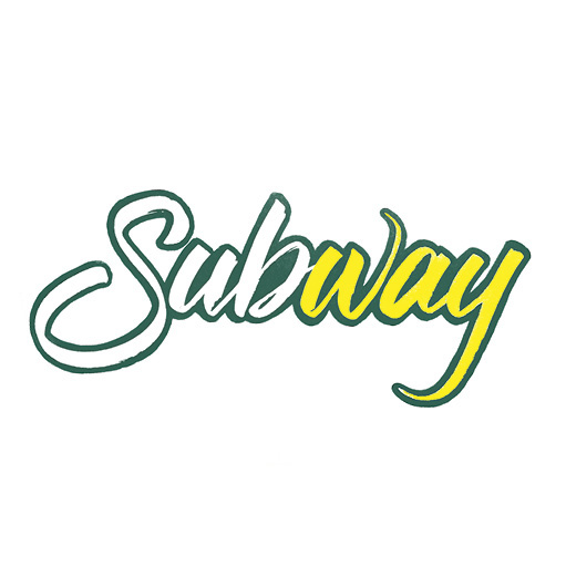
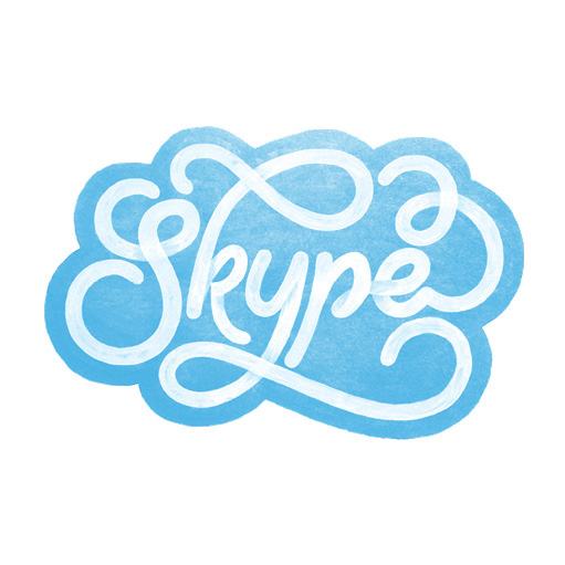
Auckland based designer Sara Marshall created this latest project, 'Brand by Hand' to explore the defining attributes of some of the biggest companies in the world. "Brand by Hand is intended as an intersection of these two trends by introducing the personal, hand-treated and flowery nature of hand lettering into the cold corporate world," she explains.
"The purpose, besides being a personal exploration of letterforms, is to reimagine these logos while retaining key defining elements of their original branding," she continues. "Some examples have taken the salient features of each brand and conceptualised them in workable ways while others really challenge minimalist ideals through ornamentation and embellishment."


Liked this? Read these!
Sign up to Creative Bloq's daily newsletter, which brings you the latest news and inspiration from the worlds of art, design and technology.

Sammy Maine was a founding member of the Creative Bloq team way back in the early 2010s, working as a Commissioning Editor. Her interests cover graphic design in music and film, illustration and animation. Since departing, Sammy has written for The Guardian, VICE, The Independent & Metro, and currently co-edits the quarterly music journal Gold Flake Paint.
