World's largest retail outlet gets new logo
For its 20th anniversary, Mall of America was in search of a new identity. Design agency Duffy & Partners took care of it. Check out the new designs and the thinking behind them.
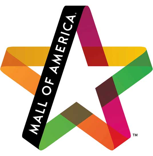
The world's largest retail complex, Mall of America recently celebrated its 20th anniversary. In order to celebrate with something special, it went in search of a new logo design - something that would better reflect its position as a curator of popular culture.
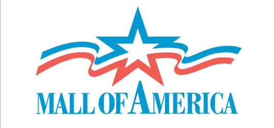
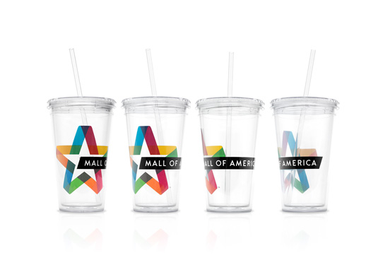
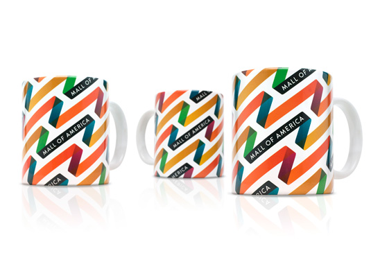
The new logo (above) is a big departure from the previous identity (below), based on dynamic-looking star design with bright colours that are designed to be interchangeable.
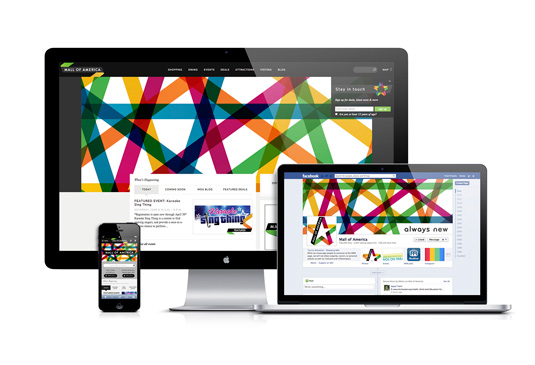
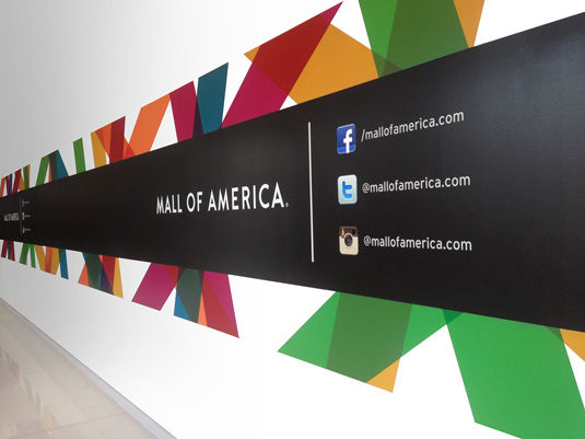
The new branding for the Minneapolis complex - with elements including brand language, logo, promotional merchandise, website, social media pages and interior branding - was created by local design agency Duffy & Partners.
Article continues below"We knew we had to harness the dynamism of their unique experience, the equity found in their American ingenuity and embrace all the 'new' that is their DNA," says the agency's founder Joe Duffy. "The result is a robust brand language that is fresh and full of energy and optimism, accompanied by a tagline crafted by Duffy - 'Always New'."
The new logo will appear on everything from billboards to business cards, gift cards to garbage cans. Mall employees will get new uniforms, and gift shops will be stocked with updated apparel, accessories and merchandise, all featuring the new logo.
See more inspiring work from Duffy & Partners over on their website.
Like this? Read these!
- The ultimate guide to designing the best logos
- The best free web fonts for designers
- Useful and inspiring flyer templates
What do you think of the new logo? Is it better than the old one? Let us know in the comments box below!
Sign up to Creative Bloq's daily newsletter, which brings you the latest news and inspiration from the worlds of art, design and technology.

The Creative Bloq team is made up of a group of art and design enthusiasts, and has changed and evolved since Creative Bloq began back in 2012. The current website team consists of eight full-time members of staff: Editor Georgia Coggan, Deputy Editor Rosie Hilder, Ecommerce Editor Beren Neale, Senior News Editor Daniel Piper, Editor, Digital Art and 3D Ian Dean, Tech Reviews Editor Erlingur Einarsson, Ecommerce Writer Beth Nicholls and Staff Writer Natalie Fear, as well as a roster of freelancers from around the world. The ImagineFX magazine team also pitch in, ensuring that content from leading digital art publication ImagineFX is represented on Creative Bloq.
