New logo and branding for Sundance Festival
Pentagram's Paula Scher gives the world-famous festival, and its parent organisation, a brand new look.
Sign up to Creative Bloq's daily newsletter, which brings you the latest news and inspiration from the worlds of art, design and technology.
You are now subscribed
Your newsletter sign-up was successful
Want to add more newsletters?
Back in 1981, actor Robert Redford organised a small film festival in the mountains of Sundance, Utah. It's since grown into one of the world's leading cinematic events, and the organisation behind it, the Sundance Institute, has grown into a global nonprofit cultural organization working across a variety of artistic disciplines.
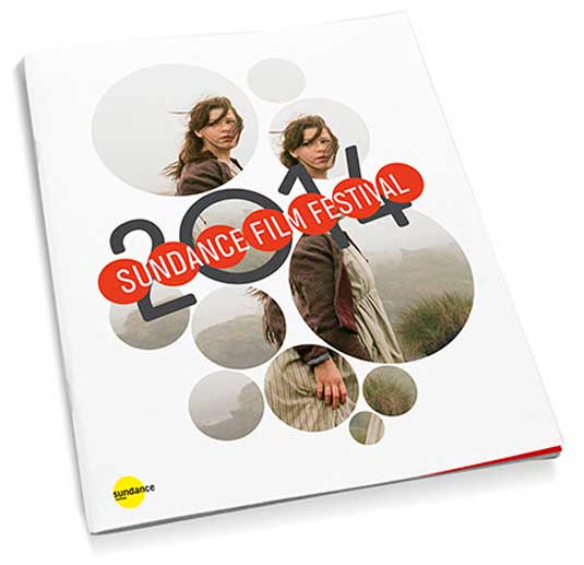
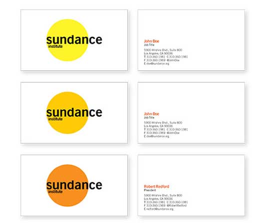
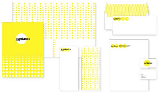
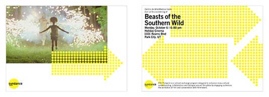
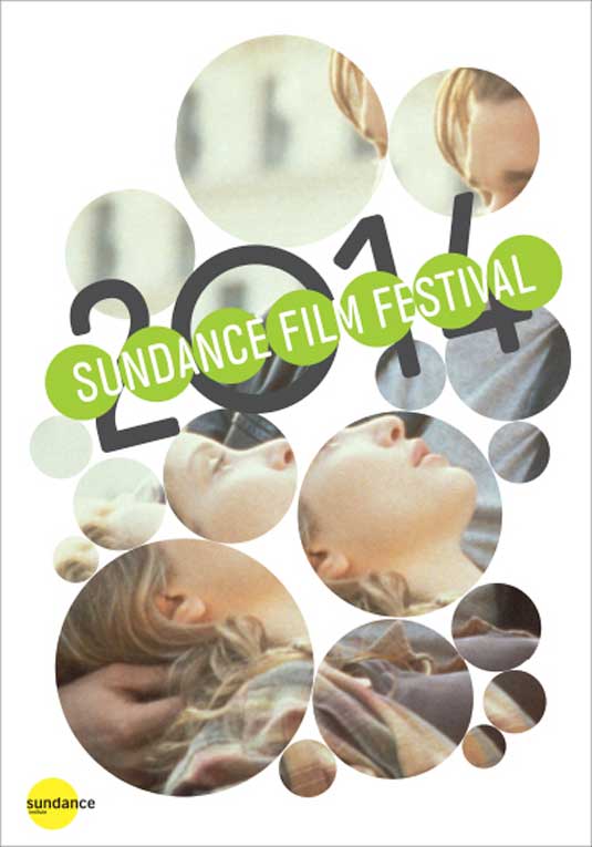
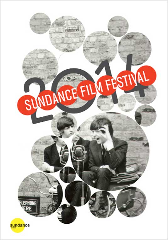
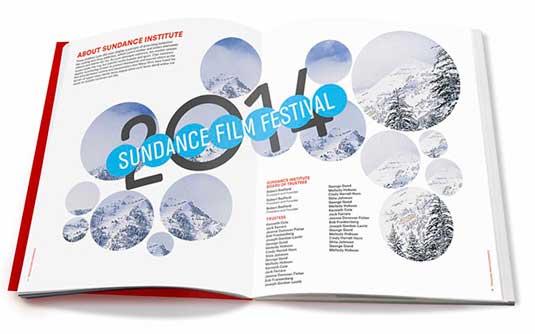
Pentagram's Paula Scher was tasked with creating a new identity for the Sundance Institute and a flexible identity system that could be customized for its many programs and initiatives. Bold, iconic and memorable, her design is based around the simple form of a bright yellow circle. At the same time, Scher also designed the graphic identity for the 2014 Sundance Film Festival.
Bright yellow
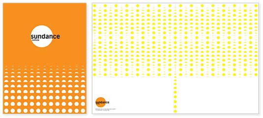
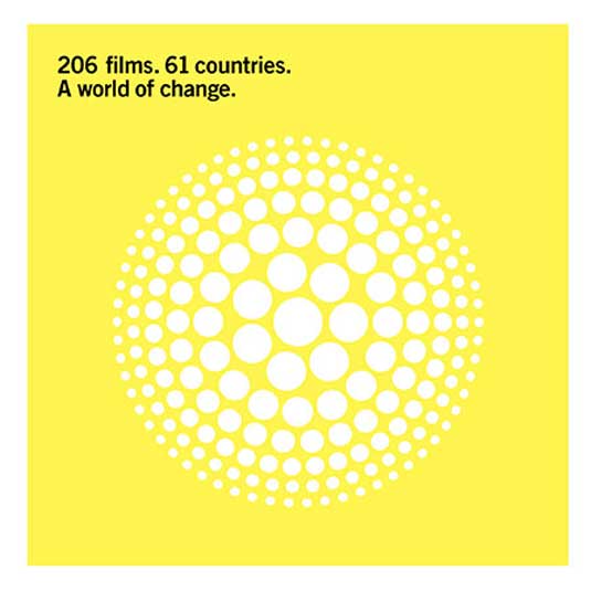
The colorful identity appears in bright yellow and is also accompanied by two variations in shades of mustard and warm orange. The logotype is set in Trade Gothic, the typeface of the identity.
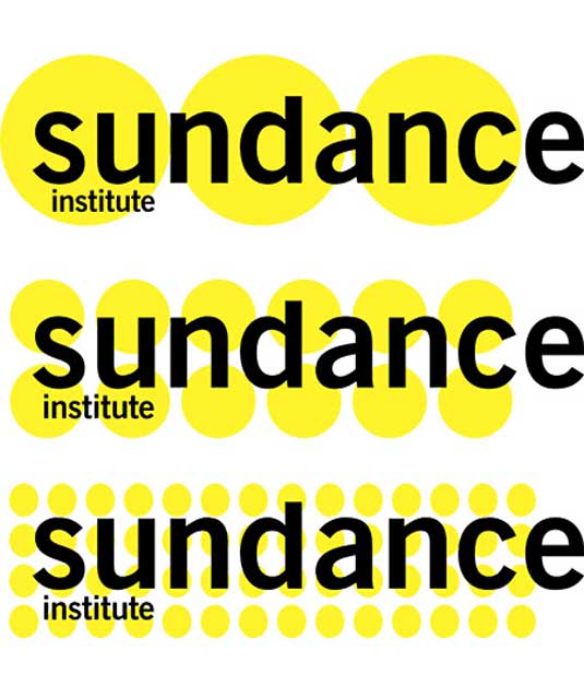
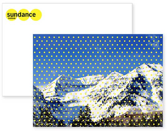
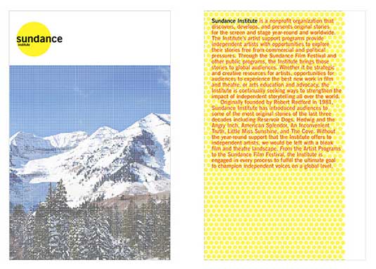
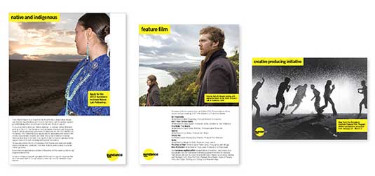
Article continues belowThe circles of the identity can be used to form series and patterns, as well as shapes, images and gradations. In communications like brochures and the website, the identity can be combined with stills from thousands of films and plays supported by Sundance, or photographs of the Utah locale.
Liked this? Read these!
- The ultimate guide to designing the best logos
- The best free web fonts for designers
- Useful and inspiring flyer templates
- The best 3D movies of 2013
Have you seen an inspiring rebranding exercise? Let us know about it in the comments!
Sign up to Creative Bloq's daily newsletter, which brings you the latest news and inspiration from the worlds of art, design and technology.

The Creative Bloq team is made up of a group of art and design enthusiasts, and has changed and evolved since Creative Bloq began back in 2012. The current website team consists of eight full-time members of staff: Editor Georgia Coggan, Deputy Editor Rosie Hilder, Ecommerce Editor Beren Neale, Senior News Editor Daniel Piper, Editor, Digital Art and 3D Ian Dean, Tech Reviews Editor Erlingur Einarsson, Ecommerce Writer Beth Nicholls and Staff Writer Natalie Fear, as well as a roster of freelancers from around the world. The ImagineFX magazine team also pitch in, ensuring that content from leading digital art publication ImagineFX is represented on Creative Bloq.
