Disney unveils new logo
Sign up to Creative Bloq's daily newsletter, which brings you the latest news and inspiration from the worlds of art, design and technology.
You are now subscribed
Your newsletter sign-up was successful
Want to add more newsletters?

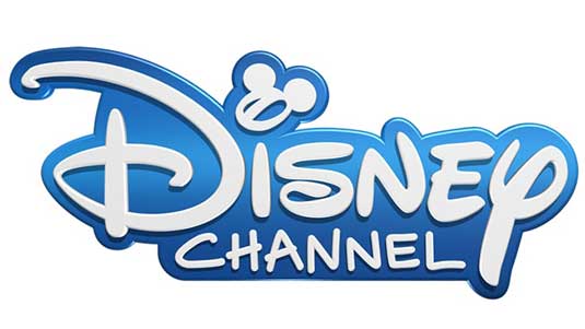
The Disney Channel is today rolling out a new logo design (above) across all its international TV networks - and it's a radical change from the previous identity.
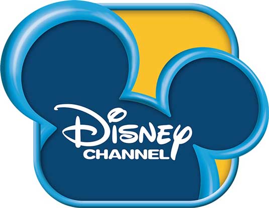
At first glance it looks like a purely typographic logo, in which the Mickey Mouse silhouette that dominated the old logo (below) is nowhere to be seen.
Look closer, though, and you'll see it's still there - just; relegated to a couple of circular ears added to the dot of the 'i' of 'Disney'.
Article continues below 
In general, the new logo is dramatically simplified, with the graphical elements all but removed and a single colour treatment, with the two constrasting blues of old merged together using a subtle gradient.
Also the lettering of the word 'Channel' has been made more casual and friendly to bring it more in line with the Disney wordmark based on founder Walt's original signature, which remains unchanged.
International rollout
The new logo will appear on all of Disney's entertainment channels and/or channel feeds, which are available in 166 countries in 34 languages, incluing Disney Channel, Disney XD, Disney Junior, Disney Cinemagic, Hungama and Radio Disney.
"The new branding was an international collaboration between Disney Channel global and European teams and is crafted so our teams everywhere can customize it to create local stories, in familiar settings, featuring culturally identifiable storytelling," said Richard Loomis, Senior Vice President and Chief Marketing Officer, Disney Channels Worldwide.
Sign up to Creative Bloq's daily newsletter, which brings you the latest news and inspiration from the worlds of art, design and technology.
What do you think of the new logo? Let us know in the comments!

Tom May is an award-winning journalist specialising in art, design, photography and technology. His latest book, The 50 Greatest Designers (Arcturus Publishing), was published this June. He's also author of Great TED Talks: Creativity (Pavilion Books). Tom was previously editor of Professional Photography magazine, associate editor at Creative Bloq, and deputy editor at net magazine.
