Master the fine art of compositing
Alex Varanese builds a deconstructed urban environment composed of 3D and typography.
Sign up to Creative Bloq's daily newsletter, which brings you the latest news and inspiration from the worlds of art, design and technology.
You are now subscribed
Your newsletter sign-up was successful
Want to add more newsletters?
- Time needed 8-12 hours
- Skills-Envision layout and typography in 3D-Use render passes and post-production effects in your 3D illustrations-Approach design projects with a multidisciplinary perspective
The future of digital design and computer art lies beyond the boundaries that separate 3D illustration, typography and traditional image compositing. When these and other creative disciplines are merged into a single, seamless style, a fascinating new world emerges that straddles the line between tangible realism and boundless abstraction.
The barrier of entry into this future is rising, however, with increasingly sophisticated techniques for creating and manipulating imagery becoming the norm. This tutorial provides an introduction to this world with a tour of Urban Cartography, a multidisciplinary print series that I created to explore the theme of urban deconstruction in the style of San Francisco's Mission District.
The piece we'll be creating, 'The Glass Jungle', strikes a balance between textures composed of vectors and photographic samples, typography, 3D modelling and rendering, colour processing, compositing and different effects. With an understanding of how these applications and techniques come together, you'll have the perspective necessary to carve your own path into a challenging frontier that's as complex as it is rewarding.
Article continues below3ds Max trial
Download a 30-day trial of 3ds Max at http://bit.ly/hBVBbT (UK) or http://bit.ly/fGj06p (US and Canada).
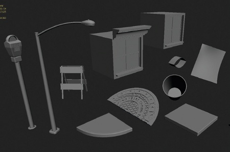
01 I almost always begin design projects in 3D, as it enables ideas to form without constraints on concept, contour, or perspective. In this case the goal is to create a fractured cityscape by arranging detailed elements in loose, chaotic patterns. First, open 3ds Max and create those elements by modelling their geometry. I've tried to create as diverse a collection as possible, from blocky segments of buildings and roads to signage, streetlights and debris.
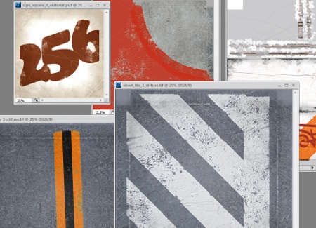
02 Now create a range of textures to give the models a final layer of realism. Merge different photographic samples of asphalt, bricks and city grime with vector art, typography and Photoshop brushwork to create everything from painted curbs and street signs to the labels on parking meters.
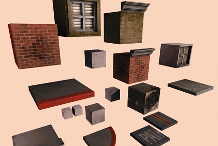
03 By this stage you should have a good collection of large, basic elements, including cube-shaped chunks of buildings and segments of pavements and roads. These will be used later in the process to flesh out the general shape and composition of the piece.
Sign up to Creative Bloq's daily newsletter, which brings you the latest news and inspiration from the worlds of art, design and technology.
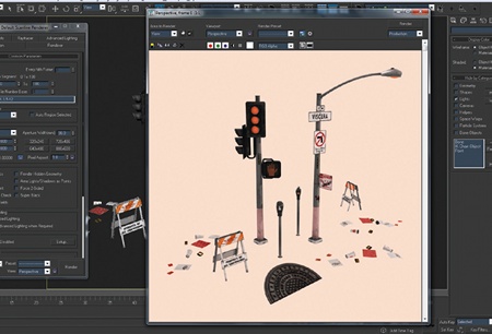
04 Create some additional selections of detail to round out the set: lamp posts, construction barriers, a halved manhole cover and the kind of discarded detritus that tends to accumulate around kerbs and storm drains. Capturing even some of a city's grime and grit is an essential step in striking the right tone.
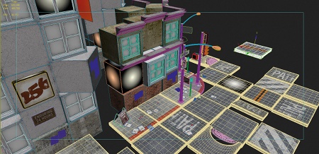
05 The next step is to use these completed parts to cobble together a scene. My goal is to be as haphazard as possible, while still retaining the compositional coherence of a compelling design. Rotate, offset and delete entire chunks of the overall structure to create a sufficiently disjointed world. For additional surrealism we will insert a glowing effect during the compositing stage, so pick out elements at random for this. The elements I chose are marked with a circular gradient texture.
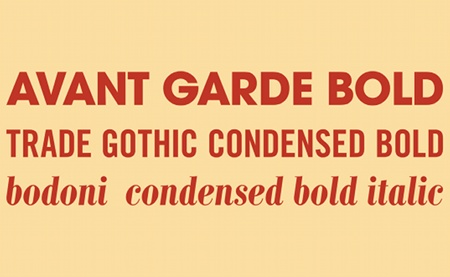
06 Switching gear a little, add a dense typographical element to push the abstract nature of the piece further and pit the 3D look against the feel of a more traditional print piece. I've started with a vague, stream-of-consciousness writing exercise, also known as 'pretentious blather', and picked out three visually contrasting typefaces to render it with an energetic sense of disarray: Avant Garde Bold, Trade Gothic Condensed Bold and Bodoni Condensed Bold Italic.
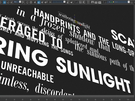
07 Rather than composing the type in Illustrator, however, lay it out directly in the 3D scene itself to ensure a seamless composition later on. A common pitfall when mixing 2D and 3D design is an inconsistent look wherein certain elements seem to be visibly created with one program while the rest look like the product of another. Creating as much of the illustration as possible in the original 3D space will help prevent this from happening.
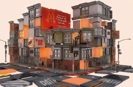
08 The secret to good rendering is to separate the channels of image information into multiple passes. Doing this will enable their composition to be tweaked and adjusted at will later on. In this case, the first pass consists of neutral lighting with soft shadows, as well as a subtle hint of specularity to highlight metal edges and other details. It has a very dull, unremarkable look on its own, but that's what makes it a good starting point for subsequent layering and processing as you build up the image.
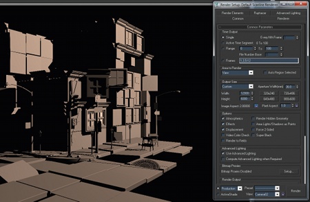
09 For the second pass, render only the dramatic, hard-edged shadows cast by the late afternoon sun. Cityscapes are often presented at night, with an emphasis on headlights, glowing windows and flashes of vivid colour, but I've always found the Mission District to be most compelling during the day. This pass will enable you to experiment with that look.

10 With the main render passes complete, it's time to render a couple of greyscale mattes that will allow you to isolate specific parts of the image for further processing, analogous to alpha channels in Photoshop. The first of these is a glow matte, seen here, which highlights all of the elements that are going to receive the glowing effect described in step 5.
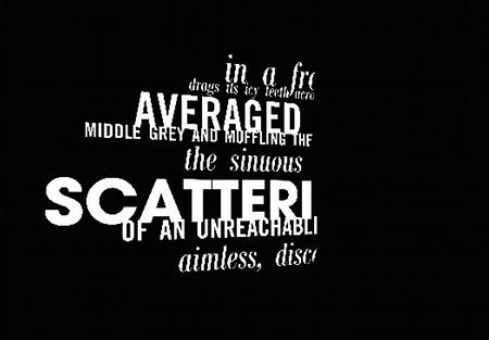
11 The second matte provides the shape of the typographic layers. This will enable you to merge them into the composition using any number of fills, effects and blending modes without concern about the surrounding image. Note that the centre of the matte is mostly empty; this is where the type will be occluded by the buildings.
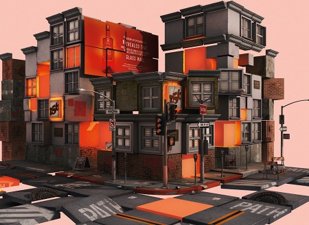
12 With the renders and mattes done, open Photoshop and begin merging the shadow pass with the base render of the scene. This is a good time to experiment with the opacity and blending modes to make the shadows as dramatic or as subtle as you like. I found that using an overlay causes the shadows to liven the base layer up in interesting ways, rather than simply falling on it.
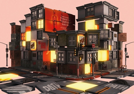
13 Next, the glow matte is used to cover those selected elements with a bright, solid colour fill and multiple layers of glowing edges. Furthermore, the black-to-white gradient texture seen in step 5 was actually a special light-emitting material that cast a warm, orange glow onto surrounding surfaces within the 3D space during the render. When combined with a 2D glow in Photoshop, the result is a convincing sense of vivid light.
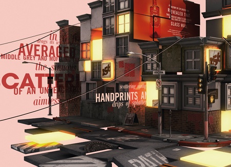
14 Now use a red colour overlay to insert the typography into the scene in a way that feels both crisp and ethereal. Then, using similar compositing techniques, insert an additional white, opaque layer of type into a different part of the scene, as well as abstract shapes that resemble power lines.
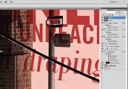
15 With the major elements in place, it's time to start stylising the composition overall. The first step is to add layers of noise to downplay that unnaturally perfect look so often associated with 3D renders, and to help further enhance the gritty, urban feel. Here I've used multiple layers of noise at varying scales to amplify the effect, and to ensure it's visible in print at 300dpi.
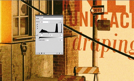
16 The final step is to apply multiple layers of colour processing to instil a faded, retro vibe. First, dramatically exaggerate the levels, heavily clamping the range between midtones and shadows for contrast. Next, bring the saturation way down to compensate for the level boost, and tweak the colour balance to warm yellow and red tones. Last, lay a barely visible layer of solid yellow over everything to compress the dynamic range.
Alex Varanese
After years as a hip-hop aerobics instructor and backup dancer for Bobby Brown and other new jack swing artists of the early '90s, Alex refocused his gift for sensual rhythms and inner-city soul on graphic design. The results have been questionable.
www.alexvaranese.com

The Creative Bloq team is made up of a group of art and design enthusiasts, and has changed and evolved since Creative Bloq began back in 2012. The current website team consists of eight full-time members of staff: Editor Georgia Coggan, Deputy Editor Rosie Hilder, Ecommerce Editor Beren Neale, Senior News Editor Daniel Piper, Editor, Digital Art and 3D Ian Dean, Tech Reviews Editor Erlingur Einarsson, Ecommerce Writer Beth Nicholls and Staff Writer Natalie Fear, as well as a roster of freelancers from around the world. The ImagineFX magazine team also pitch in, ensuring that content from leading digital art publication ImagineFX is represented on Creative Bloq.
