UX design for startups: efficient design techniques
Marcin Treder of UXPin explains how to weave UX considerations into the visual design process and create an efficient workflow
Ah, design techniques ... the exact epicentre of longstanding battles in the user experience design world. Should we wireframe? How do we create the real-deal prototype? How many deliverables are too much? Should we create any deliverables at all? Should designers know how to code? The fight goes on endlessly. It’s easy to get lost in all the arguments, especially if you’re an extremely busy entrepreneur, trying to fire up the design and amaze users.
In my experience, only two things are certain in all these discussions: they are boring and they are futile. You don’t need to engage in them to design a stunning user experience. Most probably you even shouldn’t.

The best designers (judging by the results!) that I know are not bothered by the above-mentioned battles. They are agnostics on the subject of which design technique is the holy grail of design. The best designers I know are strategists. They thoughtfully choose the best design techniques for each of their projects. Because they’re very serious about creating an amazing experience for their users.
Article continues belowI assure you they know each of the techniques well, just as you know your old friends. You know that you can take Sammy fishing, but he’s not a party animal (Jeff is) and they also know that sometimes we’re fine with a sketch, sometimes a good old wireframe would do and sometimes we need a reusable prototype written in HTML.
Simple, right? Nothing to get over-excited about and fight over for hours.
To really nail your design, you need a strategy – and to form a strategy you need to get to know and befriend classic design techniques. As always, you should base your decisions on knowledge, rather than on assumptions, and I’m here to help you. In this article we’ll thoroughly discuss what to use and when to use it.
However, before we talk about the advantages of paper and the true nature of wireframes, mockups and prototypes, we need to build a strategy framework that will help you in every design project you’ll be working on from now on.
Sign up to Creative Bloq's daily newsletter, which brings you the latest news and inspiration from the worlds of art, design and technology.

Whenever you’re faced with the problem of which design technique use to guide your product from the idea stage to the execution stage and beyond, try to honestly answer these questions:
- What speed level is appropriate for your project? Are you in a hurry, or do you have some extra time that can be used for design? Remember, it’s always about the quality-time transaction.
- What accuracy level is appropriate for your project? Are you planning to test prototypes with users? Are you designing a complex product in the health industry? Greater accuracy equals more time spent on the documenting phase of the project.
- How did your team respond to different design techniques that you used in the past? Did they understand it? Were they able to proceed without tons of questions? Were they happy with the way you worked last time?
Speed, accuracy and past experiences are three determinants that are absolutely crucial for the right choice of design technique. Try to learn this by heart and you’ll never get lost nor distracted by the endless quarrels that trouble the design industry.
Design techniques are just tools
You must remember, though, that tools are just tools and that user experience design shouldn’t be confused with merely drawing a wireframe, creating a prototype, or forming a diagram.
To be honest, I have a feeling (based on both my UXPin and UX Manager experience) that many people consider UX designers as sort of wireframers. By wireframers I mean unfortunate people who just do wireframes and perhaps clickable prototypes from time to time. People who are focused on using design techniques, not on designing.
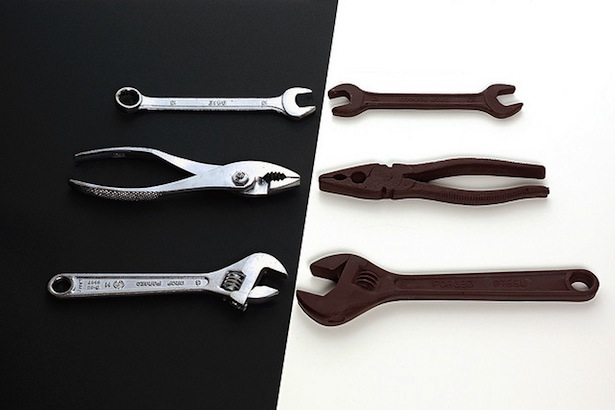
The true nature of user experience design exceeds the techniques that we use to express our design ideas. A UX designer’s work should always be derived from people’s problems and aim at finding a pleasurable, seductive and inspiring solution. The results of this work should always be measurable through metrics describing user behaviour. UX designers use knowledge and methods that originate from psychology, anthropology, sociology, computer science, graphic design, industrial design and cognitive science.
User experience design is a complex set of activities and, in fact, a way of thinking. If you start to breath the air of UX design and really devote yourself to it, your startup will surprise you and amaze your customers. In the age of user experience design, your users expect your product to be well designed.
And it’s really important for the sake of your company that you remember: UX design does not equal wireframing. Anyone can wireframe – it’s a rather simple activity; many people can write simple HTML code, but not everyone can design experiences.
Before you start thinking about the right design technique to use in your project, get back to your C-P-S hypothesis (we discussed that in part 1 of the series). Great user experience design is all about the problem of a specific target group that you’re just dying to solve. Without acknowledging and in fact deeply understanding the problem of your users-to-be, any design technique will be just an empty shell.
If you haven’t considered your C-P-S hypothesis yet, do it now.
The power of analog
Back in 2010 together, two of my friends and I started to think about a solution to the internal problem of the company we used to work in the R&D department of: how to engage non-designers in design activities. They couldn’t be bothered with professional software (we were using Axure at the time), because it was way too hard to use and too far removed from fun (fun is actually an important factor here). Just the sight of a complex interface scared them to death and we were trying to get these ideas out of their minds and engage them in the UX design process.
We came up with the idea of using sticky notes as design elements and creating workshops in which anybody could express their ideas. It was a blast, and not long afterwards we commercialised the method as UXPin Paper Prototyping Kits, selling it to designers in 41 countries.
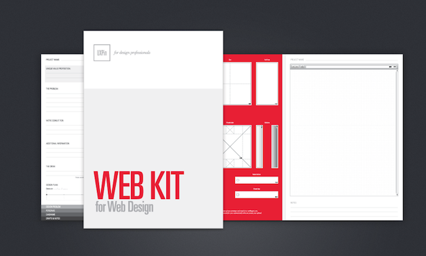
Our success was possible because people love to interact with physical products. It’s much easier and less stressful to move a UI design element on paper than doing this in the software. Try it with your team and be amazed.
Generally speaking, the advantages of paper include:
- No limits, because paper has an extremely simple user interface with no predefined styles, rules, or guidelines.
- Inherent collaborative qualities; it’s easy to share and easy to pin on the wall.
- It’s easier to throw away what you only spent five minutes designing.
- It teaches designers that their ideas are more important to the design process than the tools they use.
This is well understood in the UX community. Todd Zaki Warfel, in his research for Prototyping, found that paper prototyping is the most widely used design technique in the world. Bill Buxton, in his great book Sketching User Experiences, brings up lots of great real-life stories of the use of paper in design.
The great question is, when should we use paper prototyping? I can come up with two particularly useful situations:
- Always, as a quick and dirty ideation tool that you use before using other, more complex, design techniques;
- In small, not complicated, projects, as a primary design technique, on one condition: you must have a good relationship with your team who can work on scrappy documentation and, in this particular project, you must prefer speed over accuracy.
You can either engage in sketching, or use sticky notes as we did. Try to be as quick as you can and don’t over-design your paper prototypes. They don’t need to be works of art, unless you plan to test them with users (which is an interesting way of quickly testing your design ideas!).
The true nature of wireframing
I suppose wireframing is the second most popular method of rapid documentation of design and one that you have probably seen many times throughout your career.
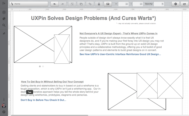
A set of gray boxes that hardly look like a design, but somehow get everyone excited during ‘buy in’ meetings. Sounds familiar? That’s what a wireframe looks like if you don’t consider its powerful communication skills.
What’s the true nature of a wireframe?
A wireframe is a low fidelity representation of a design. It should always clearly show:
- The main groups of content
- The structure of information
- A description and basic visualisation of interactions between users and the interface
Consider the wireframe as the backbone of your design, and remember that it should contain a representation of every important piece of the final product.
A wireframe is for web and mobile projects what a blueprint is for the architecture of buildings – a representation.
'Representation' is an absolutely crucial term here, which will help you find the right fidelity-speed balance. You can’t go into too many details but, on the other hand, you need to create a solid representation of the final design that doesn’t miss out any important piece of it. You’re setting a path for the whole project and for the people that are working with you (developers, visual designers, copy writers, project managers – they all need well-created wireframes). You might compare it to the creation of a map of a city. Every street is represented on a map, but, obviously, it’s vastly simplified. You can sense the architecture of a city if you look at a map, but you can’t perceive its beauty.
Wireframes should be created quickly and almost the whole time should be spent communicating with team members and … thinking. The mere activity of wireframe-creation should be really quick.
The visualisation should be aesthetic, but this is vastly simplified. Black-grey-white are the typical colours you’ll use (you may add blue to specify links). If something takes too much time to prepare (such as choosing icons or uploading images), you have to represent it in a simplified way (for instance, using placeholders – crossed rectangles for images, plus an appropriate description). This is why we call wireframes low-fidelity deliverables (lo-fi).
It doesn’t need to be pretty, it has to be functional. Remember – a well-created wireframe communicates design in a crystal clear way and sets a path for the whole team.
When to use wireframes?
- In any huge, complex project that has an alarmingly close deadline.
- In any small project with a limited budget.
In both cases, wireframes are typically used as the documentation of the project. Since they are static and fix interaction with an interface at a specific point in time, they should be accompanied by the written word (from short notes explaining interaction to, when needed, complex technical documentation).
However, they might be also used in a less formal way. Since they are quick and simple in form, they serve well as clear sketches for inner communication in the team. If developers ask how something should be done – the answer can be provided as a rapidly created wireframe.
To give you an example, UXPin is a startup with really rapid development cycles (releases every couple of days). We use wireframes to quickly visualise tasks (even small ones!). It eliminates misunderstandings and is really cheap.
Wireframes are seldom used as a testing material, although they may help to gather feedback in initial, guerrilla-style, research, in which you don’t care about methodological purity, but rather try to get some quick insights.
Wireframes placed in the context of the whole design story can be surprisingly effective and, though in recent years they’ve received some bad press, are still indispensable as an initial stage of complex projects.
Misunderstandings around mockups
The term 'mockup' was used for years in regard to high fidelity, static, design representation. It’s a kind of draft (or even a final version!) of visual design used to get a buy-in from stakeholders.
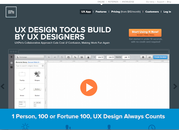
Suddenly the term started to lose its meaning and become close to wireframes. The reason is trivial. A couple of companies, founded by non-designers, which created wireframing software, confused mockups and wireframes and started to advertise themselves as ‘mockup software’. It’s a pity really, because right now a lot of people don’t see the difference between these completely different ways of expressing design ideas.
Remember, a well created mockup:
- represents the structure of information, visualises the content and demonstrates the basic functionalities in a static way
- encourages people to actually review the visual side of the project.
Mockups are particularly useful if you want to get an early buy-in from a stakeholder. Thanks to their visual nature, mockups don’t have the resistance of low fidelity deliverables and are much quicker to create than prototypes. They are a good feedback-gatherer and, if placed in the context of the whole design story, can form a great chapter of your documentation.
The real power of prototyping
A prototype is often confused with both a wireframe and a mockup. In actual fact, though, it’s totally different. A prototype is a middle-to-high fidelity representation of the final product, which simulates user interface interaction. It’s interactive and dynamic.
It should enable the user to:
- experience content and interactions with the interface
- test the main interactions in a way similar to the final product.
If your prototype is static, it’s either a mockup or a wireframe. A prototype is not the final product though. It’s a simulation of the final interaction between the user and the interface. It might not look exactly like the final product, but should be vastly similar (it’s definitely not a greyish, sketchy thing). Interactions should be modelled with care and have a significant resemblance to the final experience. Interdependence between the interface and backend mechanisms is often omitted to reduce costs and speed up development cycles.
Prototypes are used to their full potential in user testing. Such a simulation of the final interactions forms great material to check the usability of the interface, before the development actually begins.
Prototypes usually aren’t the best documentation you can imagine, since they force the 'reader' to take some effort to understand the interface. On the other hand, a prototype is the most engaging form of design documentation, as the interface is tangible and straightforward.
Beware that prototyping is rather an expensive and time-consuming form of design communication. I’d suggest rather creating prototypes that can be reused in development (yep, it means that you need to code some HTML, CSS and probably JS on your own). It’s especially effective in relatively simple projects.
Done right and combined with user testing, prototyping can pay for itself.
Getting out of the silly deliverable business
You might hear from time to time a call to get out of the deliverable business and focus on the action. It seems a little bit strange and unnecessarily rebellious. Should we always get out of the highway to try our luck at finding a shortcut through the woods? It might work from time to time, but just watch the famous (and painfully simple) horror movie Wrong Turn to see where it can lead you if you are out of luck.
Oh yes, it may hurt.
I might agree with this call, though, if we added 'silly' to the sentence. Get out of the silly deliverable business – now that’s the task we all should accomplish as soon as possible. It makes a lot of sense.
What’s a silly deliverable? It’s the one that’s unnecessary for success.
You should keep unnecessary work to the bare minimum and always remember that your job is to design a product, not documentation. Do only what helps you create a stunning user experience.
Iterate, iterate, iterate
We live in dynamic times in which we need to constantly adapt ourselves and our ideas to the changing requirements of the (business) environment. This means that all the design techniques that you use should leave you just enough space and time to constantly iterate on your ideas and those of your team.
Don’t totally devote yourself to one concept and one design technique. Design needs richness and you shouldn’t feel limited.

The Creative Bloq team is made up of a group of art and design enthusiasts, and has changed and evolved since Creative Bloq began back in 2012. The current website team consists of eight full-time members of staff: Editor Georgia Coggan, Deputy Editor Rosie Hilder, Ecommerce Editor Beren Neale, Senior News Editor Daniel Piper, Editor, Digital Art and 3D Ian Dean, Tech Reviews Editor Erlingur Einarsson, Ecommerce Writer Beth Nicholls and Staff Writer Natalie Fear, as well as a roster of freelancers from around the world. The ImagineFX magazine team also pitch in, ensuring that content from leading digital art publication ImagineFX is represented on Creative Bloq.
