Google's brand new redesign is a real all-rounder
It's very 'Googley', says Google.
Sign up to Creative Bloq's daily newsletter, which brings you the latest news and inspiration from the worlds of art, design and technology.
You are now subscribed
Your newsletter sign-up was successful
Want to add more newsletters?
Google's simplified Workspace logos were quite the source of contention last year, with many complaining that the new, minimal icons for Gmail, Google Photos and more were just too similar. Well, it seems the company isn't planning to reverse course any time soon – and next up for a 'Googley' redesign (Google's word, not ours) is the search engine itself.
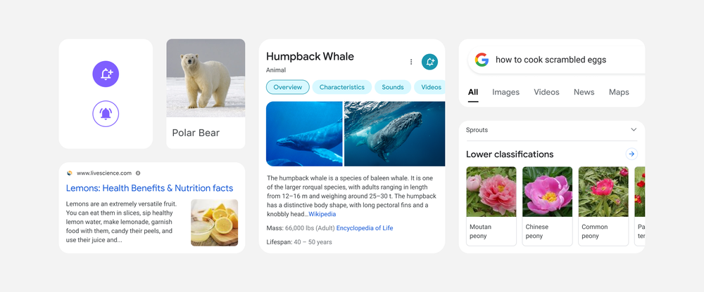
The company has revealed a brand new design for mobile search, inspired by the roundness of the Google logo. Simplifying the page to "let the search results shine," the new look is designed to feel both new and familiar, as well as more consistent with the rest of Google's apps. (Check out our best web design tools if you're embarking on a project of your own.)

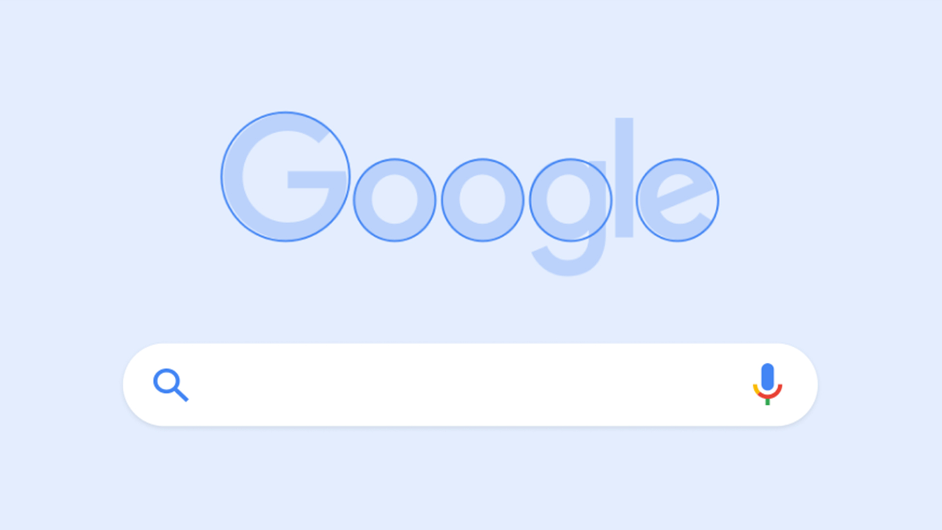
Perhaps the most noticeable difference is the abundance of round edges. From news boxes to image results, there isn't a square edge in sight – and Google says it has taken inspiration from the Google logo itself. “If you look at the Google logo," the company says in a blog post, "you’ll notice there’s a lot of roundness to it," (we'd never noticed). The new look is designed to appear "bubblier and bouncier," which, according to the company, means "leaning into that Googley feeling". We'll be impressed if that phrase takes off.
Article continues below 
Emphasising the minimal look is a general reduction of shadows, turning the mobile search page into a much more solid example of flat design. Text, meanwhile, has been made larger, and Google's own font (already prevalent in Android and Gmail) "appears much more" to increase consistency. Check out our best free fonts if you're looking for typographical inspiration.
Google says the new look is all about breathing room, with the cleaner visual space simplifying things and helping people get the experience they're looking for as quickly as possible. While it's by no means the most exciting web redesign we've seen, we'd say it's a pleasant, clean update to one of the most viewed web pages in the world – and anything that makes Google search less cluttered ought to add to its accessibility.
But as this recent viral Twitter thread shows, web users' appetites for minimal, flat design might be on the wane, with many beginning to see it as a lazy, unimaginative or, at worst, confusing. Indeed, for evidence of the backlash against over-simplified design, Google can look a little closer to home – for users still fuming about the new Gmail logo, that Googley feeling isn't such a great one.
Read more:
Sign up to Creative Bloq's daily newsletter, which brings you the latest news and inspiration from the worlds of art, design and technology.

Daniel John is Design Editor at Creative Bloq. He reports on the worlds of design, branding and lifestyle tech, and has covered several industry events including Milan Design Week, OFFF Barcelona and Adobe Max in Los Angeles. He has interviewed leaders and designers at brands including Apple, Microsoft and Adobe. Daniel's debut book of short stories and poems was published in 2018, and his comedy newsletter is a Substack Bestseller.
