If there's one thing that designers hate, it's inconsistency. Surely the minds behind the world's leading creative software wouldn't make such an error? Well it looks like they have: right now the mixture of rounded and square-edged app icons on Adobe's popular tools is driving designers crazy.
The apparent error has been a bone of contention for some time, but the recent release of Photoshop 2020 has reignited the rage of designers everywhere. The matter is detracting somewhat from all the exciting updates from Adobe MAX 2019, including the news that Photoshop on the iPad is finally here, and Illustrator on the iPad is in the works too.
- Want a Creative Cloud discount? Explore our guide to the best Creative Cloud discount
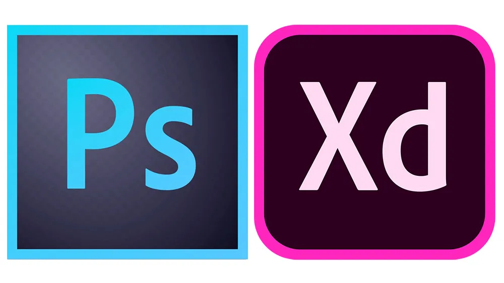
Wondering why the XD and Photoshop icons in your dock or have rounded corners, while Illustrator and InDesign remain stubbornly square? Stephen Nielson, who leads the Photoshop product management team at Adobe has taken to Twitter to explain that it's actually intentional. He tweeted that "Adobe apps get rounded corners when they become multi-device and cloud-aware". So now you know.
While it makes a little more sense now you know the thinking behind the inconsistency, Design Twitter is having none of it. Neil A. Evans summed up the crux of the problem, tweeting: "An icon that has to be explained is rubbish. I don’t care if it’s multi platform, if I install it on my other platforms I’ll already know. Make the icons consistent."
An icon should be the purest version of what it represents, with no prior knowledge required (see our roundup of the best iOS app icons for more tips). While the difference between multi-device, cloud-aware apps and standalone apps is a big deal for those working at Adobe, it doesn't make a big difference to the general user – and certainly not the extent of wanting a different type of icon to remind them.
Another hot take: I really don’t care whether or not my Adobe apps are cloud-aware (whatever that even means), and I doubt I’ll ever get the urge to be reminded by looking at an app icon’s corners. https://t.co/eFZ8kGRPK7November 6, 2019
If you're really struggling with the non-uniform icons, there is a solution. Go into Finder, and in the app's info panel you can override its icon. Copy in the 2019 icon, and you'll have a beautifully consistent dock once again. Phew.
Read more:

