Who thought the new Ant-Man and Wasp logo was a good idea?
Leaked design has the internet baffled.

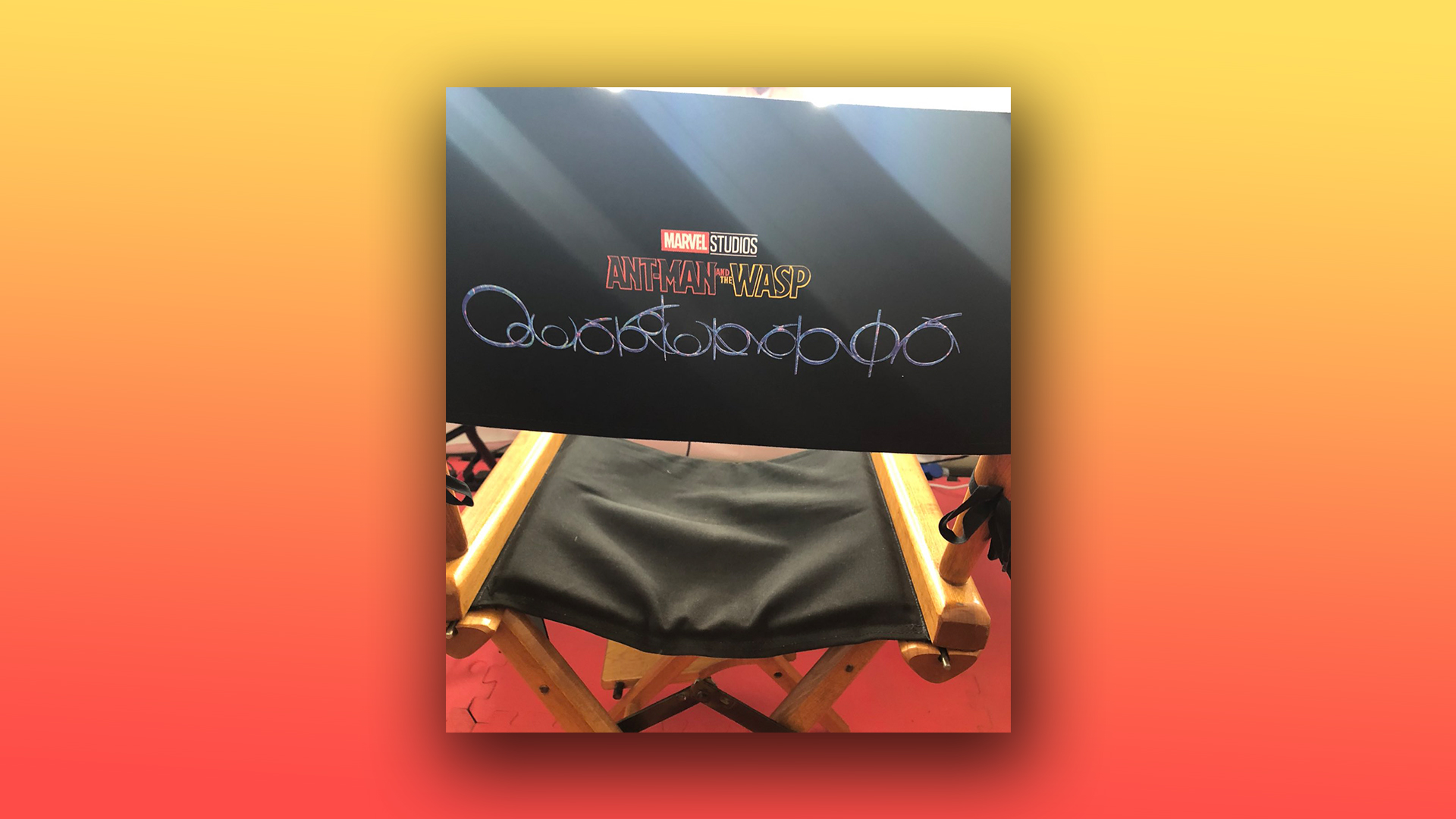
The Marvel franchise is renowned for its iconic advertising and branding designs, but the latest logo for Ant-Man and the Wasp: Quantumania might've missed the mark. A photo of the logo has surfaced online, but fans are totally perplexed by it.
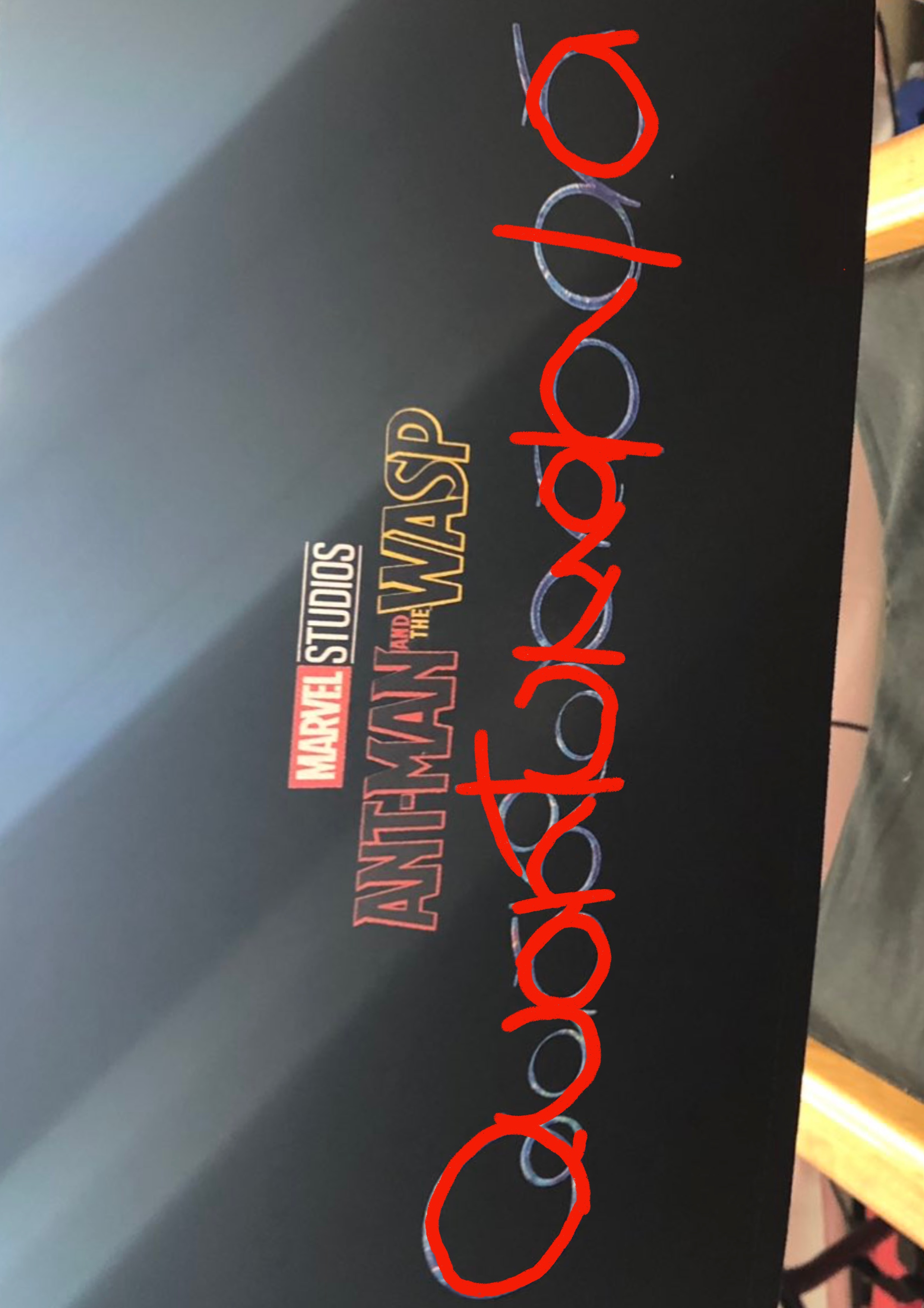
The next Ant-Man movie is set to be released in 2023 after filming began during the summer. A photo from the set has surfaced of a branded chair that features a variant of the Ant-Man and the Wasp logo, but it seems to be confusing fans. The new logo features what looks like a number of intertwining and complex patterns, that apparently spell out the word 'Quantumania', but the new design is barely legible. If you think you could design a better logo for the Ant-Man movie, then check out our roundup of the best free logo designers and have a go.

The complex design makes it incredibly hard to decipher, especially in comparison to the Ant-Man and The Wasp logo above it. We think the new logo would look at home on the front cover of a gothic album from the early 00s which may be a little too niche for the likes of a mainstream superhero movie like Ant-Man.
Article continues belowThe photo of what looks like a set chair was posted by a user on Twitter called JohanssonComer. The account has since suspiciously been deleted, and we wonder whether Marvel has something to do with the logo leak, as we know how much it loves a good spoiler (Tom Holland we're looking at you).
The internet is just as confused as we are about the logo, and users have taken to Twitter in response to the leaked design. One user asked, "How are we supposed to read that?" and another asked, "Do you want my eyes to be stressed out, or do you want me to watch your movie?" It seems as though the fans aren't happy, but one user pointed out, "Everyone is mentioning how weird it looks, but it's gotta mean something," and thinking about Marvel's track record of easter eggs, there is every possibility that this bizarre logo has a deeper meaning.
Ant-Man and the Wasp OooOoooOoOOO https://t.co/jkr6A43TR0October 25, 2021
that subtitle looks like the world's most dangerous rollercoaster ride https://t.co/DbqPL6GLBjOctober 25, 2021
This shit looks like reCAPTCHA https://t.co/kZL9CWwvWLOctober 25, 2021
With thousands of retweets and Ant-Man trending on Twitter, it looks like the Quantumania debate will continue. We look forward to seeing this design in the context of the movie poster (especially if it's as cool as the Hawkeye poster) or trailer in the near future, but in the meantime, we will just continue to scratch our heads over this design. If you are designing your own logo and want to avoid the same confusion, then check out our 15 golden rules of logo design.
Read More:
Sign up to Creative Bloq's daily newsletter, which brings you the latest news and inspiration from the worlds of art, design and technology.
- Can you tell the difference between Marvel characters and font names?
- The MacBook Air looks set to get its most radical update yet
- Apple defends controversial new MacBook Pro design

Amelia previously worked as Creative Bloq’s Staff Writer. After completing a degree in Popular Music and a Master’s in Song Writing, Amelia began designing posters, logos, album covers and websites for musicians. She covered a range of topics on Creative Bloq, including posters, optical illusions, logos (she's a particular fan of logo Easter eggs), gaming and illustration. In her free time, she relishes in the likes of art (especially the Pre-Raphaelites), photography and literature. Amelia prides herself on her unorthodox creative methods, her Animal Crossing island and her extensive music library.
