TikTok couldn't believe the Apple logo is made of circles
But is it actually by design?

Sign up to Creative Bloq's daily newsletter, which brings you the latest news and inspiration from the worlds of art, design and technology.
You are now subscribed
Your newsletter sign-up was successful
Want to add more newsletters?
From hidden messages to surprising histories, we uncover a fair amount of logo secrets on Creative Bloq. Last year, one of the most famous 'secrets' of the lot went going wild on TikTok, and we're still thinking about it now.
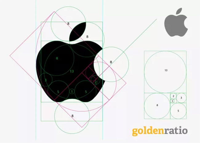
A user discovered that the Apple logo is created from "nothing but perfect circles", and shared a video demonstrating how it can be recreated using the shape. Commenters were suitably aghast – but is the design, one of our best logos of all time, as simple as it seems?
Thomas J. Stevens' video (above) shows how the curvature of various circles contributes to the design. "How have I never noticed this before?" one user commented, while another added, "so the Apple is one big circle, who knew?"
Article continues belowIndeed, it's a theory almost as old as time that the Apple logo was created using the Golden Ratio. For the uninitiated, this is a mathematical ratio, commonly found in nature. It can be used to create organic-looking, visually-pleasing compositions. And going by Stevens' TikTok video and the graphic below, it's easy to believe that the Apple logo was designed using only circles.

But was it by design, or is it simply easy to slap some overlaying circles over a naturally curved shape? The circular logo may be an urban myth – designer Rob Janoff based his work on actual apples; he sliced them into cross sections and built his designs around the curves supplied by nature.
Either way, there's no denying that the circles fit seamlessly over the logo. And one again, it's proof that TikTok is delightfully fascinated with logo design. From that hilariously bad McDonald's logo redesign to those 'premium' rebrands, we've seen plenty of logo love on the platform. Want to make your own? Take a look at our guide to logo design.
Read more:
Sign up to Creative Bloq's daily newsletter, which brings you the latest news and inspiration from the worlds of art, design and technology.

Daniel John is Design Editor at Creative Bloq. He reports on the worlds of design, branding and lifestyle tech, and has covered several industry events including Milan Design Week, OFFF Barcelona and Adobe Max in Los Angeles. He has interviewed leaders and designers at brands including Apple, Microsoft and Adobe. Daniel's debut book of short stories and poems was published in 2018, and his comedy newsletter is a Substack Bestseller.
