Are brands saying sayonara to serifs?
We take a look at the big brands that have gone sans.
The familiar little flicks that help lettering flow as you read have been falling out of favour with big brands over recent years. That's if HSBC's recent subtle rebrand is anything to go by, in any case.
In fact, last year we noticed that some big brands were going one step further with their logo designs and resorting to an all-caps approach.
But are serifs really on the way out for logo design? Earlier this year we predicted exactly the opposite. Our type experts forecast that serifs would continue to grow in popularity, and remain an important tool for brands to establish a sense of personality and 'uncorporateness' (take that, The Man, we're making up words now).
Nevertheless, we've noticed a number of big brands pruning the serifs from their beloved logos and letters. Does this rob them of personality, or does it reinforce an aspect of their identity? Let's take a look at five big brands who have ditched their serifs to find out.
01. HSBC
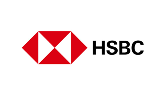
Use the arrow icons to compare the old and new logos
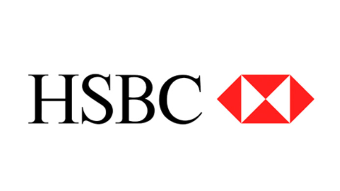
In a rebrand that could be dismissed as 'same same but different', HSBC has snuck out a sans-serif logo. It's a rebrand that's largely flown under the radar, possibly because it's so inoffensive. As well as straightening out the lettering, HSBC has also swapped around the logo and the brand name, and deepened the colour of its hexagonal logo.
So why did this rebrand pique our interest? Well, it's mainly because HSBC was one of the last banking bastions of serif lettering. With a serifed font, HSBC set itself apart from the pack as a traditional, established brand, which is especially reassuring when you're handling people's cash in a choppy economic climate.
The new lettering is perfectly acceptable, if a little uninspiring. To get an idea of how a bank can drop the serifs and still retain a personality, check out the Natwest rebrand, which packs in colour and heritage.
Sign up to Creative Bloq's daily newsletter, which brings you the latest news and inspiration from the worlds of art, design and technology.
02. Santander
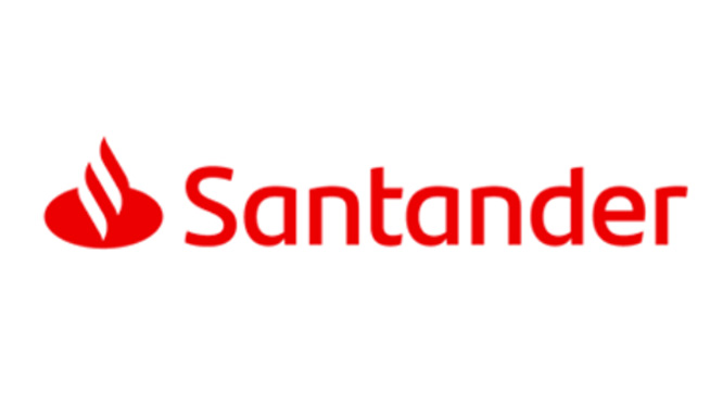
Use the arrow icons to compare the old and new logos
Hang on a minute, haven't we just seen a banking group drop the serifs and adopt a darker shade? Isn't that always the way though: you wait forever for a subtle bank rebrand and then two come along at once...
Jokes aside, the new Santander identity was built to be more legible on digital devices. The evolution of the logo sees embellishments clipped from both the lettering and the flame icon, resulting in a straightened out and balanced design.
Much like the HSBC rebrand, the new Santander graphics have been met with a 'great, I guess...' reaction. While the new lettering matches the weight of the flame (ticking off the more legible and simpler mission statement in the process), the icon consequently loses its 'S' shape, which was a pleasant and playful nod to the bank's name.
03. Google
Use the arrow icons to compare the old and new logos
You know serifs are in trouble when a company as big as Google sends them packing. Launched back in 2015, the new sans-serif logo coincided with the reveal of Google's new parent company, Alphabet.
This new logo retained the colour elements from the previous, instantly recognisable design, but the letter shapes received a complete overhaul. Gone were the slender, almost calligraphic letters. In their place were solid weight, sans-serif forms that were better suited to a change in internet browsing habits and catered for different devices.
At the time of the announcement, Google said in a blog post that it wanted to create "a new logo and identity family that reflects this reality and shows you when the Google magic is working for you, even on the tiniest screens."
04. Yahoo!
Use the arrow icons to compare the old and new logos
Before Google came along and blew everyone away with its sans-serif logo, Yahoo had already been there and done that way back in 2013. Yahoo might not have the same clout as Google any more, but that doesn't mean that its redesign failed to cause shockwaves in the design community.
Created in-house by Yahoo's design team, which was headed up by then-CEO and president Marissa Mayer, the new logo hoped to exhume the company's popularity. It certainly garnered attention as Yahoo took a 29-day run-up the the launch with an event called 30 days of change, which saw the tech behemoth reveal a different logo every day before the official one was unveiled.
While it ramped up the anticipation, 30 days of change also exhausted and annoyed viewers. So was the new logo worth the wait? Well, it certainly dragged Yahoo away from the goofy serif logo that summed up some of the naivety of the early internet, but ultimately the design was criticised for a lack of imagination.
05. Diet Coke
Coca-Cola has been shaking things up this year in terms of design. As well as launching a heritage bespoke typeface, it also rebranded Diet Coke along with redesigned packaging.
The reason? Millennials. Or, to be more specific, how market researchers imagine Millennials. "Millennials are now thirstier than ever for adventures and new experiences, and we want to be right by their side," said Rafael Acevedo, Coca-Cola North America’s group director for Diet Coke. "We’re contemporising the Diet Coke brand and portfolio with sleek packaging and new flavours that are appealing to new audiences."
So are Millennials responsible for killing serifs along with everything else? Not really. If anything, it's the slimline cans that have forced the logo into a cramped space and squeezed out the serifs.
Related articles:

Dom Carter is a freelance writer who specialises in art and design. Formerly a staff writer for Creative Bloq, his work has also appeared on Creative Boom and in the pages of ImagineFX, Computer Arts, 3D World, and .net. He has been a D&AD New Blood judge, and has a particular interest in picture books.

